Social Media
Formats
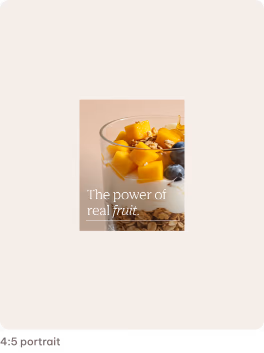
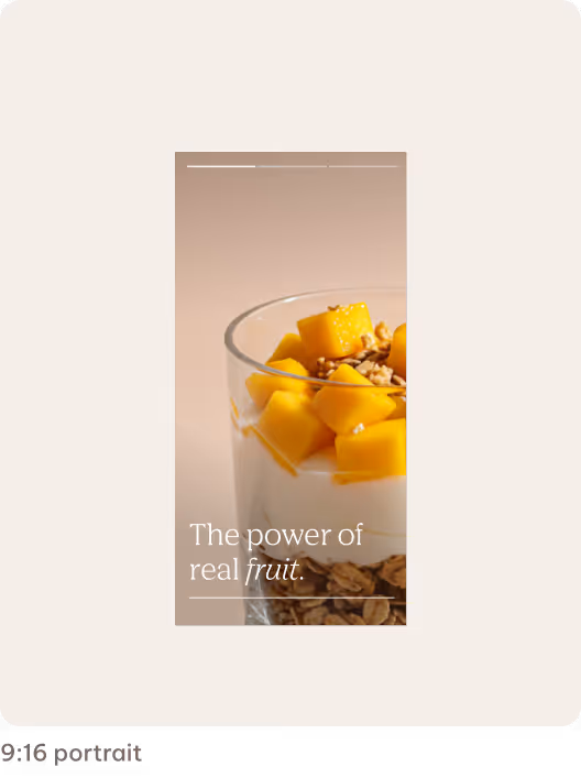
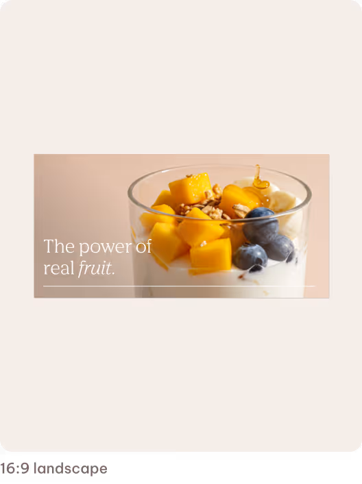
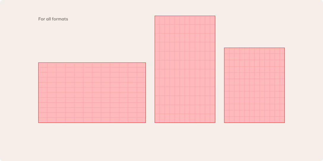
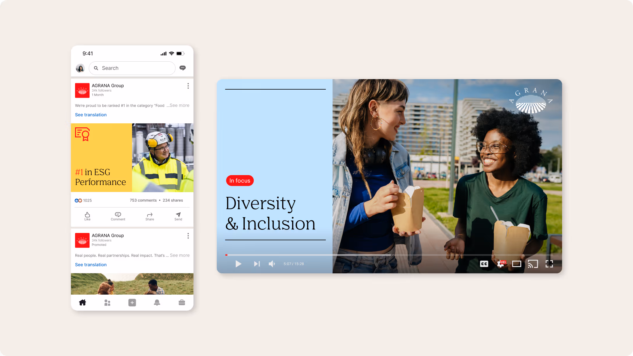
We use three core formats across our social channels: 4:5, 9:16 and 16:9.
4:5 is our preferred format for most content, offering a responsive portrait layout that works well across platforms. We use 9:16 for full-screen experiences like stories and short-form video, where vertical viewing creates a greater impact. Selectively used, 16:9 is only for instances in which the content or platform context requires a landscape format.
Profile appearance
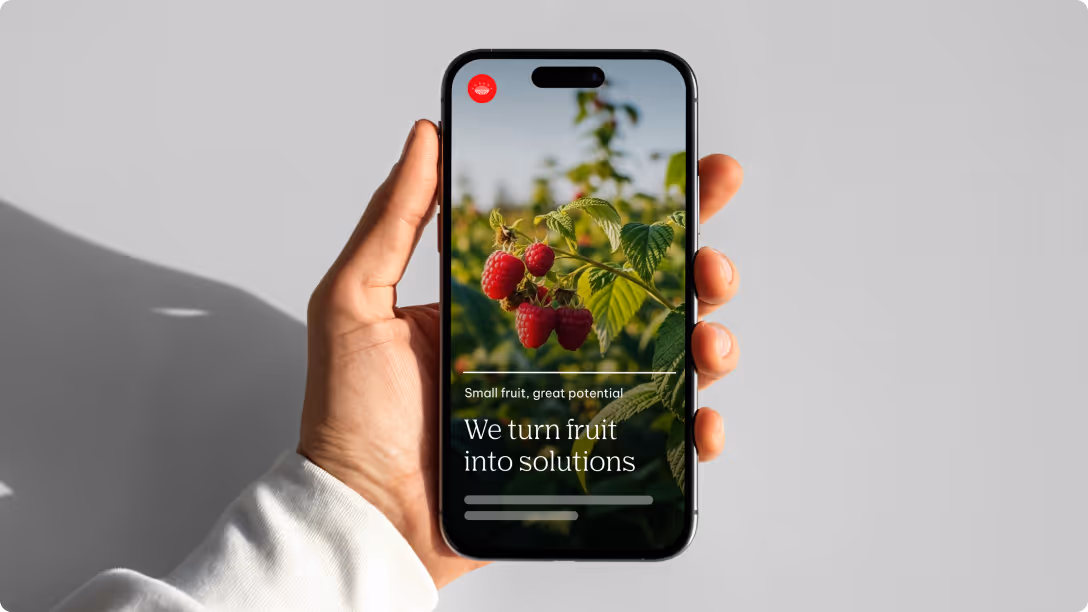
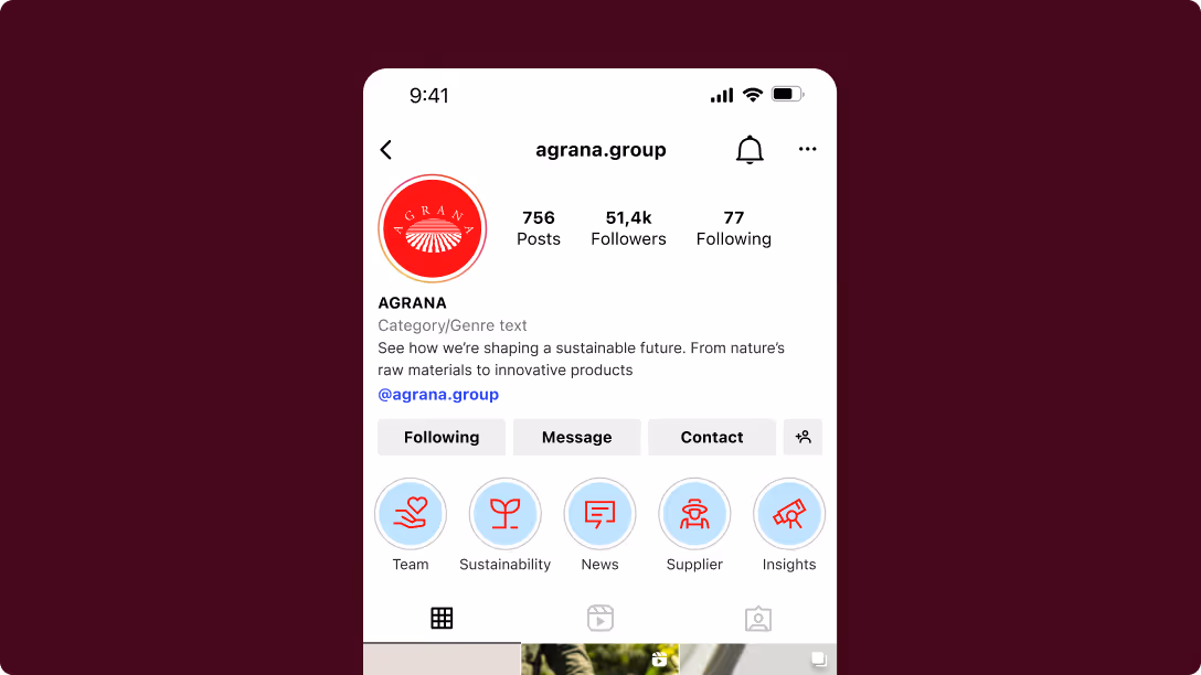
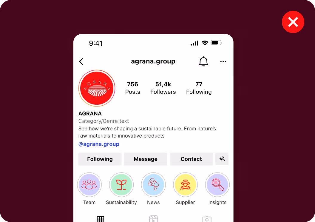
Our profile setup defines the first impression of AGRANA on social media. It includes the avatar and highlight covers. These two permanent elements shape recognition, structure the account, and ensure a consistent brand presence across regions and markets.
Avatar
The avatar defines our visual identity at the profile level and features our logo as the main brand marker across all social channels. We ensure that it remains clear, consistent, and aligned across regions and markets.
As the logo is already represented in the avatar, don’t include it in posts, stories, thumbnails, or other content formats. A coherent avatar allows for instant recognition and strengthens our overall brand presence.
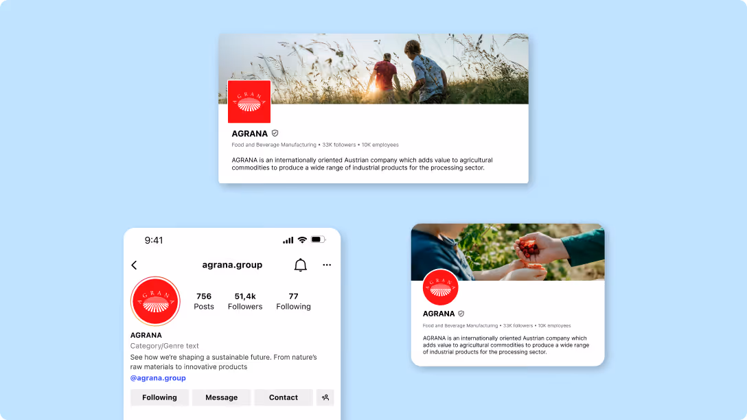
Highlight cover
Highlight covers structure our Instagram profile and make key topics easily accessible. They help make our brand presence consistent and recognizable across markets.
They follow a reduced, icon-based system using AGRANA Blue 2 as the background color. Only use the provided icons and ensure that icon colors are applied consistently across all highlights. The design is intended for long-term use and shouldn’t reflect temporary campaigns.
Content appearance
We design our content to be clear, consistent, and easy to navigate across platforms. The content hierarchy, thumbnails, subtitles, buttons, links, in-app text styles, and filters work together to create a cohesive and recognizable experience in the feed. This alignment helps audiences quickly find their way while supporting consistency across all markets.
Content hierarchy
Our content brings together two elements that work hand in hand: our verbal and visual identities. The verbal side shapes what we communicate, keeping our messaging clear, focused, and easy to grasp. The visual side reinforces how that message is understood, using design elements that add clarity, context, and consistency across channels.We design content to spark curiosity first and deliver information second. Our content encourages interaction — whether through swiping, reading further, or exploring related posts.
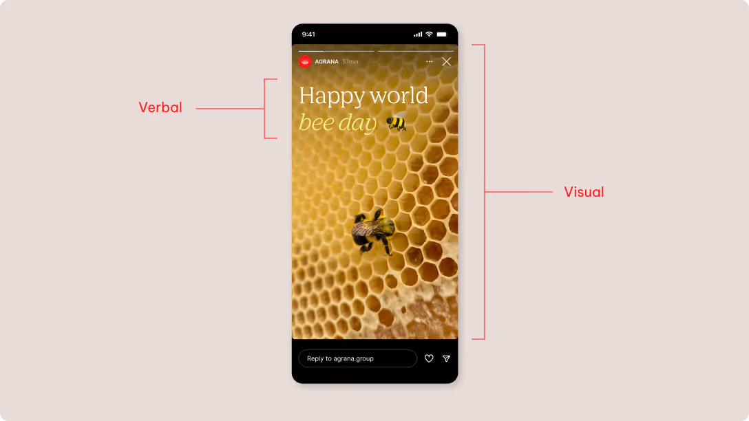
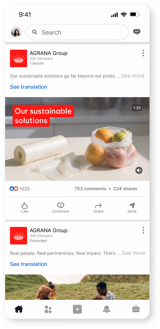
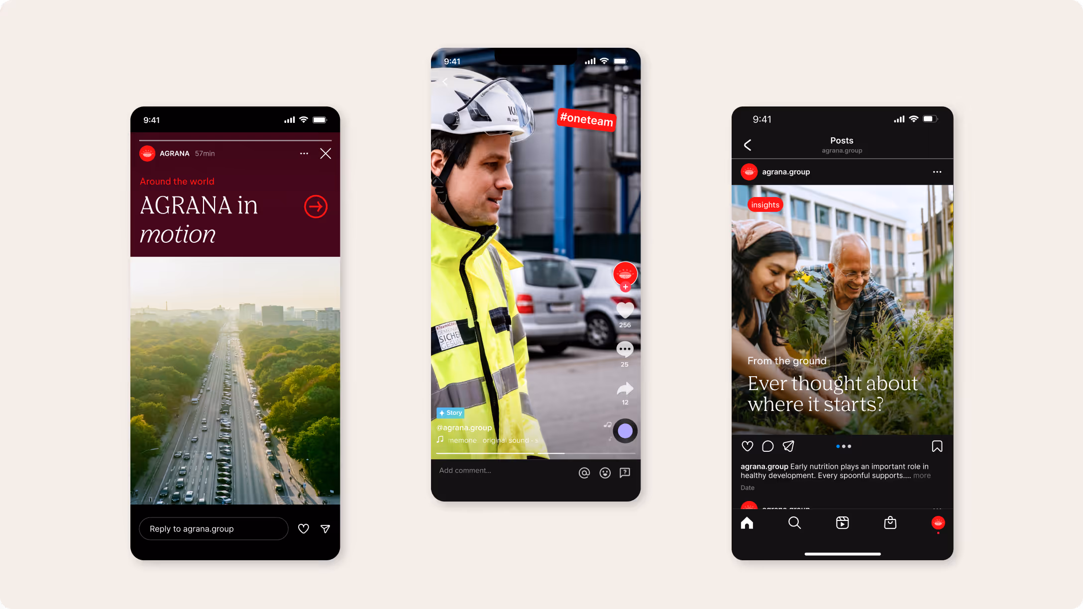
In Posts
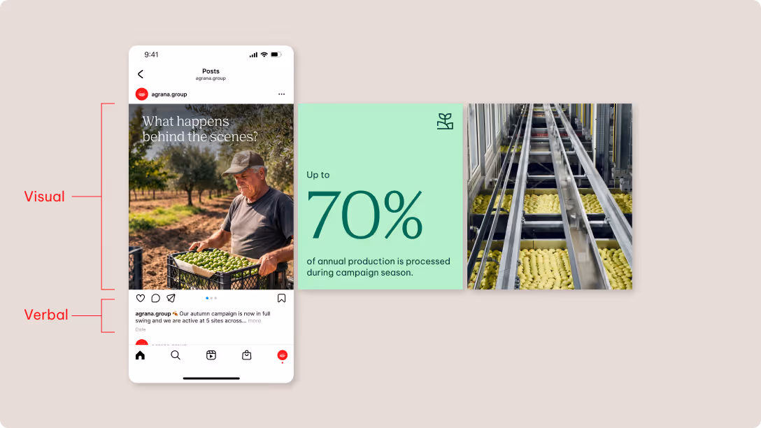
Visual
We prioritize visual storytelling over information density. Rather than explaining everything at once, visuals capture attention and invite audiences to explore the content further.
Only use minimal text within visuals if it directly supports the core message. We avoid overloading posts with information, ensuring that every visual element contributes to one clear idea.
Visuals act as the entry point to a post and are always built from our defined brand identity. This ensures consistency across imagery, colors, typography, and graphic elements.
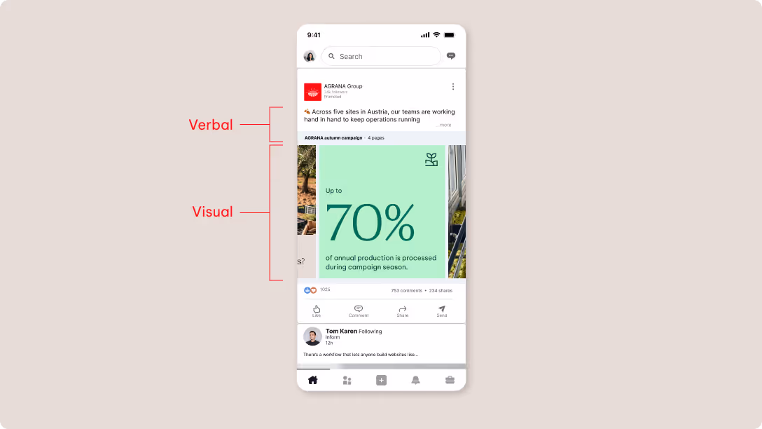
Verbal
All essential information lives in the caption, not the design. Each post communicates one clear message with the key point just before the “read more” cut.
Be sure to present clear information when creating informational posts or sharing facts to ensure that the content is easy to understand. Even factual content should be visually engaging, with design supporting clarity rather than competing with the message. The copy is still concise and avoids combining multiple topics.
We adapt our verbal approach to each platform. LinkedIn allows more informative, contextual storytelling, while Instagram and TikTok focus on lighter, more engaging communication. We tag people, partners, and events to increase visibility and engagement when relevant.
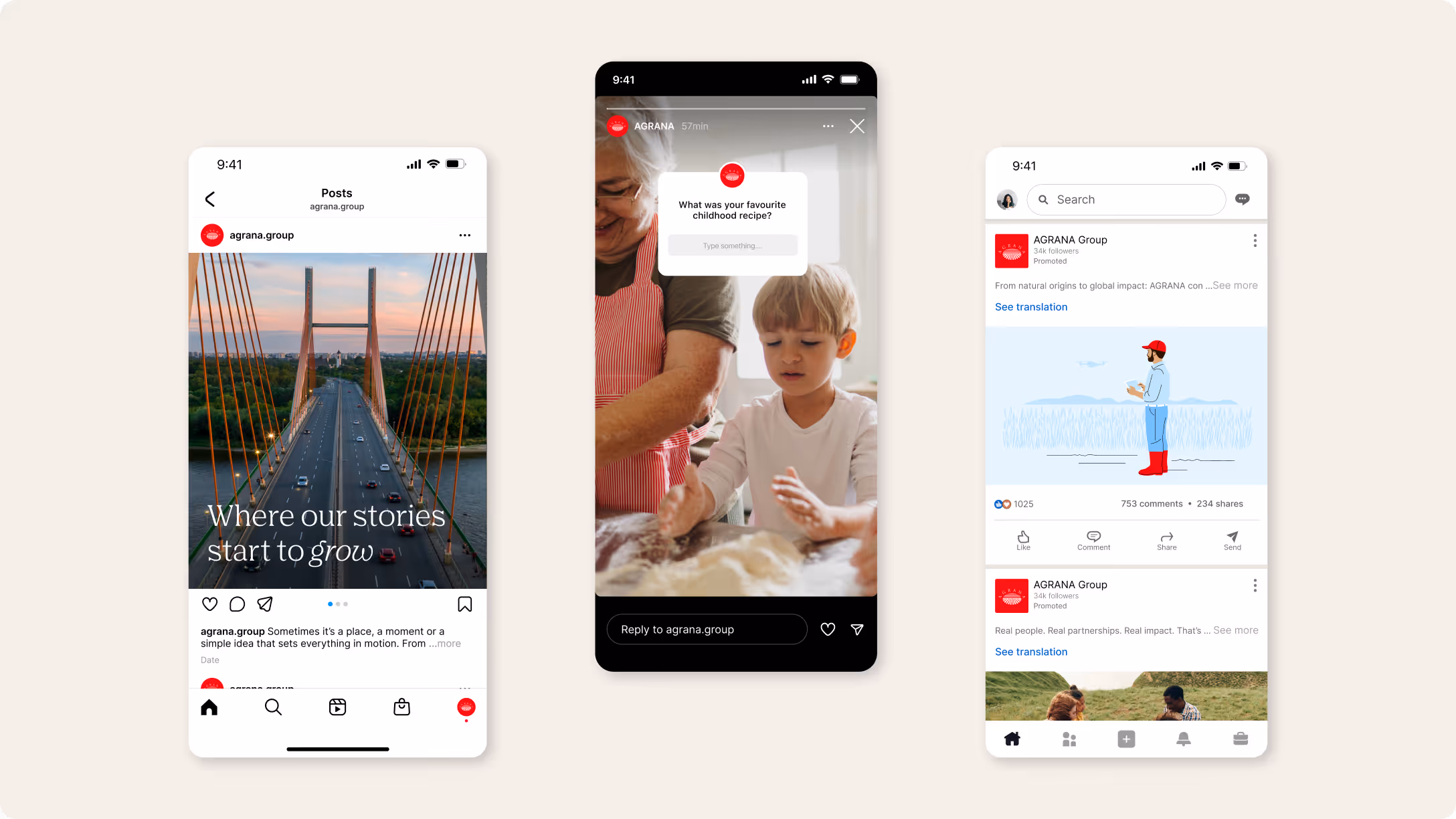
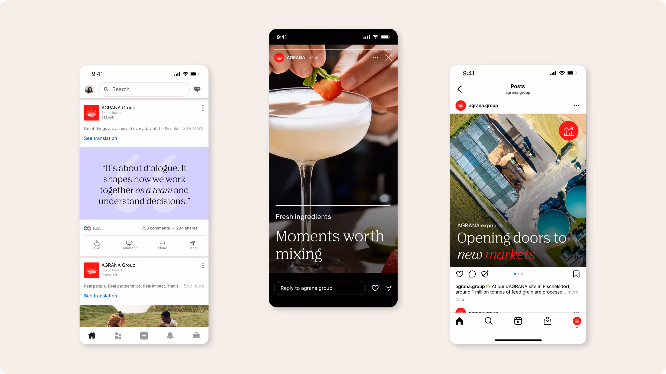
In Stories
We use Instagram stories as a fast visual format to communicate messages instantly and intuitively. Strong visual content leads our stories, capturing attention at a glance.
Visual
We prioritize the visual layer as the main carrier of communication in stories, allowing imagery or video to take the lead whenever possible. Text elements support the visual rather than compete with it, remaining minimal and unobtrusive to maintain clarity and focus.
Our stories should feel visually engaging, simple, and easy to grasp within seconds.
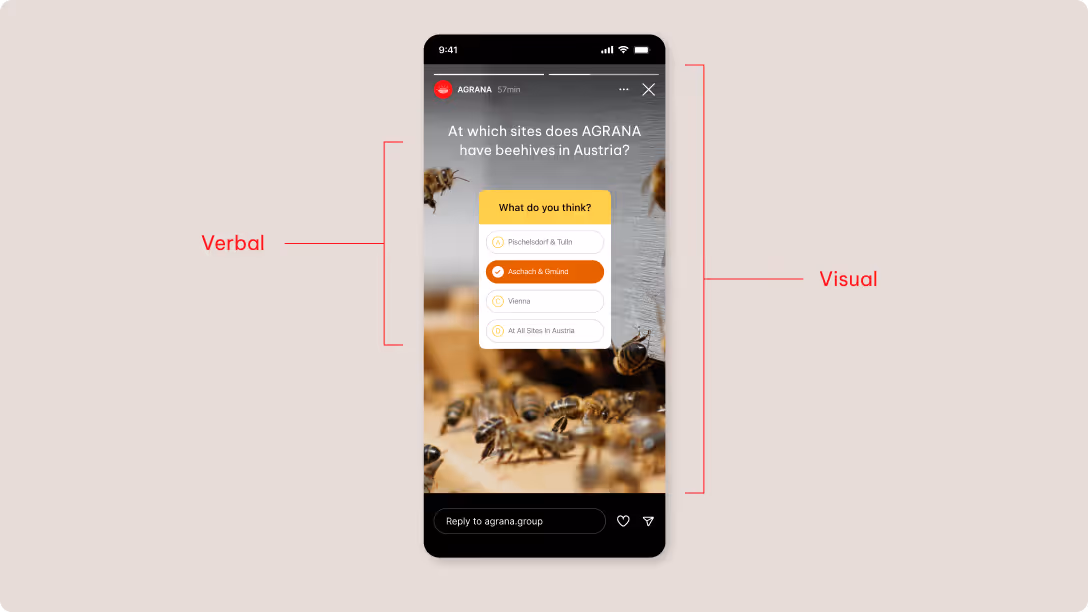
Verbal
We use text in stories to invite interaction and spark curiosity, not to provide detailed information. Verbal content should be concise and engaging, encouraging audiences to respond, explore, or learn more.
We actively use interactive elements such as questions, polls, links, sliders, or countdowns to involve audiences and guide engagement.
Avoid using purely informational text here. Limit information to short statements of no more than two to three sentences where needed.
In Reels/TikTok
Reels and TikTok videos are driven by visual storytelling. They should feel authentic, immediate, and easy to understand — with a clear focus on the moving image.
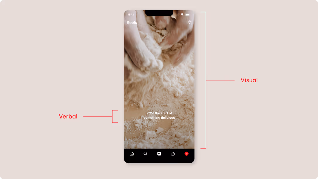
Visual
The focus remains on high-quality footage that reflects our defined visual language. The content should feel clear, authentic, and easy to grasp at first glance. We prioritize simple compositions, natural movement, and concise storytelling, avoiding visual clutter and overly complex edits. The first seconds should communicate the core message clearly and draw viewers into the content.
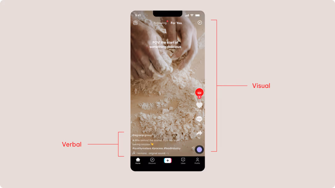
Verbal
Verbal content supports the visual narrative and is kept to a minimum. Limit on-screen text to one or two short sentences, prioritizing subtitles for clarity and accessibility. Please be sure that captions and subtitles don’t repeat or visually compete with each other. On TikTok, overlay text is the best option for verbal messaging. Check to see that the text is always visible and not obstructed by any platform interface areas.
Please see the Tone of Voice section for a deeper overview of our content principles.
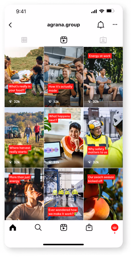
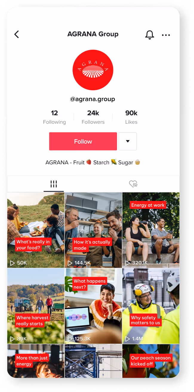
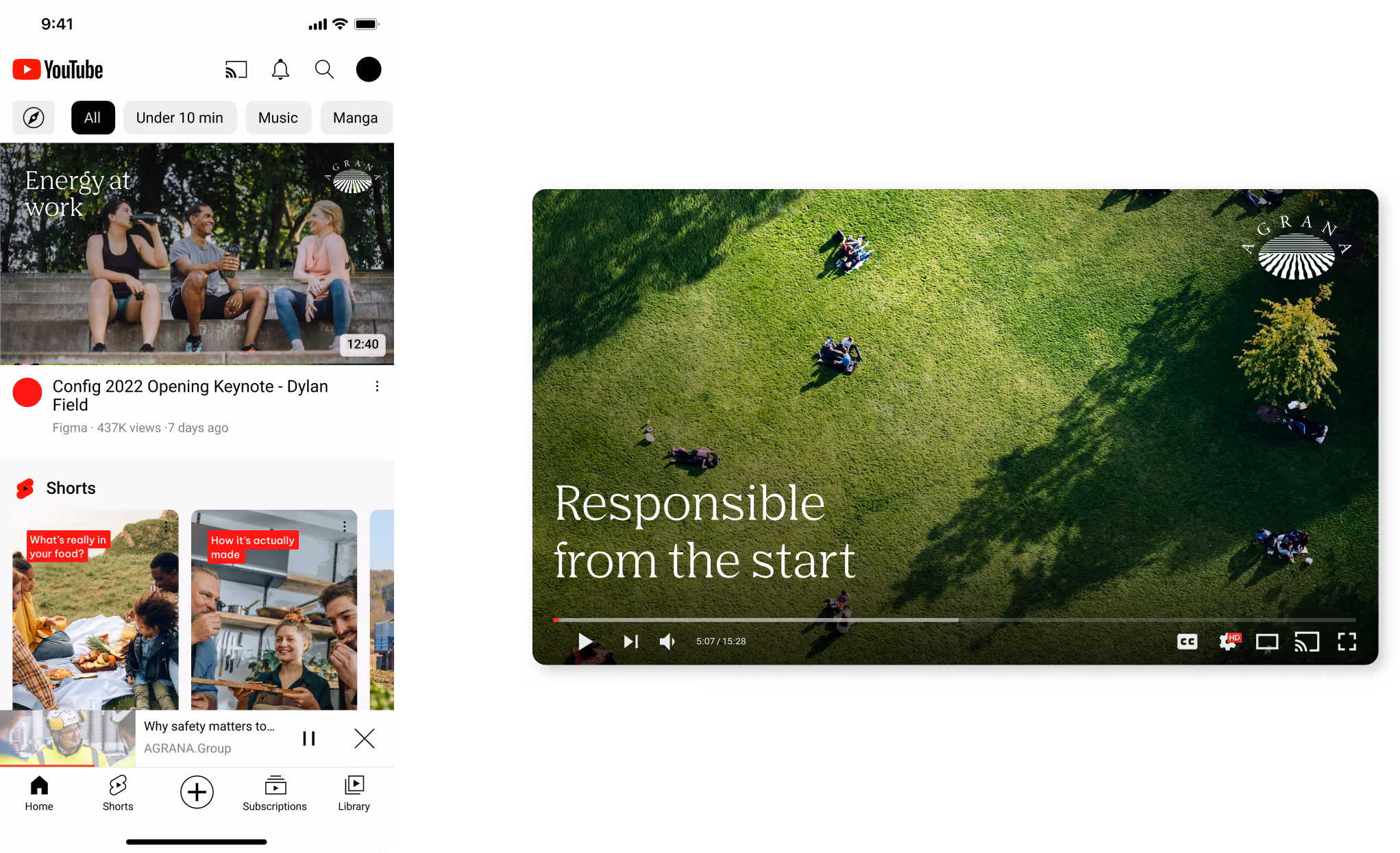
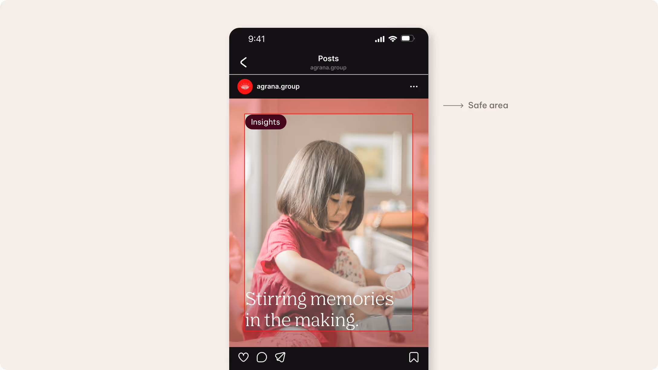
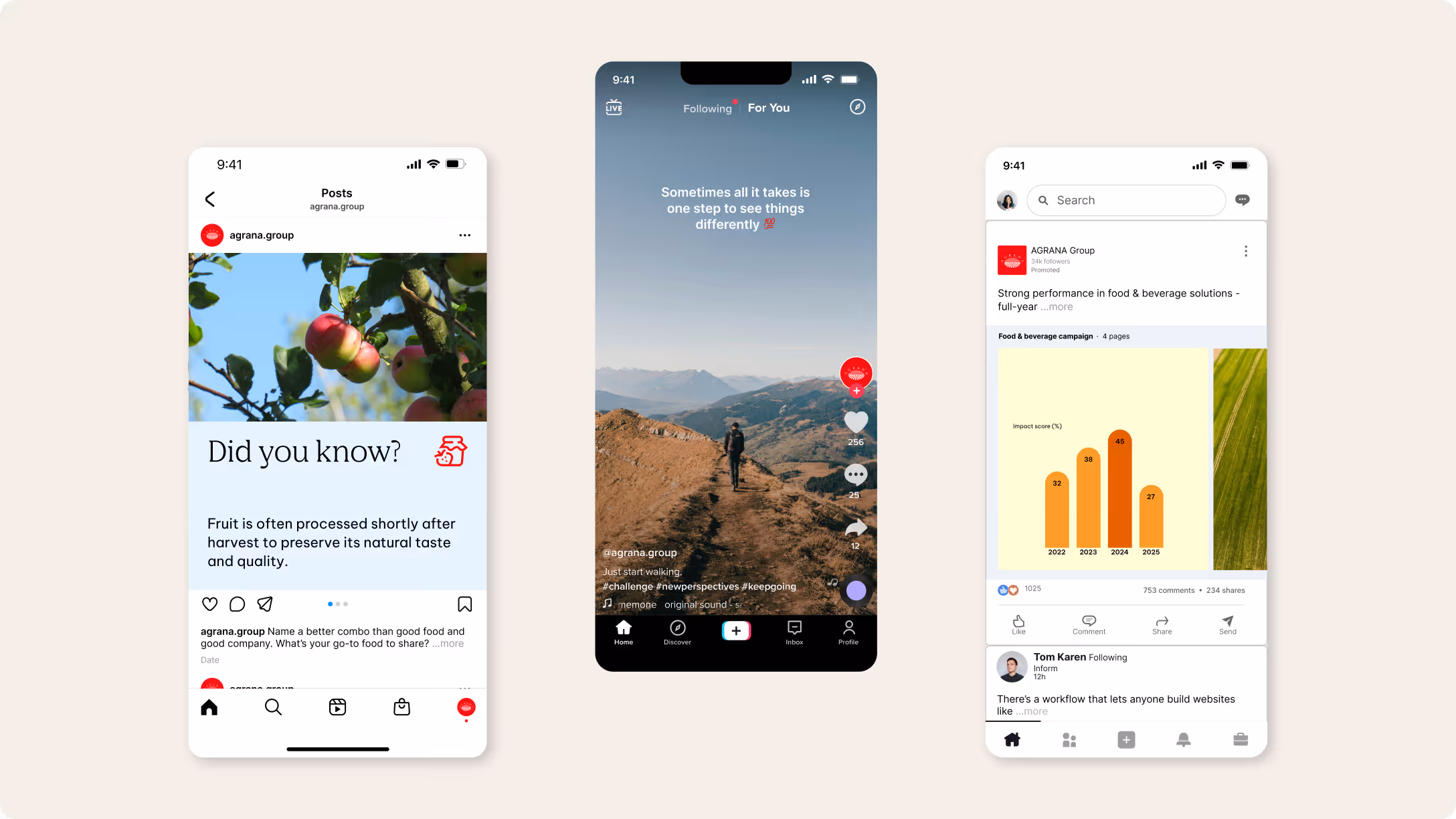
Thumbnails
We use thumbnails across all social media platforms to create a consistent and recognizable entry point for our content. In most cases, thumbnails follow the same visual logic and are based either on a relevant still image or a selected frame from the video.
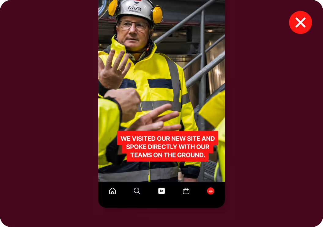
Each thumbnail features an engaging headline in white type on a red background to highlight the topic and support quick recognition. YouTube thumbnail covers follow a slightly different approach: We use the AGRANA logo here instead of the red text label. YouTube Shorts, however, follow the same thumbnail logic as Instagram, TikTok, and LinkedIn.
We use our predefined thumbnail template wherever possible to ensure consistent typography, the correct use of AGRANA Red, and proper text placement within the defined safe areas.
Instagram
TikTok
LinkedIn
YouTube
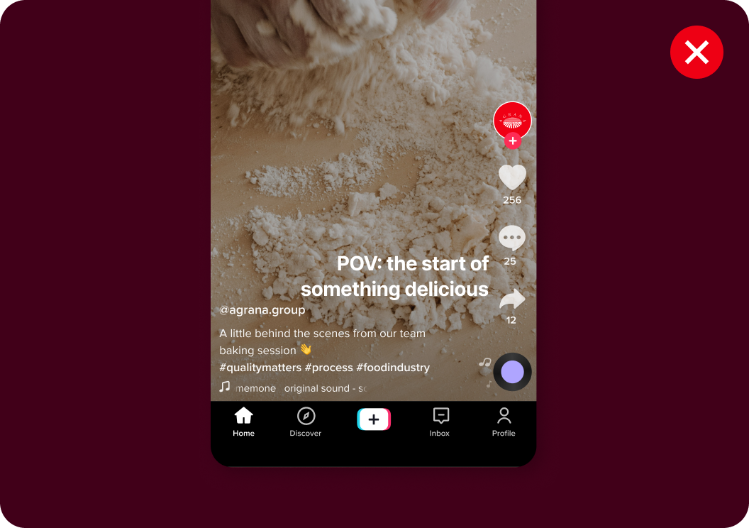
Subtitles
Subtitles serve to inform, not to entertain. We use them in reels whenever possible to keep our content accessible and easy to follow — even without sound. They must be clear and readable at all times and may not cover any essential visual elements. Subtitles appear at the top or bottom of the frame depending on the available space.
We exclusively use the native “Classic” font for all platforms. Text is center-aligned without background highlights and fonts are never mixed. Subtitles are white by default. Only use black in rare cases where additional contrast is required. Please avoid decorative effects. It’s possible to use a subtle word-by-word effect where appropriate.
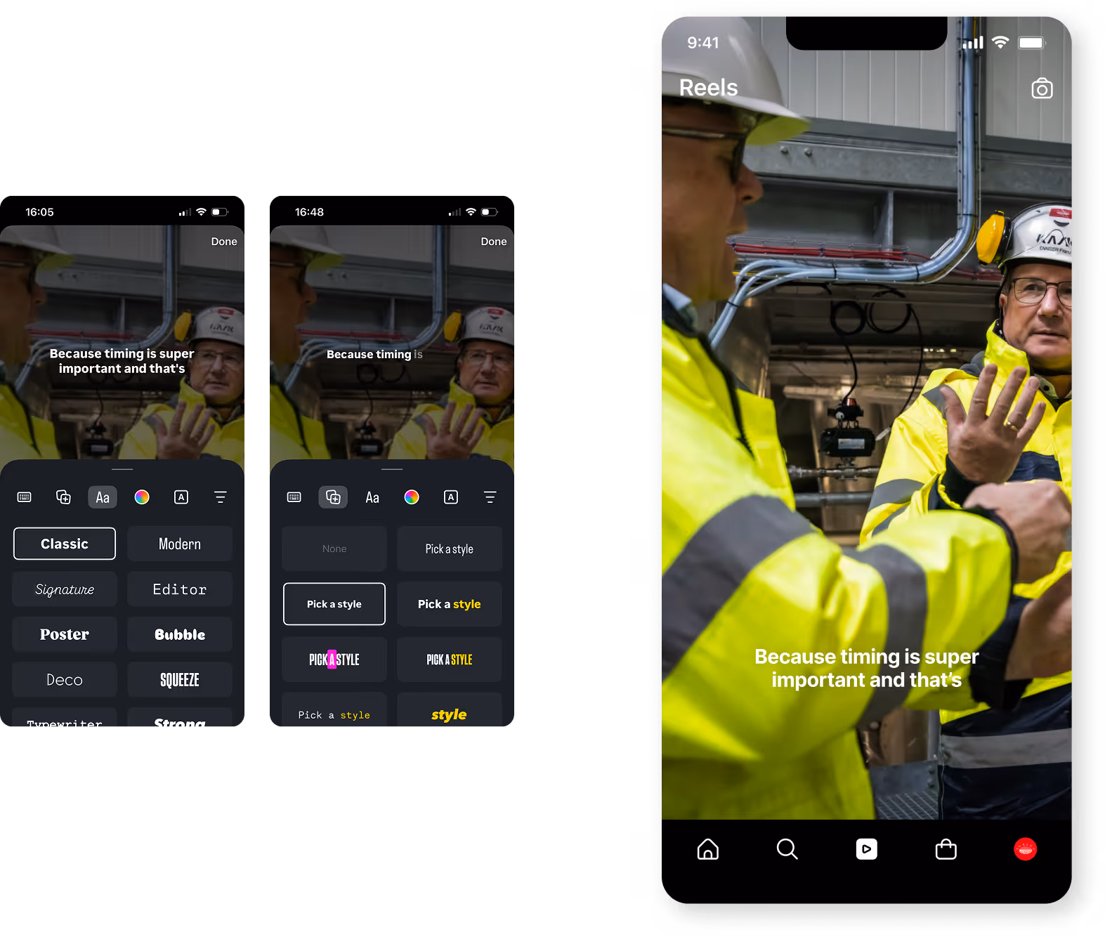
Instagram
TikTok
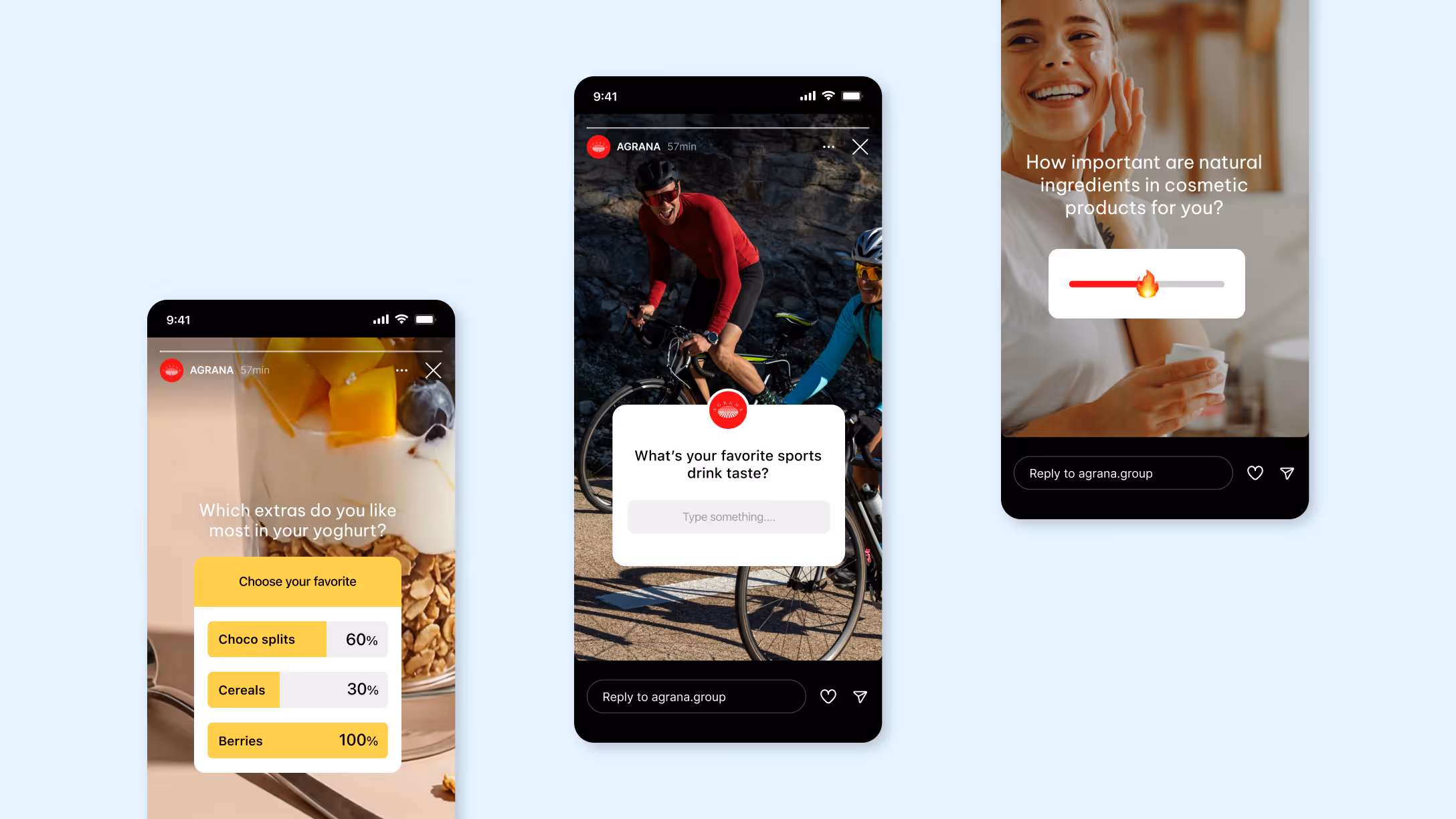
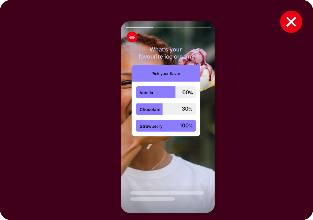
Interactive elements
We use interactive features such as polls, questions, links, and sliders in Stories to encourage participation, spark dialogue, and gather quick feedback from our audience. These tools help us create moments of direct engagement and make our content more dynamic. Keep question and answer options short, clear, and easy to scan so users can respond intuitively.
Due to differing platform capabilities, the content does more to drive interaction on TikTok and LinkedIn — for example through storytelling, prompts, or calls to action within the video or caption rather than interactive overlays.
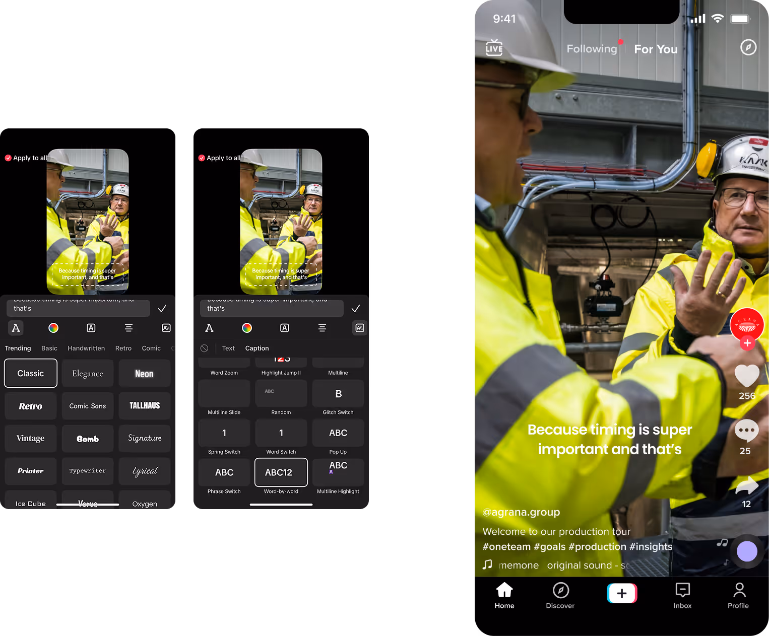
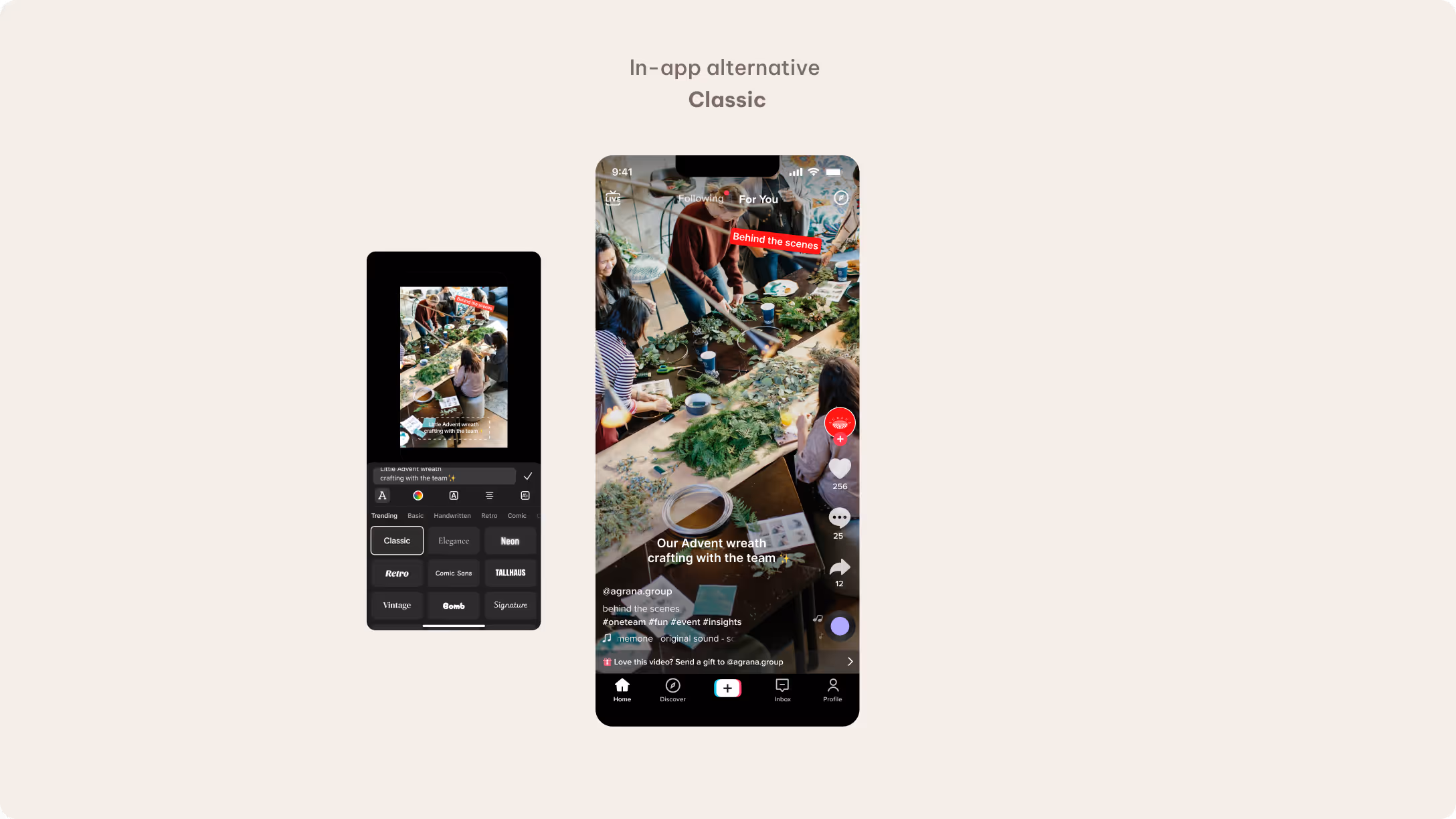
In-app text styles
We use our templates to apply our AGRANA Serif Pro and Be Vietnam Pro typefaces wherever possible to ensure a consistent, recognizable brand presence across all planned social media content. AGRANA Serif Pro is a distinctive brand typeface, which means that there is no direct in-app alternative.
It’s possible to use native in-app text styles in exceptional situations, such as live events or spontaneous, time-sensitive updates. These should remain the exception that allows us to stay flexible while maintaining visual alignment with our brand.
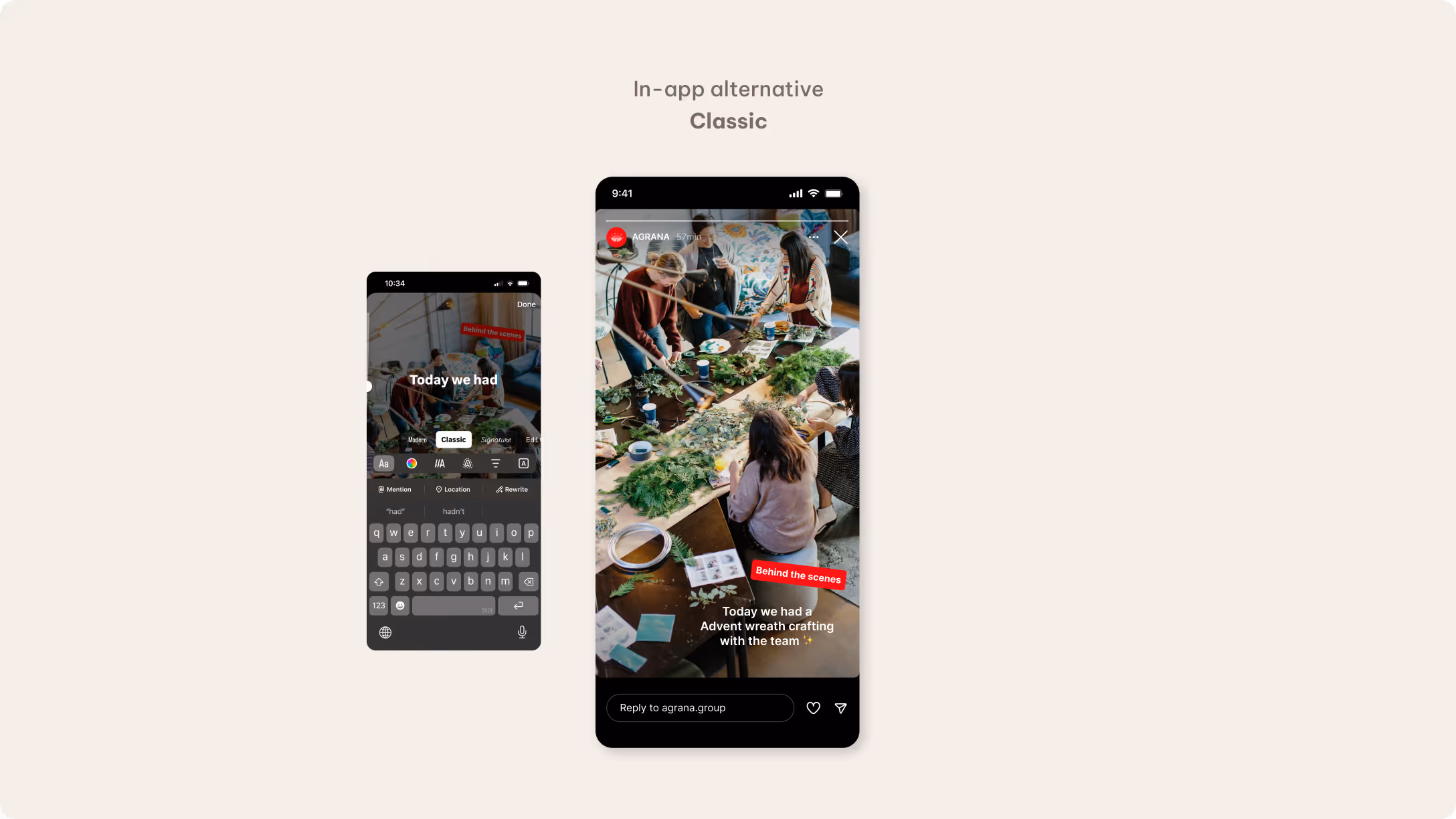
Classic serves as the primary in-app font on Instagram. Text should remain minimal and clear, avoiding ALL CAPS and decorative styling. We generally use white or black text to ensure strong readability. Background fills are not standard, but you may apply them on occasion to create tag-like highlights using the Classic font. You can use primary or secondary brand colors for these highlights depending on the context. It’s also possible to emphasize individual words using red as a font color.
TikTok
Classic serves as the primary in-app font on TikTok. The text shown on the video doesn’t move, so position it carefully to keep the key content visible. Consider using platform overlays from the outset to prevent interface elements from covering text. Like Instagram, we keep text on TikTok short, clear and restrained, using background fills only sparingly to create tag-like highlights.
Filters and GIFs
We don’t use filters or GIFs across our social media channels. Our imagery is always natural and authentic, reflecting our defined visual language that connects natural origins with innovation and global impact. Applying filters or animated overlays would compromise this consistency and move away from our intended look and feel.
You may use emojis where appropriate to introduce a more human and approachable tone. Be sure that these are always subtle and purposeful. Ensure sufficient contrast when placing headlines or text on images. If necessary, incorporate overlays to increase readability while keeping the image itself unchanged and true to its original tone.
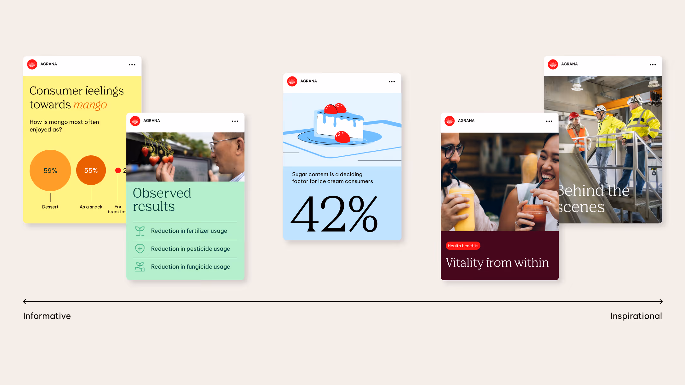
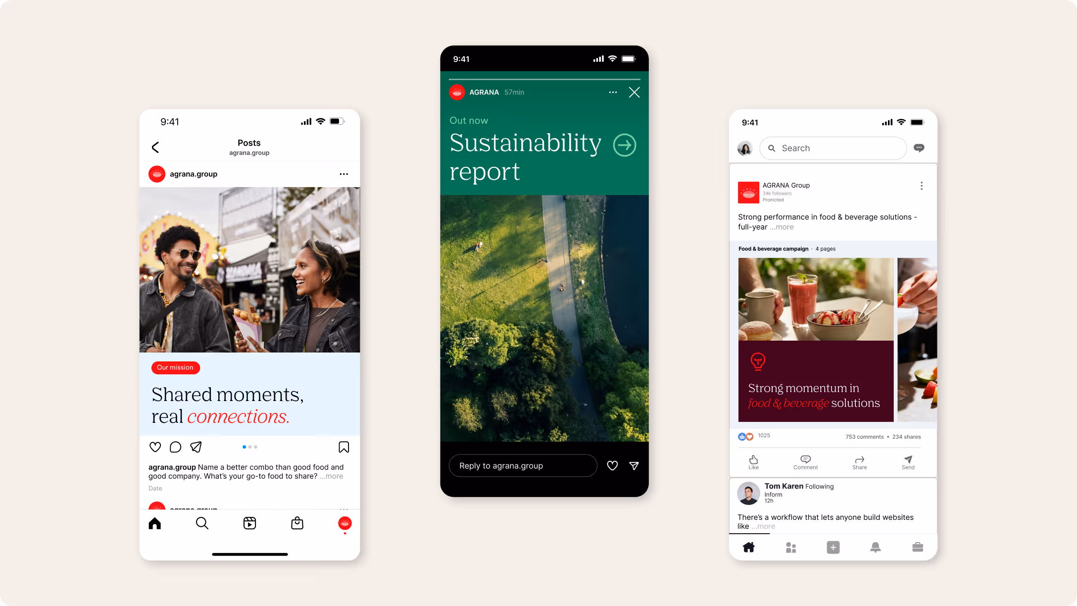
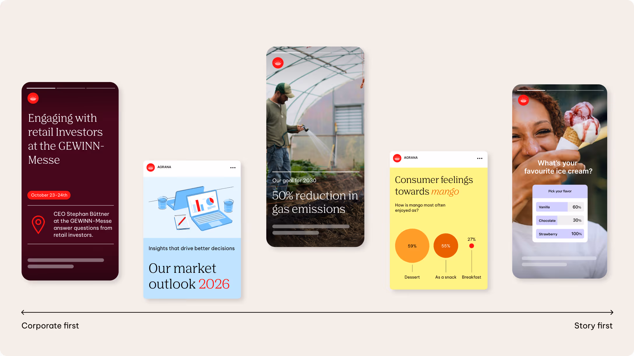
Using our brand elements
Our brand elements shape how content moves along the spectrum from informative to inspirational. Informative content focuses on key facts and clarity, while inspirational content gives visual elements more space to create presence and emphasis.
Layout, colour, typography, icons, and illustrations shape tone and create consistency across platforms. Not every element is required in every post — even a single element can convey the AGRANA look and feel. Used intentionally, they help each post land where it needs to.
Layout
Our layout builds on the AGRANA standard layout, adapted and simplified for digital content. It’s flexible and versatile, allowing it to respond to different formats and content needs.
Full bleed is our default approach. It creates the strongest visual impact and allows content to take center stage without distraction. Giving our imagery and messages maximum space creates clarity and presence. Feel free to use horizontal or vertical splits if you need additional structure. These divisions should enhance clarity and support the story, not dilute the focus.
Possible division examples
The following examples show how to use full bleed compositions and horizontal or vertical divisions across formats.
Full bleed
Full bleed is our preferred and default layout choice. It places full emphasis on a single visual or message without any distractions. The format works especially well for immersive imagery or strong, concise statements. It creates clarity, confidence, and a strong visual presence.
Horizontal
The horizontal split introduces structure when needed. It separates the visual and message into defined zones, making both clearly readable. We use this format when content requires explanation or hierarchy. It maintains focus while adding informative depth.
Vertical
The vertical split introduces a clear side-by-side structure within the 16:9 format. It separates the message and imagery into defined zones while maintaining visual balance. We apply this format when both elements carry equal weight and should be experienced simultaneously.
See the layout section for a more detailed explanation of our layout compositions.
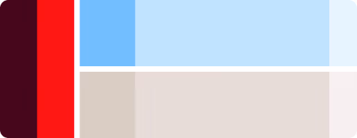
Safe area
We design with the platform in mind. Interface elements like captions or interaction buttons can overlap the content and affect visibility.
To ensure visibility across devices, we place key messaging and critical elements inside a central safe zone — especially in portrait formats (9:16). Respecting safe areas helps us maintain clarity and consistency across all channels.
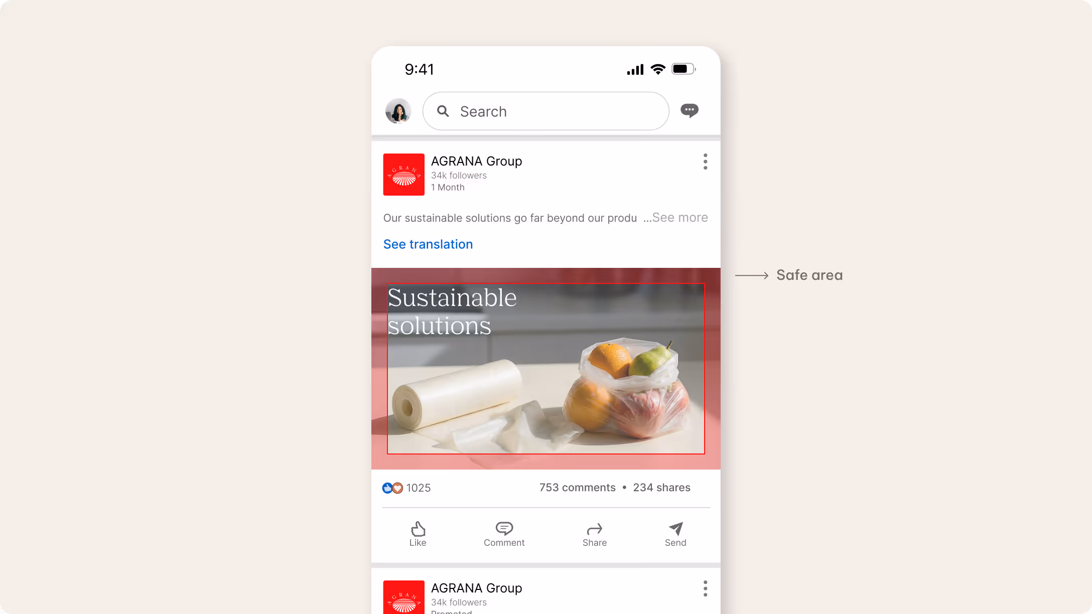
4:5 (Portrait)
We maintain a safe area around the edges of the layout in 4:5 portrait formats. Keep key messaging and essential elements inside this zone to ensure good readability.
This keeps content clearly visible and consistent across different devices and feed views.
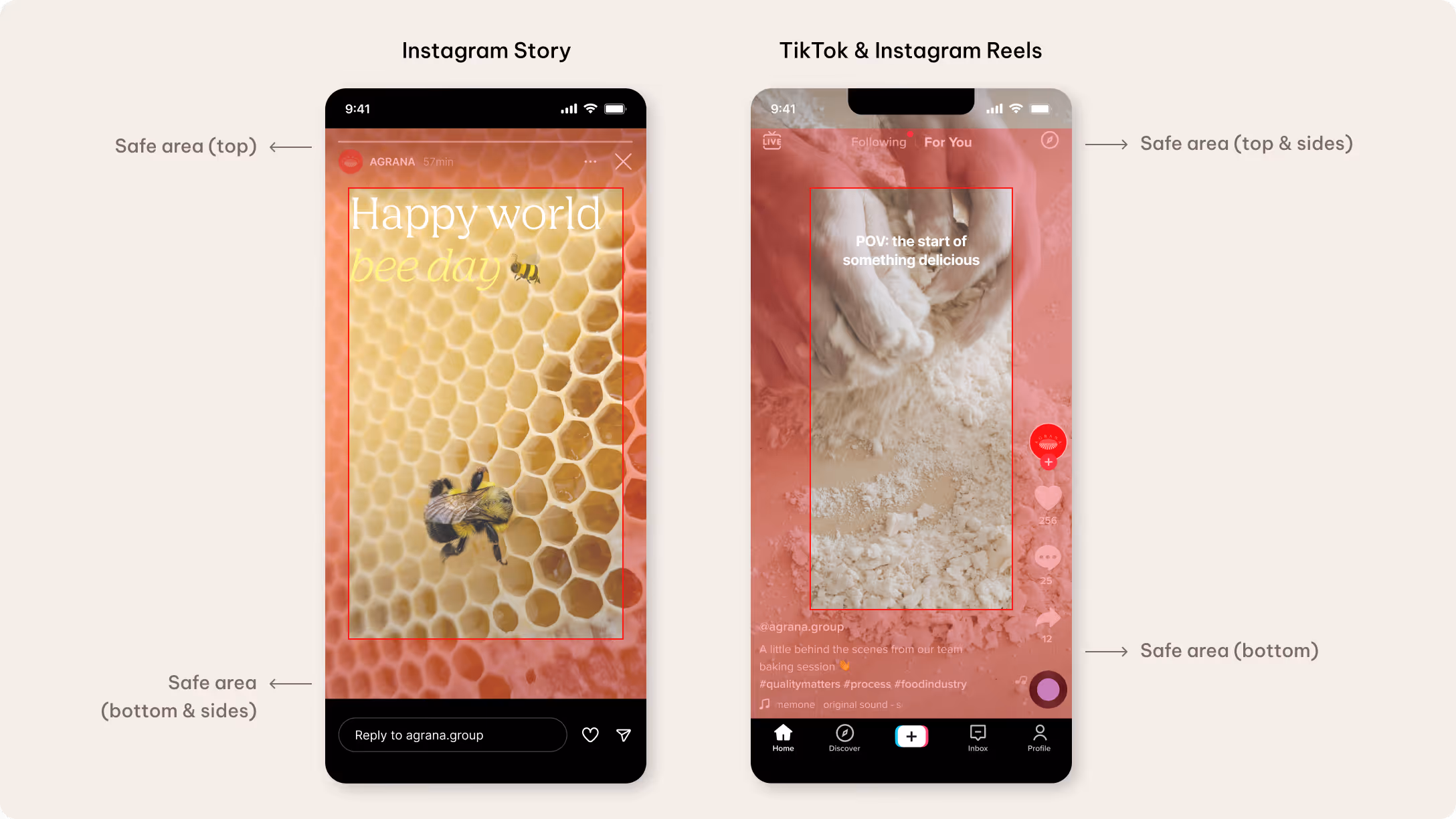
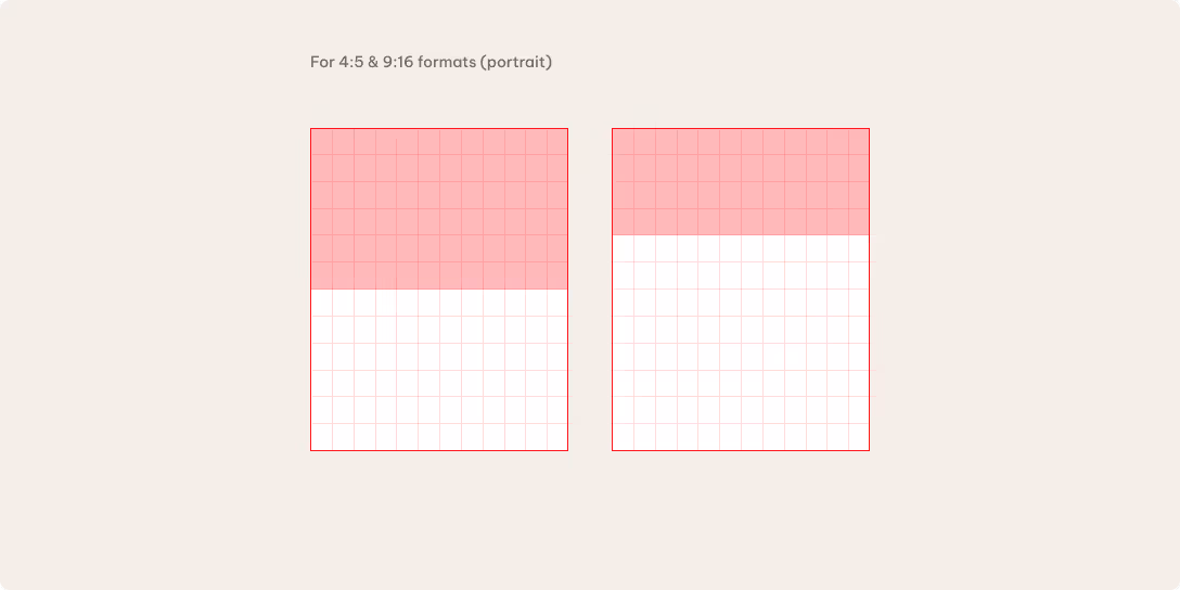
9:16 (Portrait)
We account for platform interface elements that may overlap the content in 9:16 portrait formats. Keep key messaging and essential elements inside the safe area to ensure clear readability.
Interface elements appear at the top and bottom of the screen on platforms such as Instagram Stories, Reels and TikTok. These include profile information, captions, and interaction icons. Maintaining sufficient spacing ensures that important content remains visible and unobstructed.
Paid social placements may introduce additional interface elements, such as call-to-action buttons or sponsored labels. As a result, the lower screen area can require additional safe space to keep key content visible.
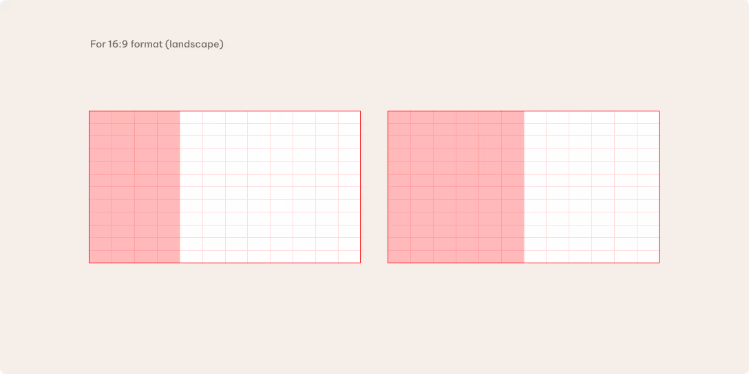
16:9 (Landscape)
We maintain a safe area around the edges of the layout in 16:9 landscape formats. Keep key visual elements inside this zone to ensure clarity and consistent readability across different devices and feed layouts.
We prioritize imagery over embedded text for LinkedIn content, primarily using the caption for messaging. Be sure to maintain sufficient spacing from the edges as feed layouts may vary slightly between desktop and mobile.
Color
Color helps define the tone of our social communication. We use either the primary or secondary palette to shape the visual expression, depending on the message. Primary colors reinforce our brand presence, while the secondary palette introduces warmth and a more engaging tone.
Coporate first
We use our primary color palette when the brand takes the lead. These colors create recognition, authority, and a clear AGRANA presence. They work especially well for corporate communication, HR-related messages, formal statements, and broader business topics.
Story first
We use our secondary color palette to create content with a more inviting, engaging feel. These colors add warmth and help highlight human stories or thematic moments. They work especially well for inspirational content, illustrated messages, data visualizations, and people-focused stories.
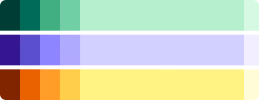
In most cases, social media should follow a story-first approach — prioritizing engaging, human, and narrative-driven content over purely corporate messaging.
Please see the Color section for more detailed information on how we use our color palette.
Typography
We keep our typography clear and easy to follow across all social content. Use no more than two text sizes to maintain readability and a balanced layout. The minimum font size should not be less than 10px. If we need more text, we can use plain backgrounds and move additional details to the post description. Our content generally focuses on the core message, while stories remain light and high-level.
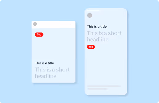
Titles & tags
We use titles to provide quick context and introduce the topic of the post. They remain concise, ideally in a single line, and support the headline.
Tags highlight key information such as themes, dates, and locations. We keep them short, using one to two words to create a clear visual marker.
Headlines
We use headlines to communicate the core message of the content. They remain short and easy to read.
Headlines in posts are limited to two lines, while stories, reels, and TikTok content may use up to three lines. Add titles, tags, or supporting body text to headlines if you need more context.
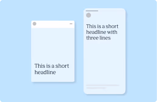
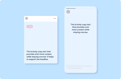
Body copy
We use body copy sparingly to provide brief context or support the main message. Detailed information should generally live in the post caption, not the visual.
Body copy should not exceed three lines in posts, but you can use up to four lines in Stories, Reels and TikToks for additional context.
Please see the Content hierarchy section in these guidelines for more detailed information on how we structure and split our content.
Possible text combination examples
The following examples show how to use full bleed compositions and horizontal or vertical divisions across formats.
These examples help us keep messaging clear by avoiding too many text types in one post. The combinations are optional, but they offer a simple hierarchy that makes structuring the message easier and more effective.
Icons and illustrations
Illustrations and icons help shape how information is understood at a glance. Illustrations add storytelling, tone, and context, while icons support clarity through structure and quick recognition.
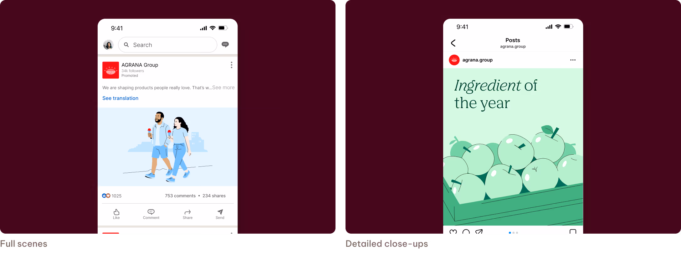
Illustrations
We use illustrations when content benefits from storytelling or additional context. They help explain complex topics and create a more approachable, warmer tone. Illustrations can appear as full scenes or close-ups that highlight key elements.
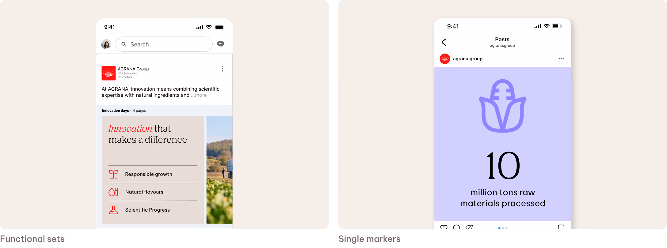
Icons
We use icons for functional or informational messages. They help structure content, such as data points, features, categories, or lists, keeping layouts clear and easy to scan. Icons can appear as functional sets to organize information or as single markers to highlight key details.
Please see the Illustration section and Icon section for more detailed information on how we use illustrations and icons.
Don'ts
In this section, we outline what we avoid to maintain a coherent, consistent social media presence. We refer to the dedicated chapters within these guidelines for more details on specific elements.
We don’t introduce additional colors or icon styles in story highlights.
Only use the defined AGRANA primary colors and official icon set. Avoid secondary colors, color variations, and external icon styles.
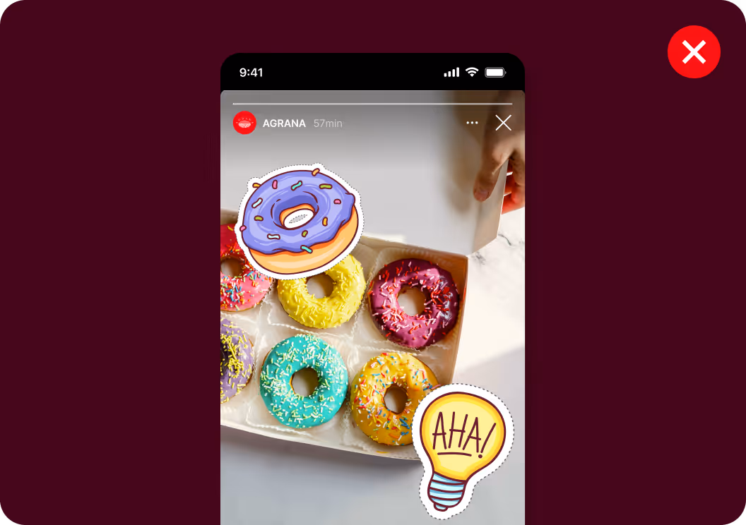
We don’t use GIFs or stickers in our social content.
Opt for video or platform-native motion formats instead. Use emojis selectively to add a human and engaging tone.
Don’t use all caps or text highlights.
Avoid all caps and don’t place text on color backgrounds. Labels are only for short tags of up to two or three words.
Don’t overload content with information.
Keep the visual content clear and focused. Detailed messaging belongs in the caption, and on-visual text follows the defined line limits to maintain readability.
We don’t place text too close to interface elements.
Avoid placing text near in-app interface elements such as navigation or interaction overlays.
We don’t compromise image clarity.
Don’t cover important visual content with text or graphic elements. When text is used, it remains clearly readable and follows the defined color and contrast principles.