Layout
Introduction
The purpose of our layout system is to provide a practical, adaptable overarching framework that supports flexibility and scalability – enabling consistent brand expression across a wide range of formats, content types, and touchpoints.
Composition
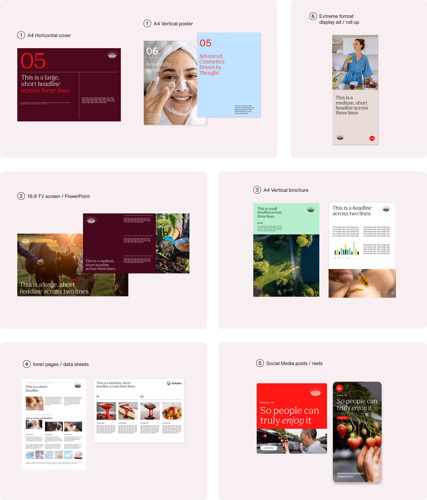
We use three layout compositions across all formats: full-bleed, vertical division, and horizontal division. Each layout uses one composition; the split ratio can be adjusted to 1:3, 1:2, or 3:1, depending on the communication need.
Full-bleed layouts are used when the content is image-led and requires strong visual impact. They work for both visual compositions and solid color backgrounds.

Divided layouts create a clear balance between image and text. The default orientation is a vertical division in landscape formats and a horizontal division in portrait formats, with flexibility to adapt across different formats.
More image area increases visual emphasis, while more text area enhances clarity and structure.
Refer to the Best practices page for further content examples.
Base unit principle
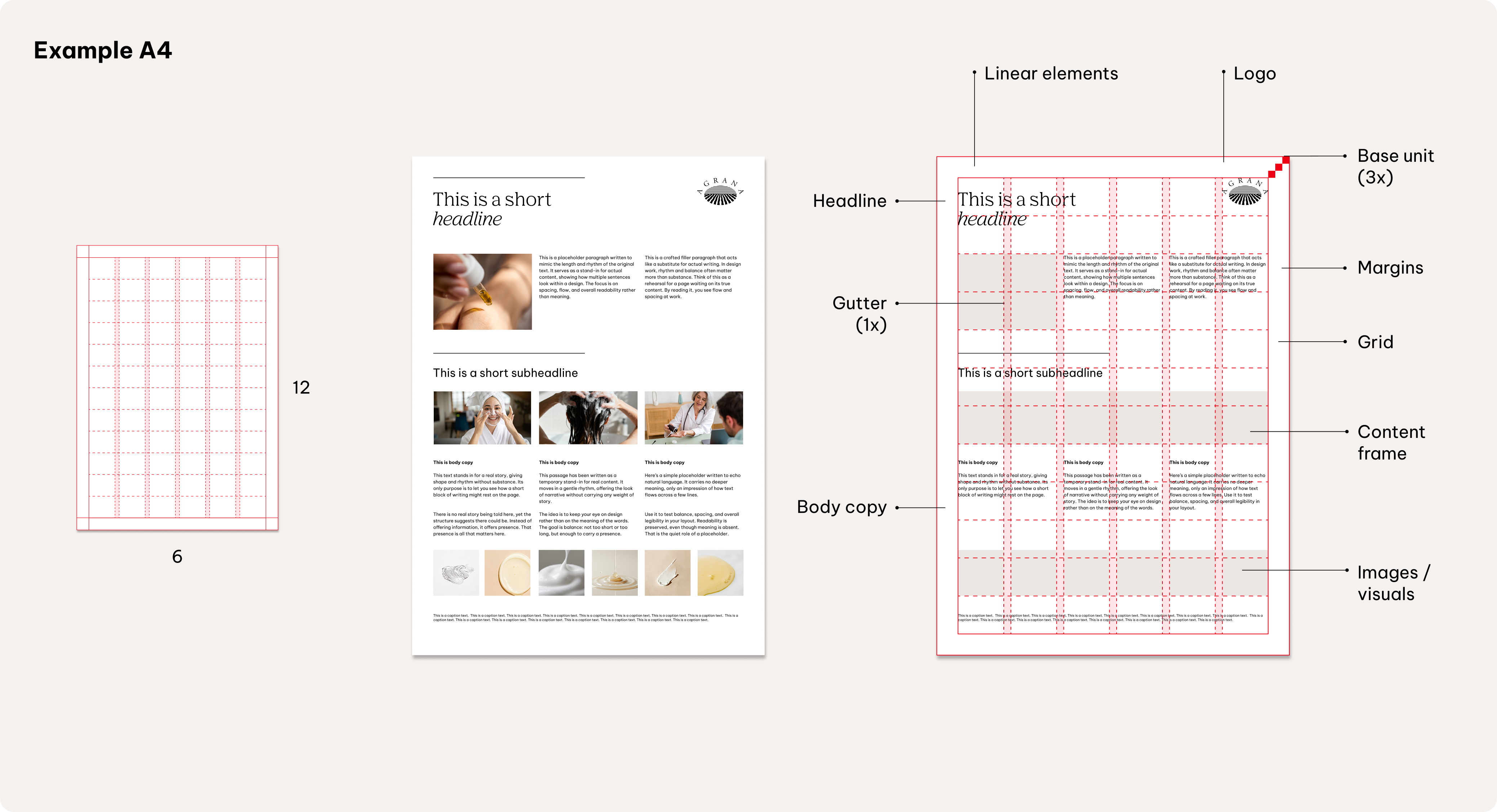
The base unit, represented as 'x', is the smallest building block of our layout system. It defines key measurements such as margins, logo sizes, and spacing—ensuring that every format and application follows a consistent underlying logic, regardless of scale or context.
This unit is calculated based on 2% of the shorter side of the format and can be scaled up, depending on the respective usage.

Base unit scaling
Use multiples of the base unit for all measurements. Keep these multipliers consistent across formats—only the base value (x) scales with size. Avoid using measurements that aren’t whole multiples of x.

Margins
x3 Base Units
Calculation example DIN A4
x = shorter side of format x 0.02
x = 210 mm x 0.02
x = 4.2 mm

The shorter side of the format is 210 mm. Two percent of 210 mm is 4.2 mm. The base unit for DIN A4 formats is 4.2 mm, regardless of the format orientation.
Margins
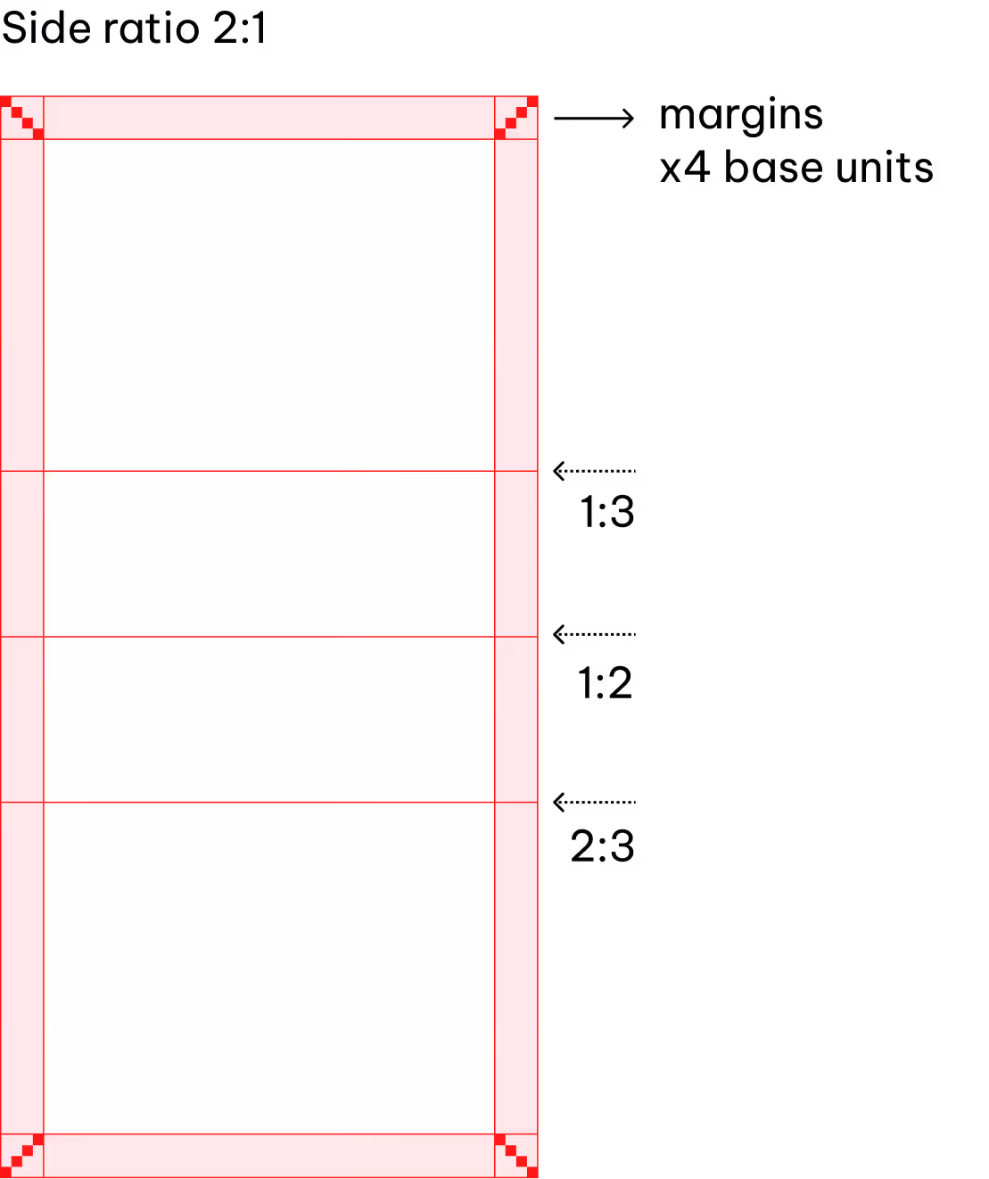
Each format uses defined margins and a column-and-row structure, forming a grid system that ensures visual harmony across all content types.
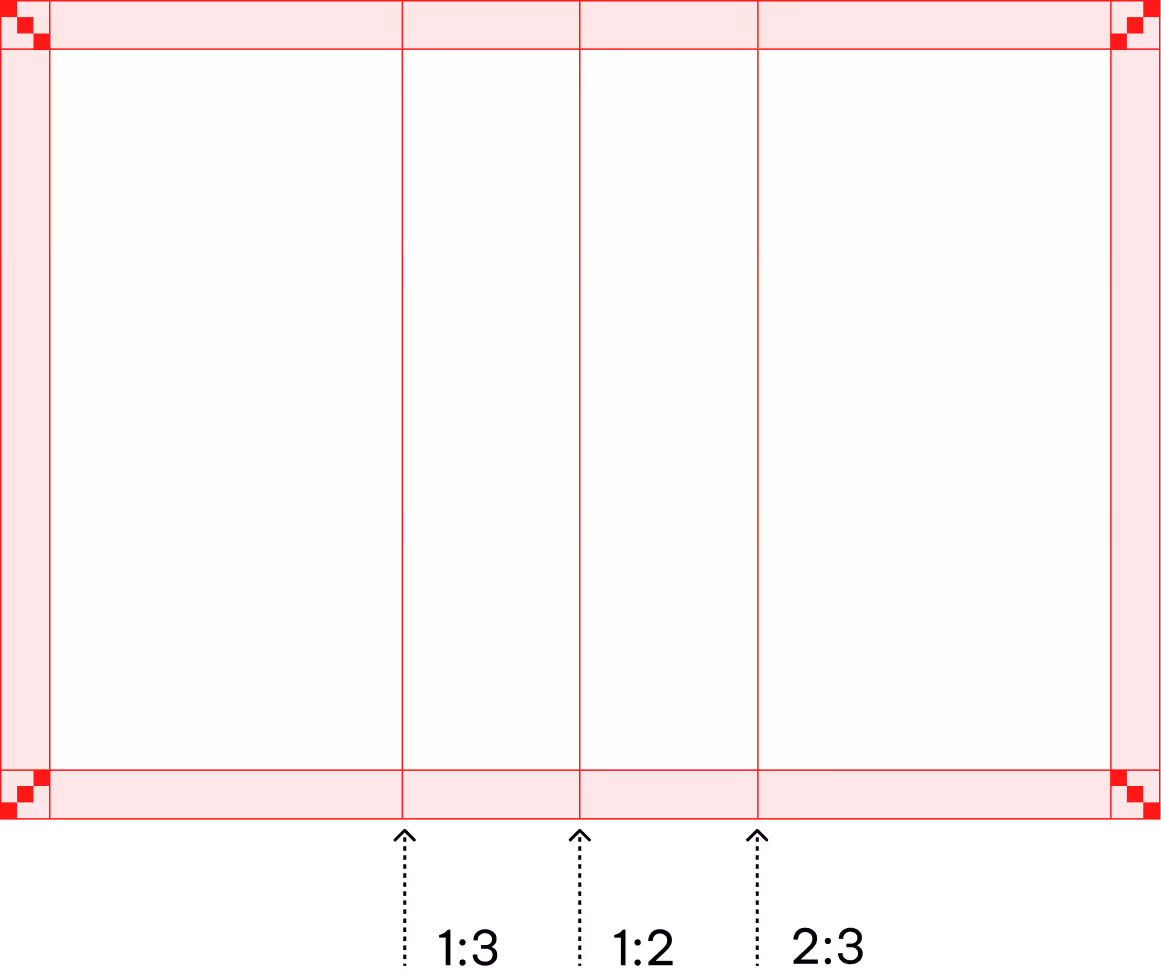
Standard formats
For standard formats are based on the base unit (x), scaled by 3 for optimal spacing.
The number of base units for the margin can be increased for special extreme formats.
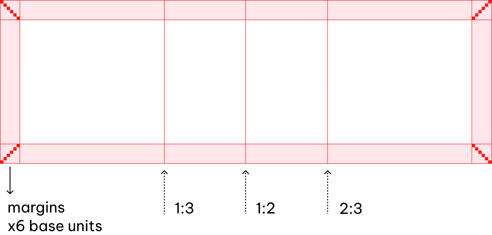
Special and extreme formats
Extreme ratios can make content appear stretched, crowded, or unbalanced.
To maintain visual harmony and clarity, increase the margins. The following applies to formats such as 2:1 or 3:1: Four base units of margin are used in the 2:1 format, and six base units in the 3:1 format.
Grid system
Each format uses a clear column-and-row structure, forming a grid that ensures visual harmony and consistency across all content types. Our grid system is responsive and adapts to a variety of formats and applications
Elements
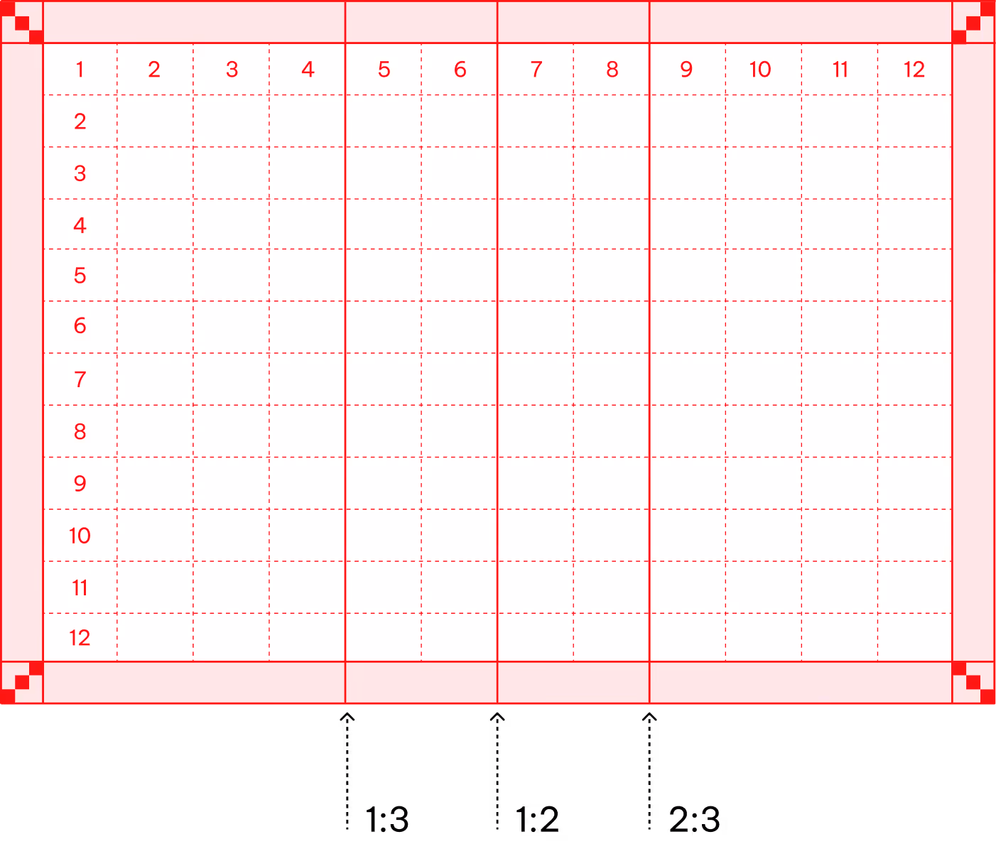
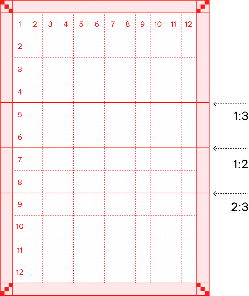
Rows and columns
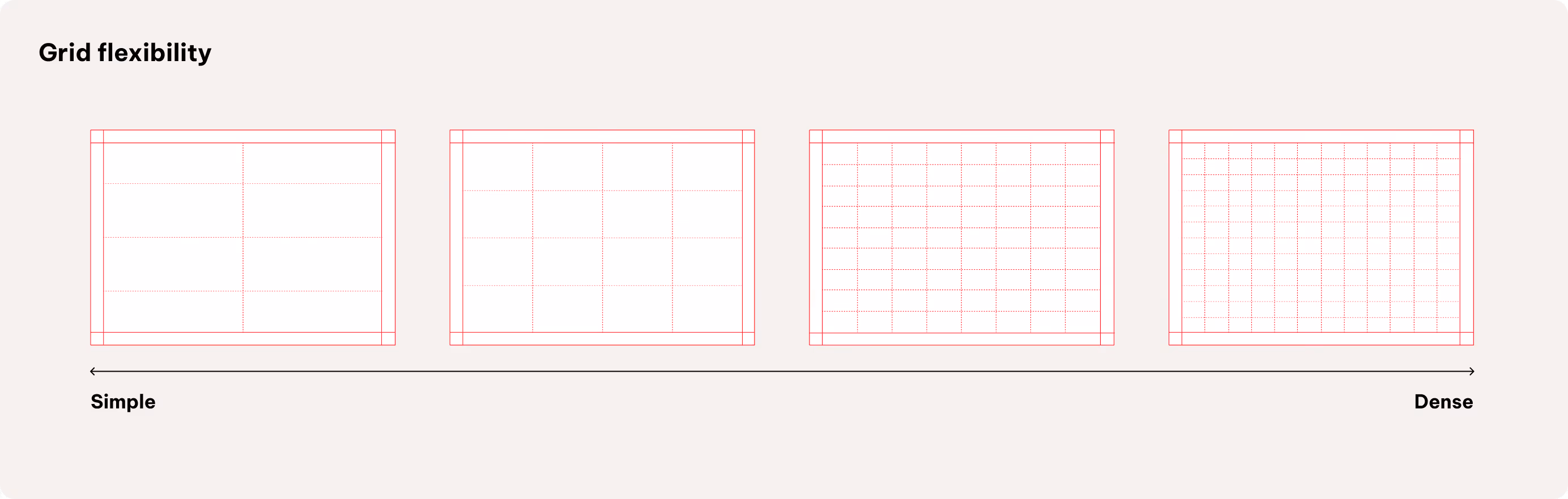
We use a flexible grid based on multiples of 4—typically 4, 8, or 12 columns or rows, and more if needed. The 12-column grid allows a wide range of layout splits and supports both image-driven and content-heavy formats.
Choose fewer columns and rows for impact-driven layouts, such as posters, and more for detailed, informational formats. All combinations are allowed as long as they follow the multiples of 4 principle, ensuring clarity and alignment throughout.
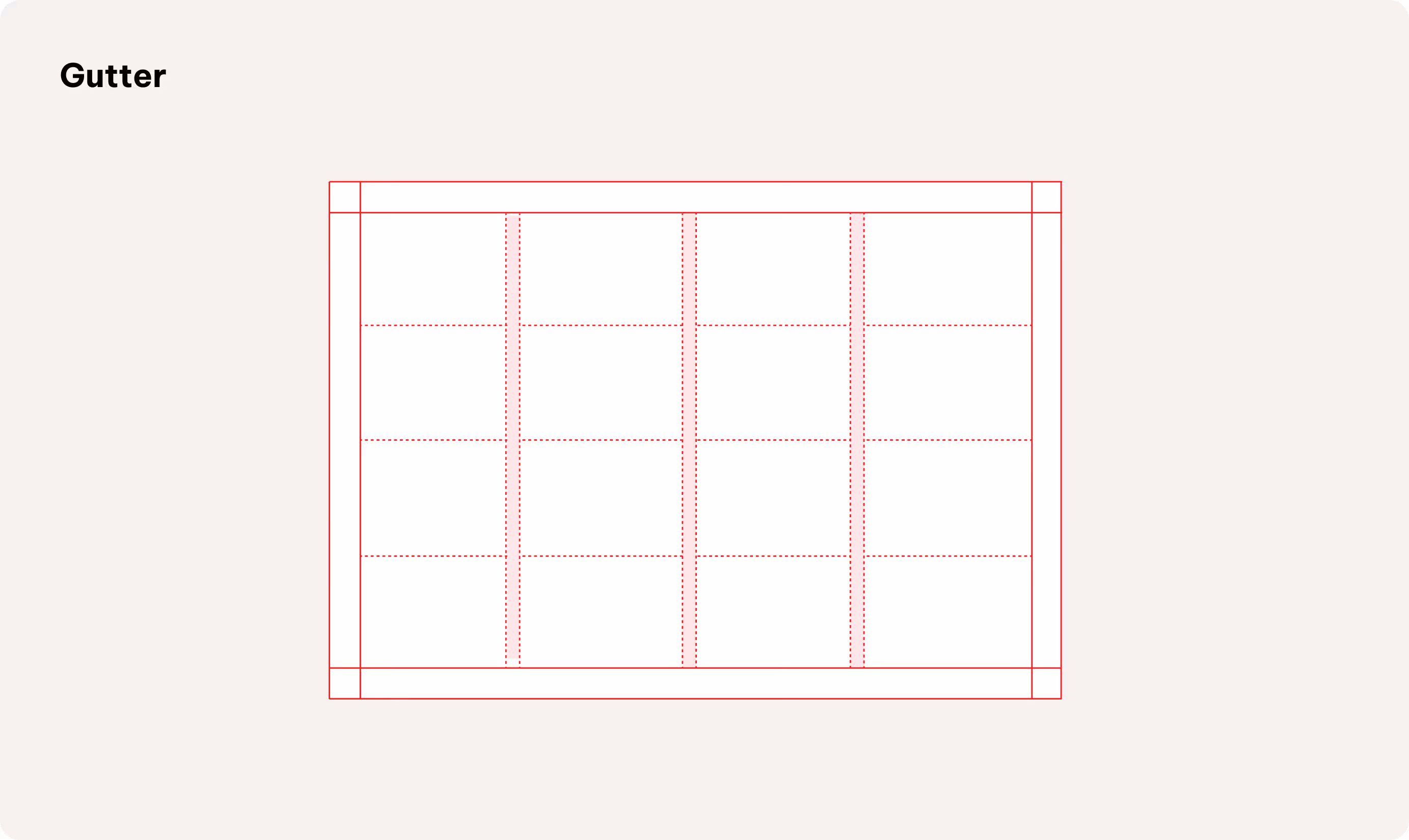
Gutter
We use a defined gutter (1x base unit) to structure complex layouts and editorial formats
How to use
Our flexible grid system ensures visual harmony when placing elements across all content types.
Further placement details will be defined in specific touchpoint guidelines (e.g., editorial).
Using the grid (complex)
Our grid system incorporates a gutter to structure complex layouts and editorial formats.
Setting the gutter at one base unit (1x) ensures clear separation between elements and supports visual clarity throughout.
Further placement details will be defined in specific touchpoint guidelines (e.g., editorial).
Logo size and positioning
Set the logo height within a flexible range of 2 to 3 base units, allowing adaptability for different applications while ensuring visual consistency.
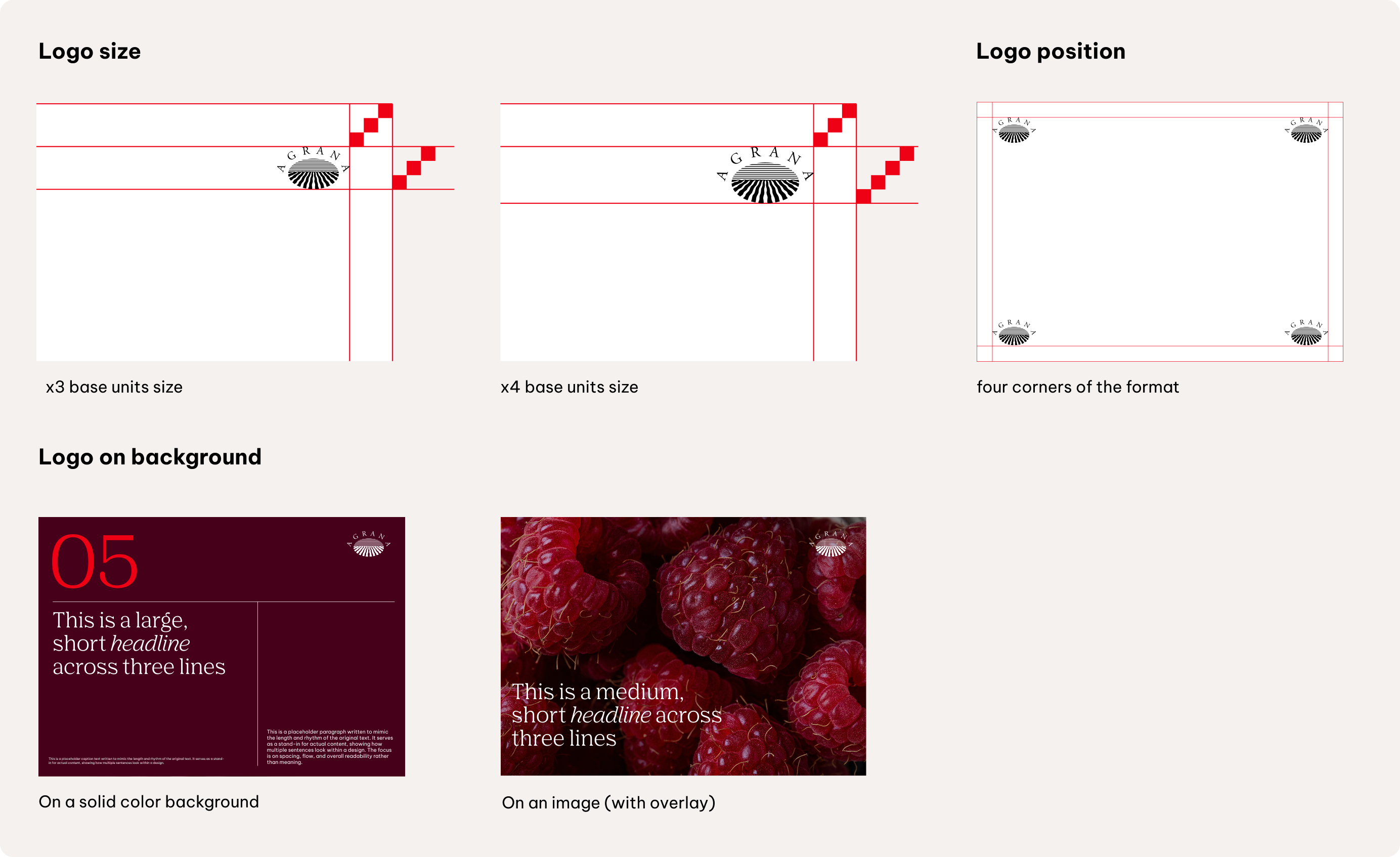
Position the logo in any of the four corners of the layout, preferably on a solid colour background to maximise recognizability.
Flexibility of logo placement is allowed within one format, but placement should always ensure clarity and brand recognition.
Transparent overlays
Overlays can be used when placing logos, text, or other graphical elements over images, to provide contrast and improving legibility.
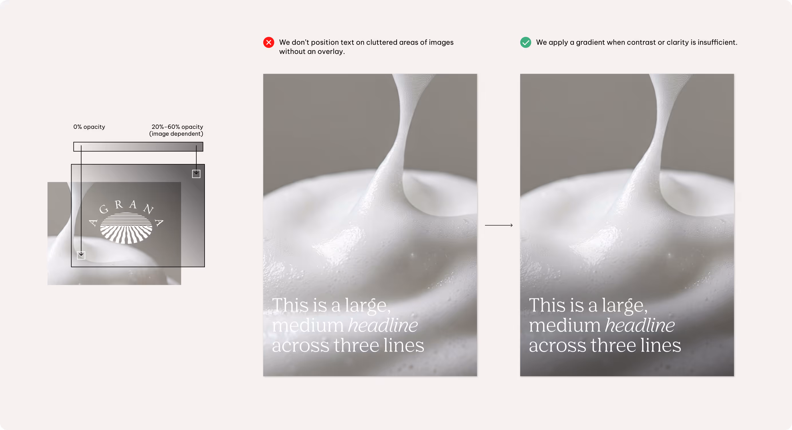
Typically, use a black overlay with reduced opacity on light images, or a white overlay with low opacity on dark images. Adjust the transparency as needed to ensure all content
Linear elements
Use linear elements as supporting tools within the layout system to anchor and structure content, creating a clean and balanced composition. Include lines only when they reinforce hierarchy, anchor elements, or enhance layout balance—there is no requirement to use them in every layout.
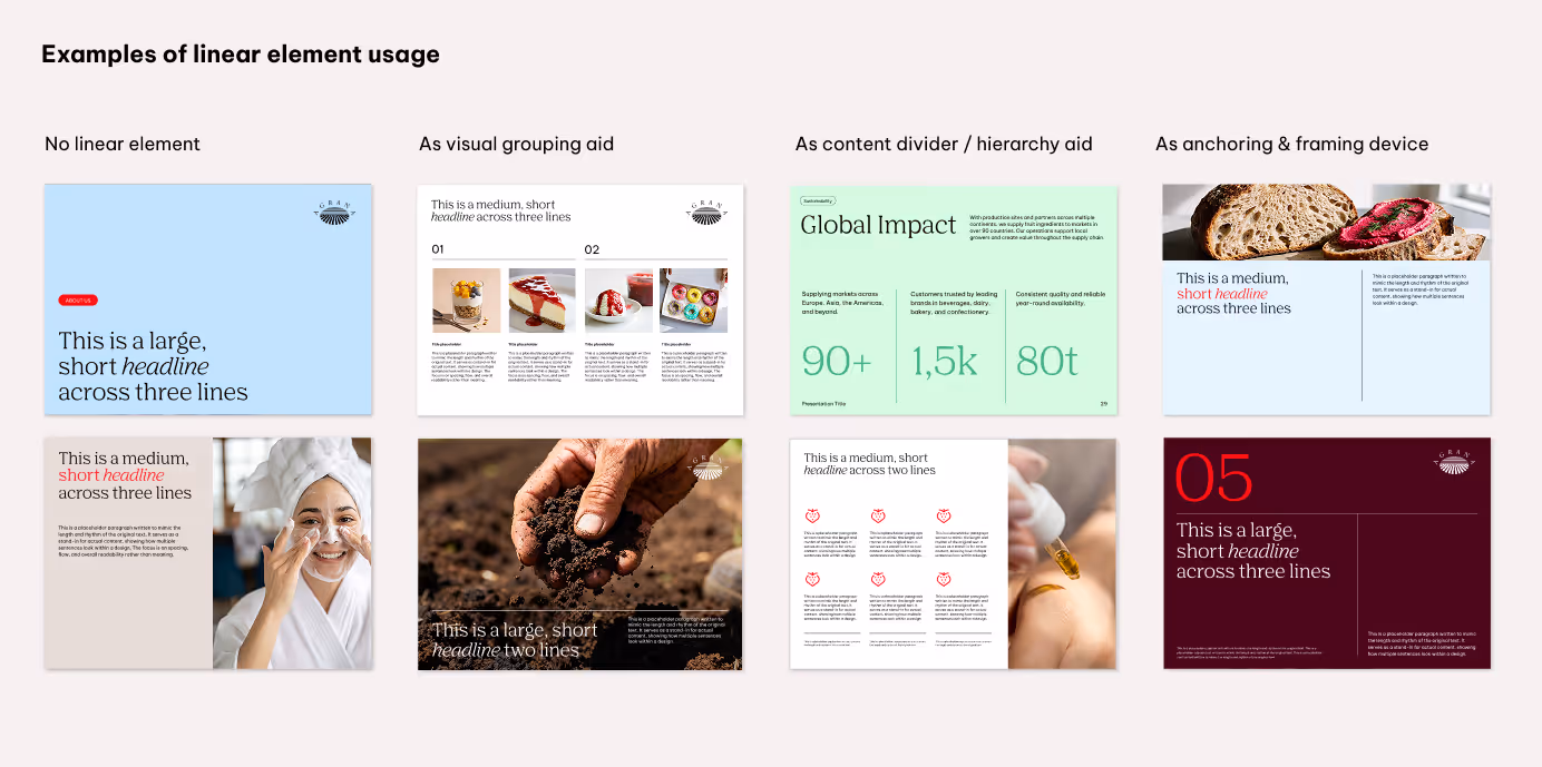
Lines must always use straight caps and joins, and be set to a thickness of approximately 1pt for full HD resolution (1920x1080px). Adjust the line thickness appropriately for different resolutions, sizes, and the specific needs of each touchpoint.
Best practices
Don'ts
We keep our logo consistent across all touchpoints. That means we don’t alter, separate, or apply effects that compromise its clarity. To make this clear, the next examples highlight some of the most common mistakes and how to avoid them.
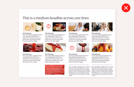
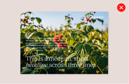
We avoid overload the composition
Keep layouts balanced with a clear visual hierarchy and with enough white space to let the content stand out.
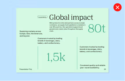
We don’t randomly arrange elements
Maintain clear alignment and adhere to the established grid system for a coherent and organized layout.
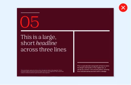
We avoid angled splits
Use only straight horizontal and vertical ratio divisions for format compositions.
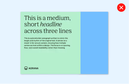
We don’t create format divisions with two background colors or two images
Combine solid color background with images for visual balance.
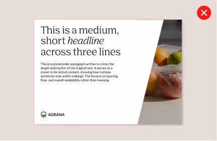
We don’t position key content on cluttered areas of images
Choose clear image locations, support the composition with a color background, or use a gradient overlay to improve contrast.
We don’t overuse or restyle linear elements
Use linear elements purposefully and always follow the established guidelines.