Logo
Introduction
Composition: Our AGRANA logo always consists of two elements: the word mark and the symbol.
We treat these as inseparable parts of our identity and always use them together as one combined logo. This ensures our brand remains clear, distinctive, and instantly recognizable.
By uniting our word mark with our symbol, we create a strong and consistent brand expression. Together they reflect our roots in agriculture while representing the clarity and trust we stand for.
Clear space
We define clear space around our logo to keep it distinct and legible within any layout. The minimum clear space equals 2 base units, calculated as 2% of the shorter side of the format. This breathing room ensures our logo never competes with other elements and always maintains its impact.
Placement
Our logo can be placed in any corner of the format. We prefer placing it on a solid color background to maximize clarity and recognizability.
In special cases, the logo may be positioned more freely. You can find detailed guidance on this in the “Special cases” chapter of these guidelines.
Size
Standard size
The standard height of our logo equals 4 base units, ensuring balance and consistency across layouts. For touchpoints where the logo needs more presence, such as large-scale formats or high-traffic environments, we may extend it to 5 base units. One base unit equals 2% of the shorter side of the format.
Minimum size
We define a minimum size to keep our logo clear and legible in all physical and digital applications.
Special formats
In special or extreme formats, our logo may be scaled more freely – up to 8 base units – always respecting clear space and legibility. These exceptions are rare and only used when the format truly demands it.


Color
Our AGRANA logo comes in three versions – black, white, and multicolored – so that we can always ensure clarity and recognition across different backgrounds. We carefully choose the right version to maintain contrast and legibility in every situation.
Multicolored logo
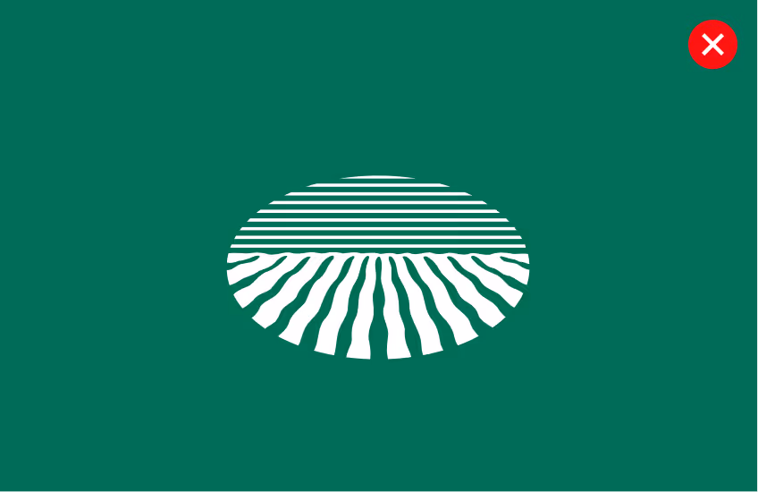
The multicolored AGRANA logo represents our full brand expression and is the preferred version wherever color reproduction allows.
Secondary Colours
AGRANA Black
HEX
#000000
RGB
0/0/0
RAL
XXX
PMS-C
Black C
PMS-U
Black U
CMYK-C
0/0/0/100
CMYK-U
0/0/0/100
AGRANA Dark blue
HEX
#3087CD
RGB
48/135/205
RAL
XXX
PMS-C
284 C
PMS-U
2194 U
CMYK-C
85/35/0/0
CMYK-U
90/20/0/0
AGRANA Red
HEX
#EE0014
RGB
238/0/20
RAL
XXX
PMS-C
2035 C
PMS-U
2035 U
CMYK-C
0/100/100/0
CMYK-U
0/100/100/0

WCAG 2
APCA
On brand colors
On light brand colors and white, the multicolor logo is our major option, while the black logo is reserved for restricted media or where color printing is limited.
White only
Black only
Multicolored only & Black
Multicolored only & Black
Multicolored only & Black
White only
White only
Black only
Multicolored only & Black
Multicolored only & Black
White only
Black only
WCAG 2
APCA
On Secondary Colors
We apply the black logo on mid tones and tints and the white logo on shades.
Shades
White only
White only
White only
White only
White only
White only
Mid-tones
Black only
Black only
Black only
Black only
Black only
Black only
Tints
Black only
Black only
Black only
Black only
Black only
Black only
WCAG 2
APCA
Consistency
We never alter our logo colors or introduce new versions. To ensure consistency, always use the official logo files as provided and shown in these guidelines, and avoid any recoloring or modifications.
Special cases
Depending on the context and touchpoint, our logo can be scaled up more freely to achieve greater impact. Even in these cases, we always respect the defined clear space and ensure that legibility and recognition remain intact.
Best practises
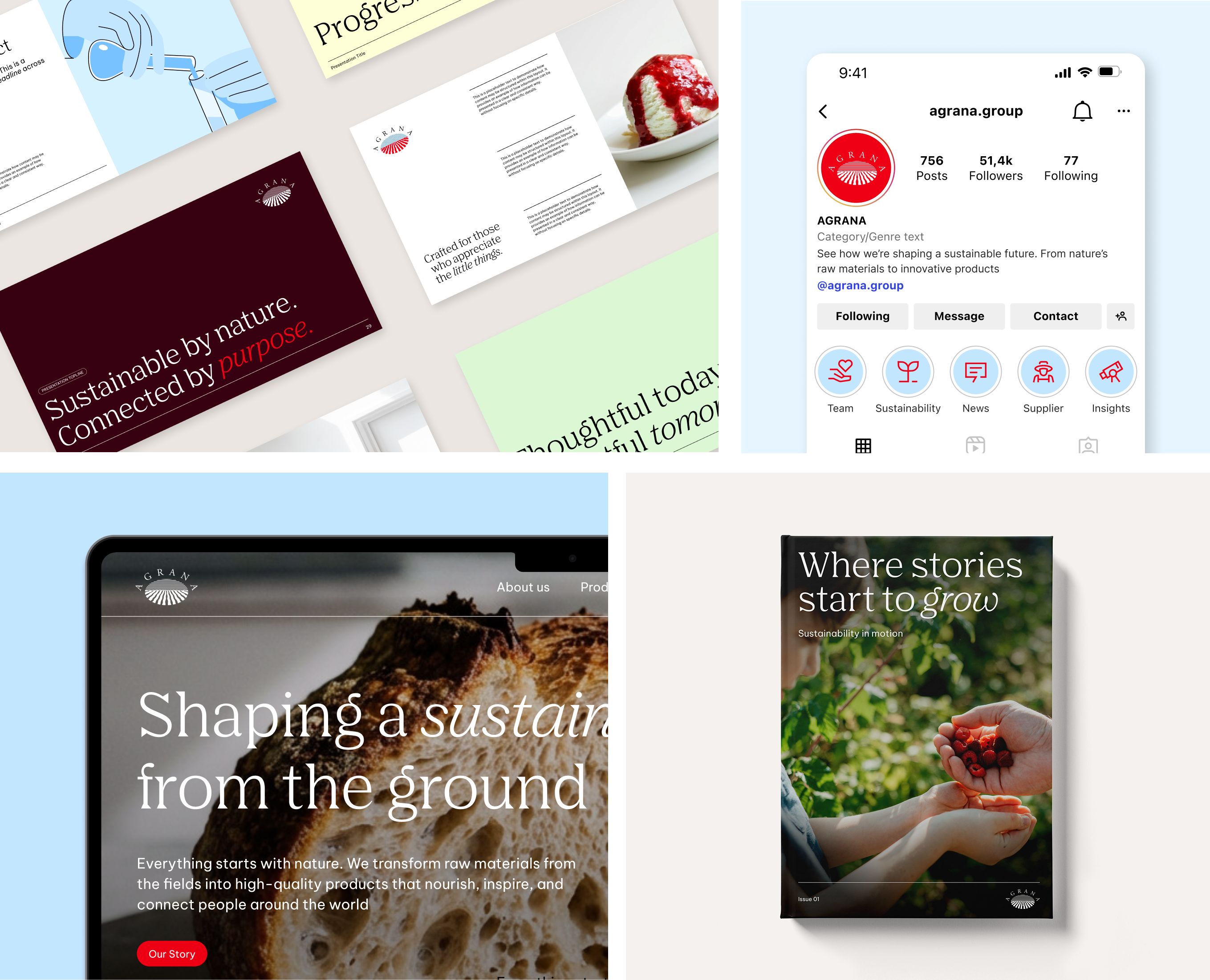
This section highlights best practices, offering guidance on how to apply the brand correctly and consistently across different use cases and touchpoints.
Don'ts
We keep our logo consistent across all touchpoints. That means we don’t alter, separate, or apply effects that compromise its clarity. To make this clear, the next examples highlight some of the most common mistakes and how to avoid them.
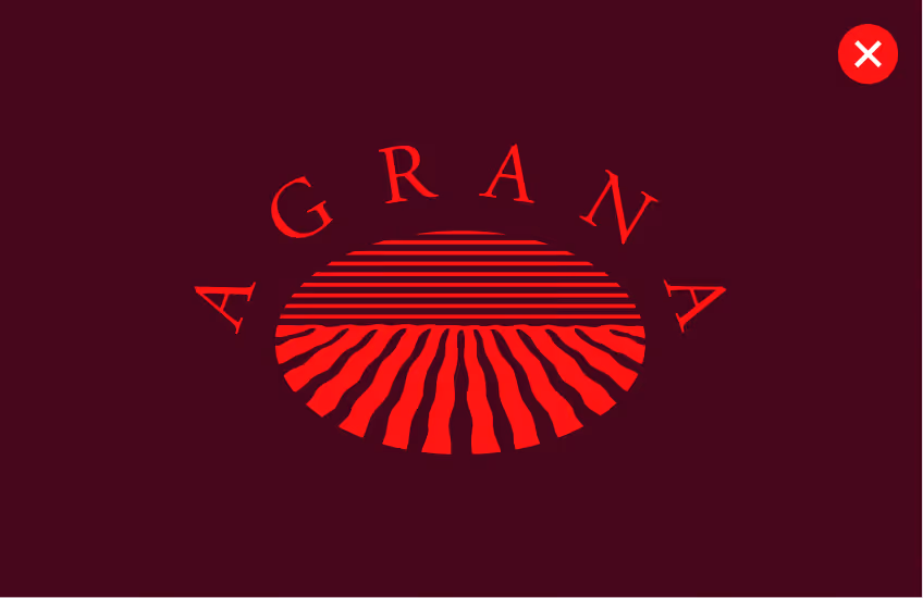
We don’t use the AGRANA red logo
Our logo should only appear in the black, white, or the multicolored version defined in these guidelines.
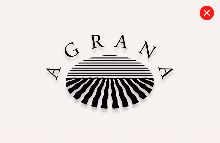
We don’t apply shadows
Our logo is always used in its original, flat version – never with drop shadows or effects.
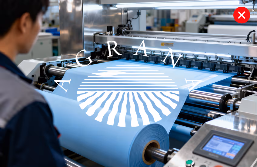
We don’t place the logo illegibly
Our logo must always be clearly visible with sufficient contrast.
We don’t distort the logo
Our logo must never be stretched, squeezed, rotated, or altered in any way.
We don’t recolor the logo
We never apply random or multiple colors to the logo. Only the approved multicolored version defined in these guidelines may be used.
We don’t separate the logo
The word mark and symbol are always used together, never on their own.
Third-Party Logo Usage in External Newsletters
The guidelines below are intended solely for the use of third-party logos in external newsletters and do not constitute general logo partnership or co-branding guidance.
The layout shown is a newsletter-specific example. The color palette and circular background element are not limited to this layout.
Downloads
There’s a specific logo tailored for each format. Please ensure you work within the appropriate colour space, whether it’s for screen or print.
Logo for Screens (RGB)
Symbol optimized for digital platforms, including websites, social media, and presentations.
Logo for Print (CMYK & Pantone)
Symbol optimized for high-resolution print materials, such as brochures and banners.
Downloads
There’s a specific logo tailored for each format. Please ensure you work within the appropriate color space, whether it’s for screen or print.