Motion
Motion principles
Our motion principles are rooted in our brand ambition. They shape how we express the brand in motion in a way that is both innovative and responsible, crafted with expertise and care.
Steady progression
Motion should feel grounded in stability while steadily moving forward. It reflects growth, renewal, and the idea of building on strong foundations.
In practice
Use an upward or left-to-right movement, or a gentle scale-up to signal progress and development. Combine different motion directions or techniques to suggest variety and the richness of a living system.
Let elements enter, settle briefly, and exit with clarity—creating animations that feel intentional, light-touch, and easy to loop.
Natural flow
Motion should have a smooth, fluid rhythm that feels continuous and easy to follow. This creates a sense of harmony and helps clarify complex information.
In practice
Apply soft, well-paced easing to give transitions a graceful, natural quality.
Ensure animations feel seamless, with no abrupt starts or stops.
Use offset timing so one element leads into the next, creating a sense of connected flow.
Add subtle drifting or slow secondary movement to keep compositions feeling alive.
Human warmth
Movement should feel relatable and genuine, guided by the natural imperfections and softness you’d expect from human gestures or real world behavior.
In practice
Include small moments of stillness or simplicity to avoid an overly polished or synthetic feel.
Avoid stiff, mechanical, or overly technical animation styles.
Use gentle blur, opacity shifts, and depth cues to add warmth and softness to transitions.
Follow a clear, intuitive visual hierarchy when bringing elements into view, echoing how people naturally perceive and process information.
Brand video elements
Logo animation
Our logo is simple, yet carefully crafted. The animated version evokes a sun rising beyond the horizon with a subtle parallax effect to add depth and movement. The logo should always be consistent when in motion and must be used exactly as provided, never recreated.
These logo intros and outros are designed to frame video content. The intro introduces the brand immediately, helping ensure visibility in contexts where viewers may scroll away quickly. The outro includes a website link and serves as a clear call to action. Both the video intro and outro are master assets and should always be used as provided. To prevent redundancy, only use both in the same video if the content runs longer than three minutes.
Intro
Outro
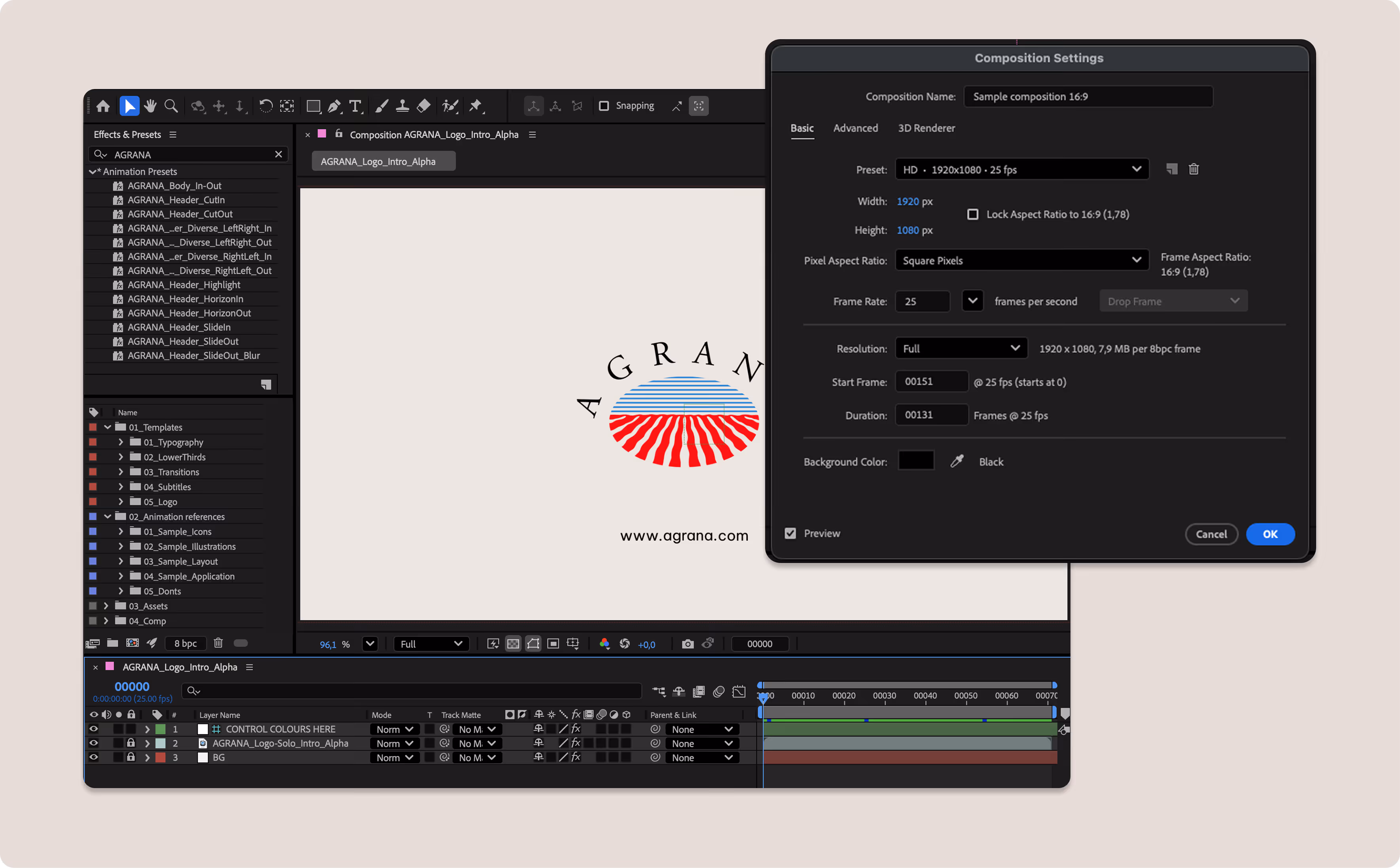
Please see the Logo section for detailed guidance on our logo, including all specifications and downloadable assets.
Typographic elements
Headlines
Our motion system uses two key headline animation styles designed to accommodate left- and center-aligned type. Be sure to alternate between these styles throughout content to avoid repetition. Template files demonstrating how each build works are available for downloading.
Horizon
The horizon option shows type animating out from a horizon line, representing the ground where produce grows. We recommend using this in 60% of applications.
Diverse
The diverse option uses multiple movement directions that converge to create a sense of unity and growth. We recommend using this in 40% of applications.
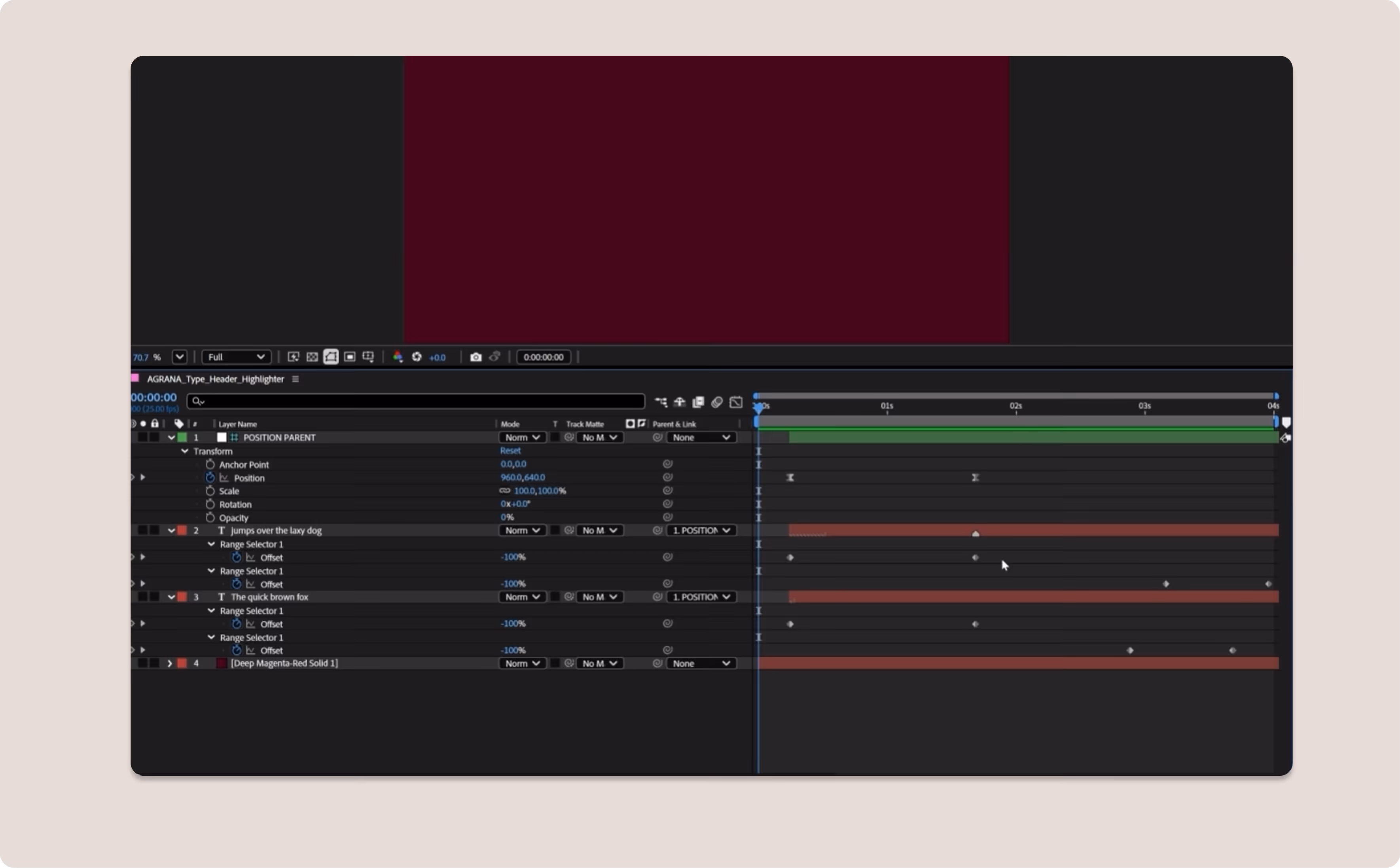
Animated highlight
It’s possible to highlight key text elements using two different animation styles. The highlighter option feels hand-drawn and organic, as if someone is physically marking the word. The call out option attracts more attention. In this case, the highlight appears as an animated replacement of the non-highlighted version.
Highlighter
Please use the highlighter approach more frequently, especially for longer headlines. The motion is more practical.We recommend using this in 90% of applications.
Call out
Use the call out approach in instances where more energy is required and you specifically aim to attract attention.We recommend using this in 10% of applications.
Subheader + body
We use one simple animation style for longer text blocks or lower-hierarchy content. Elements enter the frame with a soft fade and upward push, staggered and slightly offset. It’s possible to highlight subheader copy with the highlighter style for additional emphasis.
These type assets are templated in the toolkit working file. Use highlights to match the design if necessary, otherwise sparingly.
Please see the Typography section for detailed guidance on typography, including all specifications and downloadable assets.
Lower thirds
Our motion brand has two options for lower thirds: transparent and block. We use these simple graphics to introduce people with their name and title.
Lower thirds are included in the After Effects template. It’s easy to update the copy without changing the motion and adjust the hold time accordingly so viewers can read everything easily. Once updated, you can export the assets with alpha for use in other project files.
Transparent (default)
Block
Use the default style when the background footage supports clear, readable type.
Use when footage is busy or detailed and requires added contrast for legibility.
Subtitles
Our motion brand includes two bespoke subtitle styles for videos that require custom treatments. Not every application requires bespoke subtitles. When required, however, the motion toolkit contains editable files for both styles. Because each subtitle line uses a hard cut transition, no additional animation is needed.
Traditional
Block
The “traditional” approach uses white text with a subtle black background to ensure visibility on any background.
Use the “block” approach when captioning is more important. This helps draw attention to the content.
Transitions
Our motion system features two primary transition styles: a soft scale with a hard match cut and a directional swipe. Swipes can move from either bottom to top or left to right depending on the composition. Please alternate the transitions to ensure variety across videos. Since these transitions apply effects such as blur to the footage, be sure to implement them as demonstrated in the provided After Effects file. For more information on animation effects, see the section on “Animation dynamics” below.
Footage scale
Footage swipe
Color scale
Color swipe
*Note: Blurring on in + out only applies when a color wipes in between. Don’t use blurring for footage-to-footage transitions.
Icons
Our simple icon system has three core behaviors: in/out, ambient hold, and expressive burst.We’ve provided a basic set in working files and as masters on alpha that you can separate out for individual use. You can then simply copy the animation style onto the corresponding icon suite.
In/out
Used whenever an icon needs to enter or leave the frame with a gentle float and fade.
Ambient hold
Applies when an icon is already on screen. Subtle, minimal motion makes it feel alive without pulling focus.
Expressive
Used when we need extra energy or want to draw attention to a specific icon, delivering a single, punchy movement that resolves back to stillness.
Please see the Icons section for detailed guidance on our iconography, including all specifications and downloadable assets.
Illustration
Our motion illustration style is designed to function as ambient loops. Subtle, cinemagraph-like movements animate one or two key elements while the rest remain still. The motion should always feel continuous, natural, and quietly alive.Three example styles are available as master assets in the toolkit. Please use these as a gold standard reference to guide the level of animation for use in other illustrations.
Please see the Illustrations section for detailed guidance on our illustration style, including all specifications and downloadable assets.
Layout
We show how the animation system works across two different formats below. You can see how the easing functions and the way different treatments work together harmoniously.
Create a directional flow that alternates by varying the motion from left to right and bottom to top. Keep the timing and pacing consistent, and ensure a constant movement through drift. Use different types of headline behaviors as well as blurring when imagery transitions in and out of frame. For details on animation dynamics and effects, please see the following “Animation dynamics” section.
Vertical
Horizontal
Animation system
The following section outlines the foundational mechanics of our motion system. These tips should help you ensure consistency in all animations, whatever software platform or tools you decide to use.
Easing: Basics
Our animation style of easing balances softness with energy. We create a continuous sense of flow and movement with overlapping motion and drifting elements.
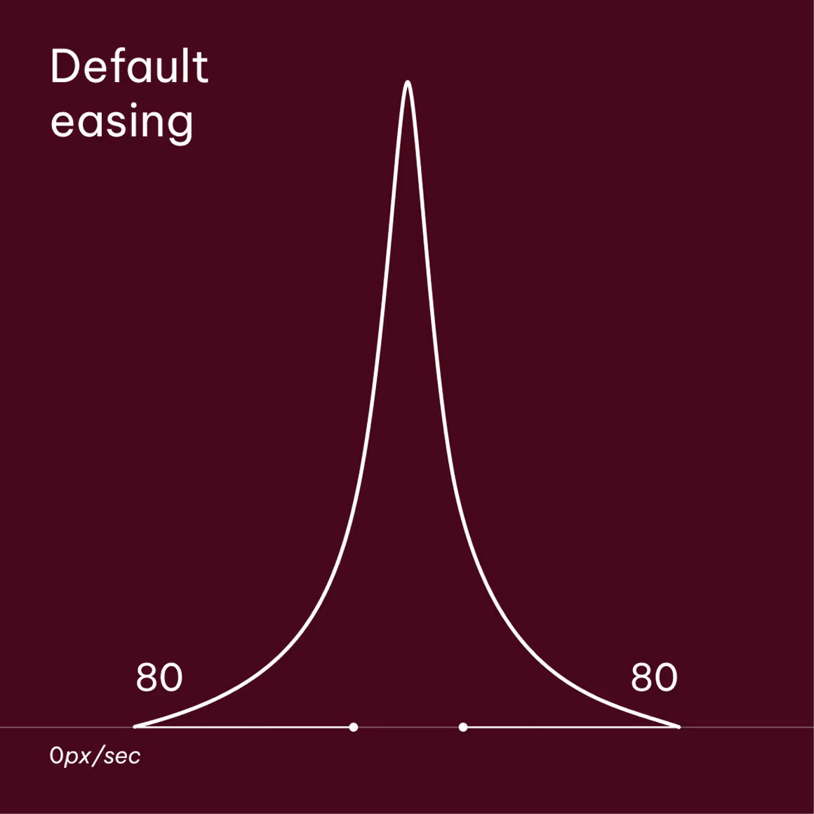
Default
The default easing is set to 80% for both ease-in and ease-out influences.
It’s possible to apply reduced influences of 40% or even 20% for gentler movements, depending on the desired level of subtlety.
Be sure that the motion doesn’t feel too robotic or linear when reducing the easing.
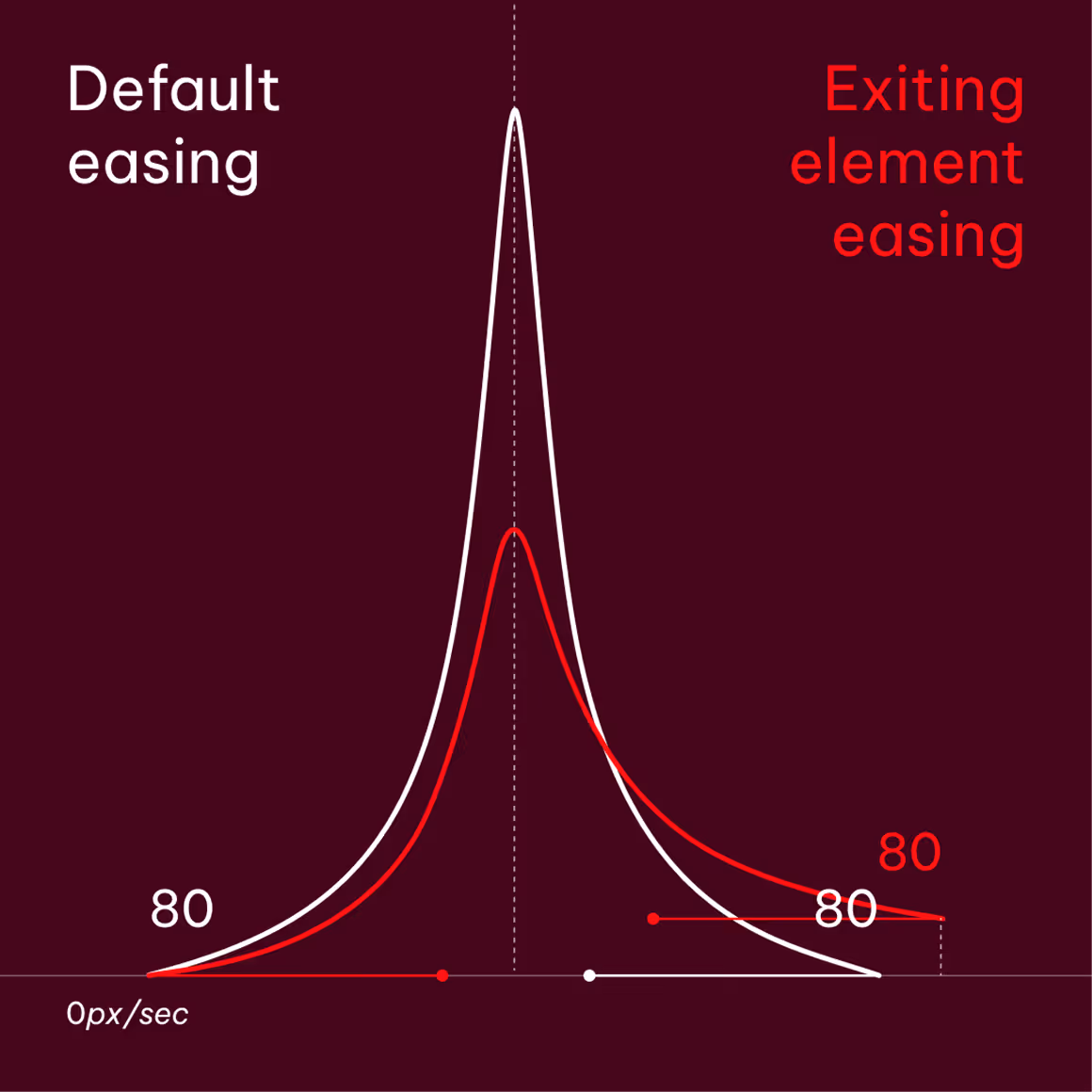
Offsetting
When syncing two offset movements to create flow as an element exits the frame, let the exiting element’s final keyframe occur slightly later and at a faster speed as shown here.
Align the curve peaks and maintain an 80% influence for consistency.

Match cuts
When match cutting between two elements, the 80% easing rule is shared between each element.
Set the influence on either side of the cut point to 0% to create a matching peak as shown here.
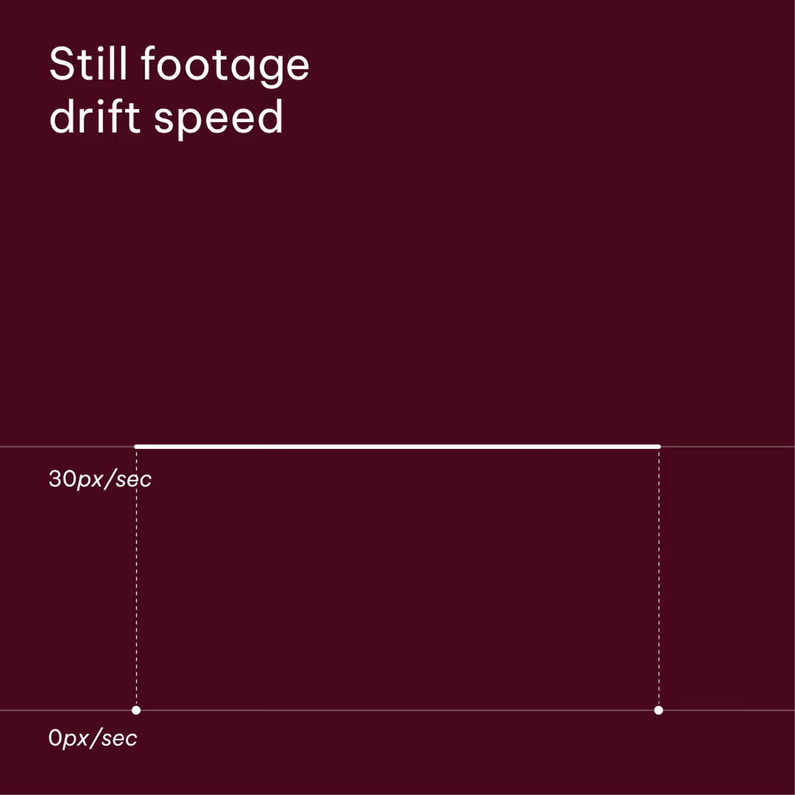
Drift
Use a subtle drift when working with still imagery. To achieve the correct look, set two position keyframes and adjust one until the speed graph hits 30px/sec.
Ensure that the drift is from left to right or bottom to top, following the flow of the sequence.
Easing: Effects
This effect’s value is used to maintain consistency across all footage. In this instance, we have two additional movements as part of our core brand identity: scaling and blurring. To ensure consistency, be sure to apply them using set values.
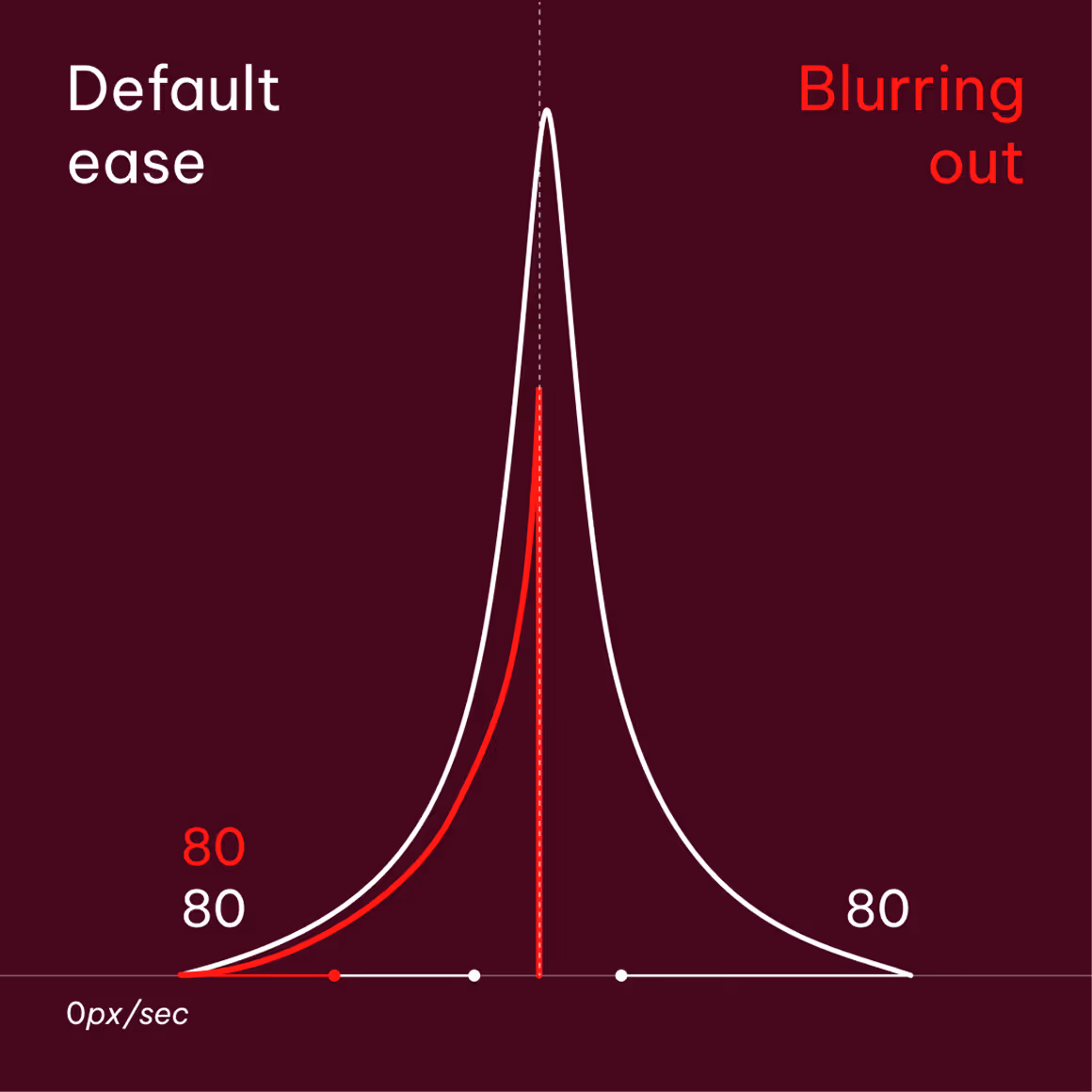
Blur
Only apply blur when footage is animating out.
Use a fast box blur with a blur radius from 0.0 → 50.0
Scaling
When scaling is required, the asset should only scale up to ±10% of its set size. Too large of a change will feel too fast when following the easing rules.
Application examples
Promotional video asset example
Here is an example showing how the headlines, highlights, color transitions, and static imagery animate as part of the motion branding system, following the brand assets above in 16:9 format.
Content displayed only to illustrate motion behavior
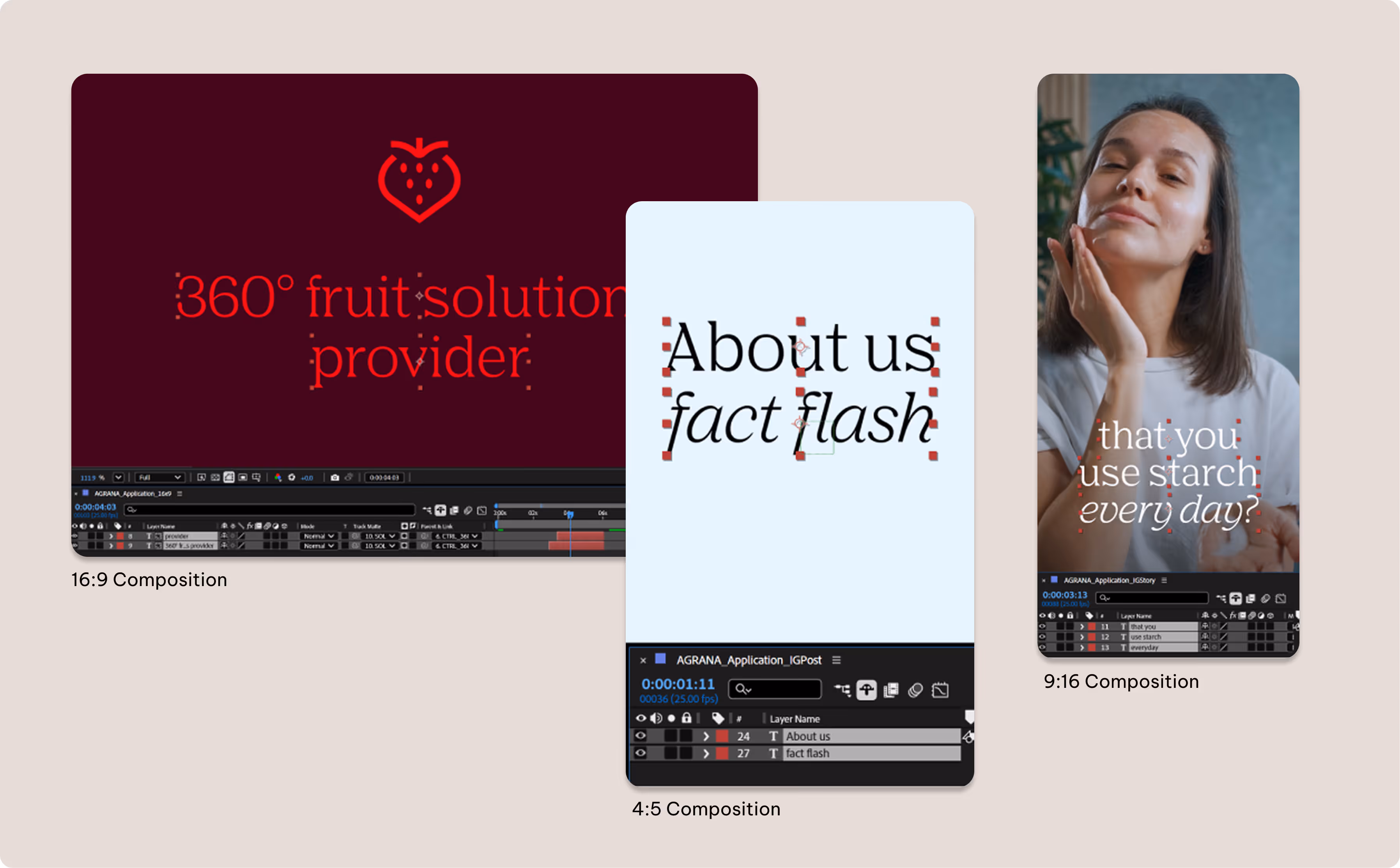
Social media assets example
Here are examples showing how headlines, video footage, transitions, and icons animate as part of the motion branding system, presented in social media dimensions (4:5 and 9:16).
Content displayed only to illustrate motion behavior
Content displayed only to illustrate motion behavior
Typography follows the same principles defined in the Brand Elements guidelines. In smaller formats, we pay particular attention to legibility and accessibility.
Sound for videos
Sound plays a key role in reinforcing the emotional and conceptual intent of video content. The selection of music, voice over, and sound design should align with the motion principles and overall brand tone, enhancing the rhythm, pacing, and clarity of the visuals. Audio elements should be balanced and purposeful, never overpowering the message or competing with visuals.
Any AI-generated voices used should feel natural and authentic. Be sure that the wording is grammatically correct and avoid any artificial or synthetic qualities to ensure a refined, human delivery.
Applying toolkit and presets
After Effects presets are designed for professional workflows. Follow the steps below to install and apply them correctly to your compositions. Once applied, it’s necessary to review them manually and adjust the preset controls accordingly to better match your specific project.
Step 1: Installing presets
Place AGRANA text presets folder to this directory: C:\Program Files\Adobe\Adobe After Effects <your version>\Support Files\Presets
Step 2: Prepare composition
Open the Motion Toolkit Master After Effects file to access the template library. It includes templates for typography, lower thirds, transitions, subtitles, and logo intros/outros.
Before applying any presets, ensure that your composition settings—such as resolution, frame rate, aspect ratio, and duration—are final, with the frame rate set to 25 fps (standard) to ensure preset compatibility. Changing these settings after applying the presets may affect the animation timing, spacing, or overall motion behavior.
Open the Motion Toolkit Master After Effects file to access the template library. It includes templates for typography, lower thirds, transitions, subtitles, and logo intros/outros. Before applying any presets, ensure that your composition settings—such as resolution, frame rate, aspect ratio, and duration—are final, with the frame rate set to 25 fps (standard) to ensure preset compatibility. Changing these settings after applying the presets may affect the animation timing, spacing, or overall motion behavior.
Step 3: Insert & mask* your text
Create your text using the AGRANA fonts and put each line of text on its own layer.Create a new mask to isolate each text line.* (Right-click → Mask → New Mask or press Ctrl + Shift + N)
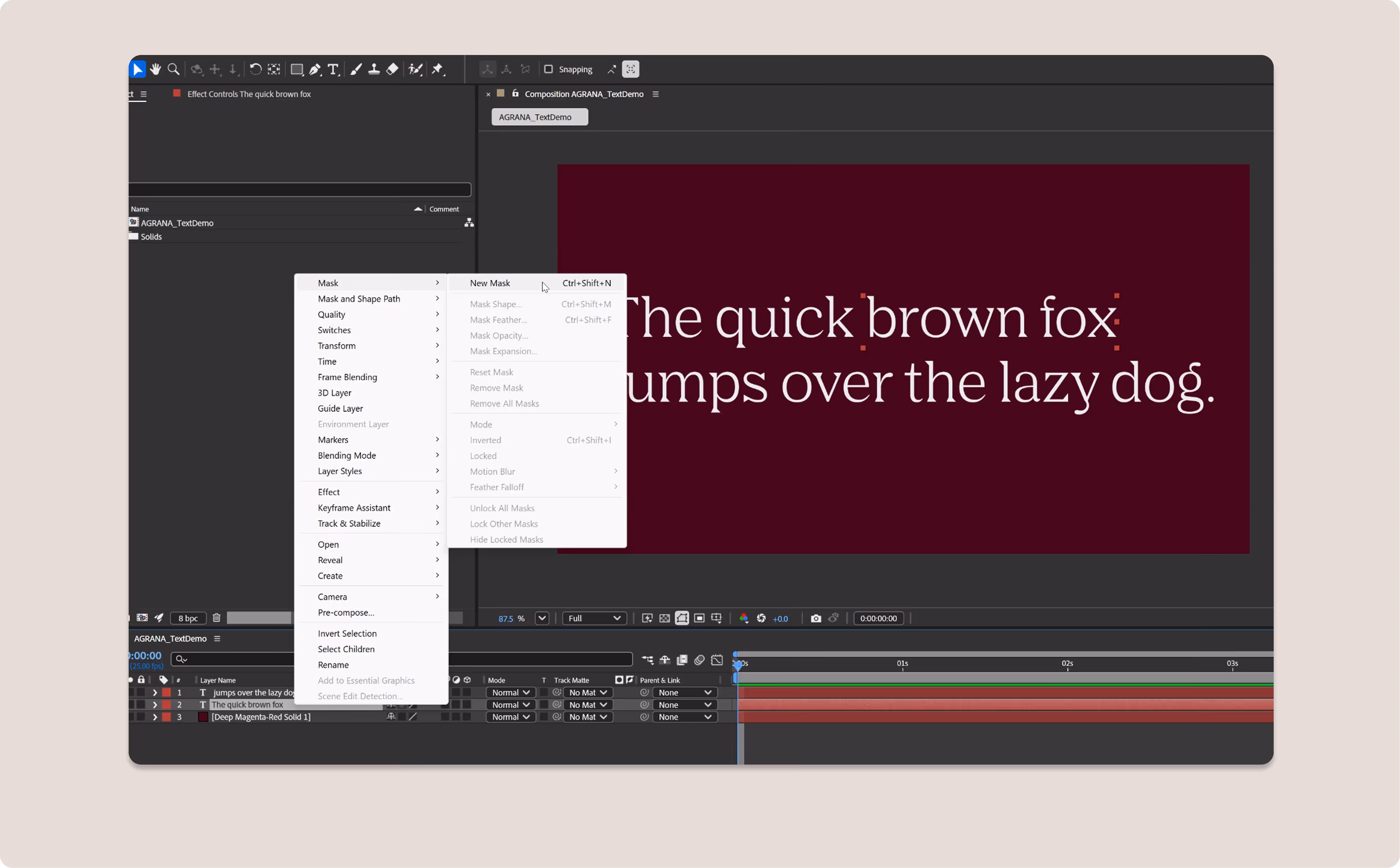
*If you’re working with body text or a subheader, you can skip this step and go straight to applying the effects to the text.
Text presets will work with any layout/format as long as the text lines are separated.
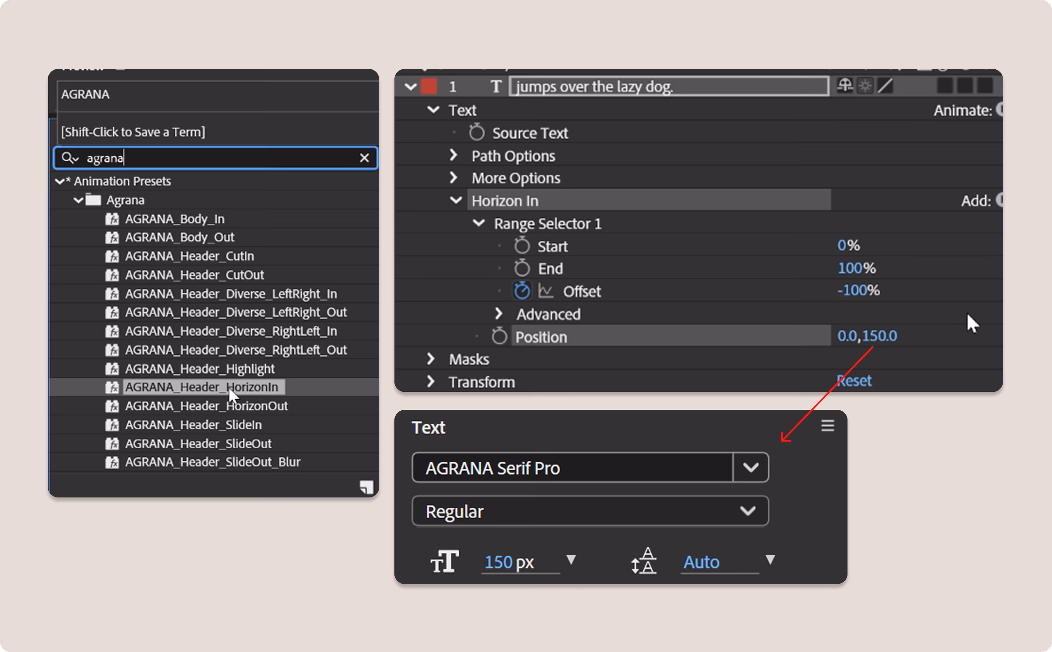
Step 4: Using the preset
Our installed presets should appear in the Effects & Presets panel. If the animation begins with the text partially cut off the screen, adjust the position value to match the text size.
Set the value equal to the text size for animating in. When animating out, use the "out" preset and set the value to the negative of the text size. Lastly, move the keyframes to adjust the timings as needed.
Step 5: Adjust and refine
Check to see whether or not the composition template contains a null layer as shown here. If so, parent the text layers to this null layer to add an extra layer of movement.
Lastly, fine-tune the animation by adjusting the keyframe timing, easing, and scale values to suit your composition, format, and layout requirements.
Our templates and presets are intended to serve as a starting point. Please feel free to customize these values and reuse them across compositions to maintain visual consistency.
Don'ts
When working with the AGRANA brand in motion, be sure to avoid the following techniques and flourishes.
We don’t fasten or modify the logo animation, or its transition in or out.
We don’t apply the logo animations on cluttered footage backgrounds. Use a solid background instead.
We don’t use color combinations for either the logo or typography beyond the approved palettes.
We don’t make animated text travel far away.
We don’t animate the text character by character.
We don’t animate backwards from right to left.
Downloads
Access editable templates of our key brand motion elements as well as ready-to-use motion files.
These After Effects presets are intended for professional use only.
Motion toolkit (Motion toolkit (templates and key assets)
Please note: It’s not possible to edit all of the examples shown in these Motion guidelines in the motion toolkit. Some are template After Effects files (text, lower thirds, subtitles, and transitions), some are master assets to be used as provided (logo intros and outros), and some are displayed purely for inspiration and reference (illustrations, icons).
Downloads
Access editable templates of our key brand motion elements as well as ready-to-use motion files.
These After Effects presets are intended for professional use only.
Motion toolkit (templates and key assets)
Please note: It’s not possible to edit all of the examples shown in these Motion guidelines in the motion toolkit. Some are template After Effects files (text, lower thirds, subtitles, and transitions), some are master assets to be used as provided (logo intros and outros), and some are displayed purely for inspiration and reference (illustrations, icons).