


Content
Our visual narrative is built on four interconnected pillars: Raw Materials, Products & Services, People, and Environments.
Together, these pillars allow us to tell a holistic story. We capture the path from raw materials in their natural origins, through products and services shaped by expertise, to the people at the heart of our work and the diverse environments that surround and inspire us.
This approach ensures our imagery conveys authenticity, expertise, and global impact.
Raw materials
Products and Services

People

Environments

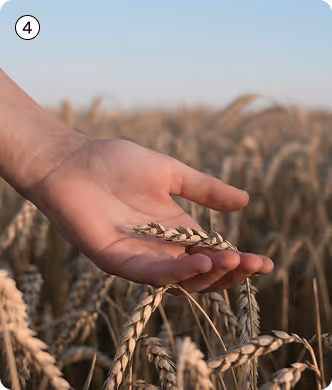
Raw materials
Raw materials imagery showcases naturalness, sustainability, craftsmanship, and the clean, precise processes that define our production.
It focuses on two key stages:
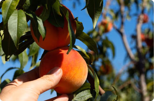
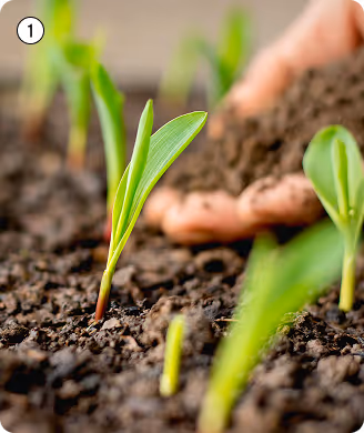
Natural stage
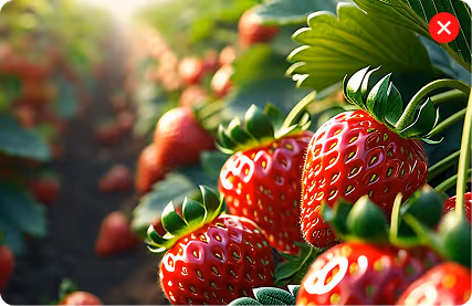
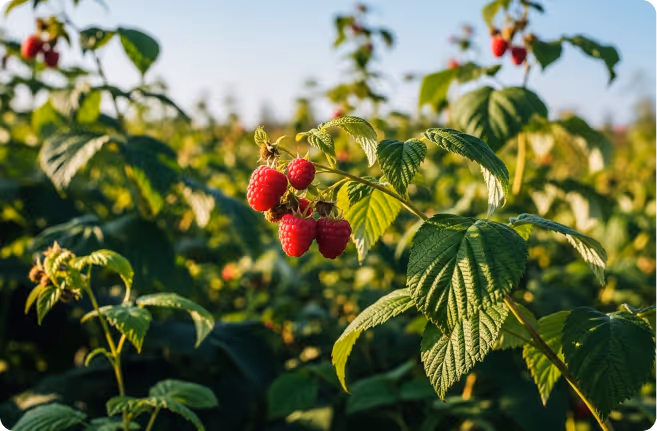
The raw materials appear in their purest form, with vivid visuals of land, crops, orchards and natural environments that inspire sustainability and authenticity.
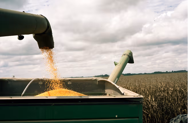
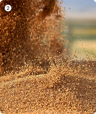
Processing stage
In this stage the focus shifts to the early transformation—capturing the handling and initial refinement that mark the seamless transition from nature to industry, reinforcing transparency, cleanliness and quality assurance.
How to
Use dynamic angles to emphasise scale, texture, and the subject’s connection to its environment.
Create a sense of action and movement in the processing stage to emphasise the dynamic nature of production.

Create clear, uncluttered compositions with a distinct point of interest and balanced framing to achieve a modern look.
Include subtle human elements, such as hands or hints of people, to add warmth and authenticity.
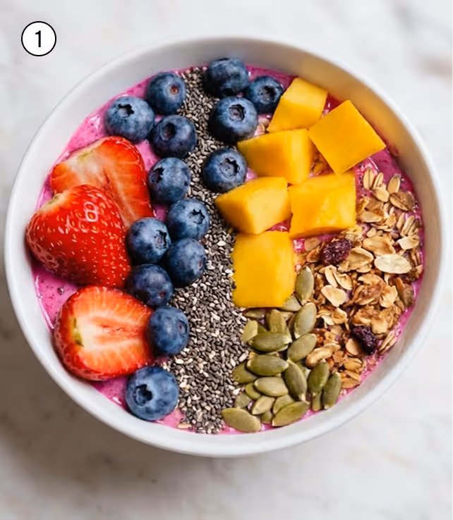
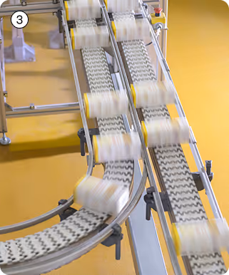
Products and services
Products and services imagery showcases the visual appeal and versatility of AGRANA’s offerings, from prepared, ready-to-consume products to the premium components and ingredients behind them.
Prepared goods
Products are shown in their final context—either in use or ready to use—emphasizing flavor, sensory impact, and the appeal of elements in a direct-to-consumer product.

Component goods
It highlights premium ingredients and intermediate products made from raw materials, focusing on their texture and consistency, and their qualities for diverse commercial and industrial applications.

How to
Capture products from clear perspectives (e.g. straight-on, top-down) to highlight key features without distraction from complex angles.

Capture implied motion— products or ingredients being poured, stirred, or sliced—to create dynamism and realism.

Frame products with clear negative space to create focus and visual clarity.

Products can be featured against solid colour backgrounds to create clean, graphic contrasts that highlight form and texture.
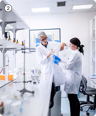
People
People imagery captures the human side of our story—those who enjoy our products and those who make them possible. It brings emotional connection, authenticity, and trust to the brand narrative.

End-consumers
People in real-life moments of enjoyment, highlighting the emotional appeal and everyday contexts where the products become part of people’s lives.
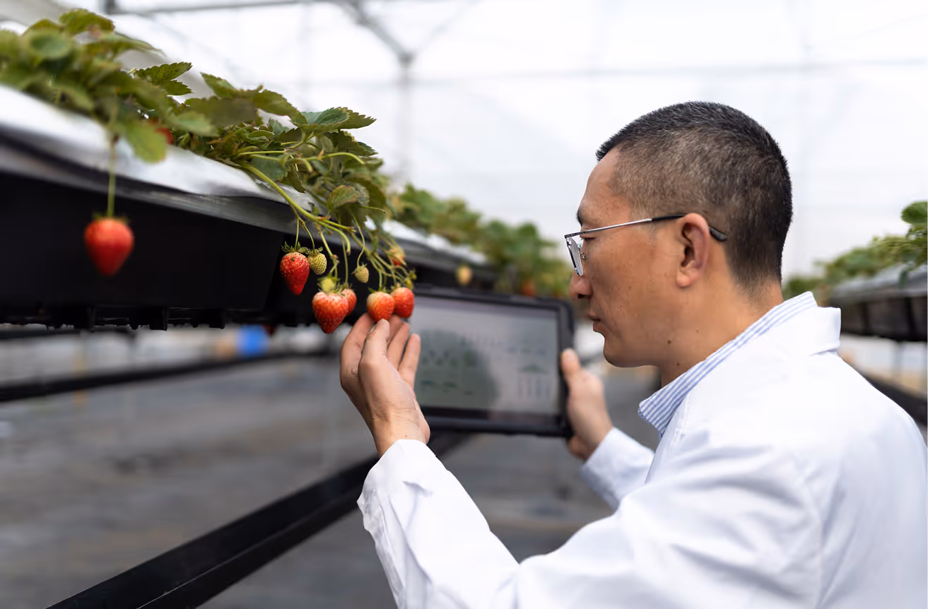
Professionals
People behind the scenes—from farmers and production teams to researchers and office staff—showcasing their expertise, care, and responsibility at every stage of the value chain.
How to

Capture people at eye level to create a relatable, human-centred perspective.
Use natural depth of field to highlight the subject while softly blending the background, creating presence and authenticity.

Capture close, personal moments that reflect genuine emotion and authenticity. Images feel more authentic when people don’t look directly at the camera, but they may do so if the expression feels genuine.

Represent diverse people and environments, reflecting our connection to many communities and contexts.
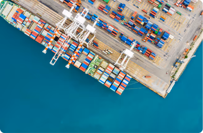
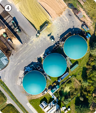
Environments
Environment imagery places our brand within its broader physical and societal context, showing both the world it impacts and the spaces where innovation happens.
World and lifestyle
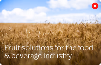
Images capture rural and urban settings where people live and work. When fields are shown, they must feature crops used in AGRANA’s products. Imagery connects people, places, and the planet through the role our products play.
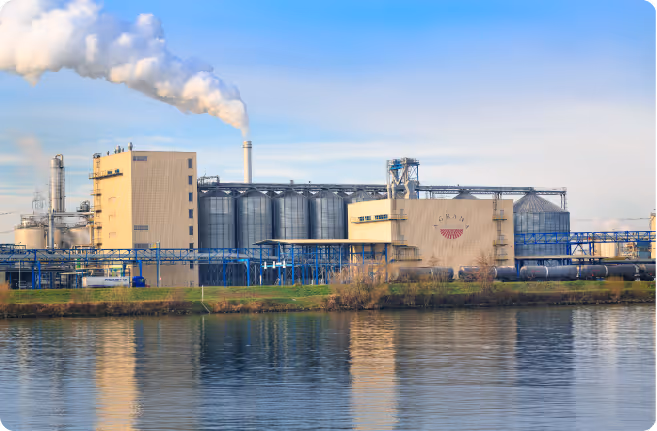
Facilities
Imagery highlights our production and innovation spaces—factories, labs, offices, and logistics—showcasing modernity, scale, safety and cleanliness. Authentic AGRANA sites should be featured wherever possible.
How to
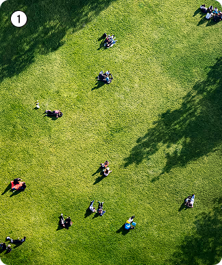
Use aerial or elevated viewpoints to reveal scale, patterns, and context in fields, facilities, or lifestyle settings.
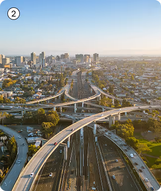
Emphasise architectural or natural geometry—lines, grids, frames, or pathways—to create visual order and modernity.
Capture human or mechanical movement—people in action or machines operating—to evoke purpose, precision, and energy.
Prioritise order and focus. Frame shots to reduce clutter while retaining essential context.