Advertising
Magazine advertising
Formats
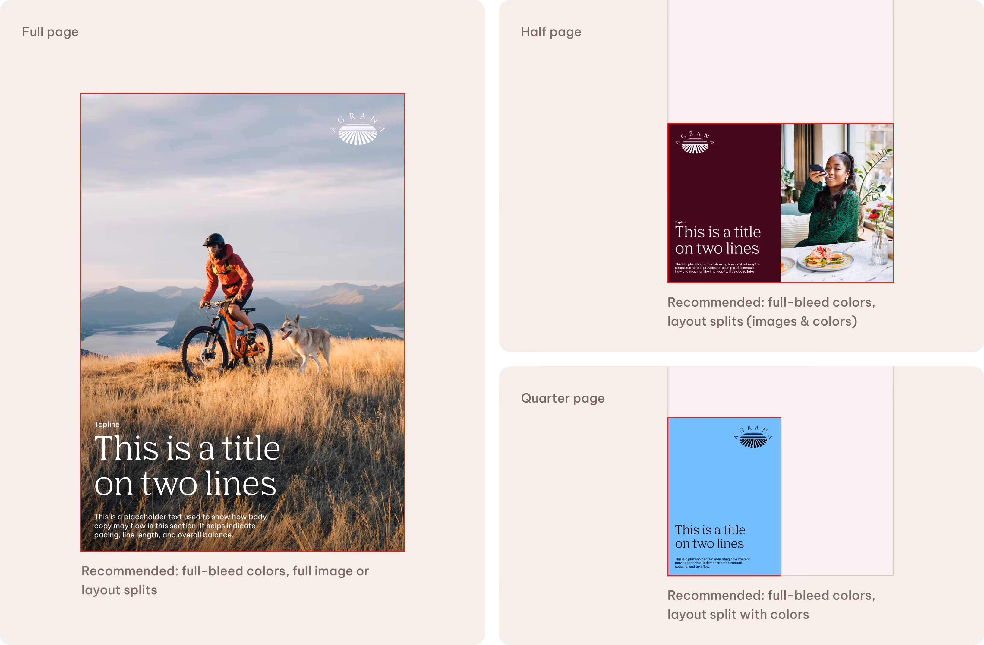
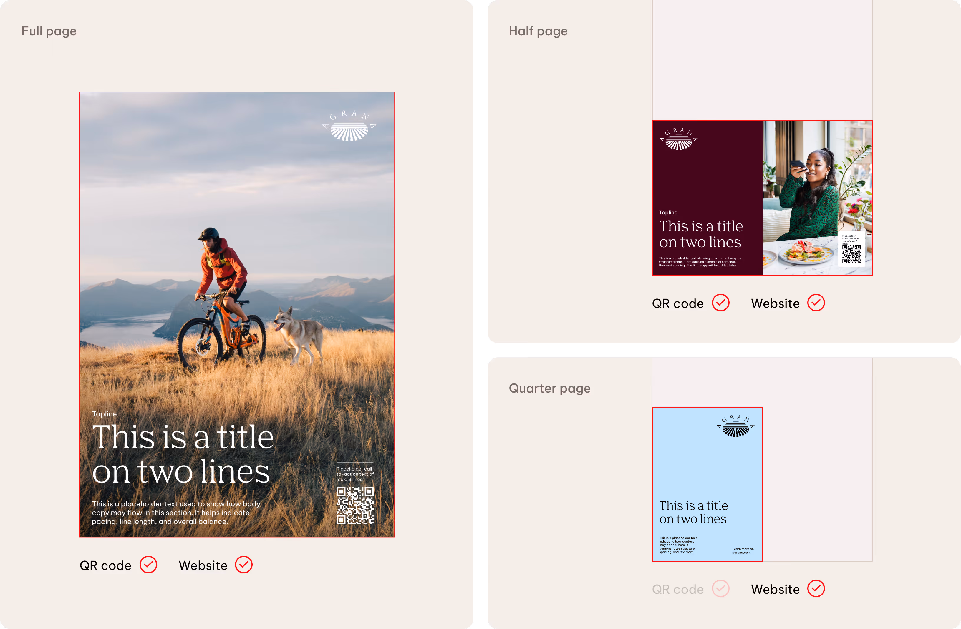
The formats defined in the Advertising guidelines focus on magazine ad applications. We work with three standard formats: full page, half page and quarter page.
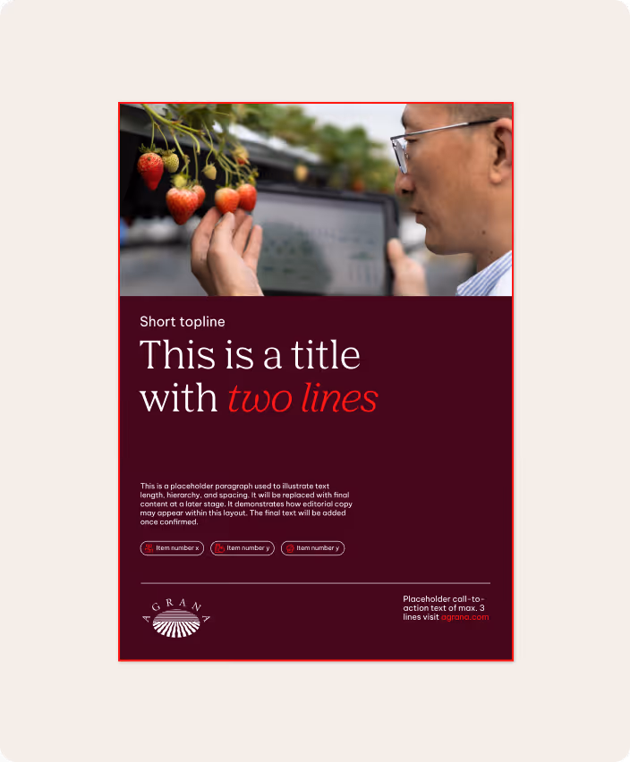
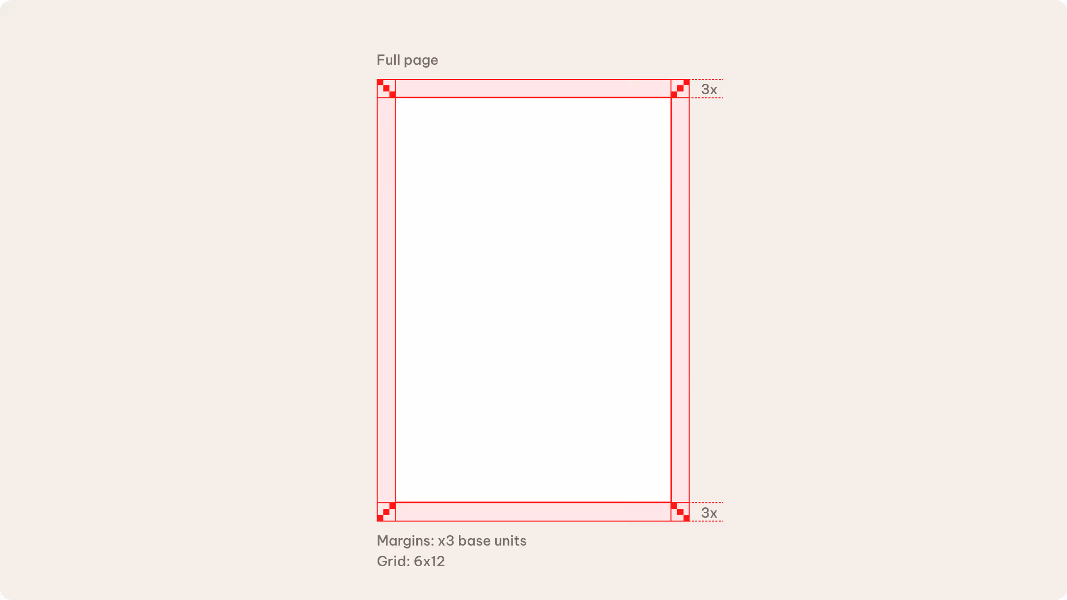
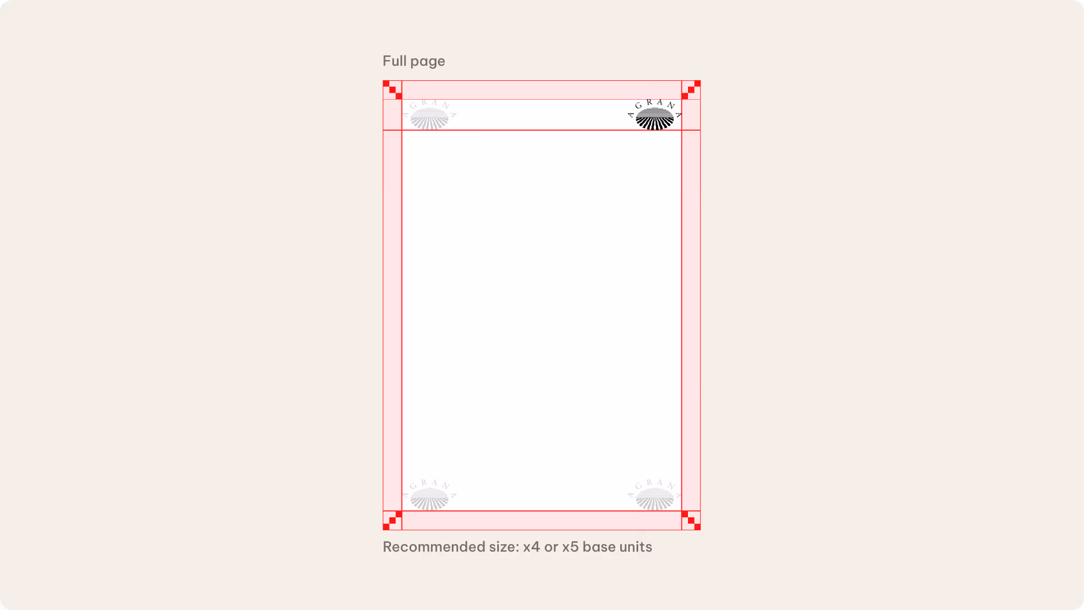
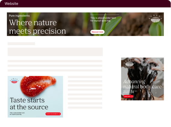
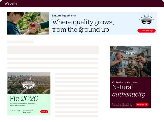
Full page
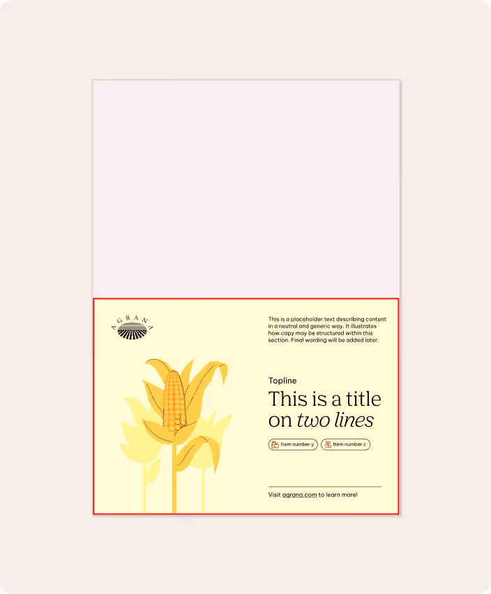
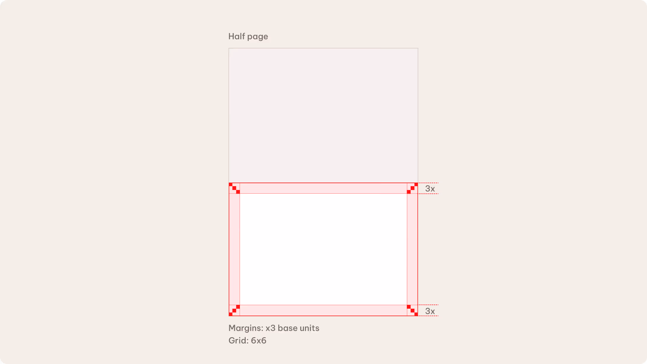
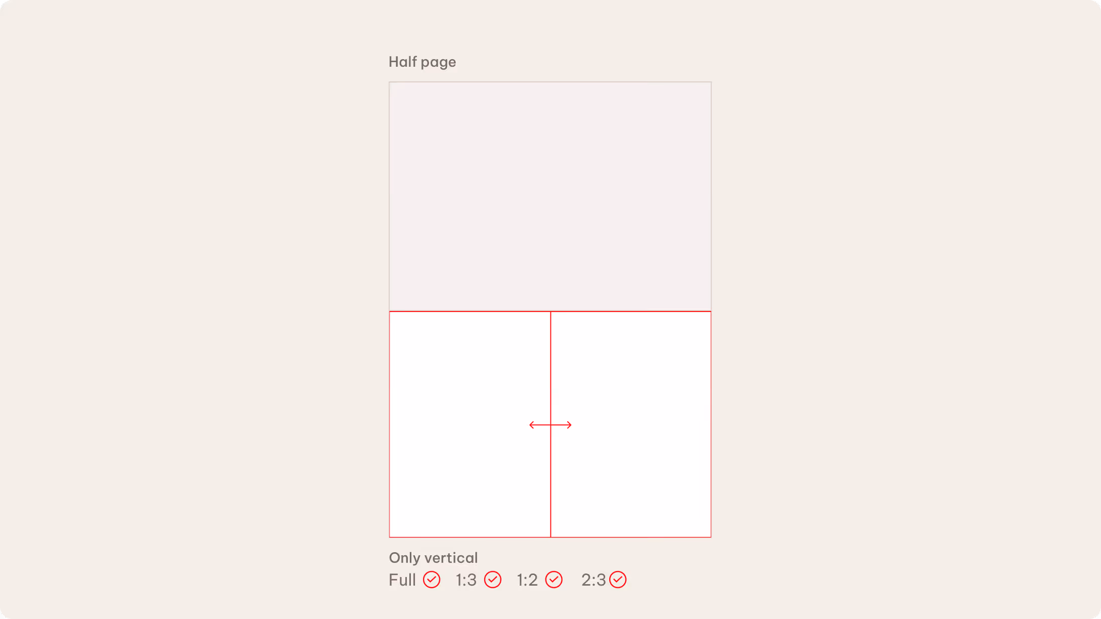
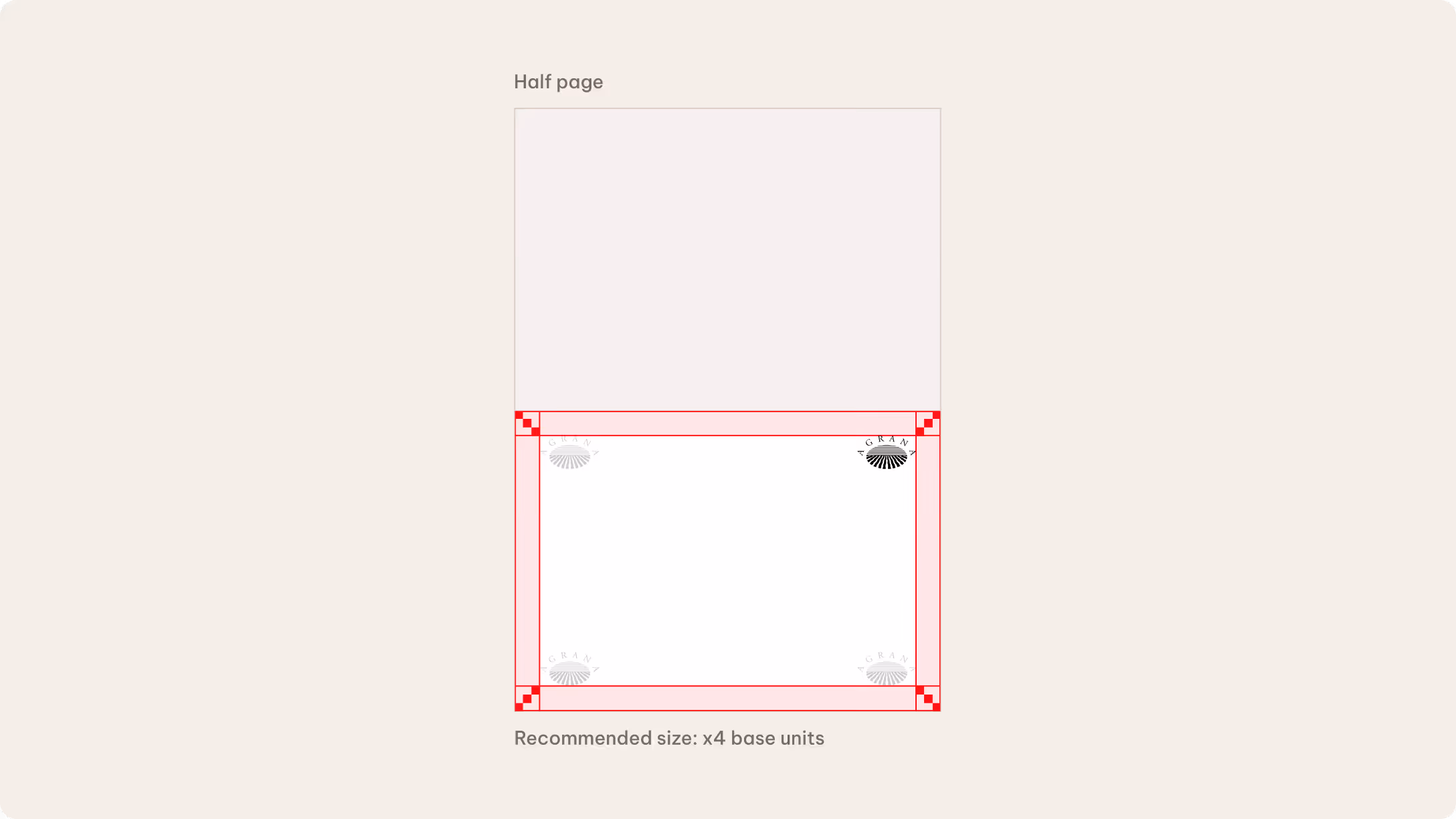
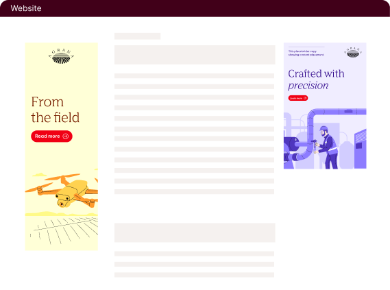
Half page
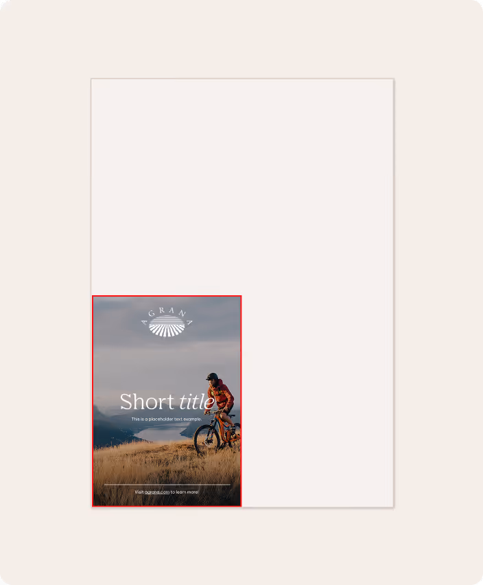
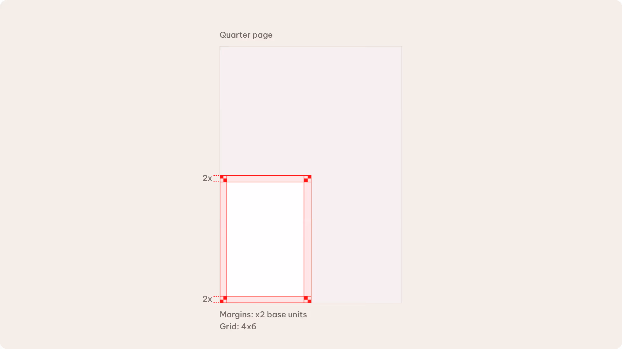
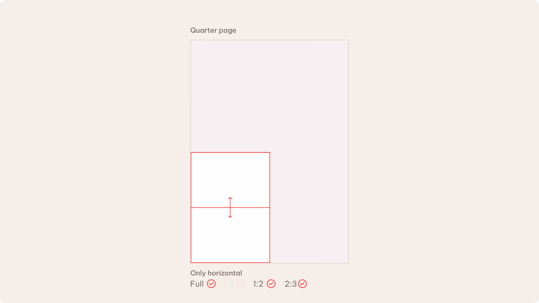
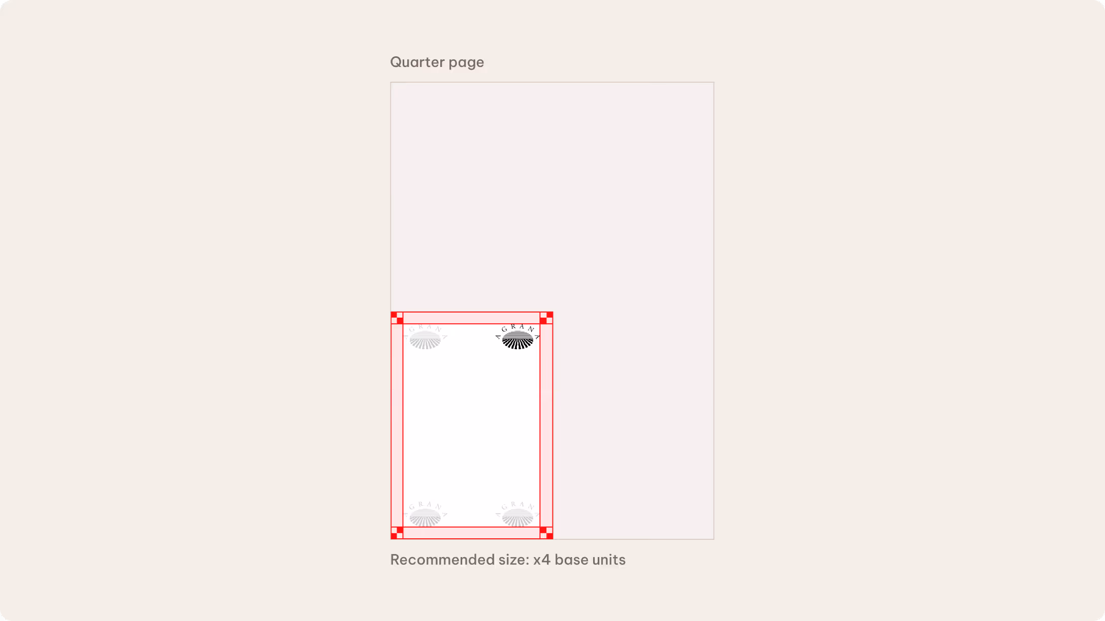
Quarter page
Grids and margins
We calculate margins based on the full format container. As a general rule, we use 3x base units for full-page and half-page formats, and 2x base units for quarter-page formats.
As formats become smaller, we simplify grid divisions to maintain clarity and avoid visual overcrowding.
Artwork preparation
Please check technical requirements (specific dimensions, bleed, color profiles, etc.) with the chosen provider.
Please see the Layout chapter to learn more about the base unit rules.
Layout composition
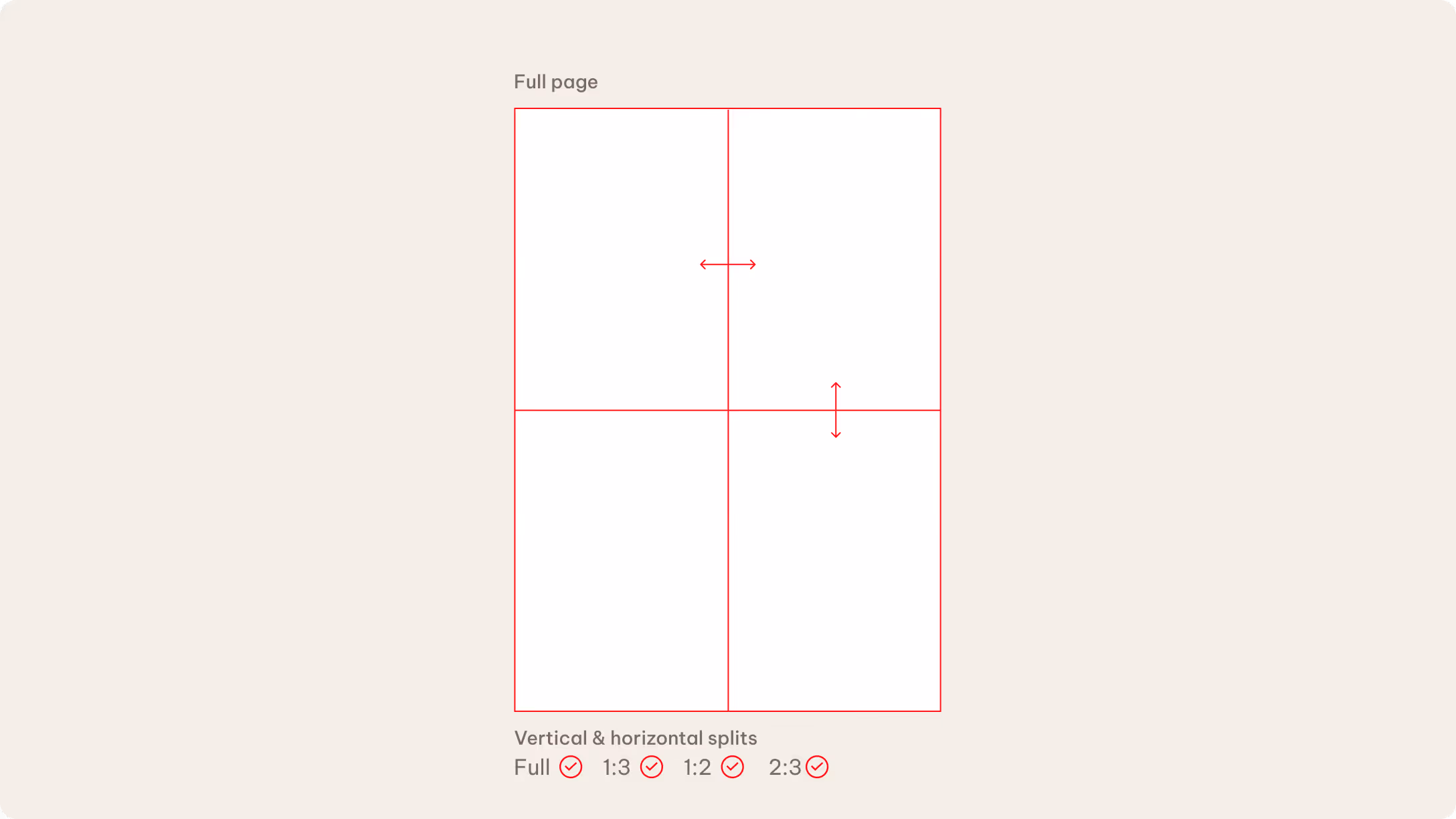
We determine the number and direction of layout divisions based on the available space within each format.
We use horizontal or vertical divisions, as well as full-page color or image compositions in full-page formats. Space is limited in half-page formats, which is why we recommend vertical divisions only, along with full-page color or image treatments. Due to their very limited space, quarter-page formats rely on horizontal divisions only with full-page color backgrounds. Solid color backgrounds help maintain clarity and visual impact at smaller sizes.
Logo size and placement
The logo size and placement depend on the format and the available space.
Logo size
- We allow 4x and 5x base units* sizes only on full-page formats.
- We recommend 4x for half-page and quarter-page formats.
Logo placement
We typically place the logo in the corners. This isn’t mandatory, though, and may vary depending on the campaign design. Centered placement is also an option when appropriate.
*Measured vertically
Content distribution
Content distribution
We allow different types of content depending on the available space. Colors, layout divisions, images, and illustrations are appropriate for full-page and half-page formats. But we only use colors for layout divisions in quarter-page formats.
Content awareness
This general rule applies: the larger the format, the more elements you can include. For instance, the full-page advertisement can feature longer texts and multiple graphic elements. When it comes to smaller formats, such as the quarter page, we advise using concise texts, limited graphic elements and less dynamic layouts.
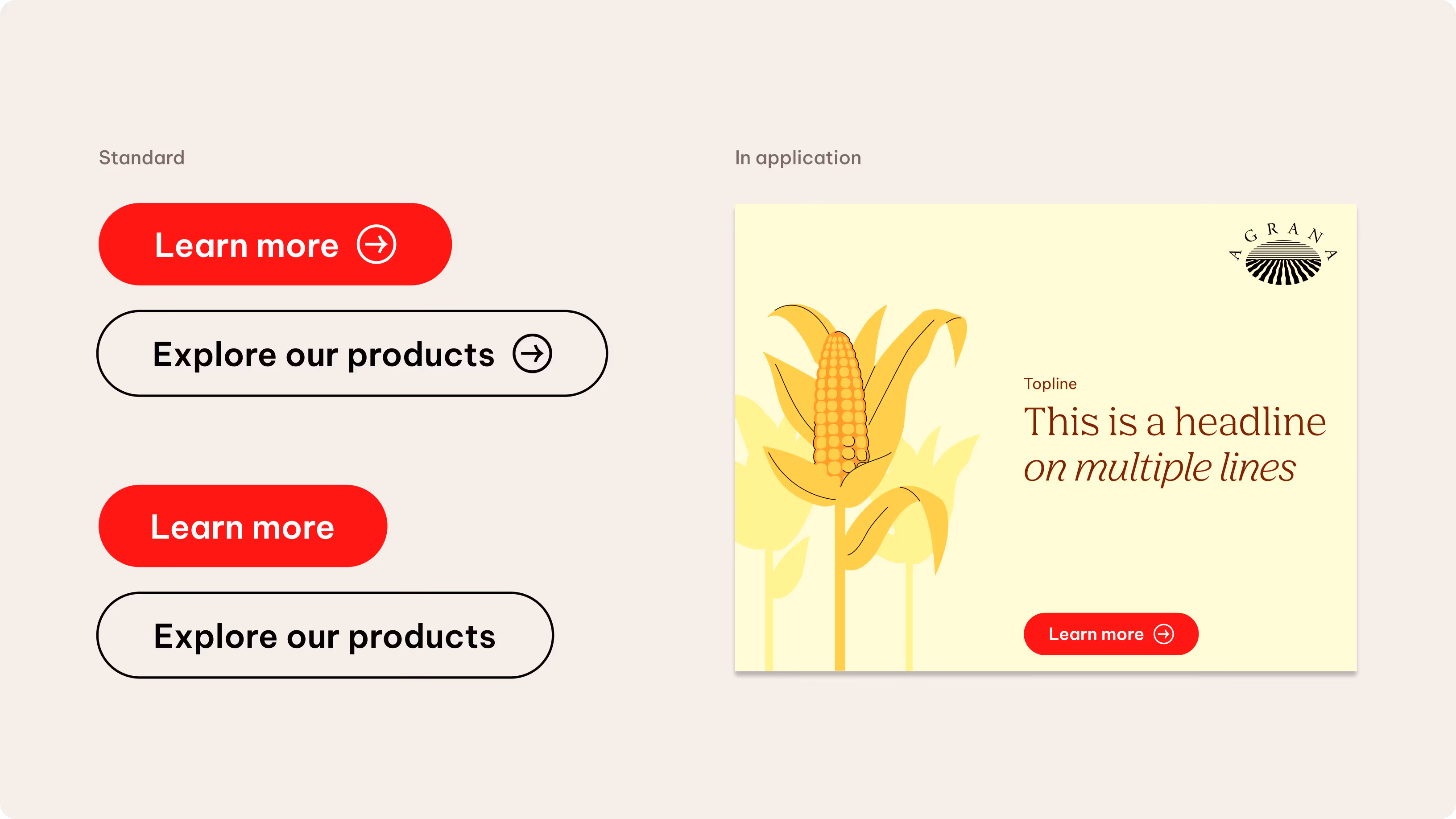
Calls to action
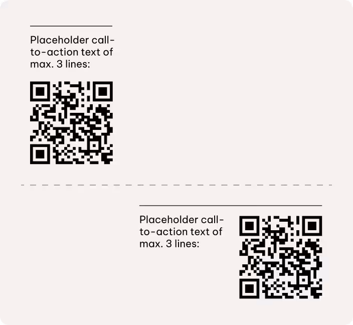
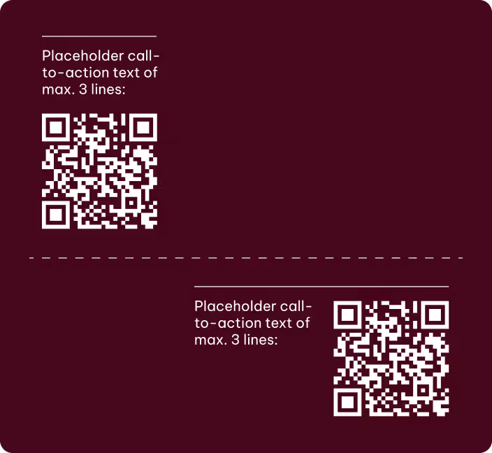
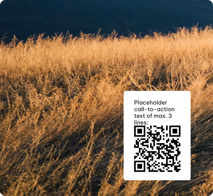
We present calls to action either as a QR code or a written website reference, depending on the format and context.
When supporting text is used alongside a QR code, it should remain concise and not exceed three lines. We position QR codes near the bottom corners of the layout to maintain a clear visual hierarchy and keep them from interfering with primary content.
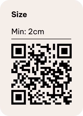
The QR code must remain clearly legible while proportionate to the overall layout. Its size should be sufficient for reliable scanning on screen without visually dominating the composition. Be sure to consider accessibility in all applications by ensuring strong contrast between the QR code, any CTA elements, and the background. If needed, use a bounding box to clearly define and protect the code area.
We use a clear, concise URL if just a website reference is required. It may appear in a standard text container or in footer-style utility areas, depending on the format and platform.
CTA placement on light background
CTA placement on dark background
CTA placement on images
Use either a QR code or a written website reference depending on the available space. You can use both options together in full-page and half-page formats. In quarter-page formats, we recommend using a website-only call to action to maintain clarity and legibility.
Additional brand elements
We primarily use the primary color palette to reinforce brand recognition. Incorporate secondary colors selectively if you need to add more character or emphasis.

Typography
Typography follows the same principles defined in the Brand Elements guidelines. In smaller formats, we pay particular attention to legibility and accessibility.
Please see the Layout chapter to learn more.
Colors
We primarily use the primary color palette to reinforce brand recognition. Incorporate secondary colors selectively if you need to add more character or emphasis.
Please see the Color chapter to learn more.

Content
We keep content concise and focused by directing more detailed information to more suitable and readable formats, such as the website.
Please see the Tone of Voice chapter to learn more.
Line elements
We use line elements selectively due to the limited available space. We prioritize more pragmatic layout solutions where possible, such as grouping or dividing content.
Please see the Layout chapter to learn more.
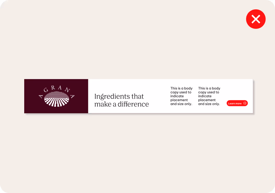
Don'ts
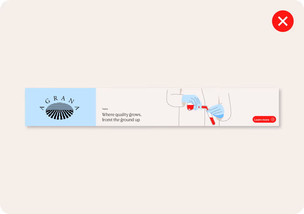
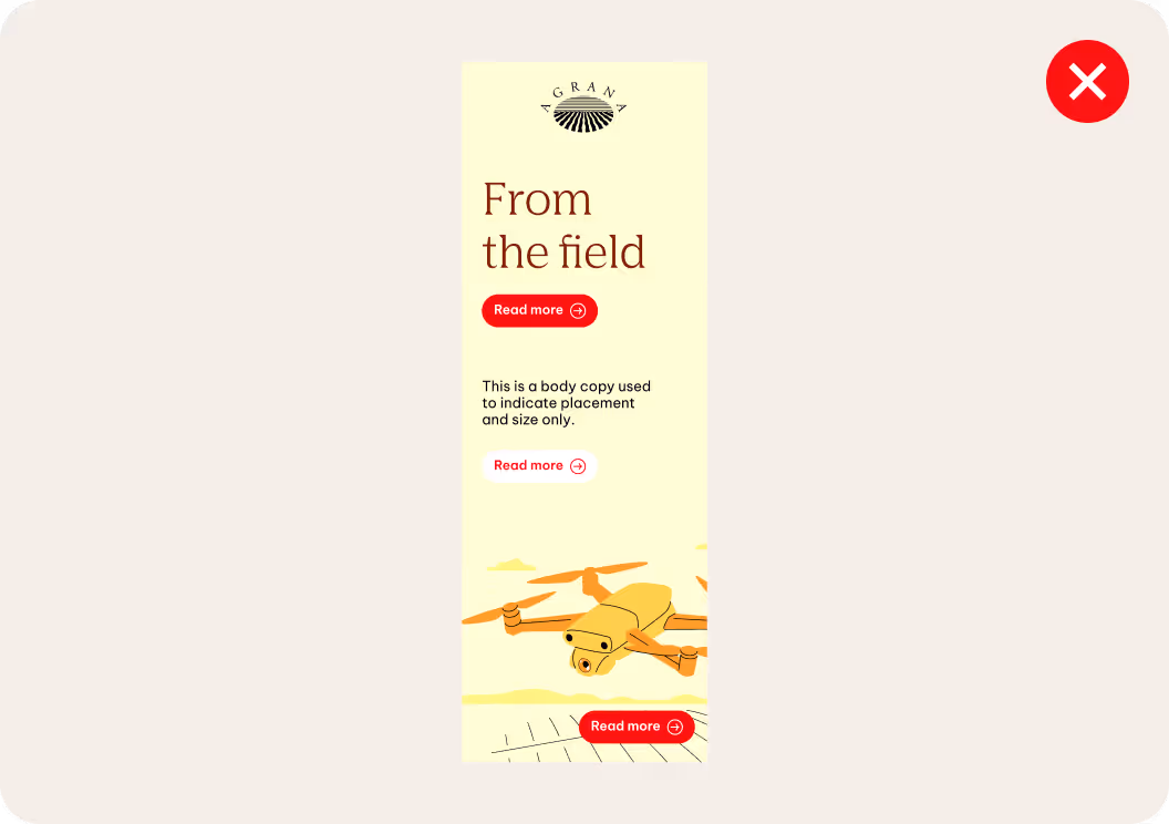
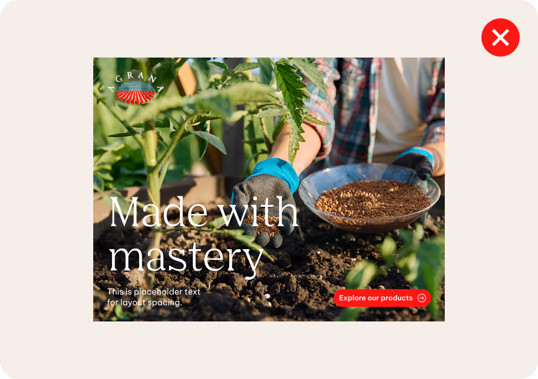
The following examples illustrate applications that don’t align with our design principles.
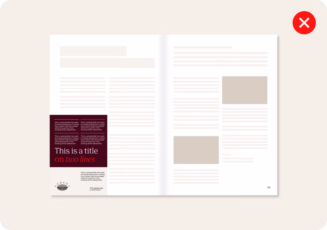
We don’t overcrowd layouts with too much content.
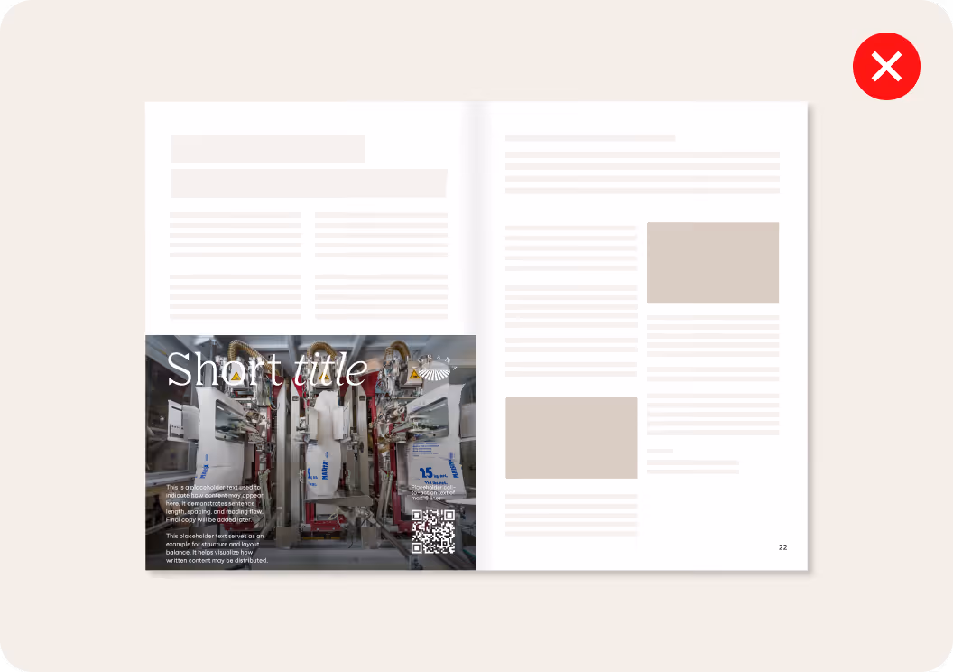
We don’t use busy or distracting backgrounds.
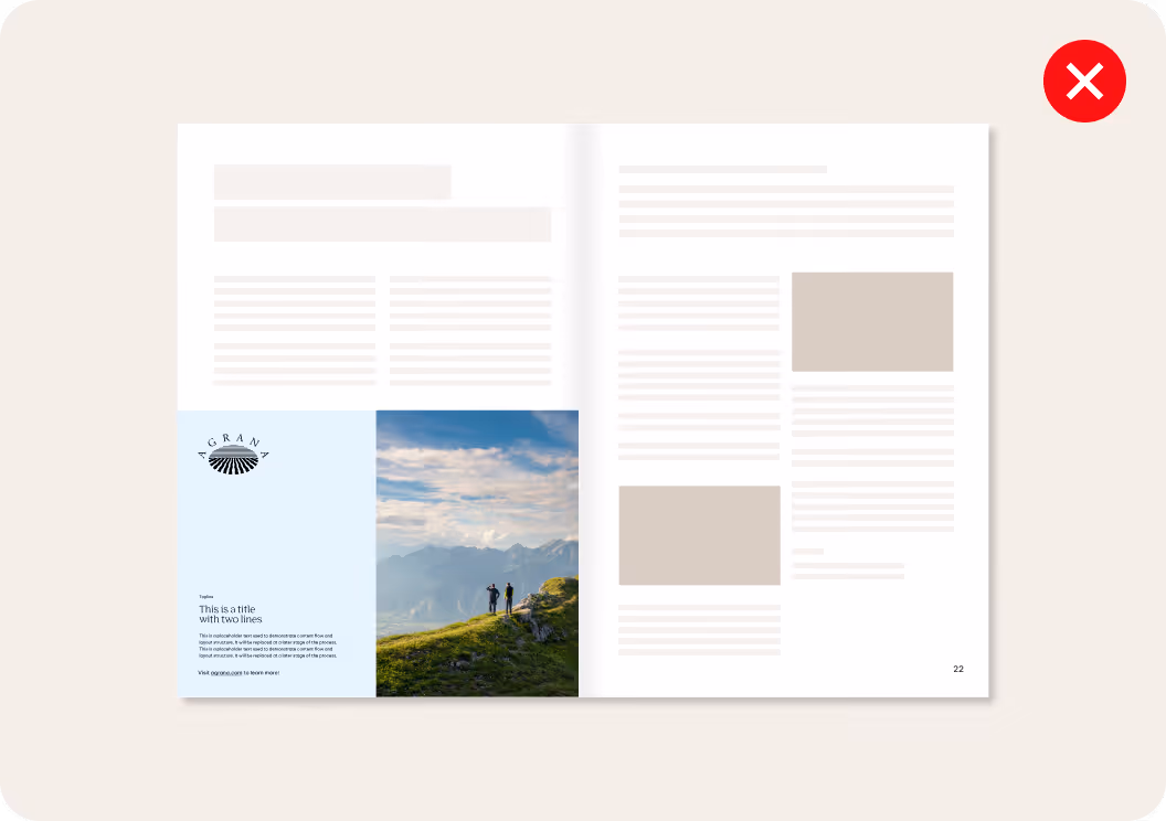
We don’t use text sizes below the defined minimum.
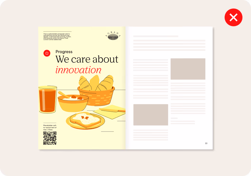
We don’t overuse purely decorative elements that add nothing to the content.
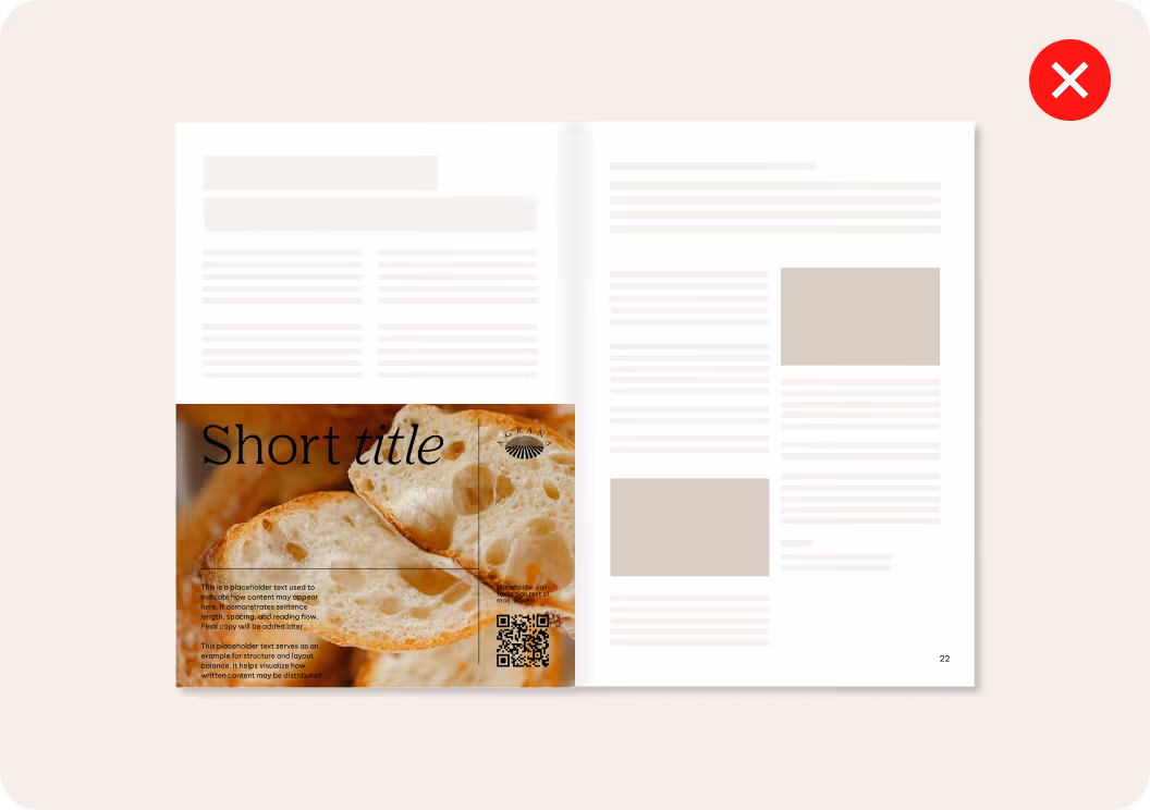
We don’t compromise readability by placing text on detailed images with low contrast.
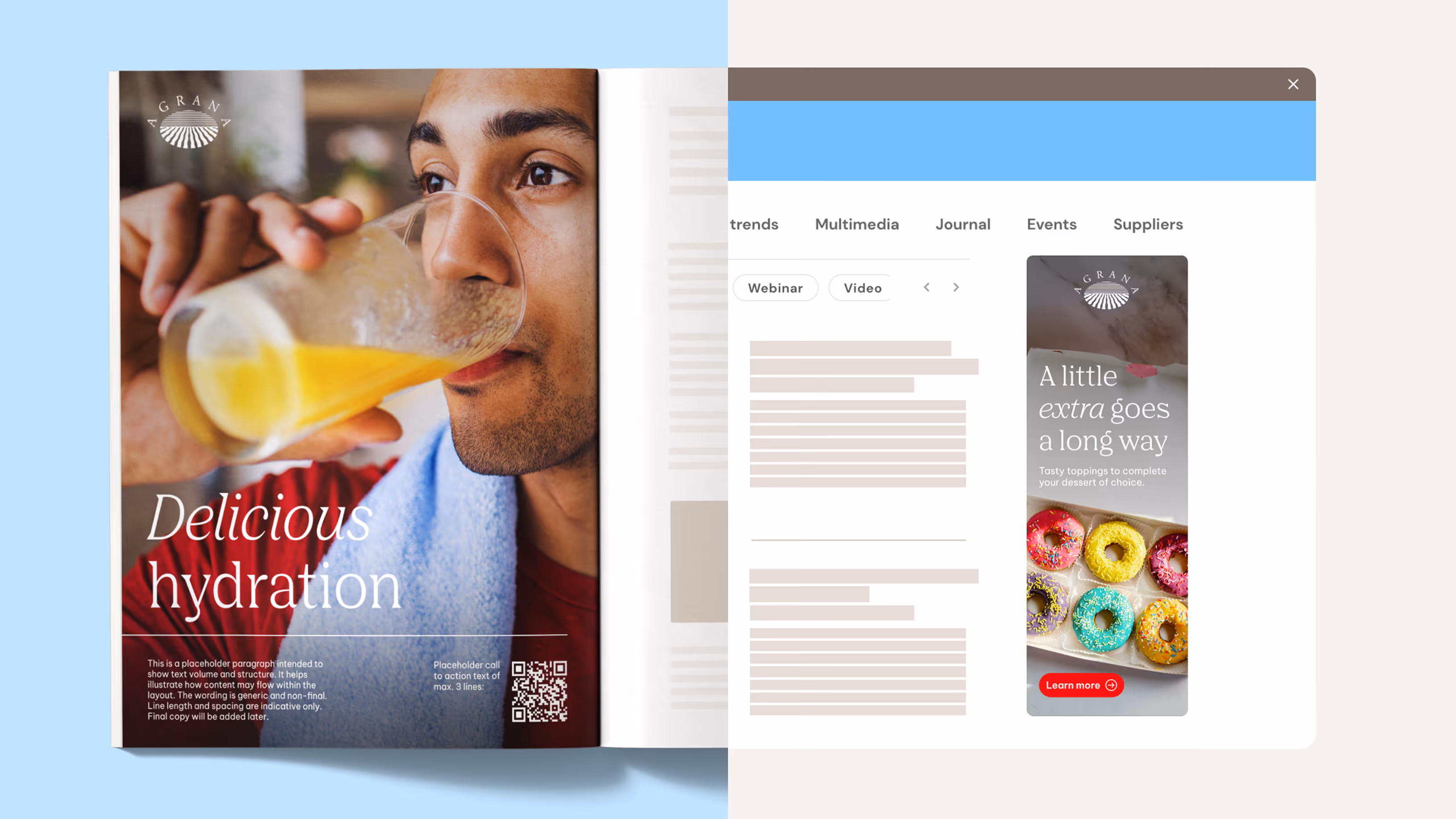
Digital advertising
Formats
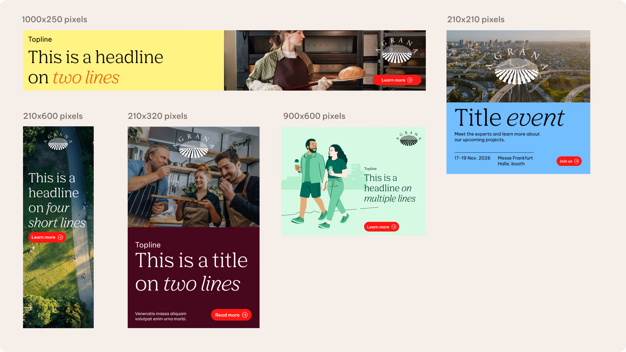
We defined a set of common proportions for digital banners and newsletter formats. The rules established for each format also apply to similar proportions.
Digital banner formats are grouped into horizontal and vertical variations. Horizontal formats include extreme, standard, and square banners. Vertical formats include skyscraper and rectangle banners.
The graphic shows how these formats can appear on a partner website. Placement is illustrative and may vary depending on the destination platform.
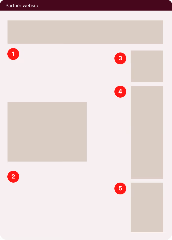

Extreme

Standard

Square

Skyscraper

Rectangle
Please note: The following rules apply to similar sized banners. The sizes used are for illustration purposes only.
Grids and margins
We define margins based on the format type and available space. We use 3x base units as the recommended margin in standard formats. We increase this to 4x base units in more extreme formats to maintain clarity and visual balance.
As formats become smaller or more constrained, we simplify grid divisions to avoid visual overcrowding and ensure content remains easy to read.
Standard formats include pop-ups, scroll banners, and in-article banners. Extreme formats include leaderboards, header banners, skyscrapers, and mobile banners.
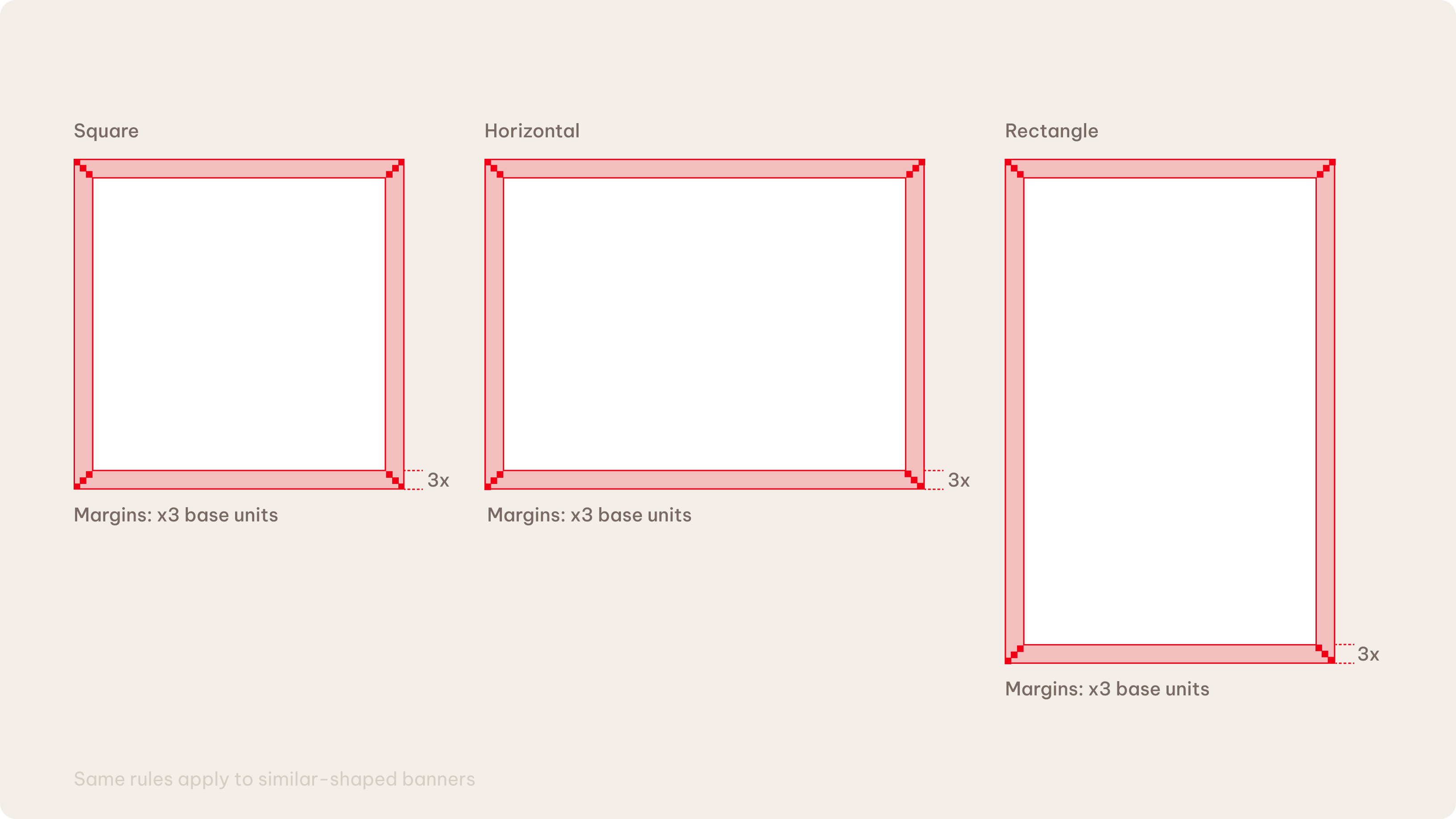
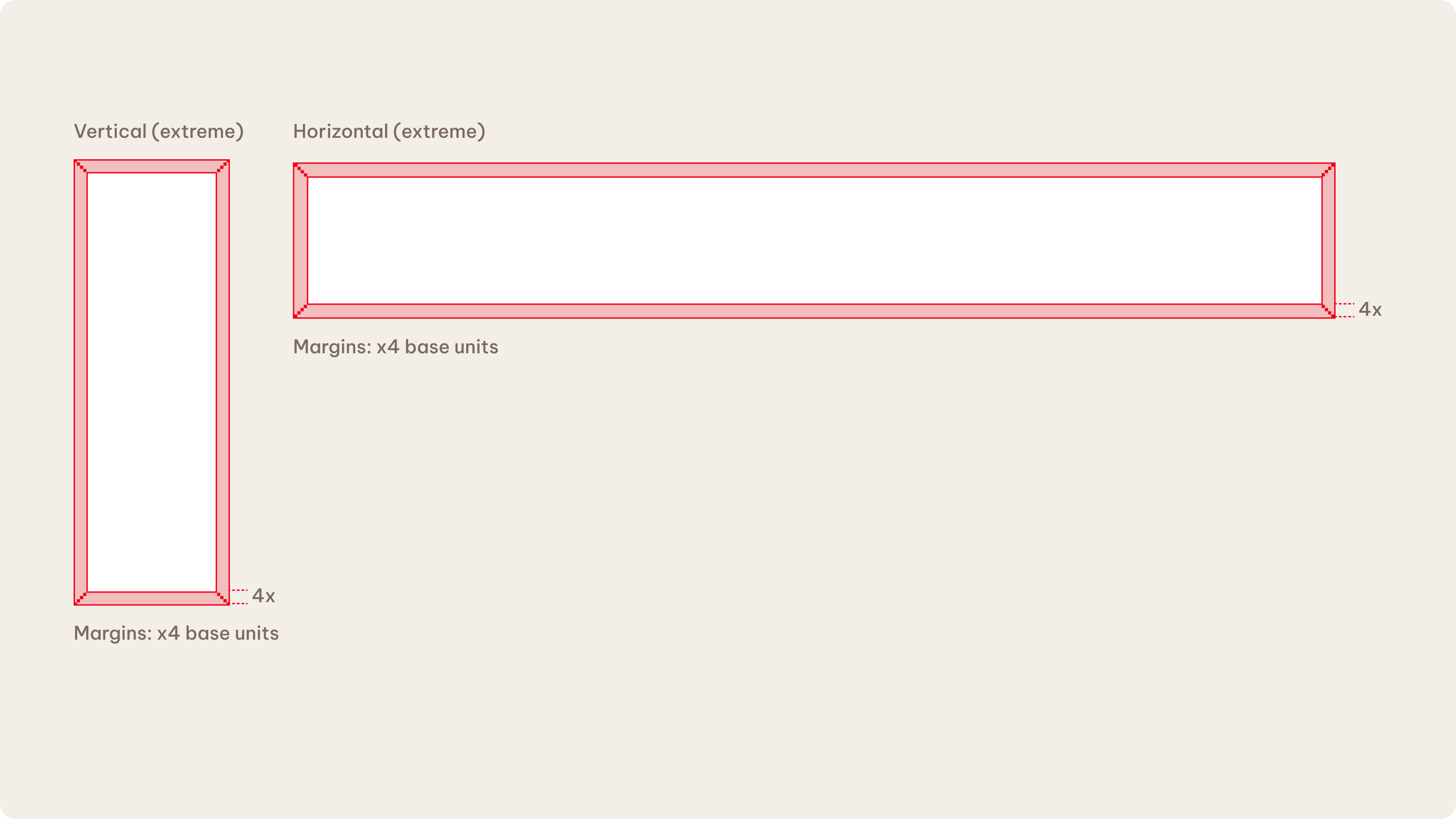
Please see the Layout chapter to learn more about the base unit rules.
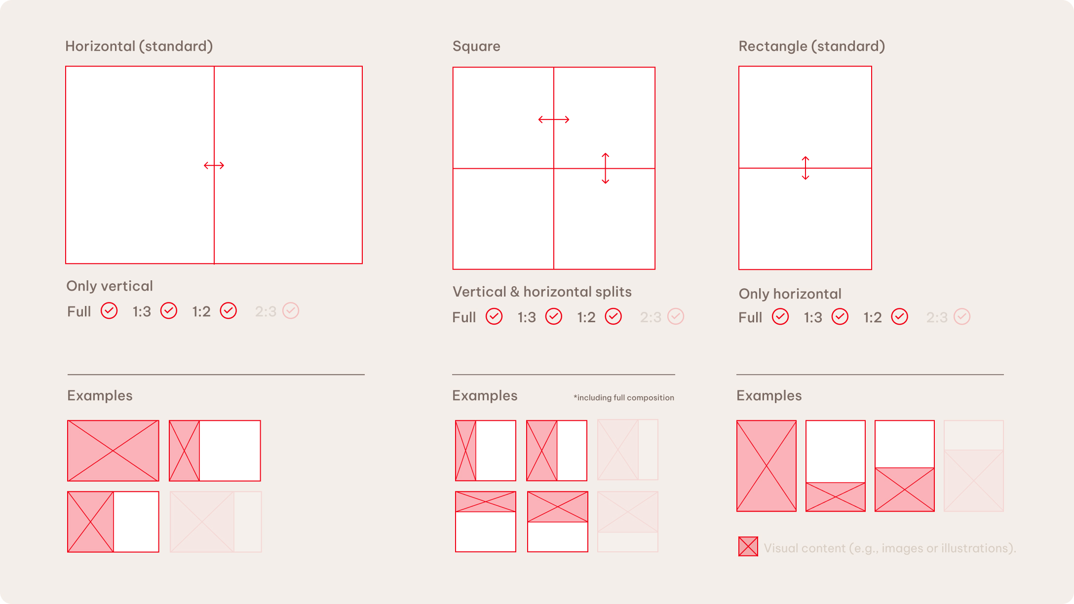
Layout composition
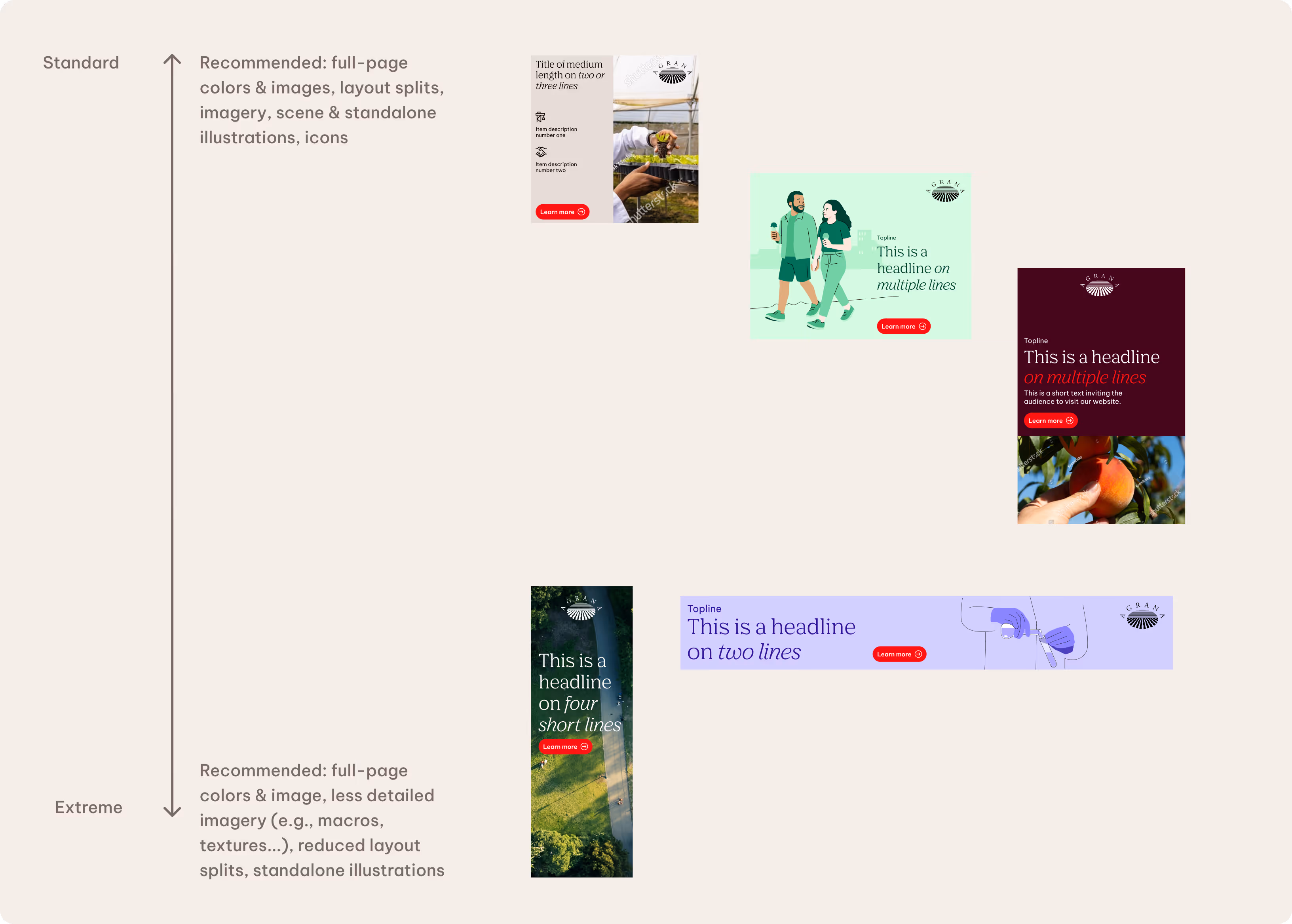
The number and direction of layout divisions depend on the available space within each format. We recommend a full-page approach, but allow layout splits in certain circumstances.
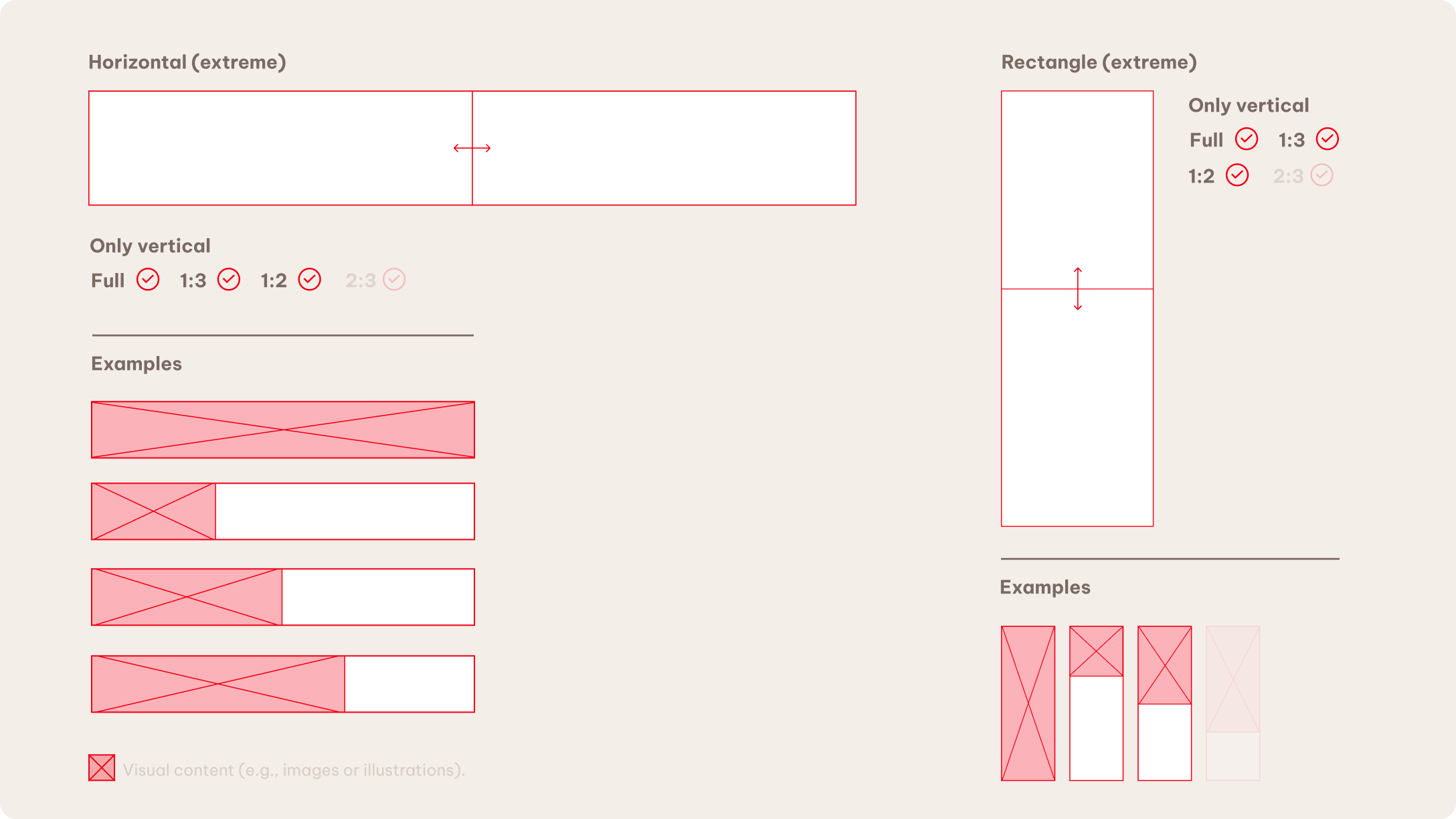
Horizontal banners
We recommend vertical splits only.
Square
This is the only format in which we allow both vertical and horizontal splits. Please be mindful of the content and use the approach that fits best.
Vertical
We allow horizontal splits only.
Logo size and placement
It’s necessary to adapt the brand guidelines for use in digital formats, which can be very small and challenging to read.
A centered logo placement is possible when appropriate and depending on the campaign content. We recommend using a centered placement in vertical formats.
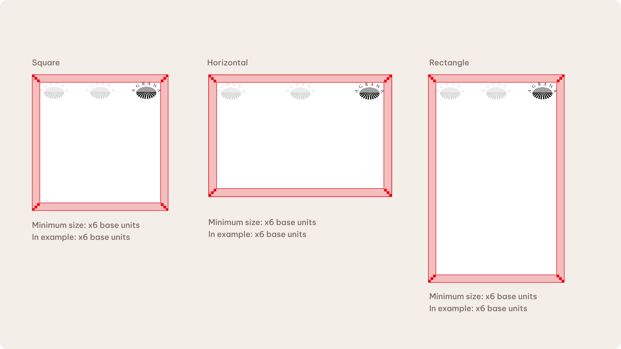
Logo size
The recommended logo size ranges from a minimum of x6 base units to a comfortable size of x8 base units. The size may vary depending on the campaign content and intention, but should be at least x6 base units.
Logo placement
We typically place the logo in the corners, The logo should be in the top area of the format in digital banners specifically. Here, the bottom area is reserved for calls to action and buttons.
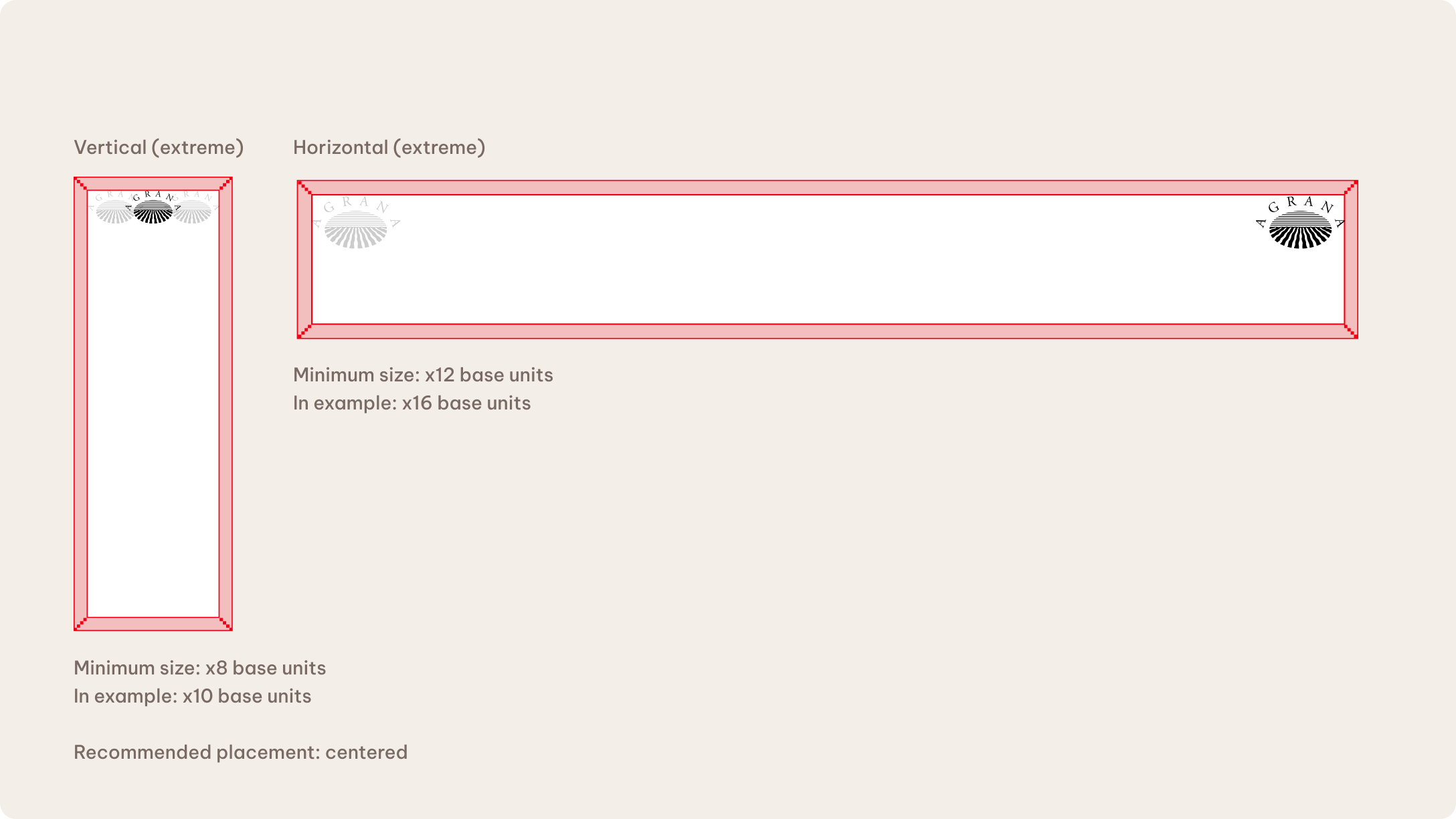
Logo size (vertical)
The recommended logo size ranges from a minimum of x8 base units to a comfortable size of x12 base units. The size may vary depending on the campaign content and intention, but should be at least x8 base units.
Logo size (horizontal)
The recommended logo size ranges from a minimum of x12 base units to a comfortable size of x16 base units. The size may vary depending on the campaign content and intention, but should be at least x12 base units.
Logo placement
We typically place the logo in the corners. The logo should be in the top area of the format in digital banners specifically. Here, the bottom area is reserved for calls to action and buttons.
Content distribution
We allow different types of content depending on the available space. More balanced (e.g., square format) proportions allow for a wide variety of combinations and layouts. On the other hand, we recommend reducing the amount of elements and simplifying layouts in more extreme formats, such as leaderboards or skyscrapers.
Calls to action
In online advertising, we use a digital call to action to guide the audience to their next step. The wording may vary depending on the purpose of the CTA.
Always embed the forward link within the banner.
Style
Buttons follow a rounded, pill-shaped appearance. We use AGRANA Red as a background color for a standardized, recognizable approach. White is another optional fill color, depending on the background image. We use Be Vietnam Pro as the button typeface.
Placement
The call to action doesn’t have a fixed location, but we do recommend certain positions. Placing CTAs in the bottom corners of the format is the most standardized approach. Other placements are possible, provided the content remains clear and the interaction feels organic for the viewer.
Minimum size
We ensure a minimum size of 16 px to maintain readability.
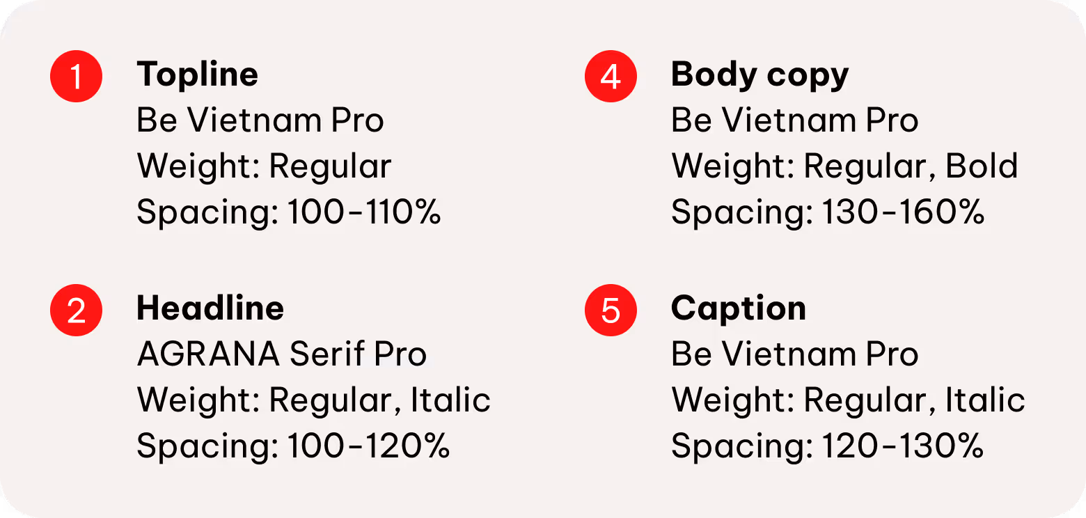
Typography
We define almost all type sizes proportionally to keep the hierarchy clear and consistent across all formats.
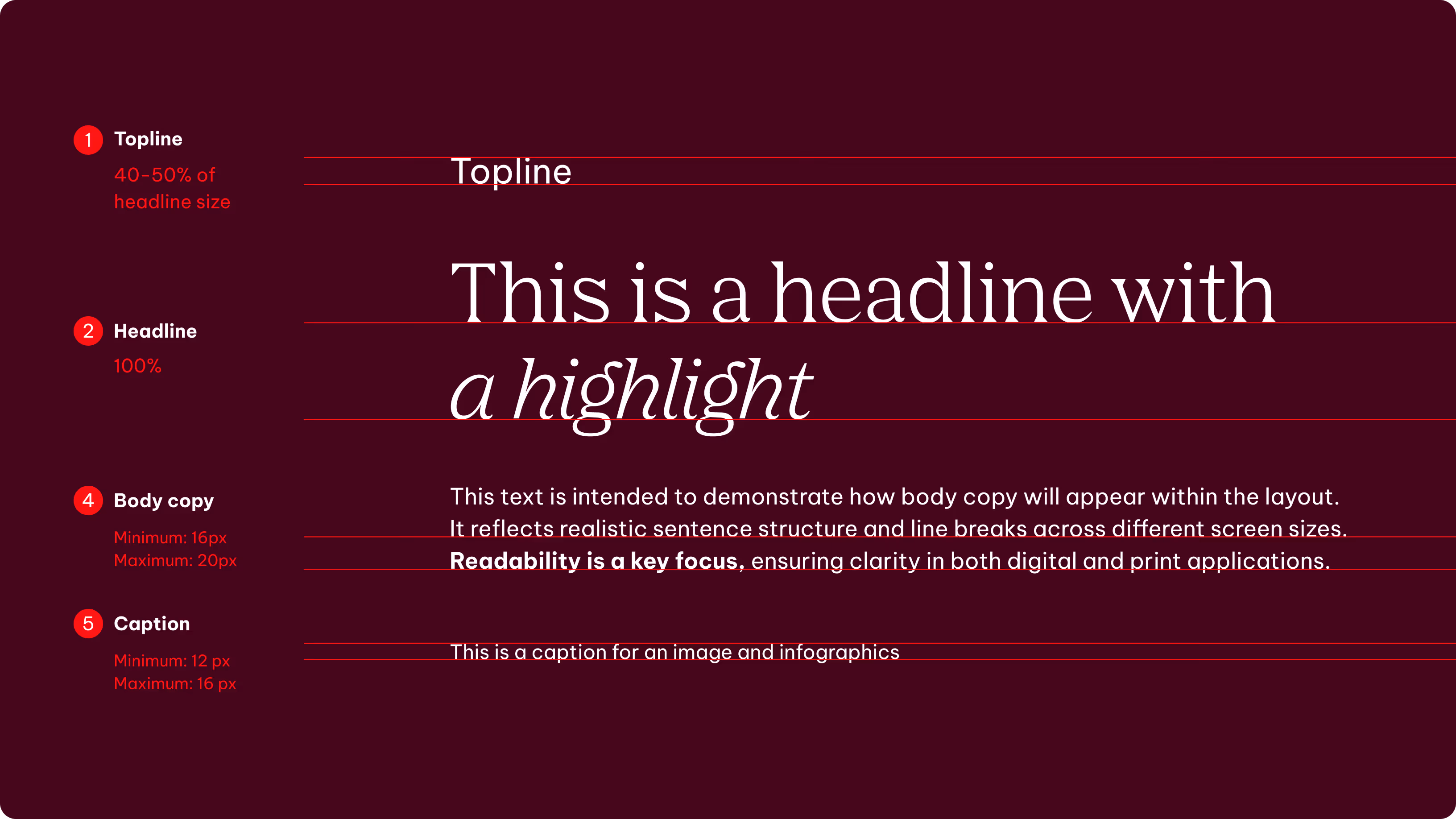
Headlines
The headline sets the base size. All other styles scale from it. Toplines follow this lead to maintain consistent hierarchy and proportions.
Body copy and captions
Body copy and captions are defined by layout, format, and context — from accessibility needs to contrast ratios and reading distance. Their sizing is independent from headlines, ensuring suitability in every situation.
Additional brand elements
We apply the same principles defined in the Brand Elements guidelines when working with advertising formats. The following section outlines how to use these elements in advertising layouts to ensure consistency and clarity across formats.

Motion
We leverage our motion behaviors to attract the viewer’s attention in digital environments.
Please see the Motion chapter to learn more.
Colors
We prefer the primary palette to reinforce recognition. Use secondary colors if you need to add more character or emphasis.
Please see the Color chapter to learn more.


Content
We keep content concise and focused by directing more detailed information to more suitable and readable formats, such as the website.
Please see the Tone of Voice chapter to learn more.
Line elements
We use line elements selectively due to the limited available space. We prioritize more pragmatic design approaches where possible, such as grouping or dividing content.
Please see the Layout chapter to learn more.
Best practices
Don'ts
The following examples illustrate applications that don’t align with our design principles.
We don’t overcrowd layout with many elements or text.
We don’t use busy or distracting backgrounds.

We don’t scale the logo smaller than the defined minimum size.
We don’t use multiple CTAs in one format.
We don’t place text on busy background images.