Color
Introduction
We use color to guide focus, structure information, and establish hierarchy across touchpoints.
We pair bold accents with calm neutrals to keep compositions accessible and balanced. The palette’s vibrancy and brightness reflects the diversity of AGRANA’s business while maintaining clarity and consistency.
.png)
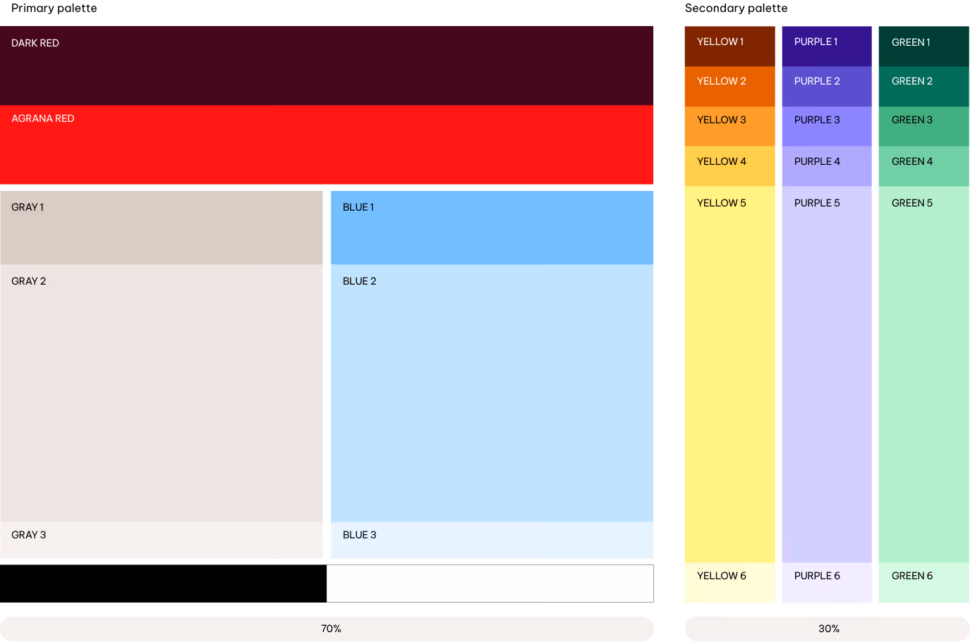
Palettes
AGRANA’s color palette is designed to create a fresh, vibrant visual identity. The primary and secondary palettes work together to deliver clarity, energy and a distinctive AGRANA character.
Primary palette
We rely on the primary palette for the majority of our communications. Blue and Gray scales create a calm, clear base. Dark Red and AGRANA Red bring energy and support brand recognition when used selectively. Black and White serve as neutral, functional colors.
Secondary palette
The secondary palette complements the primary colors. It includes Yellow, Purple, and Green. Lighter shades are used most often, while darker and mid-tones are applied more selectively to add contrast and depth, particularly in illustrations and infographics.
How to use
Here’s how we approach visual communication and accessibility with AGRANA’s color palettes and combinations. The following guidance shows how to apply the palettes effectively and consistently across different contexts. The visuals below are simplified examples.

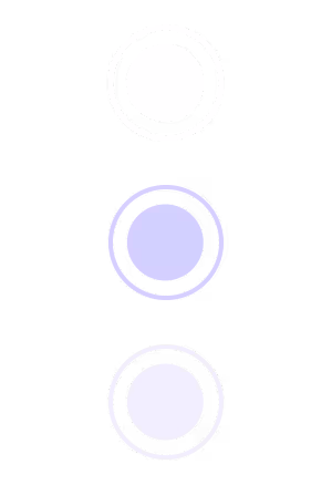
Primary colors
Use the primary colors as AGRANA’s main palette. Apply them on core touchpoints—website, stationery and packaging—to ensure recognition. Follow the defined pairings and proportions, and keep their balance consistent across layouts.
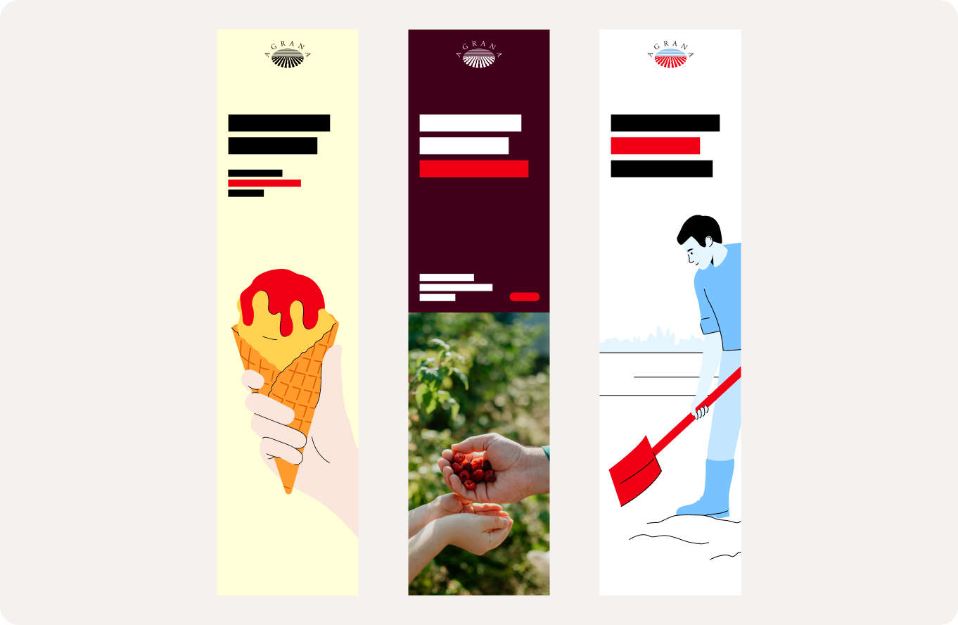
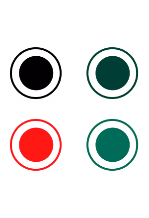
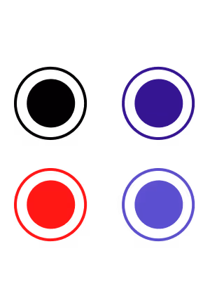
AGRANA red thread
AGRANA Red is one of our most distinctive brand assets and plays a key role in creating immediate brand recognition. Consistent use across touchpoints strengthens the visual presence of the AGRANA brand and supports a cohesive brand experience.
Use AGRANA Red selectively for highlights, icons, UI elements and illustration accents. Always balance it with the primary color palette and use it to guide attention rather than dominate compositions.
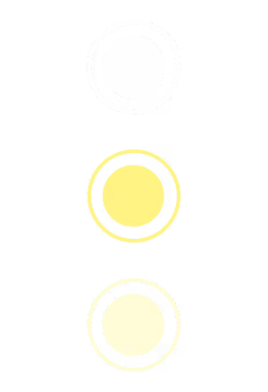
Secondary colors
Use the secondary palette to add vibrancy and support the primary palette. Apply it in illustrations, infographics, data visualization and UI elements. Keep it in a supporting role: the primary palette should create most of the overall color impression.

Primary palette
Overview
We divide the primary colors into two groups: our primary colors and the functional colors.
The primary colors includes reds, a grayscale, and a blue scale. Dark Red and AGRANA Red provide boldness and energy, balanced by the warmth of the greyscale and the calmness of the blue scale.
Dark Red
HEX
#460019
RGB
70/0/25
PMS-C
4102 C
PMS-U
4102 U
CMYK-C
35/100/60/60
CMYK-U
25/100/50/60
Usage: Backgrounds, infographics, illustrations, UI elements, icons
AGRANA Red
HEX
#EE0014
RGB
238/0/20
PMS-C
2035 C
PMS-U
2035 U
CMYK-C
0/100/100/0
CMYK-U
0/100/100/0
Usage: Backgrounds, illustration highlights, infographics, text components, UI elements, icons
Blue 1
HEX
#78C3FF
RGB
120/195/255
PMS-C
284 C
PMS-U
2915 U
CMYK-C
55/10/0/0
CMYK-U
55/6/0/0
Blue 2
HEX
#C3E6FF
RGB
195/230/255
PMS-C
291 C
PMS-U
290 U
CMYK-C
30/0/0/0
CMYK-U
25/0/0/0
Blue 3
HEX
#E6F5FF
RGB
230/245/255
PMS-C
9400 C
PMS-U
9400 U
CMYK-C
10/0/0/0
CMYK-U
10/0/0/0
Usage: Backgrounds, illustrations, infographics, text components, UI elements, icons
Grey 1
HEX
#D7CDC3
RGB
215/205/195
PMS-C
7529 C 60%
PMS-U
7529 U 60%
CMYK-C
0/5/10/20
CMYK-U
0/5/10/20
Grey 2
HEX
#EBE6E1
RGB
235/230/225
PMS-C
7529 C 40%
PMS-U
7529 U 40%
CMYK-C
0/5/10/10
CMYK-U
0/5/10/10
Grey 3
HEX
#F5F1EF
RGB
245/241/239
PMS-C
7529 C 20%
PMS-U
7529 U 20%
CMYK-C
5/5/5/0
CMYK-U
5/5/5/0
Usage: Backgrounds, illustrations, infographics, text components, UI elements, icons
Functional colors support practical and accessible applications within the palette.
Black
HEX
#000000
RGB
0/0/0
PMS-C
Black C
PMS-U
Black U
CMYK-C
0/0/0/100
CMYK-U
0/0/0/100
Usage: Logo, text components
White
HEX
#FFFFFF
RGB
255/255/255
PMS-C
n/a
PMS-U
n/a
CMYK-C
0/0/0/0
CMYK-U
0/0/0/0
Usage: Logo, text components, backgrounds
Best Practises
We show some use cases for the primary color palette.
.png)
Accessibility
Accessibility sets the rules for combining primary colours. All primary color combinations follow recognized accessibility standards (WCAG 2, APCA) to ensure sufficient contrast and legibility.
White only
Black only
Multicolored only & Black
Multicolored only & Black
Multicolored only & Black
White only
White only
Black only
Multicolored only & Black
Multicolored only & Black
White only
Black only
Logo
We apply the logo to the primary palette and imagery according to strict accessibility criteria. Black and white versions are the preferred options. AGRANA Red may be used for the logo, but only on selected backgrounds that meet contrast requirements.

WCAG 2
APCA

White only

Black only

Multicolored only & Black
Multicolored only & Black
Multicolored only & Black

White only
White only
Black only
Multicolored only & Black
Multicolored only & Black
White only
Black only
Text components
For headlines and call to actions, AGRANA Red may be used as a highlight on selected backgrounds, including Dark Red and the lighter tones of the blue and grey. For body text, only white and black are permitted to maintain legibility and accessibility.
WCAG 2
APCA
White only

Black only

Multicolored only & Black
Multicolored only & Black
Multicolored only & Black

White only
White only
Black only
Multicolored only & Black
Multicolored only & Black
White only
Black only
Graphic and interactive elements
We apply the following rules to guarantee legible and accessible graphic and interactive elements in both print and digital environments.
Secondary palette
Overview
The secondary colors extend the core palette with a clear, tonal structure. We define three hues. Each hue contains two shades, two mid-tones, and two tints. Tints make up most of the color used within the secondary palette. Shades and Mid-tones complete the range and define contrast.
Shades
Green 1
HEX
#004632
RGB
0/70/50
PMS-C
3308 C
PMS-U
336 U
CMYK-C
90/10/65/70
CMYK-U
90/30/75/30
Green 2
HEX
#057855
RGB
5/120/85
PMS-C
341 C
PMS-U
2418 U
CMYK-C
95/0/75/30
CMYK-U
95/0/80/20
Purple 1
HEX
#320A8C
RGB
50/10/140
PMS-C
2371 C
PMS-U
2372 U
CMYK-C
90/90/0/20
CMYK-U
90/90/0/15
Purple 2
HEX
#5A46C8
RGB
90/70/200
PMS-C
2725 C
PMS-U
2736 U
CMYK-C
70/60/0/0
CMYK-U
70/60/0/0
Yellow 1
HEX
#781E00
RGB
120/30/0
PMS-C
7623 C
PMS-U
2350 U
CMYK-C
15/95/100/45
CMYK-U
10/95/100/20
Yellow 2
HEX
#DC5A00
RGB
220/90/0
PMS-C
717 C
PMS-U
717 U
CMYK-C
0/70/95/10
CMYK-U
0/60/100/5
Usage: Titles, illustrations, infographics, UI elements, icons
Mid-tones
Green 3
HEX
#48BE80
RGB
72/190/128
PMS-C
2417 C
PMS-U
2414 U
CMYK-C
75/0/65/0
CMYK-U
75/0/65/0
Green 4
HEX
#78DCA5
RGB
120/220/165
PMS-C
346 C
PMS-U
345 U
CMYK-C
45/0/40/0
CMYK-U
45/0/40/0
Purple 3
HEX
#8C7DFF
RGB
140/125/255
PMS-C
2715 C
PMS-U
2725 U
CMYK-C
50/40/0/0
CMYK-U
45/40/0/0
Purple 4
HEX
#AFA5FF
RGB
175/165/255
PMS-C
2705 C
PMS-U
2715 U
CMYK-C
35/30/0/0
CMYK-U
35/30/0/0
Yellow 3
HEX
#FF9B2D
RGB
255/155/45
PMS-C
3588 C
PMS-U
144 U
CMYK-C
0/50/85/0
CMYK-U
0/45/85/0
Yellow 4
HEX
#FFD250
RGB
255/210/80
PMS-C
121 C
PMS-U
121 U
CMYK-C
0/15/75/0
CMYK-U
0/10/75/0
Usage: Backgrounds, illustrations, infographics, UI elements, icons
Tints
Green 5
HEX
#B9F8CD
RGB
185/248/205
PMS-C
2253 C
PMS-U
2253 U
CMYK-C
25/0/25/0
CMYK-U
20/0/20/0
Green 6
HEX
#D7FFE1
RGB
215/255/225
PMS-C
621 C
PMS-U
9041 U
CMYK-C
10/0/10/0
CMYK-U
10/0/10/0
Purple 5
HEX
#D2CDFF
RGB
210/205/255
PMS-C
7444 C
PMS-U
2705 U
CMYK-C
20/15/0/0
CMYK-U
20/15/0/0
Purple 6
HEX
#F0EDFF
RGB
240/237/255
PMS-C
7443 C
PMS-U
7443 U
CMYK-C
7/9/0/0
CMYK-U
7/9/0/0
Yellow 5
HEX
#FFFA87
RGB
255/250/135
PMS-C
602 C
PMS-U
3935 U
CMYK-C
0/0/55/0
CMYK-U
0/0/50/0
Yellow 6
HEX
#FFFFD7
RGB
255/255/215
PMS-C
9020 C
PMS-U
9020 U
CMYK-C
0/0/15/0
CMYK-U
0/0/15/0
Usage: Backgrounds, illustrations, infographics, UI elements, icons
Best practices
We show some use cases for the secondary color palette.
.png)
Accessibility
Accessibility sets the rules for combining primary colours. All primary color combinations follow recognized accessibility standards (WCAG 2, APCA) to ensure sufficient contrast and legibility.
Shades
White only
White only
White only
White only
White only
White only
Mid-tones
Black only
Black only
Black only
Black only
Black only
Black only
Tints
Black only
Black only
Black only
Black only
Black only
Black only
WCAG 2
APCA
Logo
We apply the logo to the secondary palette using strict accessibility criteria. Only black and white versions are permitted on secondary colors. AGRANA Red is not to be used for the logo on secondary backgrounds.
Shades

White & Tints only
White & Tints only

White & Tints only
White & Tints only

White & Tints only
White & Tints only
Mid-tones

Black only
Black only
Black only
Black only
Black only
Black only
Tints

Black & Shades only

Black & Shades + AGRANA Red

Black & Shades only

Black & Shades + AGRANA Red

Black & Shades only

Black & Shades + AGRANA Red
Accessibility: text components
For headlines and call to actions, AGRANA Red may be used as a highlight only on the lighter tints. For body text, use only white and black to maintain legibility and accessibility.
Shades
White & Tints only
White & Tints only
White & Tints only
White & Tints only
White & Tints only
White & Tints only
Mid-tones

Black only

Black only

Black only

Black only

Black only

Black only
Tints
Black & Shades only
Black & Shades + AGRANA Red
Black & Shades only
Black & Shades + AGRANA Red
Black & Shades only
Black & Shades + AGRANA Red
Graphic and interactive elements
We apply the following rules to ensure graphic and interactive elements remain legible and accessible in both print and digital environments.
AGRANA Red may be used for graphic and interactive elements, but only on the lightest tint of each hue.
Color management
Color management ensures colours appear consistently across all media. Use RGB or HEX for digital applications, Pantone or CMYK for print, and RAL for physical materials and environmental applications.
Always start from the defined master values and convert to the required mode; do not eye-match. Assign only one color mode per final asset and avoid mixing modes. After conversion, check contrast and legibility before release.
Digital
RGB
For digital and on-screen use, always apply RGB mode. RGB provides the widest color gamut and ensures vibrant results for all digital assets.

Pantone
For owned media and high-end applications in print, always use Pantone mode. Pantone delivers the strongest and most vibrant colors achievable in print.

CMYK
For paid media and economy brand applications in print, always use CMYK mode.

RAL
For signage and environmental applications, always use RAL colors to ensure accuracy and consistency.

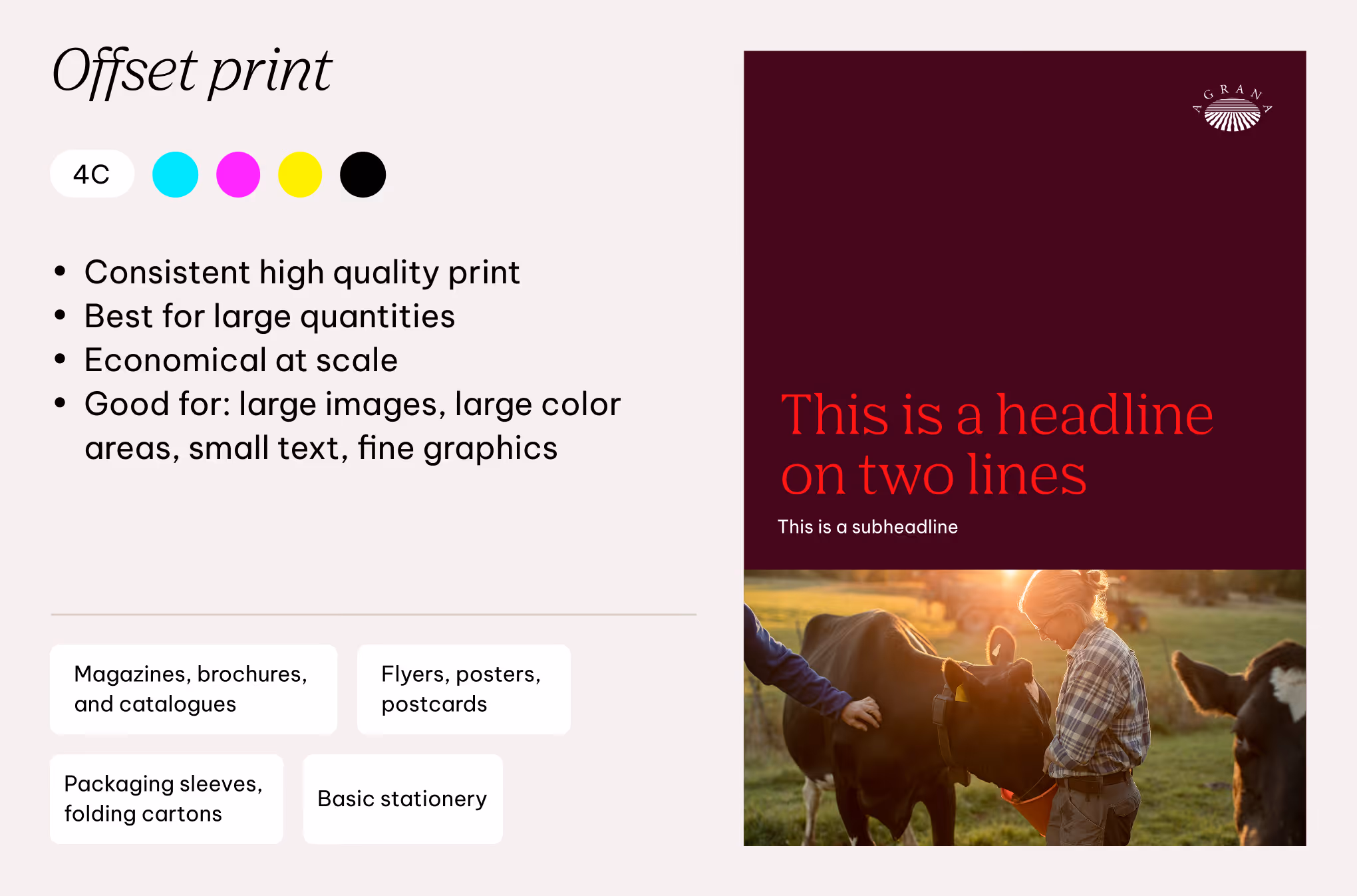
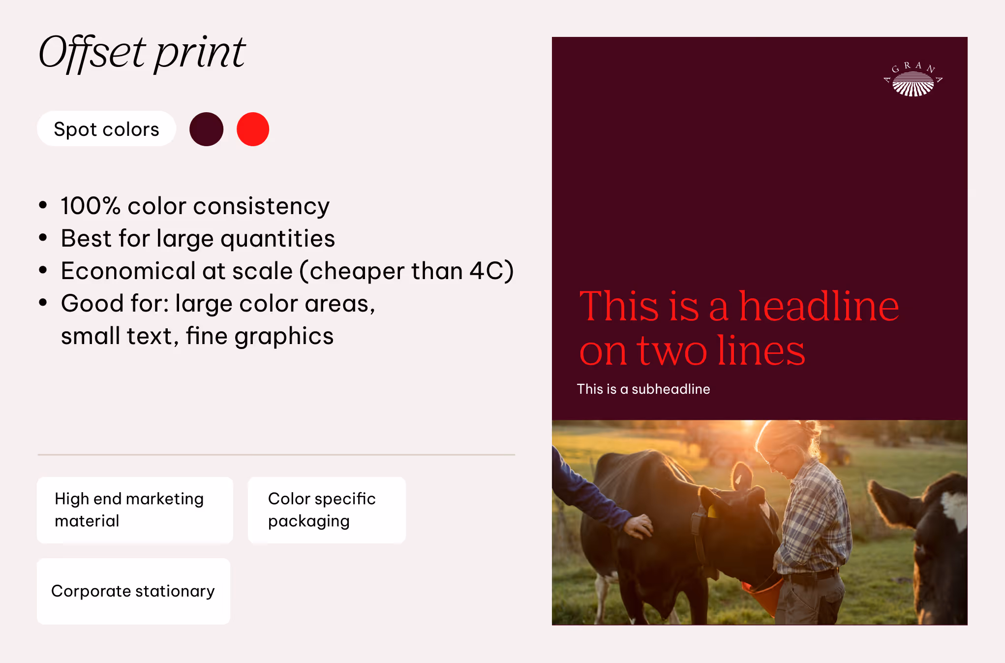
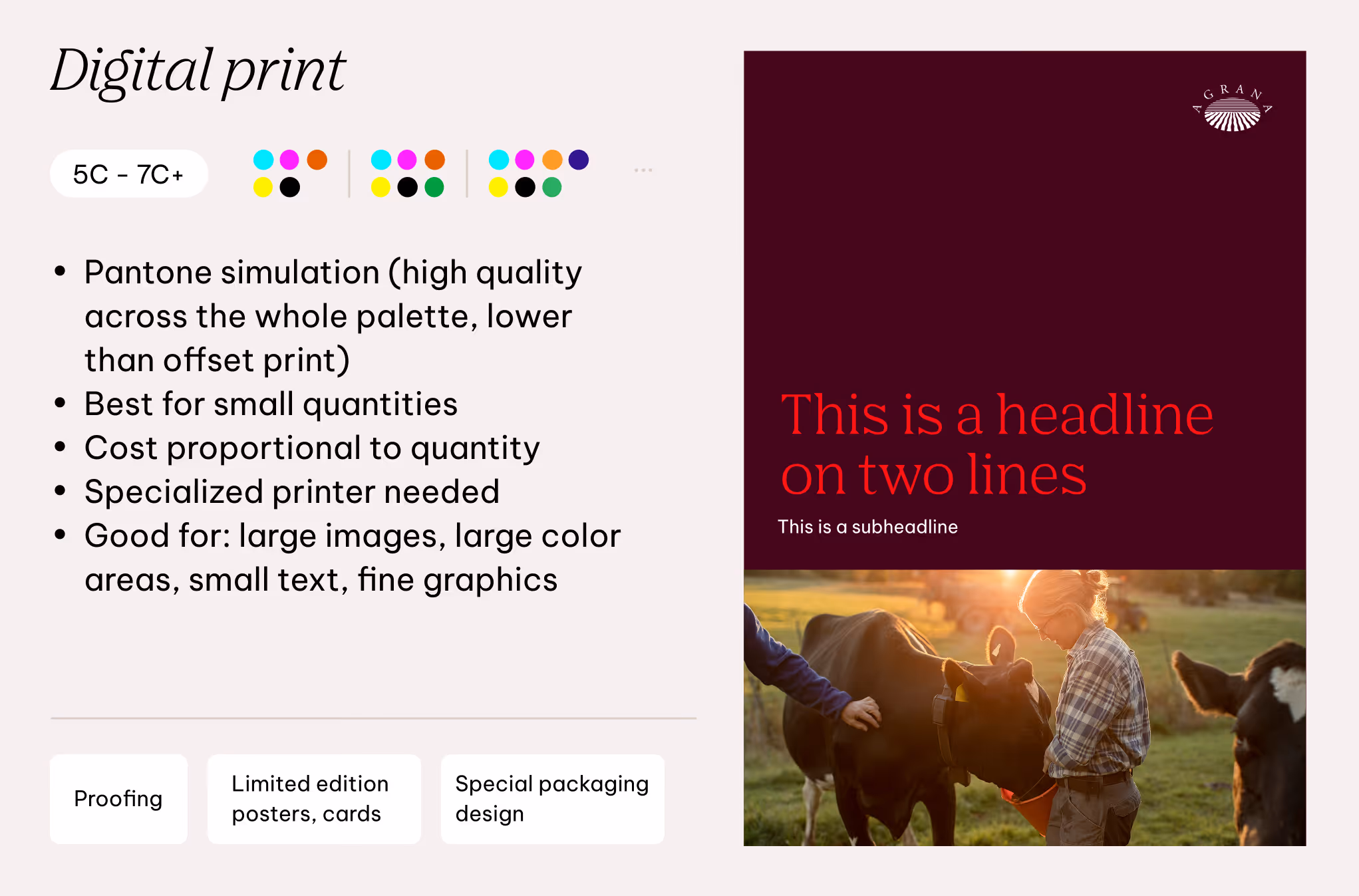
Printing methods and colour reproduction
Selecting the appropriate printing method ensures the AGRANA palette is reproduced accurately.
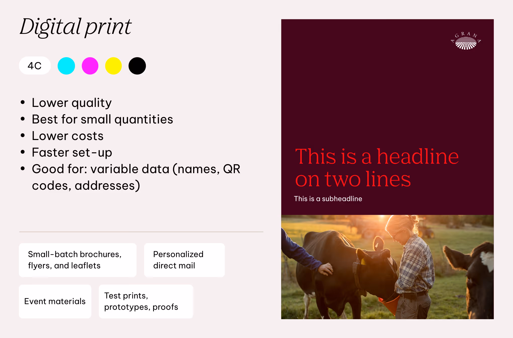
The color palette allows for 4 channel and spot color offset printing for consistent brand colors in larger runs. For digital printing, both 4 channel and extended 5 to 7 channel options are supported, allowing for greater flexibility and a wider color range.
The choice of printing method depends on the required color fidelity, quantity, and application.
Don'ts
The following guidelines outline what to avoid and what is not permitted in color usage. For detailed instructions on specific elements, refer to each element’s dedicated chapter.

We don’t use shades as backgrounds
To keep a bright and light brand feel, we only use Dark Red as a dark option for backgrounds, selectively. All shades should be used only for creating contrast in bright compositions.
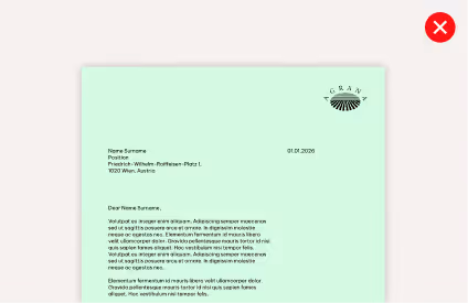
We don’t use secondary colors for the logo
The only colors allowed are white, black and multicolored.

We don’t use primary colors for text
Only AGRANA Red is allowed to be used in text components, however only in selected occasions. Black and white are preferred colors.

We don’t use low contrast color combinations
When it comes to text and graphic components, follow the color combinations to achieve correct accessibility and readability.

We don’t use AGRANA Red unless specified
To maintain its boldness and readability, AGRANA Red may only be used on the defined colors and backgrounds.
We don’t use secondary colors for primary touchpoints
For recognizability and memorability, we use primary colors for the primary touchpoints, such as business cards or letterheads.