Editorial
Design basics
Our editorial guidelines define two main categories of publications: single-page and double-page formats. Each category supports different communication needs and content depths across our touchpoints.
Recommended formats
These guidelines are based on A4 formats. We generally recommend standard formats (e.g., DIN formats) to keep costs down, minimize waste, and simplify print runs. It’s possible to explore more creative and non-standard formats for smaller print runs.
Single pages: e.g., product fact sheets, flyers
Double pages: e.g., white papers, product and image brochures
Formats covered in these guidelines:
- Product fact sheets (single, double-sided, multi-page)
- Image brochure
- Product brochure
- White paper
Approaches
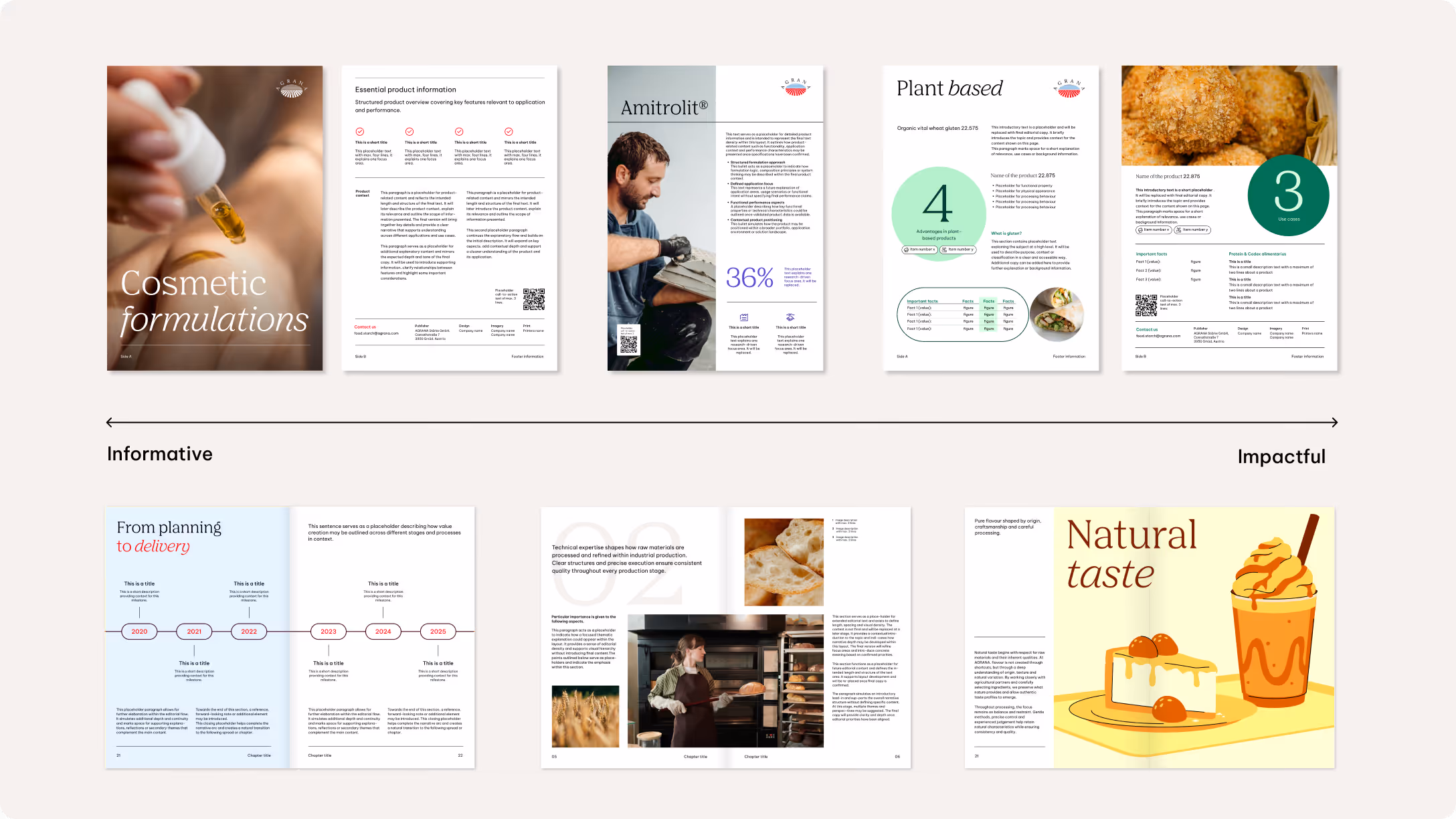
Our editorial design is guided by two complementary compositional approaches: informative and impactful. The chosen approach depends on the communication objective, content density, and desired level of visual emphasis.
We use the informative approach for content-focused formats with a high amount of text and supporting imagery. A clear, restrained layout prioritizes readability and structure, presenting information in a balanced and accessible way.
We apply the impactful approach to achieve a stronger visual presence or emotional resonance. This may involve emphasizing imagery, color, and scale to create a more expressive appearance while still remaining consistent with our overall design system.
Grids and margins
We generally use a base unit margin of 3x across all publication formats. Adaptations are possible, though, depending on specific requirements. To ensure flexibility while maintaining a tidy layout, we recommend a grid division of 6 columns and 12 rows. It’s possible to add an optional gutter measuring 1x base unit.
The logo size is defined using base units. Depending on the content, the recommended logo sizes are either 4x or 5x base units.
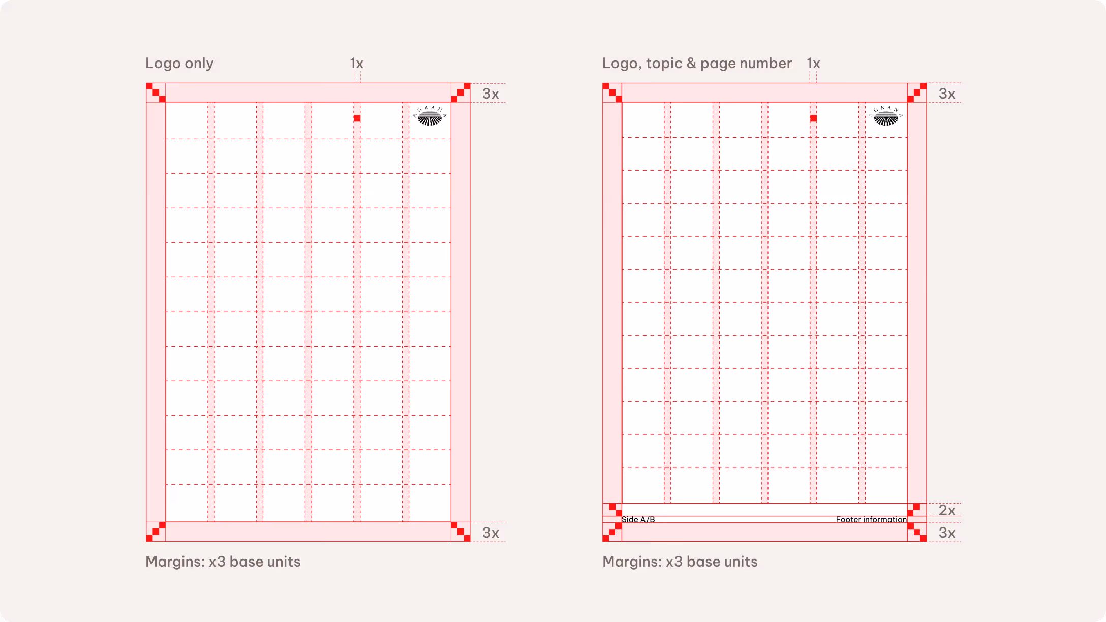
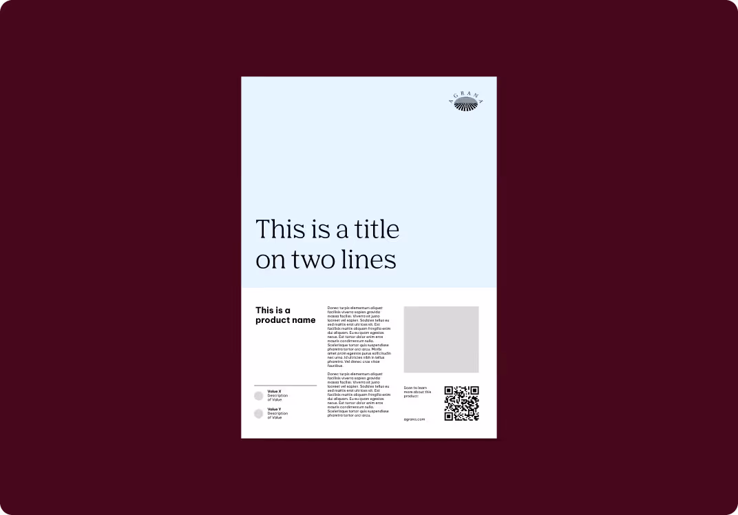
Single pages
Modifications to the standard grid are possible, depending on the requirements. Additional specifications apply when the layout requires page numbers and a standardized footer.
Place page numbers and footer information within a 3x base unit margin. An additional safe zone of 2x base units separates the main content and the footer. You can reduce this to 1.5x base units if the touchpoint is not very content heavy.
The footer may include the document topic, website URL, or short disclaimer.
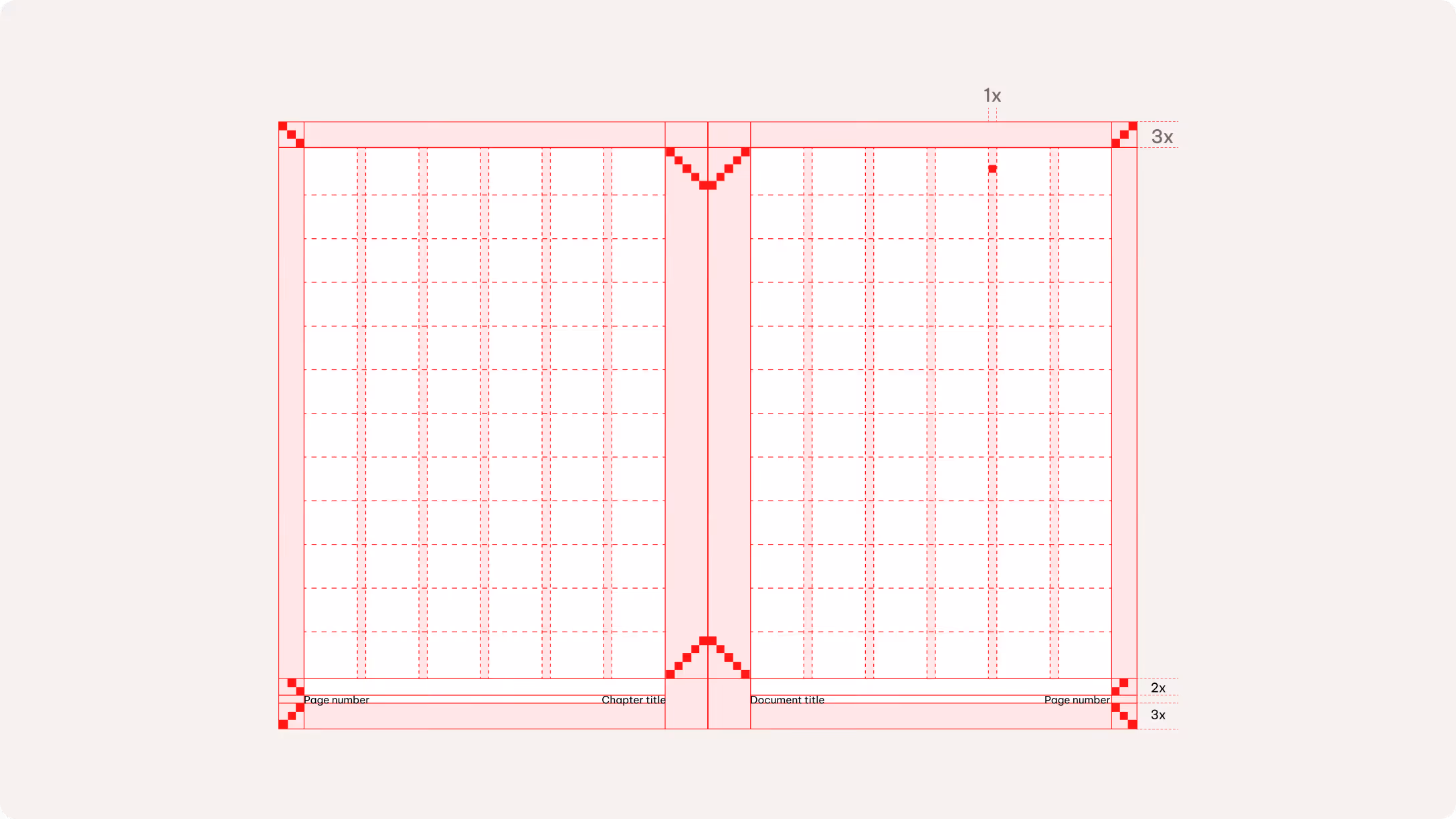
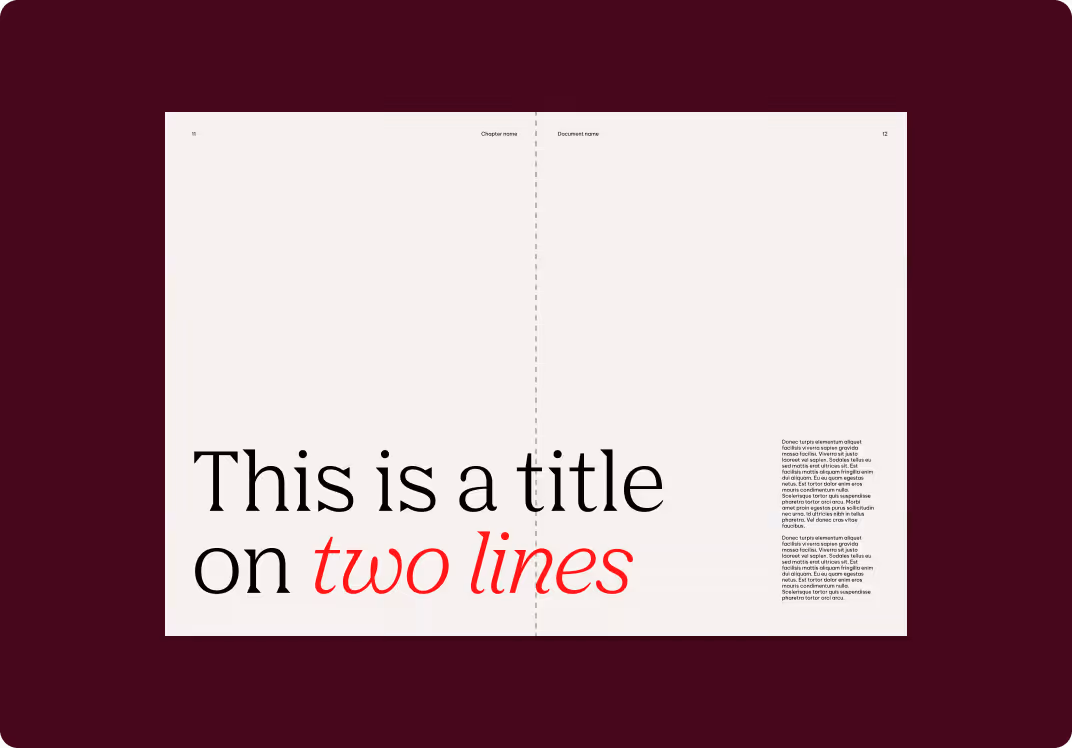
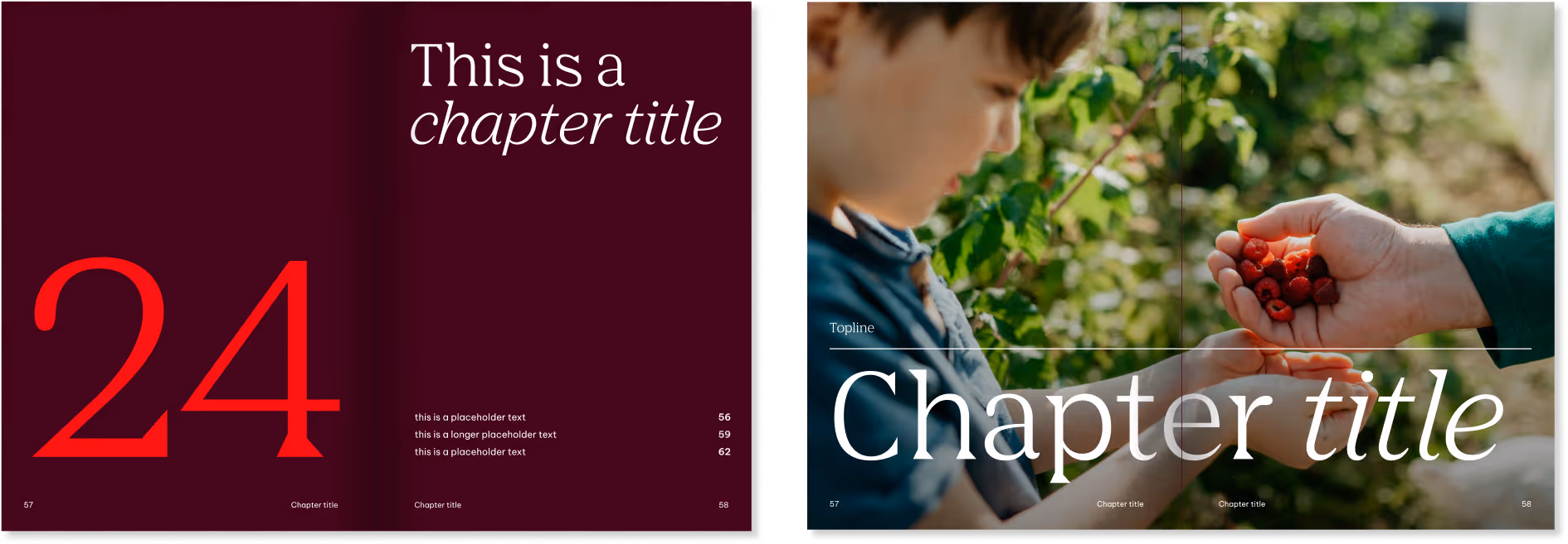
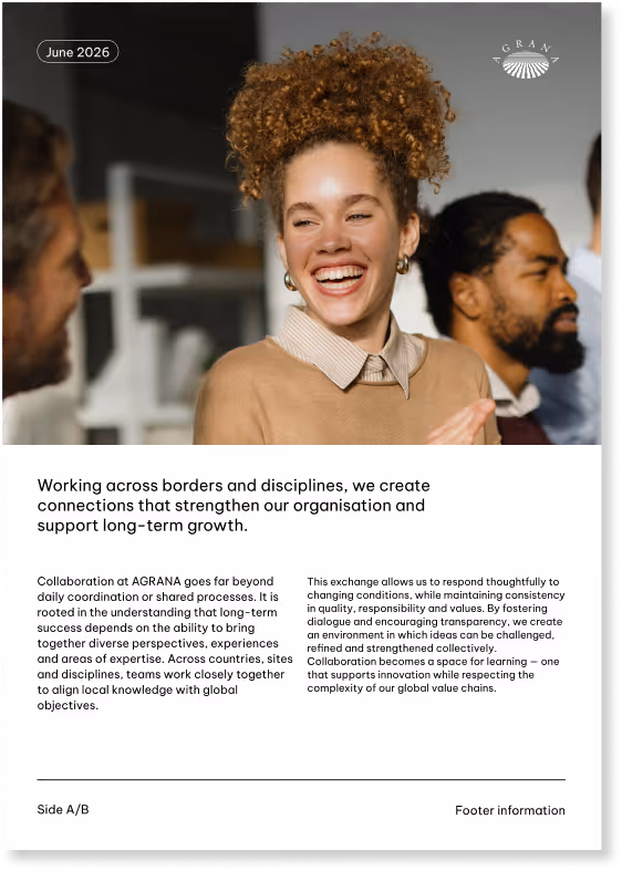
Double pages
Like the single-page approach, we maintain a margin of 3x units on the top, outside, and bottom edges. The inside edge requires a wider margin of 5x units to allow for binding in thicker formats.
We position footer information and page numbers 3x units from the outer margin, with a 2x-unit safe zone above to separate them from the main content. This safe zone may be reduced to 1.5x units when content density allows. Once a safe zone is defined, it must be applied consistently throughout the entire document. Don’t use different safe zone values within the same layout.
Please see the Layout chapter to learn more about the base unit rules.
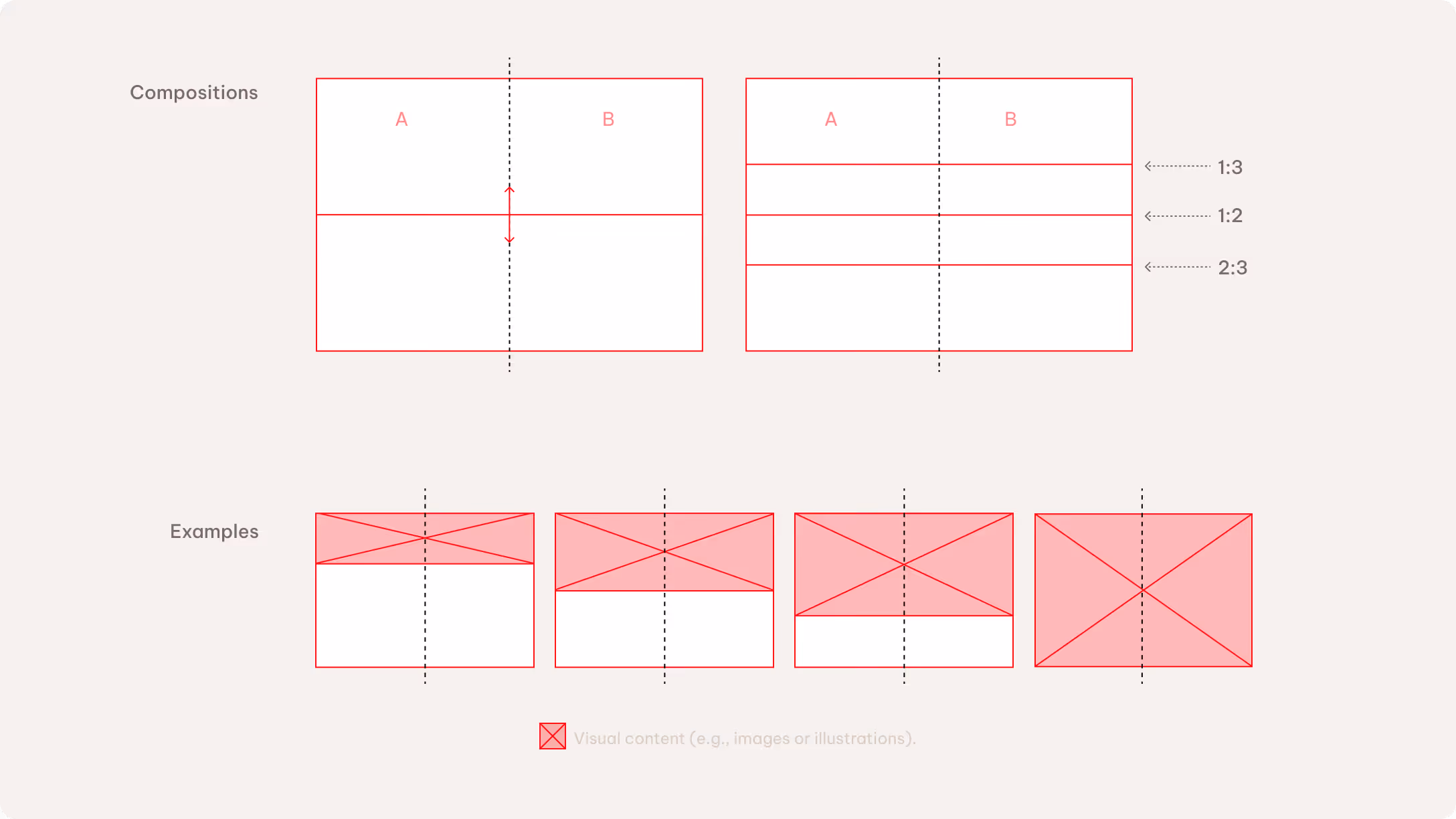
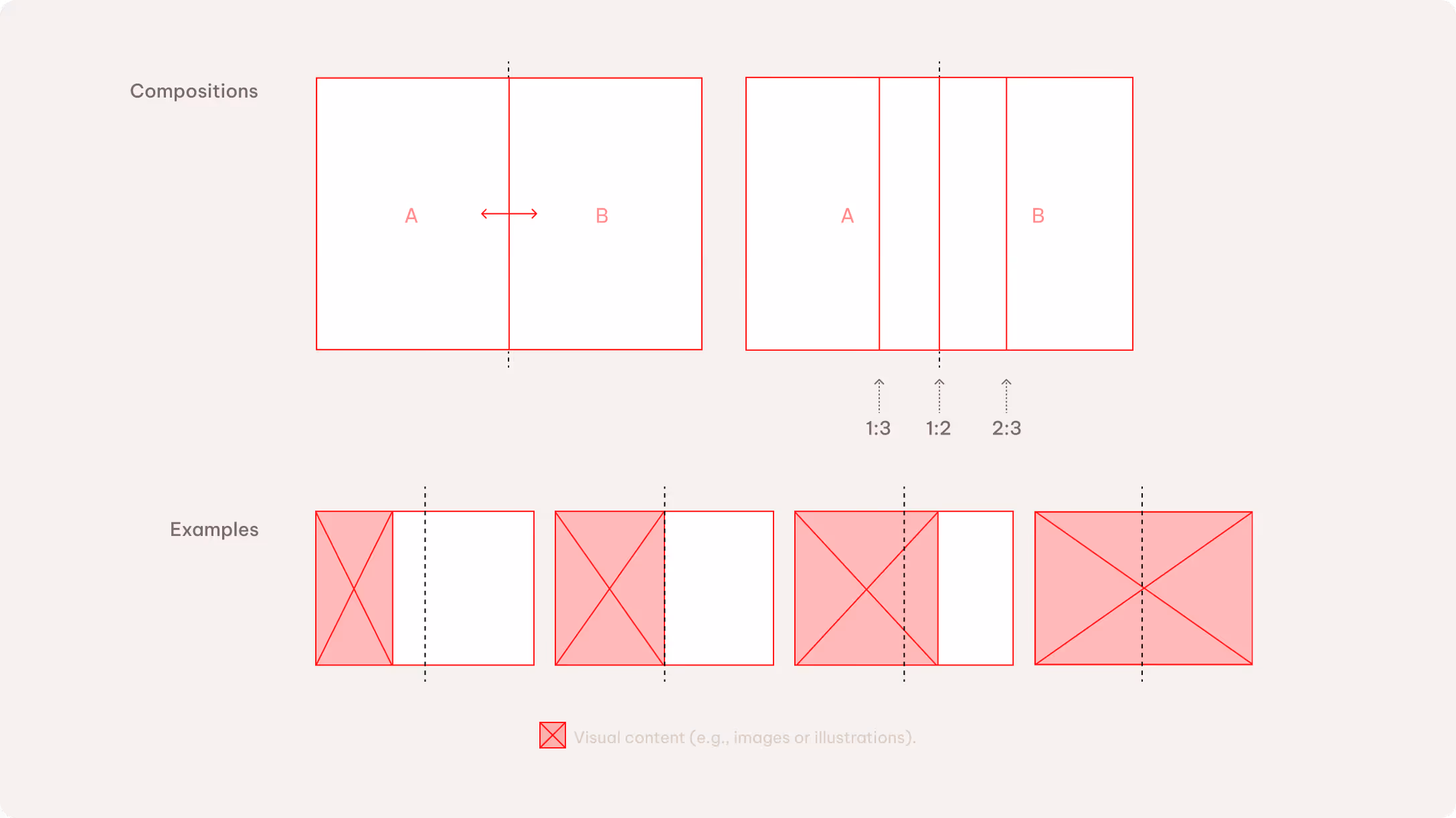
Layout composition
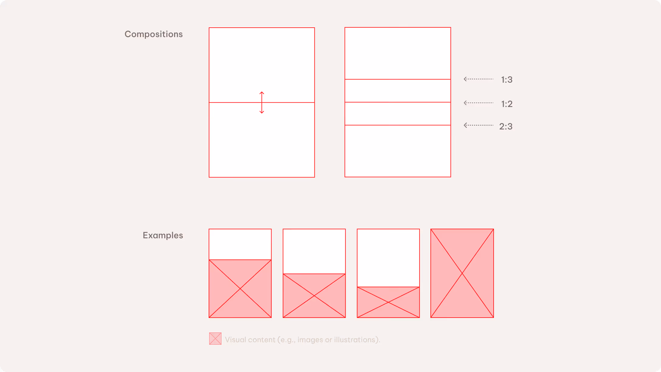
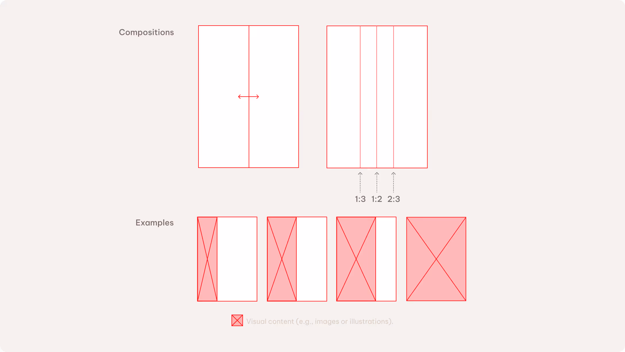
We use three layout compositions across all formats: full bleed, vertical division, and horizontal division. Each layout uses one composition. The split ratio can be adjusted to 1:3, 1:2, or 2:3, depending on the communication need.
Full-bleed layouts are used for image-led content that requires a strong visual impact. They work with both visual imagery and solid color backgrounds.
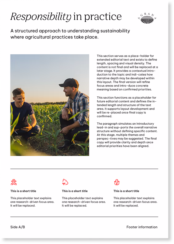
Split layouts create a clear balance between image and text. The default orientation is a vertical division in landscape formats and a horizontal division in portrait formats, with the flexibility to adapt across different formats.
Increasing the image area strengthens the visual emphasis, while increasing the text area supports clarity and structure.
Single pages
We generally recommend using a horizontal split for content-heavy touchpoints in single-page formats. A vertical split is better to achieve a more inspirational look.
Double pages
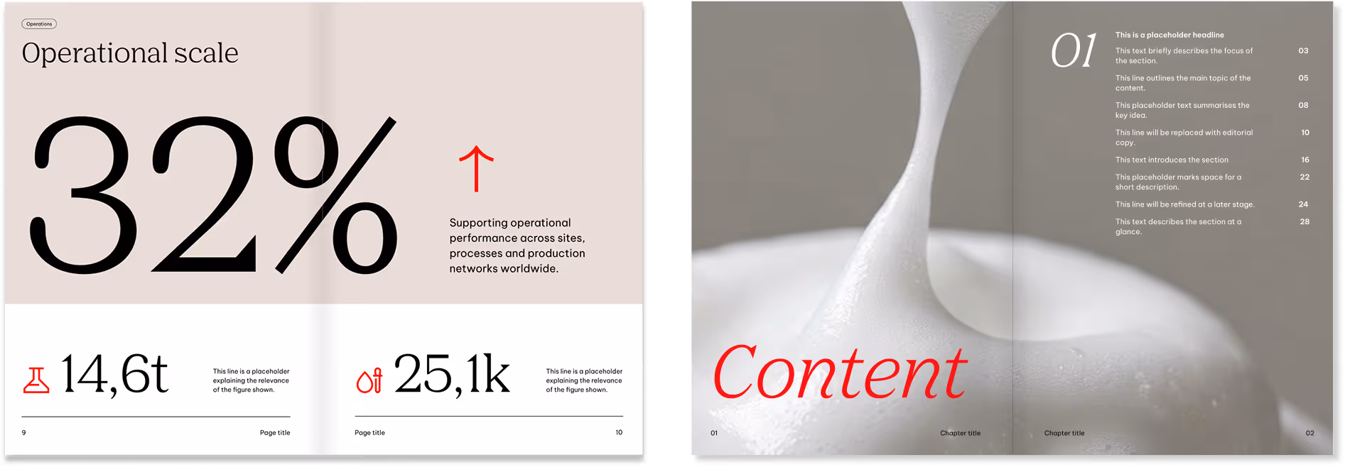
Double-page layouts follow the same compositional logic as single-page formats. The available space is divided either vertically or horizontally using one of three proportions (1:3, 1:2, or 2:3).
There are two ways to create the double-page spread: The first approach splits both pages to create a more impactful visual result. The second approach treats the two pages as standalone layouts and follow the single-page format rules. In this case, only one page uses a split composition, while the other remains either a plain background or a full-bleed image.
Color application
The primary and secondary palettes serve different purposes and carry different levels of recognizability.
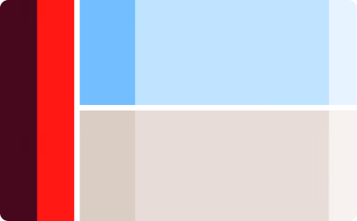
Primary colors
We use the primary palette as the main color expression for AGRANA to reinforce recognizability and consistency. It is the default choice for corporate applications and standalone documents, such as media press releases.
Backgrounds, infographics, illustrations, icons
Illustration highlights, infographics, text components, icons
Logo, backgrounds, illustration highlights, infographics, text components, icons
Logo, backgrounds, illustration highlights, infographics, text components, icons
Secondary colors
We use the secondary color palette selectively and intentionally to introduce character and visual dynamism. It’s best suited for accents, smaller elements, and interior pages within a document.

Color balance
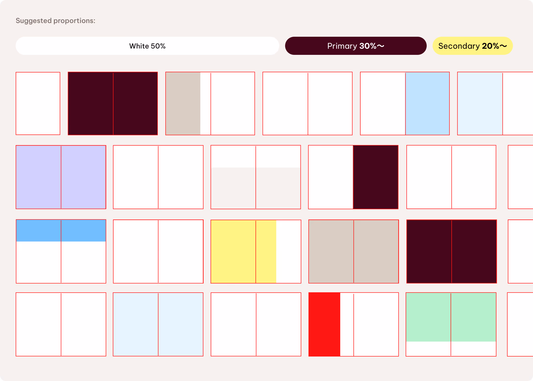
When working with multi-page documents, we treat color balance at the document level. White is the primary background color to keep content digestible and visually light while supporting clarity.
We use primary and secondary colors in an intentional and controlled way. White takes up 50% of the overall visual space, primary colors account for 30% of backgrounds and elements, and secondary colors make up the remaining 20%.
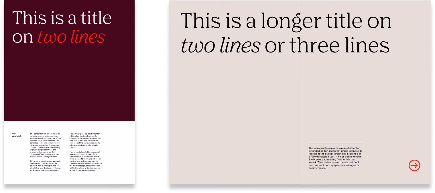
Typography
We define almost all type sizes proportionally to maintain a clear, consistent hierarchy across all formats.
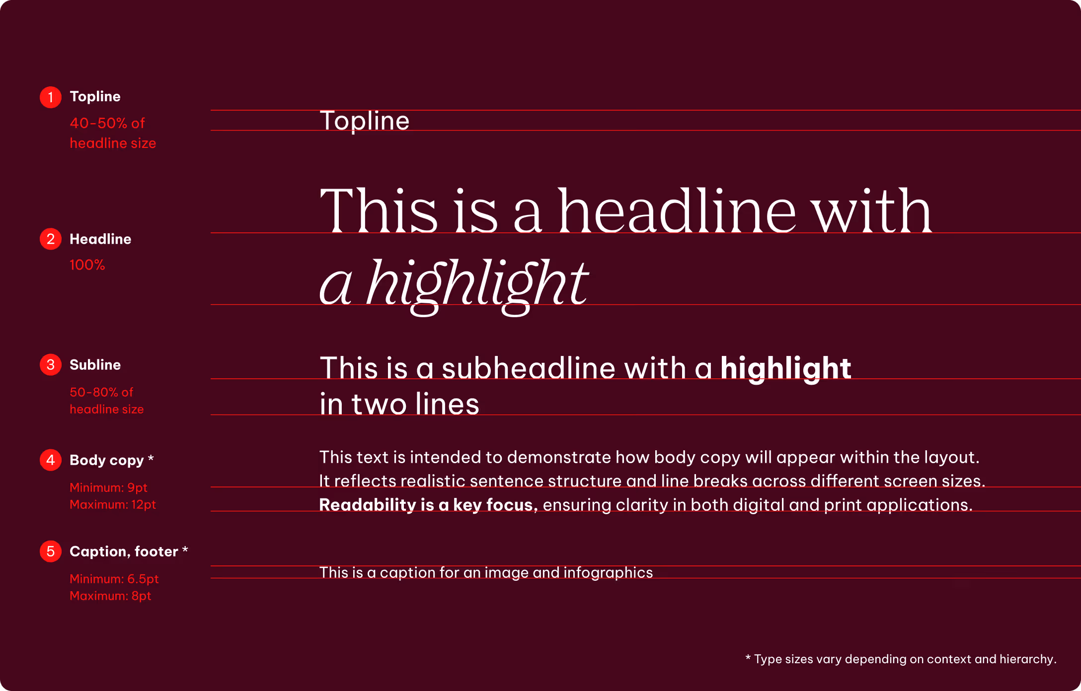
Headlines
The headline sets the base size. All other styles scale from it. Toplines and subheadlines follow this lead to maintain a consistent hierarchy and proportions.
Body copy, captions and footers
Body copy and captions are defined by layout, format and context — from accessibility needs to contrast ratios and reading distance. Their sizing is independent from headlines, ensuring suitability in every situation.
Special cases
In addition to standardized text hierarchies, we treat sizes more expressively in special cases such as infographics and chapter dividers.
Line elements
We use lines as supporting tools within the layout system to anchor and structure content, creating a clean and balanced composition. Lines reinforce hierarchy, anchor elements, and enhance layout balance. It’s not necessary to use them in every layout.
Style
We use lines with straight caps and joins. The standard line thickness for full HD resolution (1920 × 1080 px) is approximately 1 pt. Adjust the line weight as needed for different resolutions, sizes, and the specific requirements of each touchpoint.
Calls to action
We present calls to action either as a QR code or a written website reference, depending on the format and context.
QR codes must be black on white or white on black to ensure maximum legibility and reliable scan performance. As purely functional elements, they should remain neutral and not serve as decorative or branding elements.
When text is required, it should remain concise and not exceed three lines. We place QR codes in one of the bottom corners of the format to maintain a clear visual hierarchy and avoid interference with the main content.
They must be clearly legible and proportionate to the overall layout. The minimum size is 2 cm. Always ensure sufficient contrast with the background. It’s possible to use a bounding box to protect the information if needed.
We use a clear, concise URL if just a website reference is required. It may appear in a standard text container or in footer-style utility areas, depending on the format and platform.

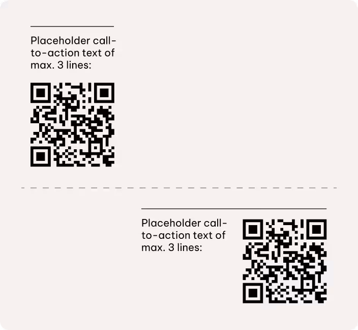
CTA placement on light background
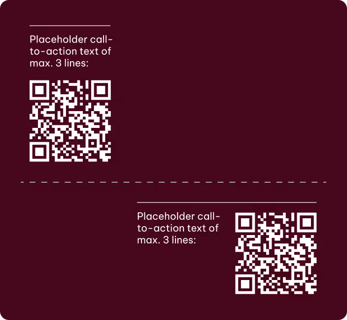
CTA placement on dark background
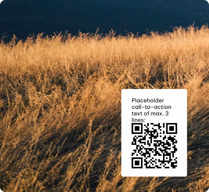
CTA placement on images
Best practices
Please note
The following best practice applications are provided for reference and inspiration. The examples for illustration purposes only. They’re intended to support the guidelines rather than represent final executions.
They outline the underlying principles that inform creative development and should be interpreted and adapted according to the specific requirements of each application.
Please visit the respective chapters in the Brand Elements guidelines to learn more about how to use the different brand elements,
Single pages
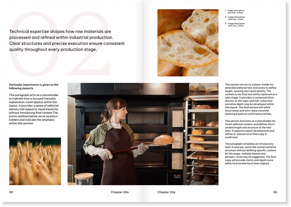
Here are a few examples of how our layout system works across different single-page formats while keeping communication clear and consistent.
We will add more best practice examples at a later date.
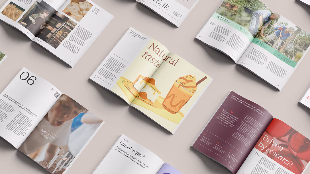
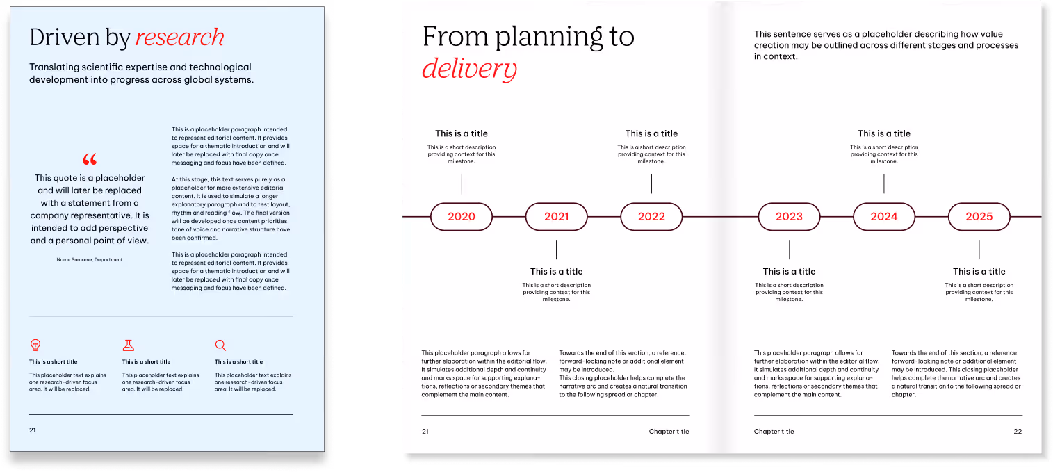
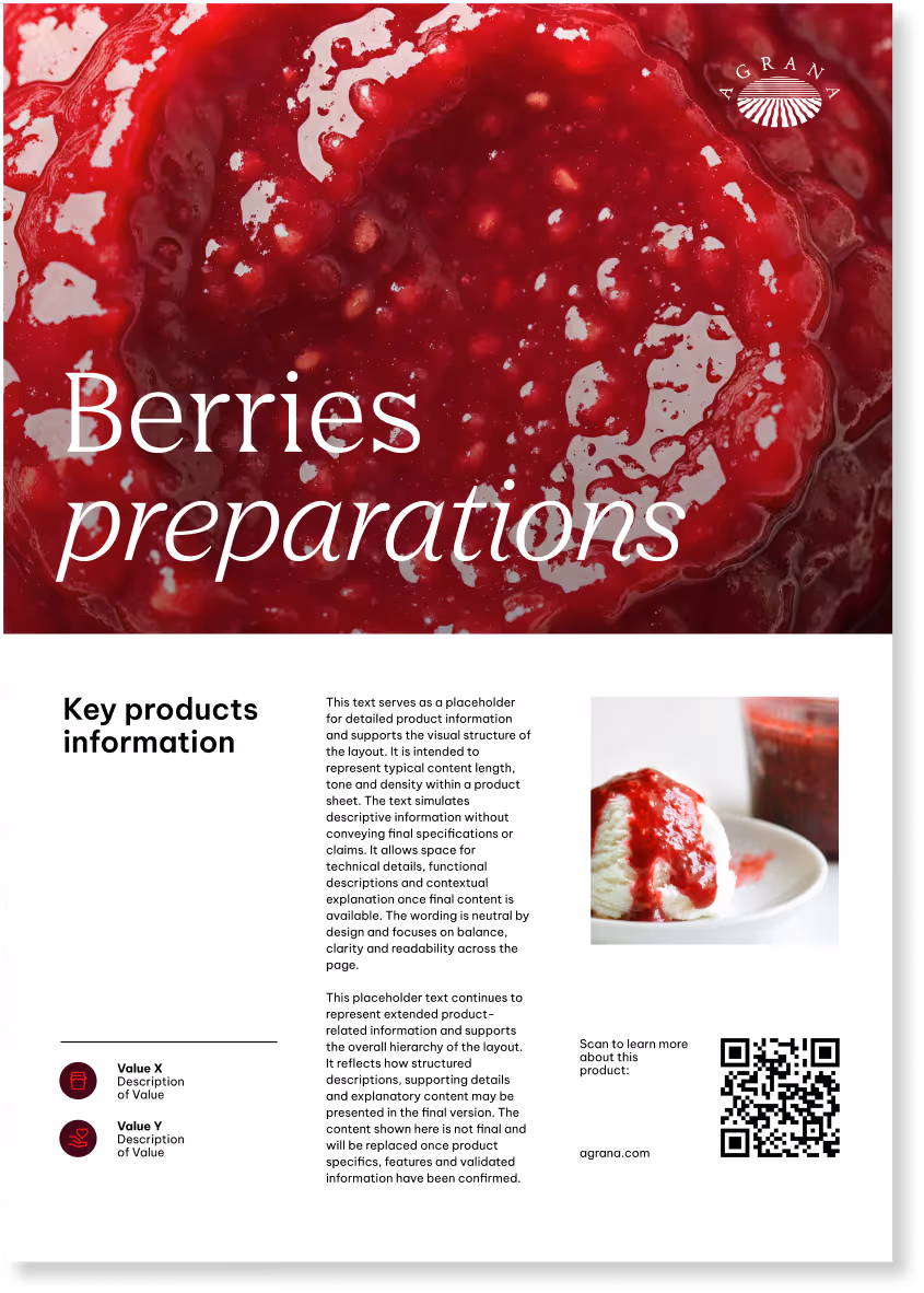
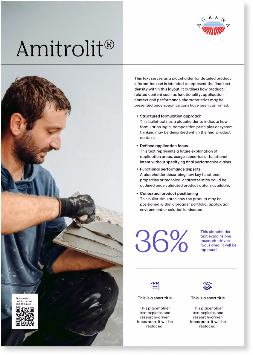
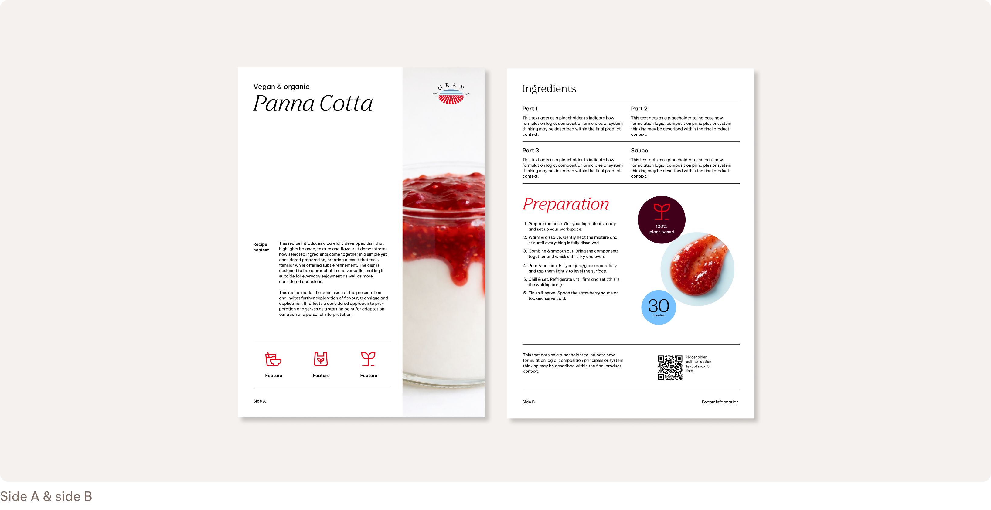
Product fact sheets
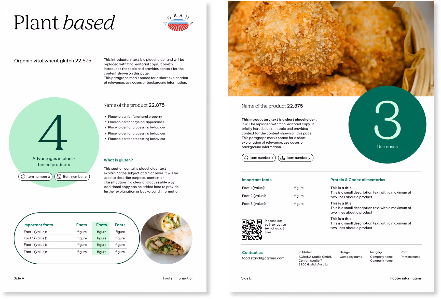
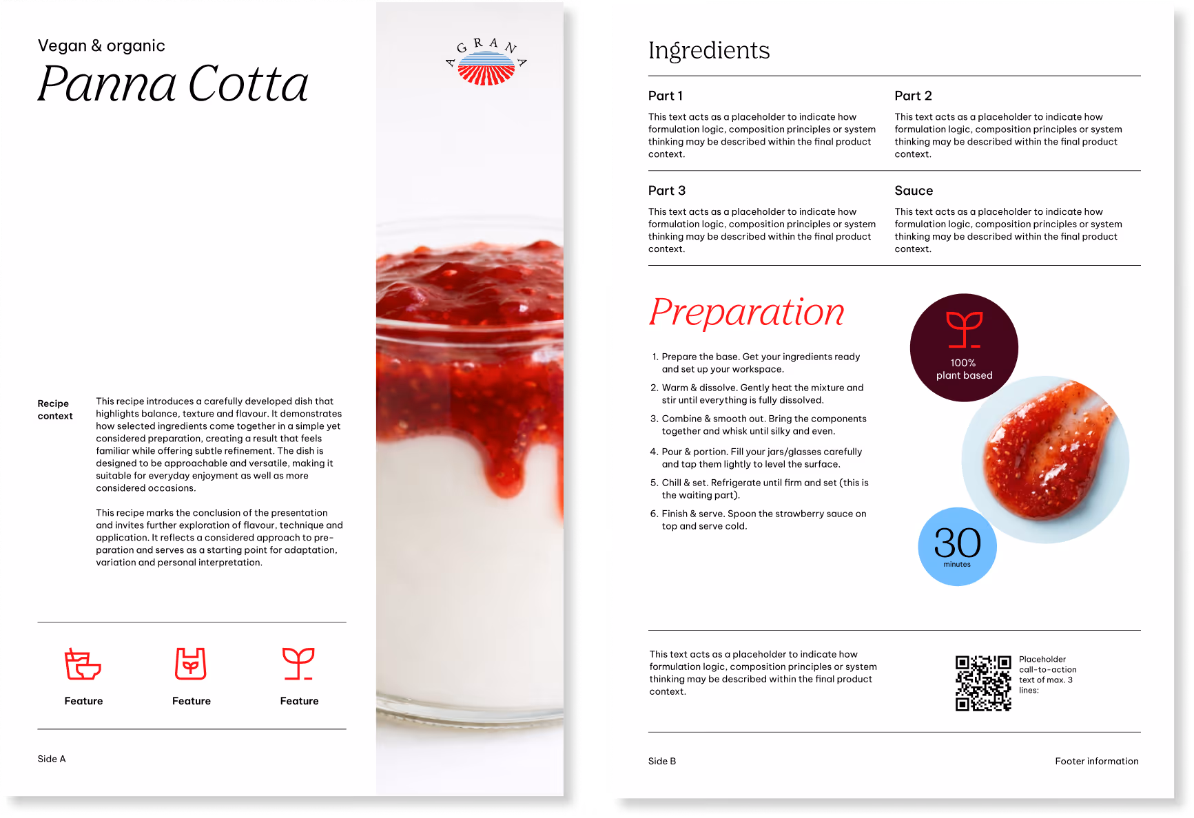
Focus topics (selected cases)
This content goes beyond product information or formal press communication to include things like recipes, market insights, sustainability topics, or innovation highlights. We use it to provide a broader context and explore themes related to our markets and areas of expertise.
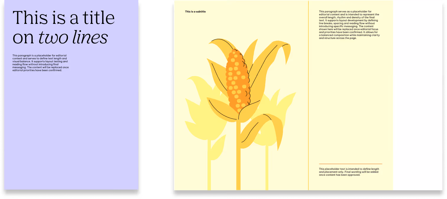
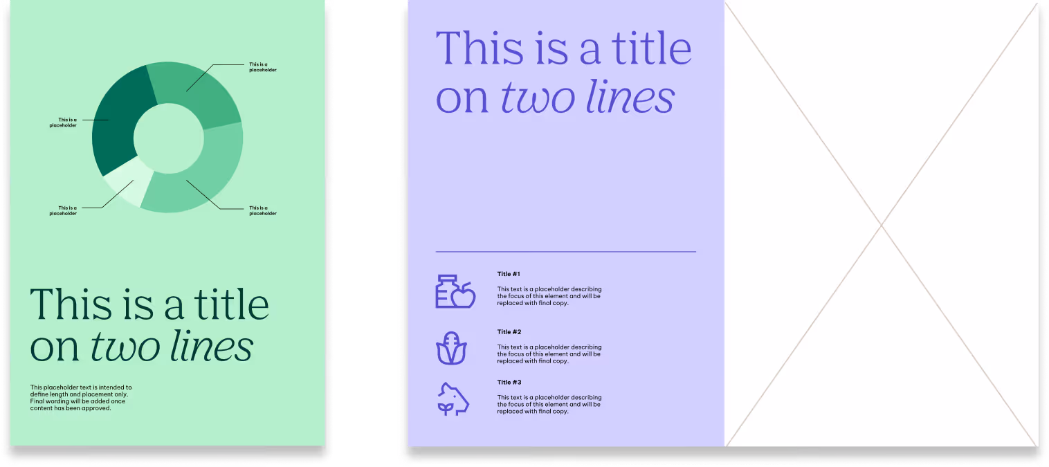
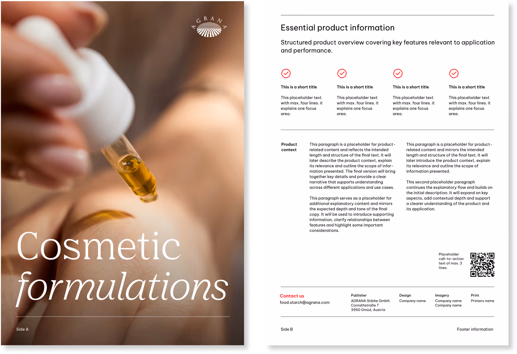
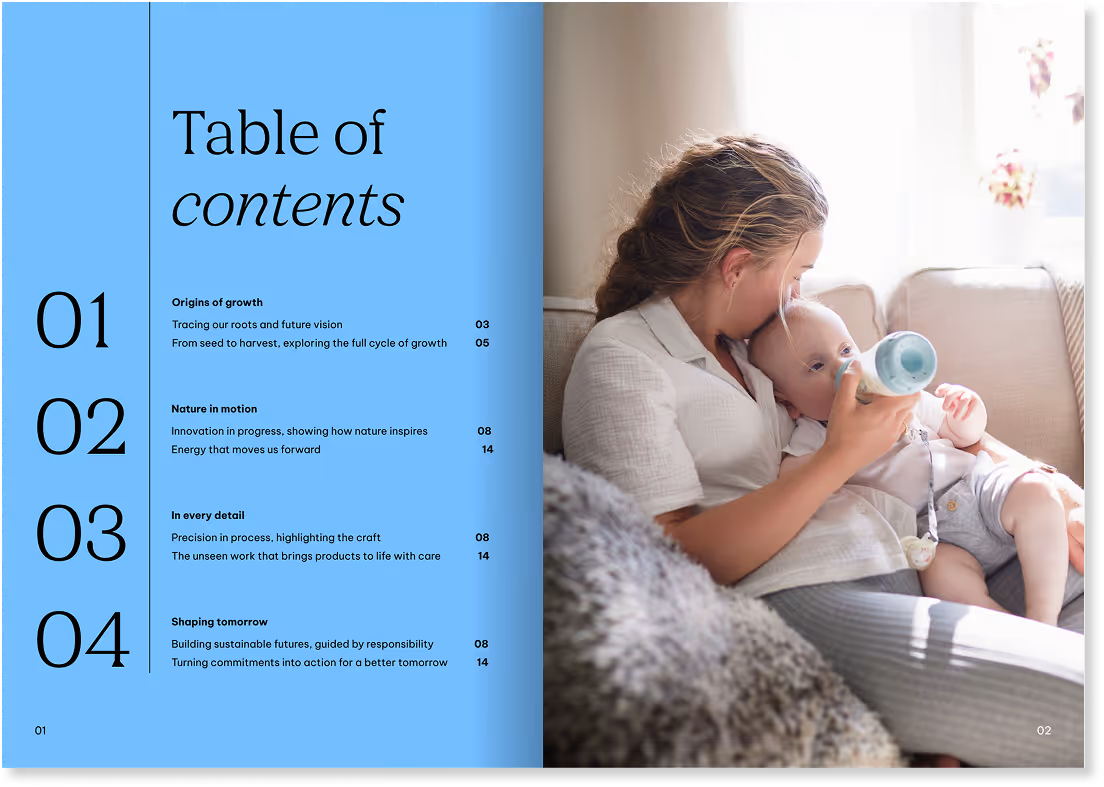
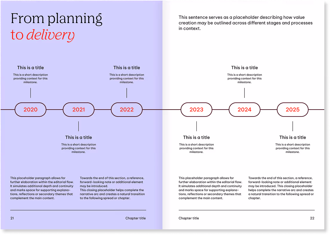
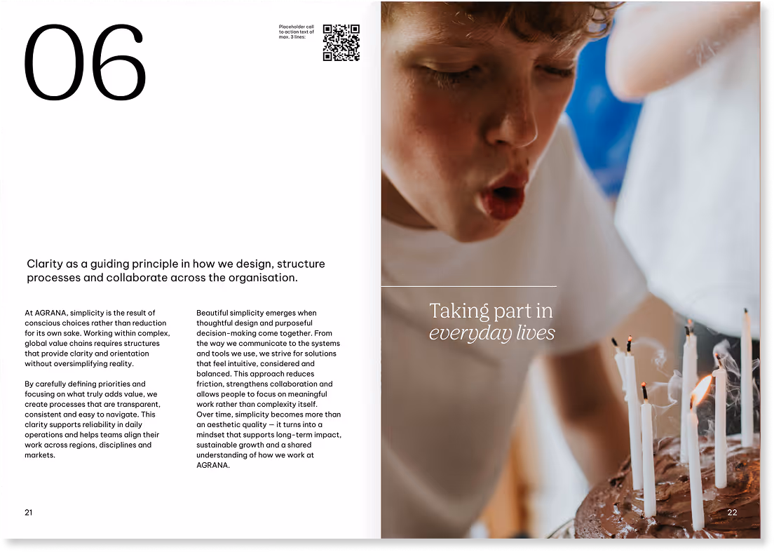
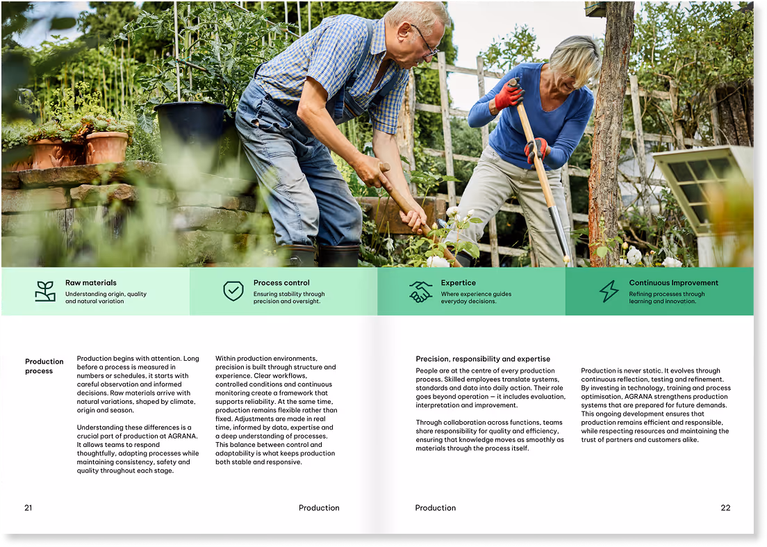
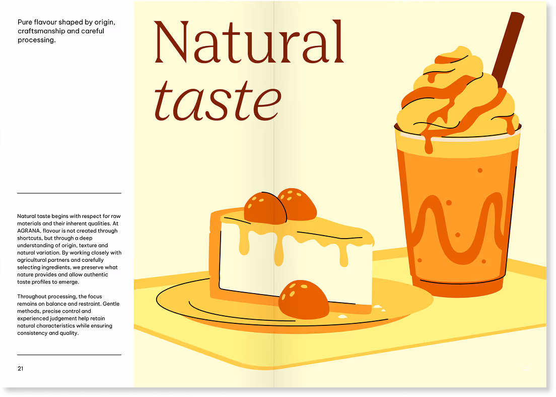
Double pages
The following examples illustrate how our layout system works across different double-page formats while maintaining clarity and consistency.
We will add more best practice examples at a later date.
Don'ts
The following examples illustrate applications that don’t align with our design principles.
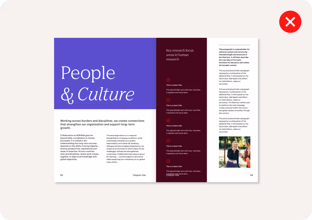
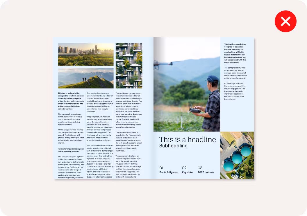
We don’t split double-page layouts in different directions.
A spread should follow one consistent direction to maintain visual clarity and balance.
We don’t overcomplicate or overload layout compositions.
Layouts should be clear, focused and easy to navigate with each element serving a defined purpose.
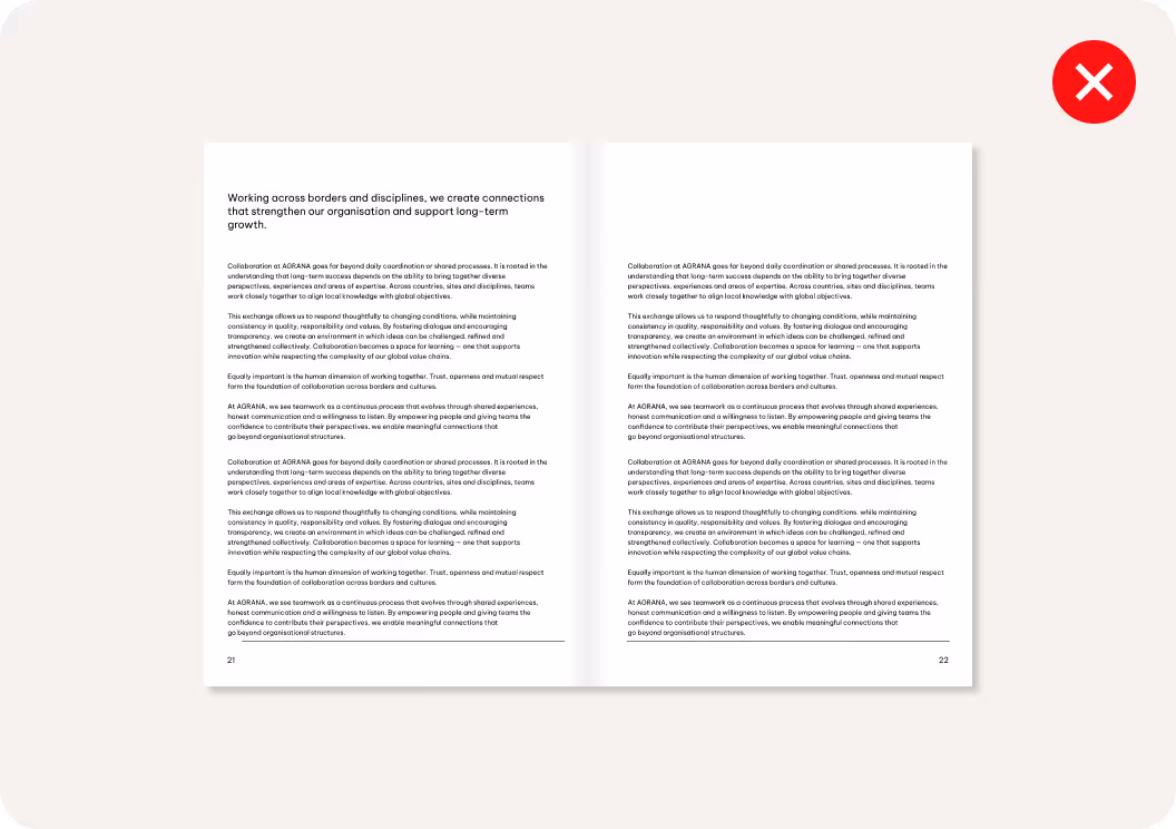
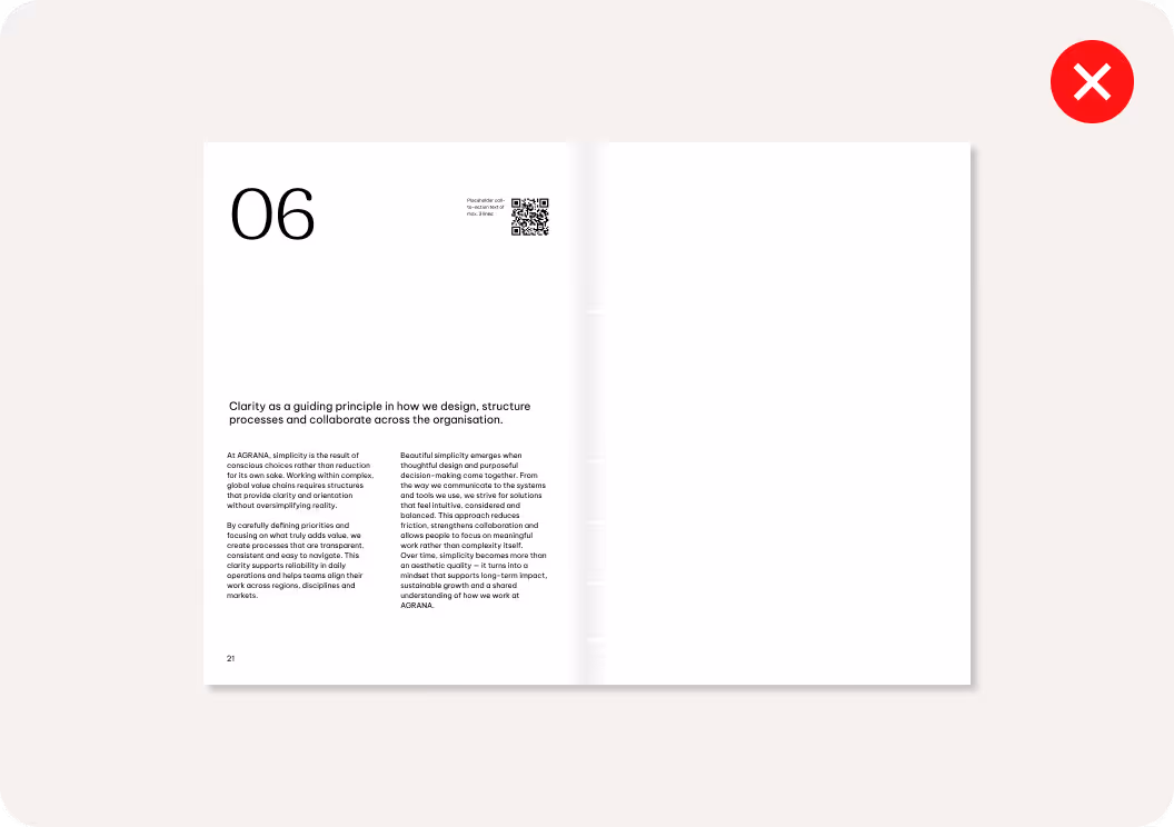
We avoid pages of lengthy text.
Content should be easy to read and quick to scan.
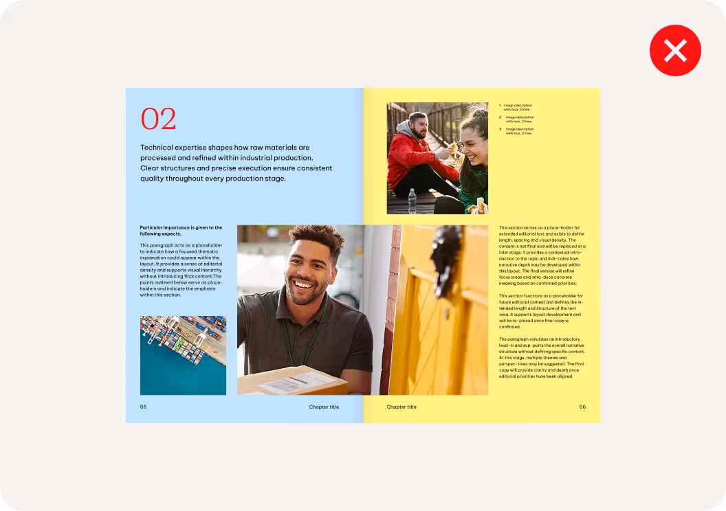
We don’t use too many colors on one page.
Each color should support the text hierarchy and meaning.
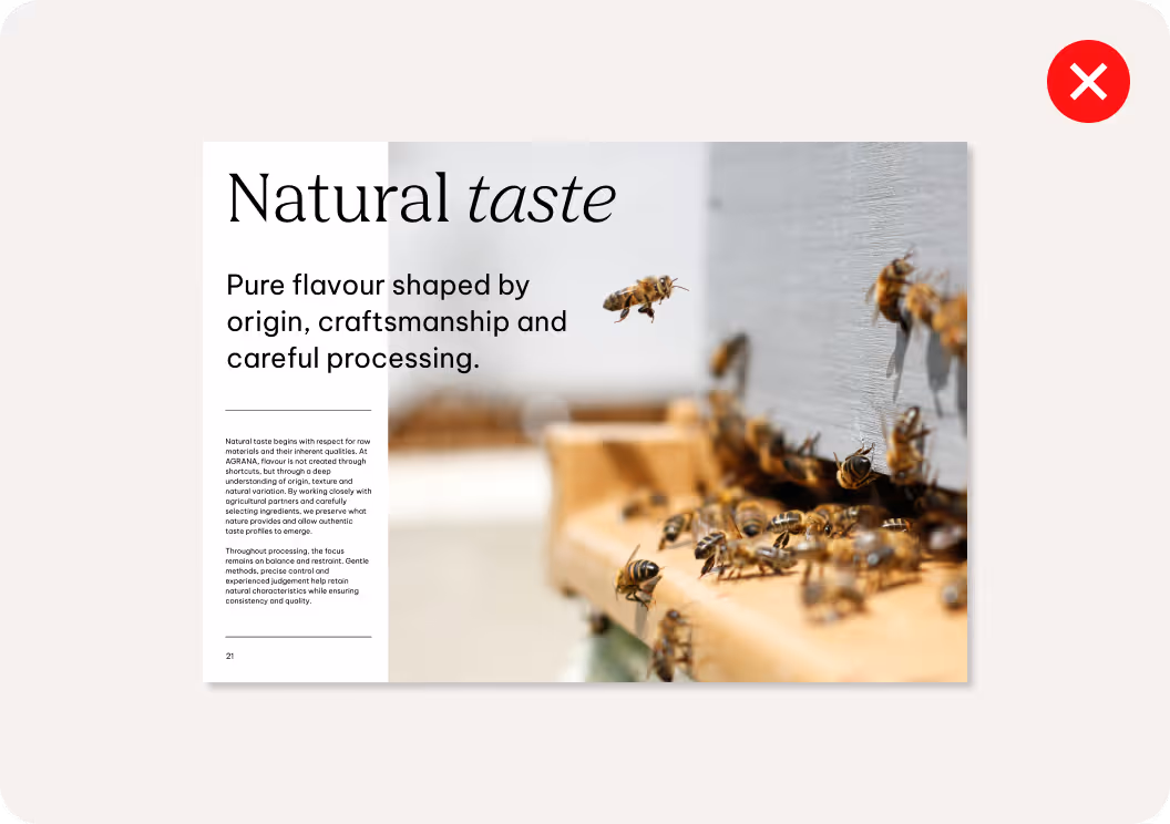
We avoid overlapping text with imagery or illustrations.
Text should remain clearly legible and visually separated from complex backgrounds.
We don’t use lines randomly.
Line elements should follow the layout structure and use balanced weights to remain subtle and support hierarchy.