Illustrations
Introduction
Illustrations bring concepts, stories, and processes to life through engaging, visually distinctive imagery. We use illustrations to clarify complex ideas, guide attention, and enrich communication within the AGRANA corporate design.
Crafted to harmonise with our overall identity, our illustrations ensure a consistent, recognizable AGRANA style across all media and touchpoints.
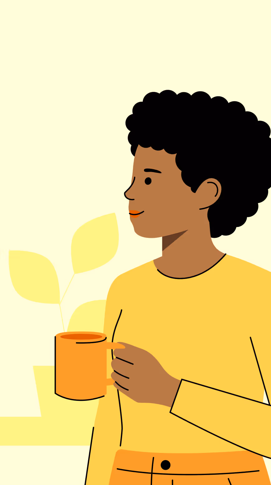
Warm & human
Our illustrations bring warmth, authenticity, and a human touch to every topic.
Clear & recognisable
We keep our illustrations simple and distinctive, so they’re instantly recognizable.

Consistent & scalable
We maintain one consistent style, no matter the application or size.

Style
Our illustration style combines clarity with personality. Built from clean lines, dynamic color, and layered simplicity, it balances technical precision with human warmth.
Subject
Our illustrations bring stories to life by focusing on the essential elements that shape our world. From the individuals at the heart of our work, to the tools and products that define our craft, and the environments that frame them — each subject plays a role in creating a clear, engaging visual narrative.
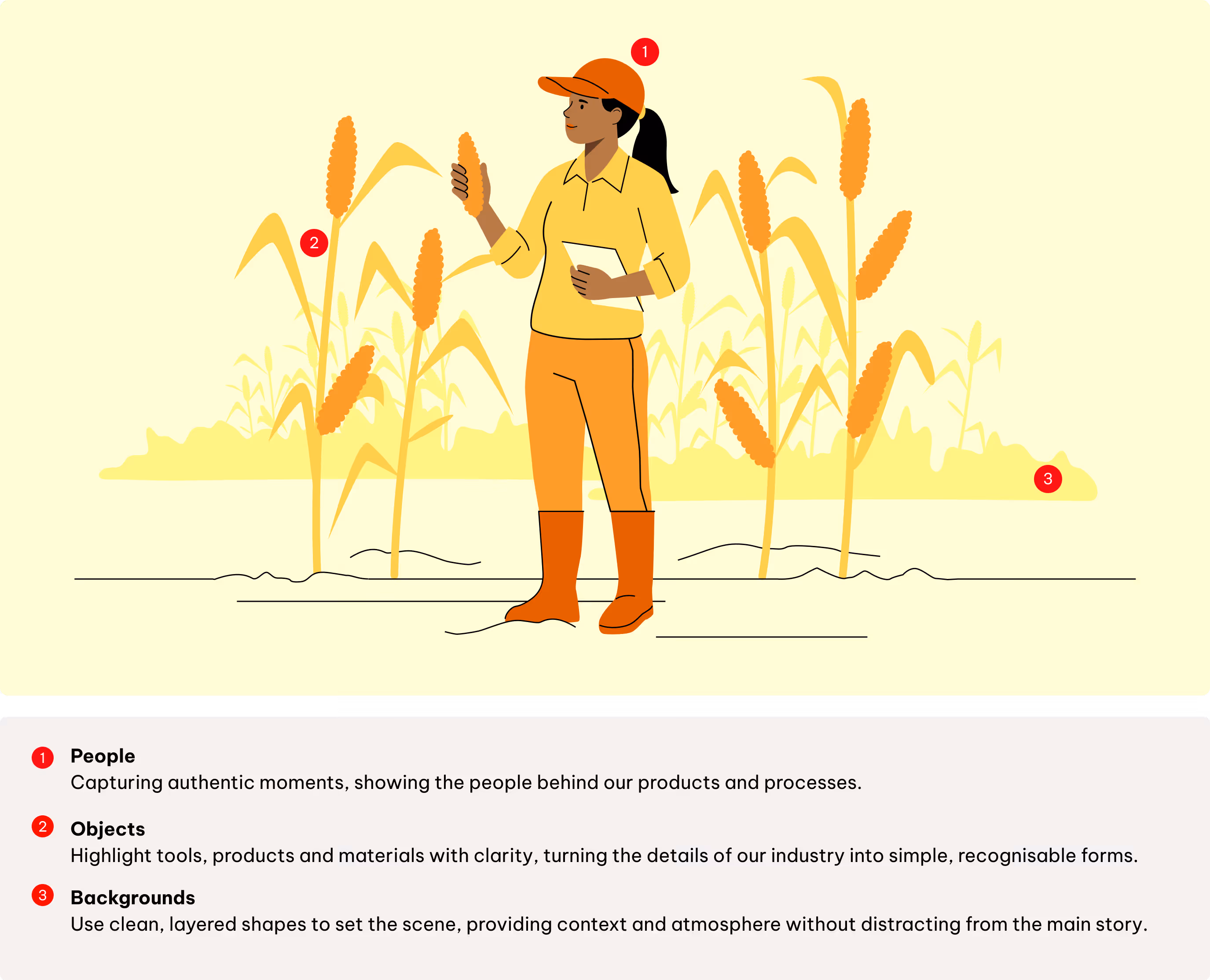
People
Our illustrations reflect diversity and inclusion not only through skin tones, but also by showing different body types, abilities, and cultural backgrounds.
Characters are drawn in a simple, reduced style, while still ensuring that the visuals feel relatable, respectful, and inclusive. This approach helps create a warm and human tone, consistent with the overall illustration system.
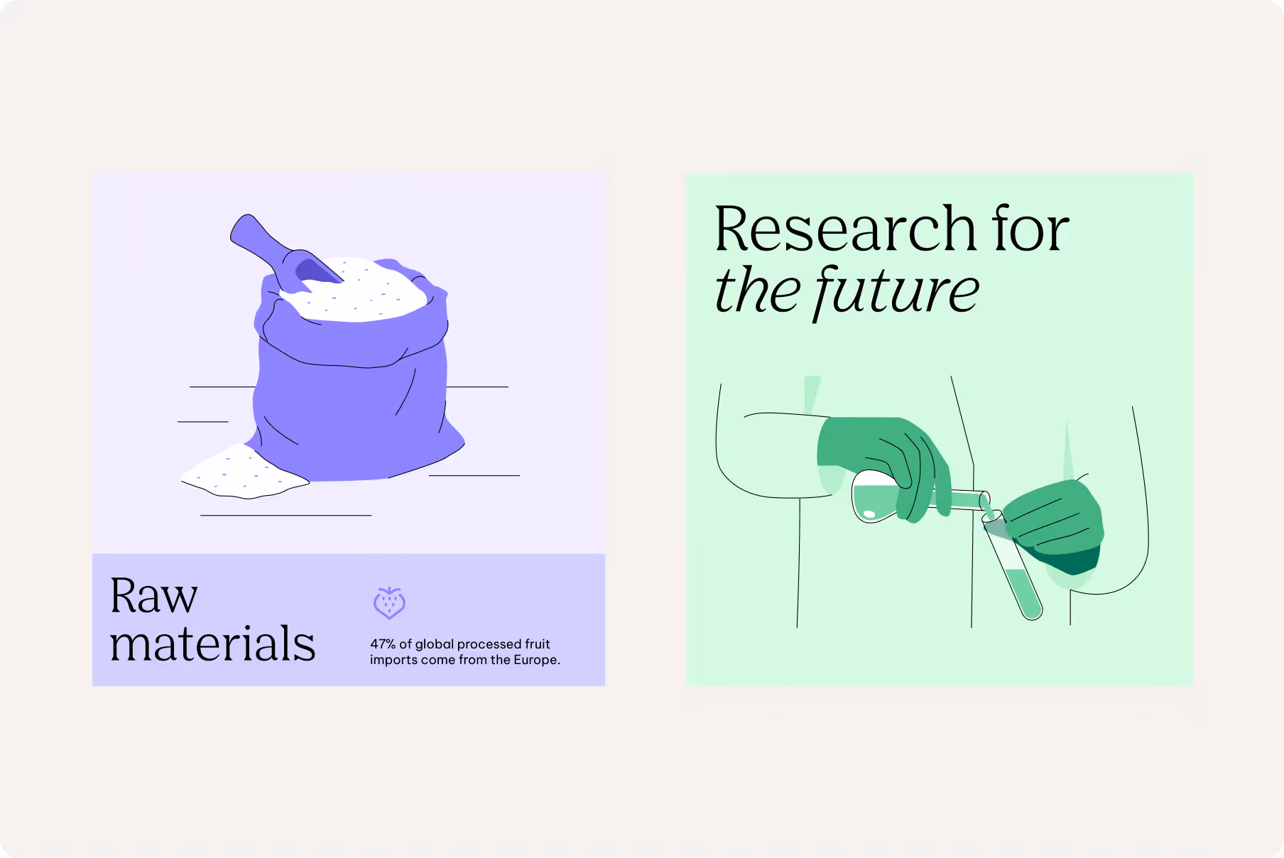
Objects
Our illustrations highlight tools, products, and materials with clarity, transforming the details of our industry into clear, recognisable forms.
Color layers and selective linework define shape and detail, while avoiding unnecessary complexity. This approach ensures objects remain easy to recognise, no matter the complexity of the object.

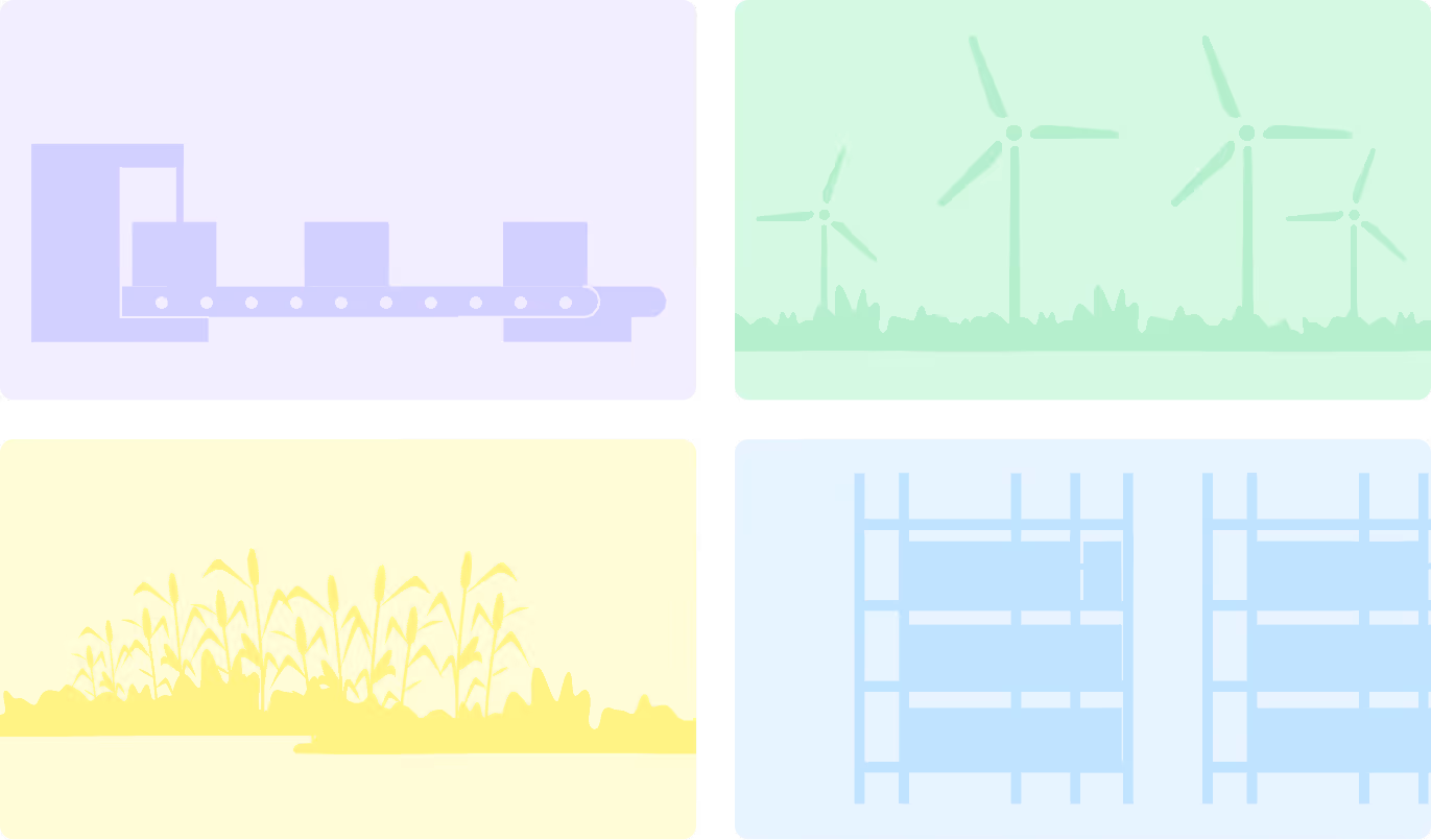
Backgrounds
Backgrounds should be built from a few recognisable shapes arranged in color blocks, giving each illustration a sense of place and supporting the narrative.
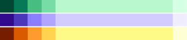
Color usage
Our illustrations draw from the same vibrant and playful color system, ensuring consistency with the overall brand identity. We can tell a story or create a specific atmosphere through our colour selection.
As a general rule, always select colors that optimize legibility and create a defined

Primary colors
Primary colors, especially AGRANA Red, carry the strongest brand recognition. They should be used sparingly and with purpose, guiding attention to key elements within the illustration.


Secondary Colors
Secondary colors add richness and flexibility, supporting illustrations to ensure they complement the surrounding layout without overshadowing it.
To maintain a refined, understated look, only one secondary color and its tones should be used in a single illustration.

Expressive
When illustrations take centre stage, Primary and Secondary colors can be combined with skin tones to create depth and liveliness.
To maintain clarity and avoid visual overload, only one secondary color should be paired with primary tones in any single composition.
Color system
Our color system is vibrant, bright, and playful, reflecting the diversity and colourfulness of the sugar and fruits world. It brings energy and clarity to layouts while supporting a clear hierarchy.
Detailing colors
Dark tones used for definition, shadows, and fine elements.
Foreground colors
Create strong contrast with subtle backgrounds, adding variety, liveliness, and clear accents when combined with main colors.
Background colors
Light tones that provide a subtle, unobtrusive base for the composition.
Refer to the Color chapter for detailed color codes.
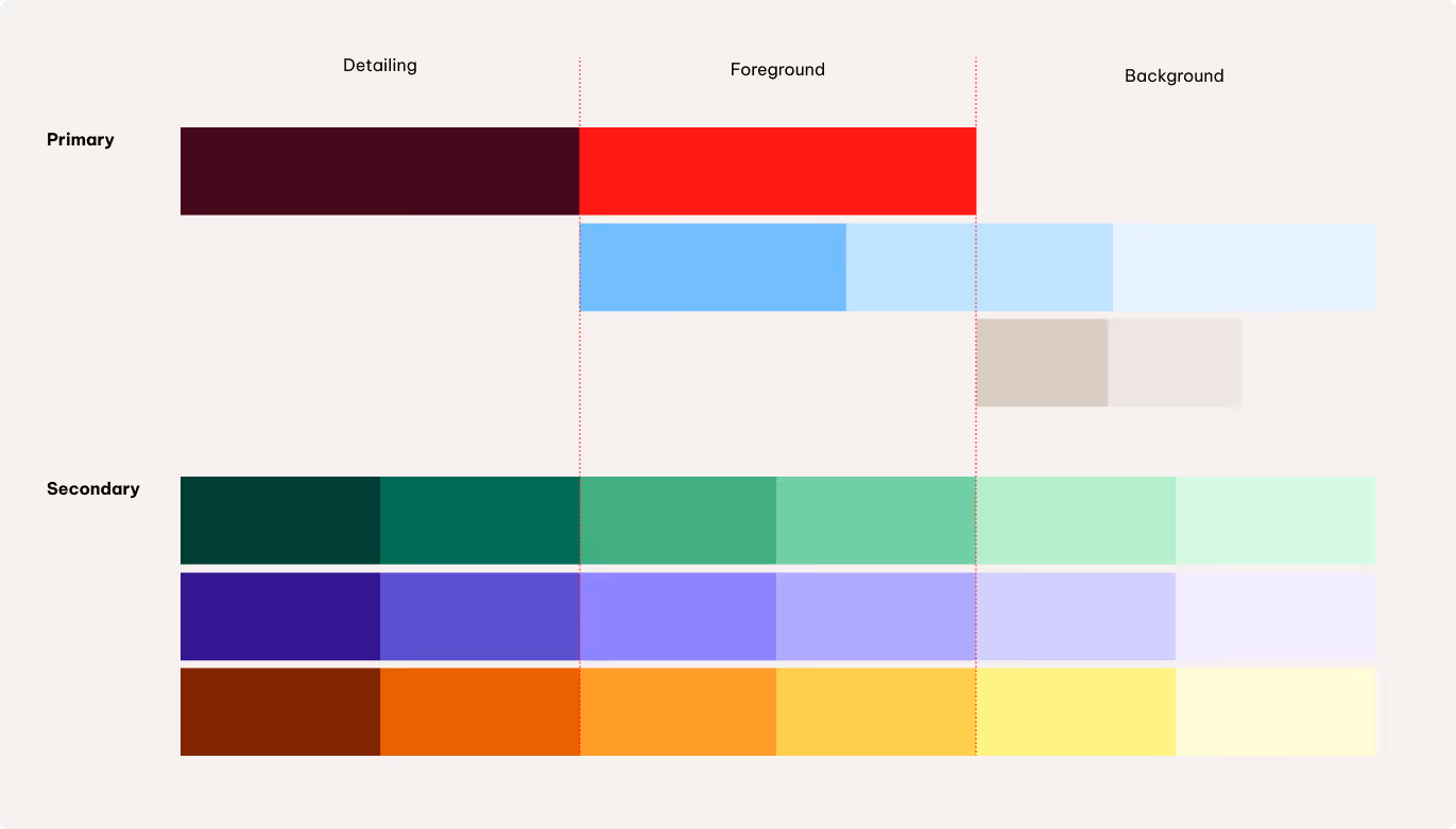
Skin tones
We use six defined skin tones to represent people authentically and inclusively. The palette allows for diversity without overcomplicating the style and can be combined with both brand colors and the secondary palette.
This keeps illustrations warm, human, and consistent while ensuring diversity is visibly represented.
Construction
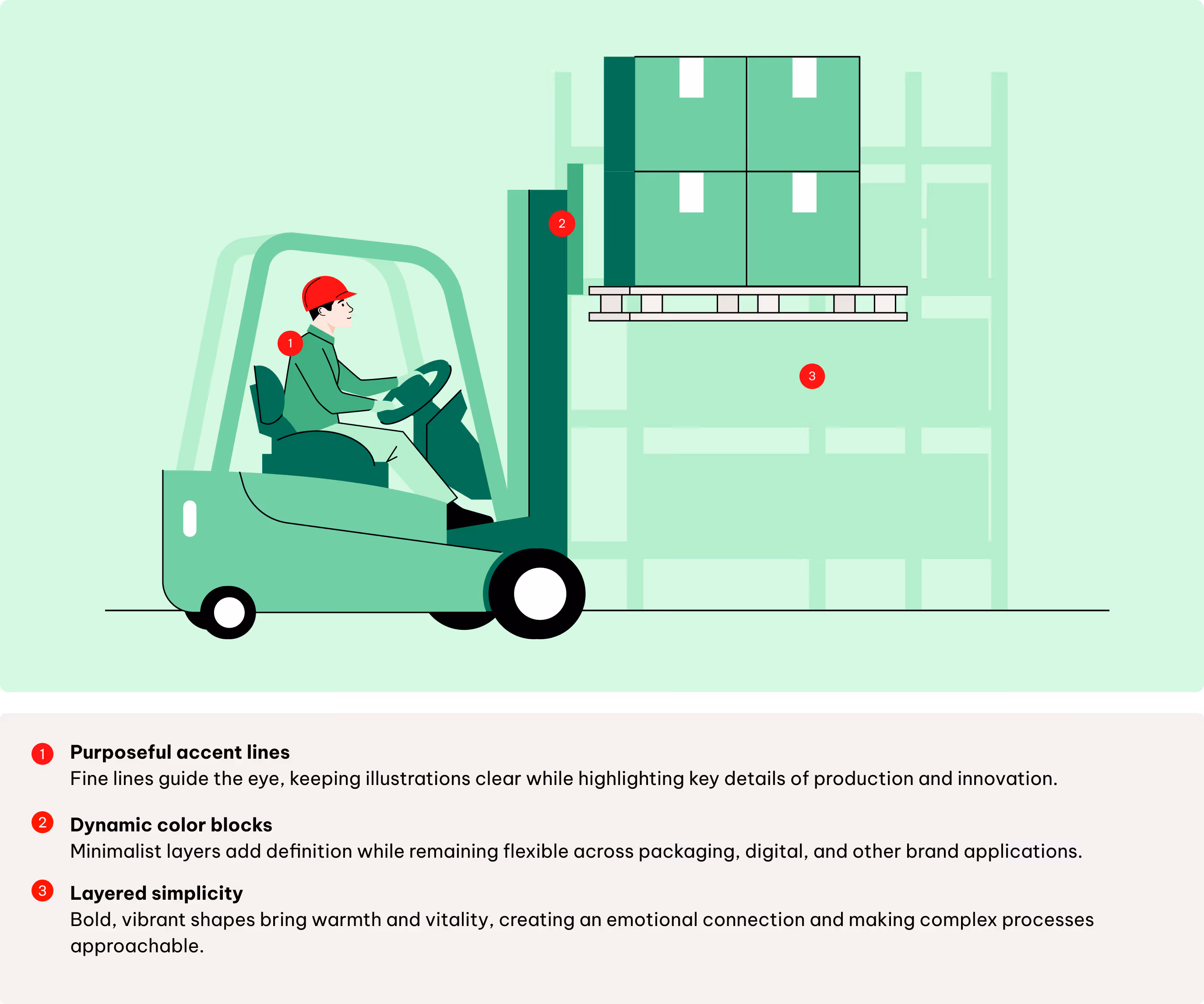
Illustrations are built with clear, consistent strokes to give structure and personality. Use organic lines to create a friendly, approachable feel, and apply accent lines sparingly to highlight details and add emphasis.
Together, these elements ensure every illustration feels balanced and recognizable.

Stroke features
The corners and caps of the strokes should always have rounded attributes.
Stroke width
The stroke thickness is set to 1.5 pt based on a Full HD resolution (1920x1080 pixels). To maintain a consistent look across different formats, adjust the stroke thickness for larger formats accordingly.

Wave and rounded lines
Illustration starts with simple geometric shapes. As the design evolves, they transform into smooth wave lines and rounded forms – representing structure and fluidity.

Accent lines
Accent lines play a pivotal role in accentuating shapes but should be used selectively within the illustration.
Perspective
Our illustrations use a slightly dynamic, layered perspective—simple and approachable, yet with enough depth to create movement and interest. This approach keeps compositions clear and balanced, while giving scenes a sense of space and life.

Scalability
Our illustration system is designed to work at different scales – from full scenes to isolated stand-alone elements. Choosing the right level depends on the touchpoint and the desired impact.
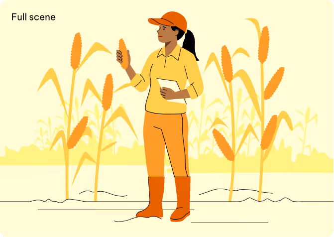
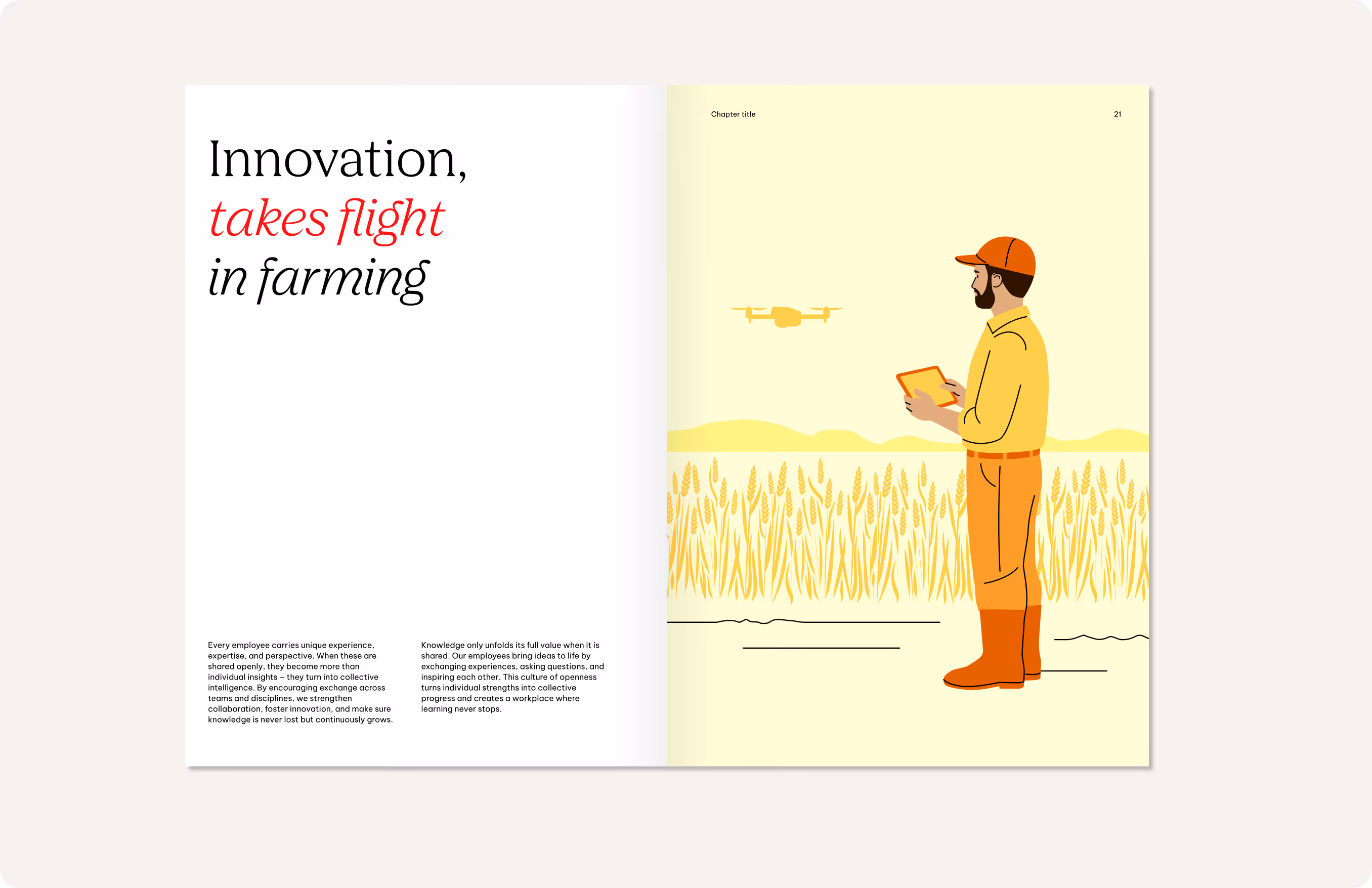
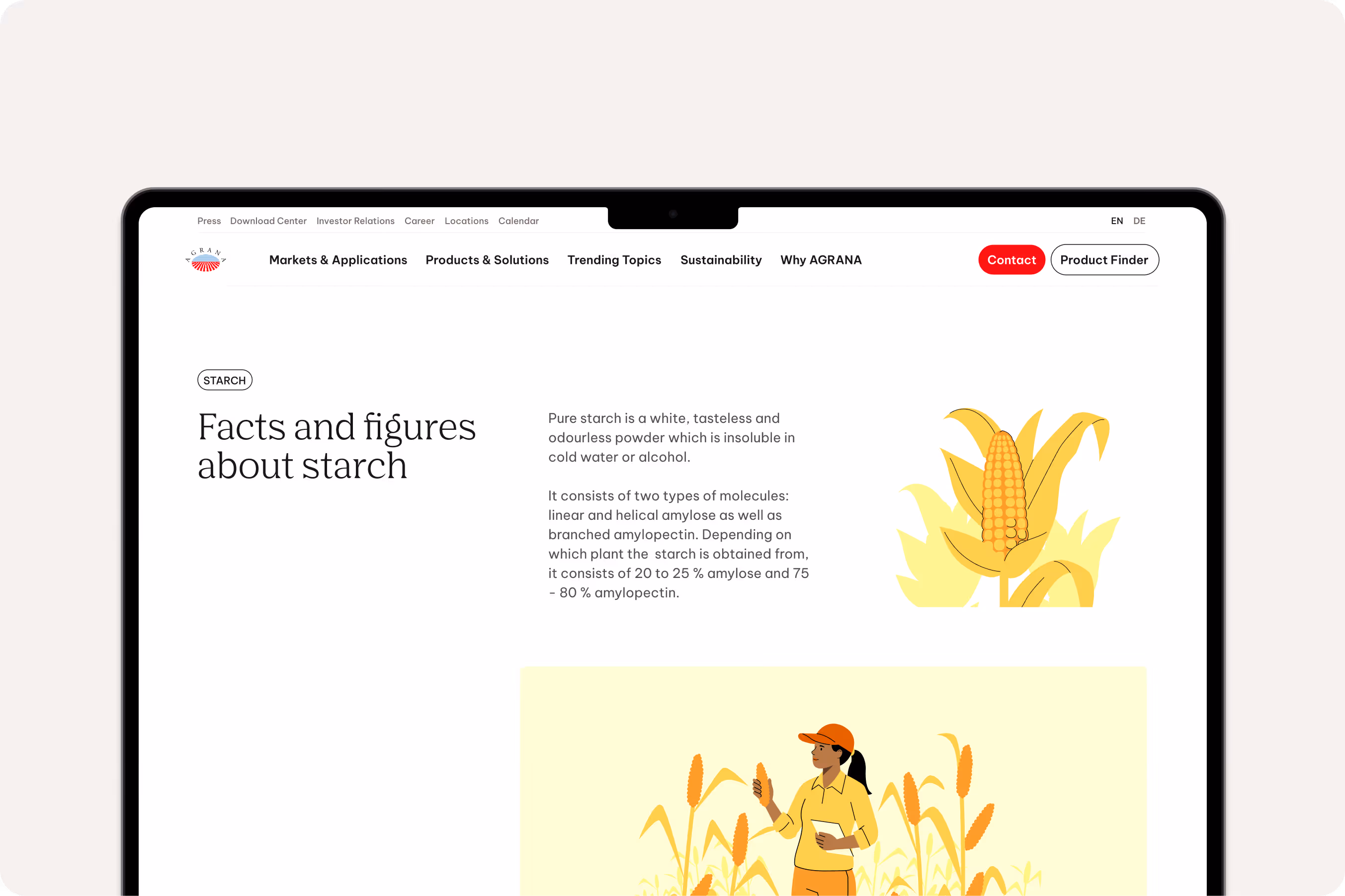
Full scene
Used when more context or storytelling is needed. They combine backgrounds, people, and objects into one cohesive setting. Best suited for larger applications where space allows for detail and narrative.

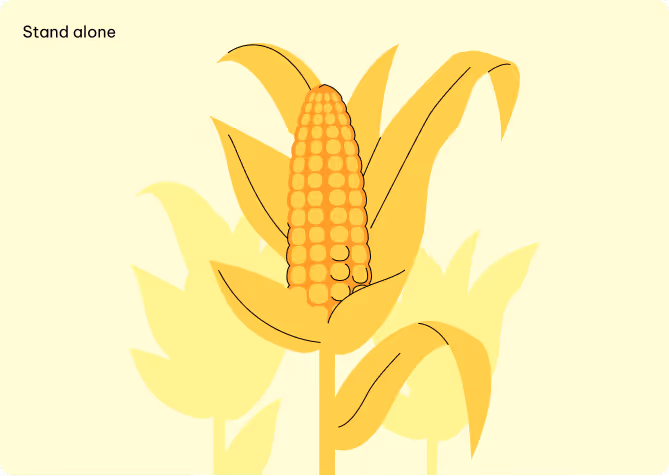
Stand-alone elements
Range-zoomed objects or symbols without much background or people. They are clear, minimal, and highly flexible – ideal for quick recognition or to support text.

Where to use
Our illustrations are a key part of our visual identity. To maintain consistency across all touchpoints, it’s important to use them thoughtfully. The following outlines the primary contexts in which illustrations should be applied and the role they play in each.
Internal communications & materials
Support messaging in newsletters, training materials, or company resources.
Websites & interfaces
Create distinctive visuals for campaigns, posts, and ads, reinforcing brand personality.
External communications & materials
Use illustrations decoratively to add personality and emphasis for social media, advertisings, literature etc.
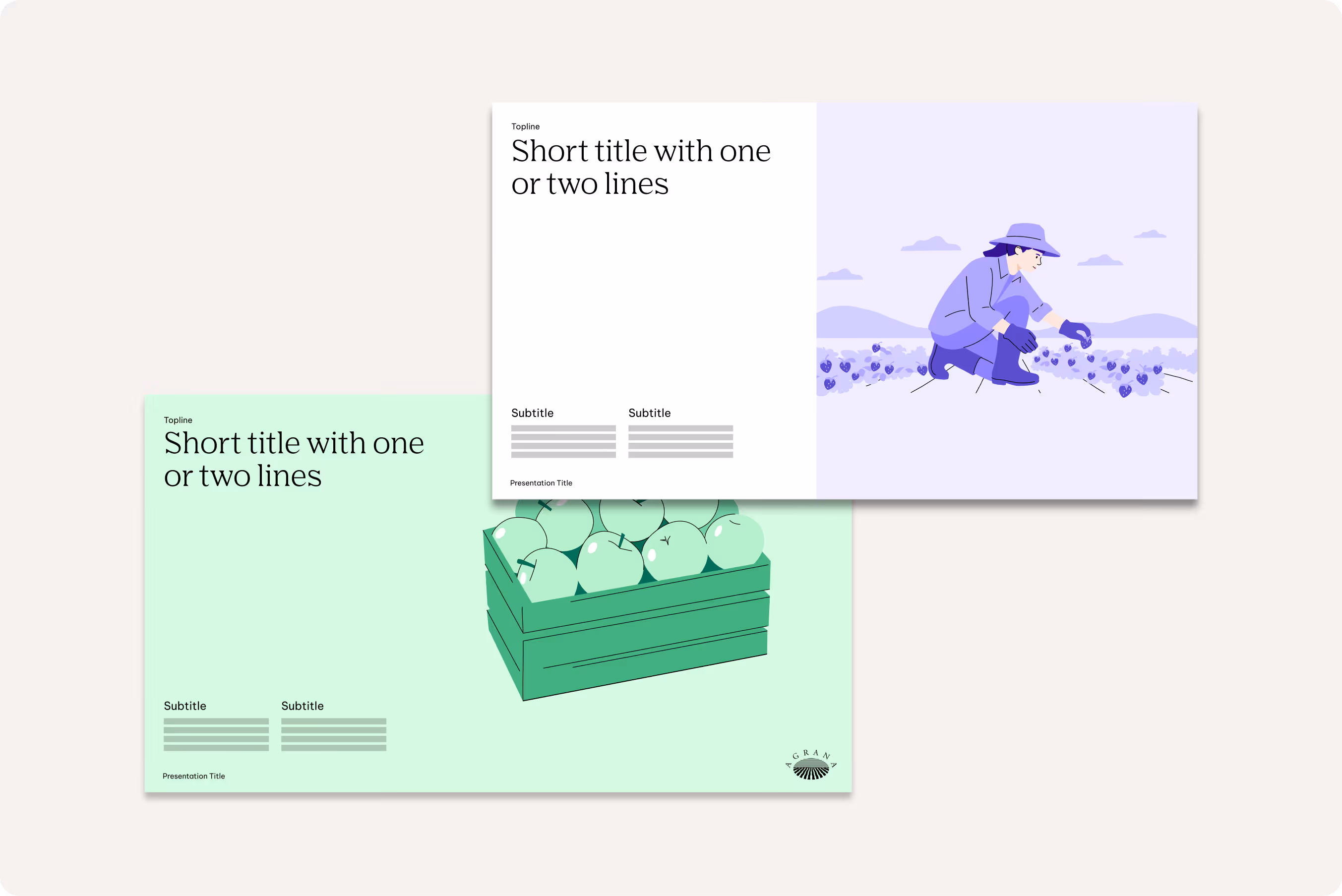
Presentations & reports
Apply icons to illustrate ideas and improve information clarity.
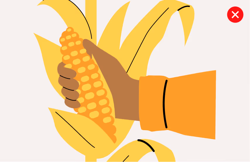
Don'ts
Strong, expressive illustrations are key to bringing our stories to life. By following these guidelines, we create visuals that are dynamic, balanced, and clear—ensuring each scene, character, and detail communicates with impact.
We avoid inconsistent line width
Ensure the line thicknesses is consistent across the illustration.

We don’t use colors outside our palette
Only use colors and combinations that are in line with our illustrative style.

We don’t combine secondary colors
Only one secondary color and its shades should be used in any single composition.

We don’t overcomplicate or oversimplify objects
Aim for a balance that is both clear and visually interesting.

We don’t depict illustrations in a different style than established
Always stick to the defined illustration style.

We don’t introduce blocky shapes
Stick to shapes match our established style.
Downloads
Downloads