Branded items
Introduction
These guidelines inform the creation of branded items and provide direction for their design in line with key principles and brand elements. Items are shown for illustration purposes only. Please discuss production and case-specific decisions with Brand and Corporate Communications as specified in the Approval process section.
Key points to remember
Three core principles guide the creation of our branded items. Together, these pillars ensure every item reflects our identity while delivering meaningful, lasting value.
Useful, intentional & desirable
Every item should serve a meaningful purpose in everyday life. Each is thoughtfully designed and genuinely desirable to use, wear or share.
Sustainability as a standard
Longevity, responsible sourcing, and material integrity are fundamental. Sustainability is embedded in every decision, not treated as an afterthought.
Distincly AGRANA
Each item must clearly express our identity: recognizable, consistent, and unmistakably AGRANA.
Core brand identifiers
Our branded items must consistently leverage our most distinctive brand assets to ensure every item is unmistakably AGRANA and clearly recognizable across all contexts.
The logo immediately identifies our brand on every item. It may be subtle in scale or placement, but cannot be omitted.
Our tagline and signature bright red accent are also powerful recognition drivers, further strengthening our brand presence on branded items beyond the logo. Items may feature only the logo or the logo with some or all of the other elements, depending on the context and use case.
Use cases
Branded items serve both internal and external audiences, each with different expectations and levels of familiarity with the brand. While internal items strengthen engagement and belonging, external items represent AGRANA and build brand equity — both requiring a consistent and intentional brand application
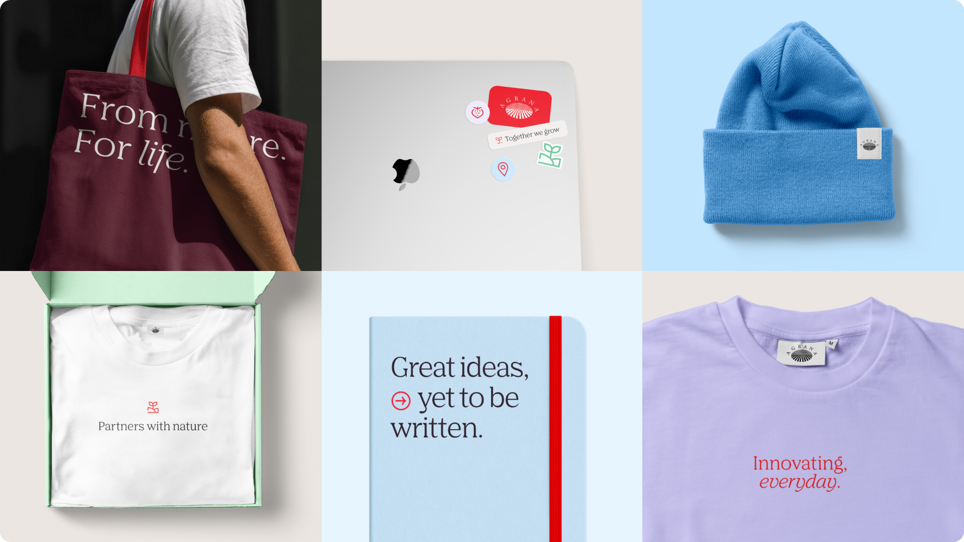
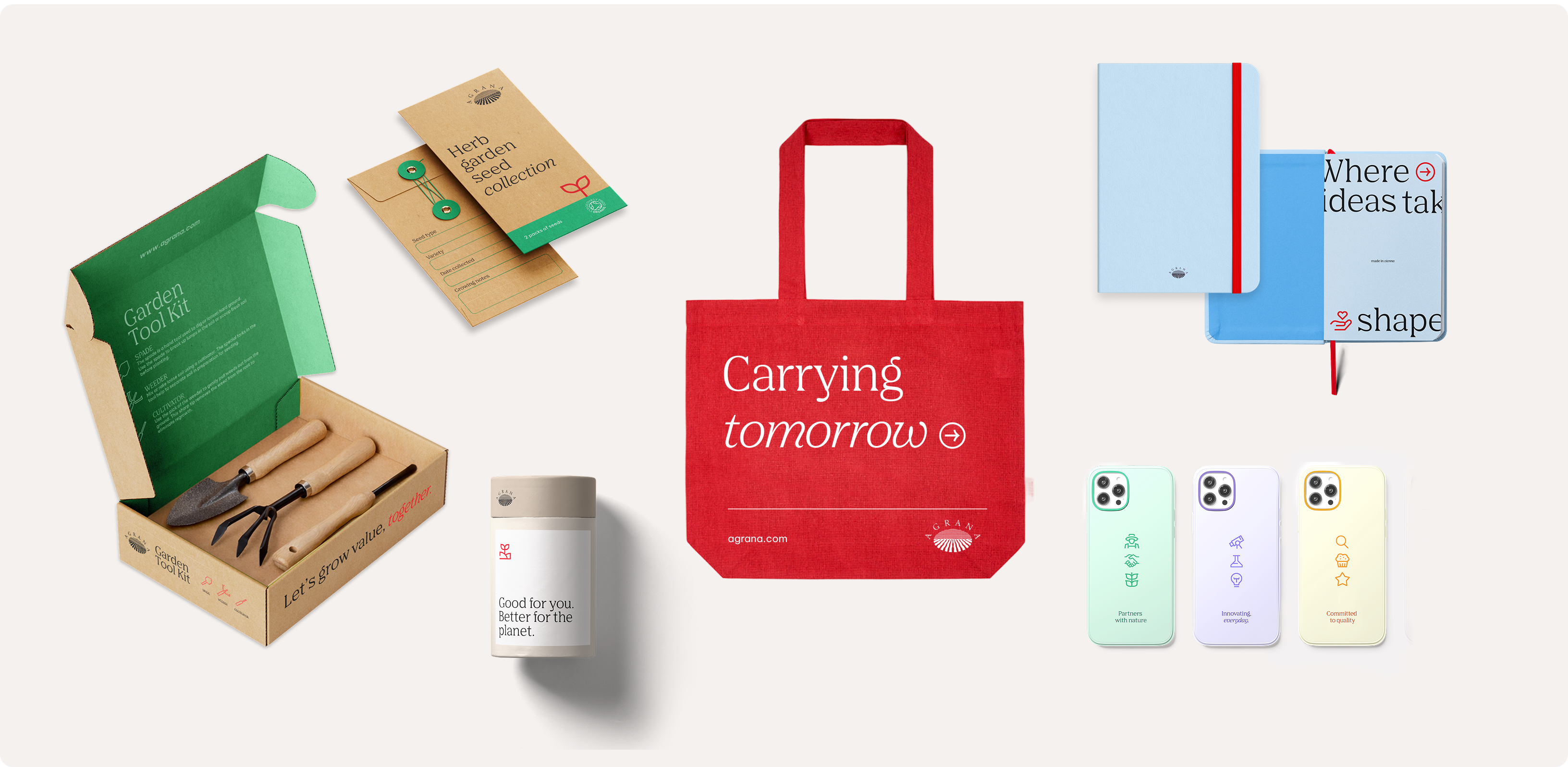
Categories
Our branded items serve different purposes and audiences: from refined, premium pieces to vibrant, everyday, and promotional items. Each category is intentionally defined and targeted, ensuring that every item is appropriate, recognizable, and aligned with the AGRANA brand experience.
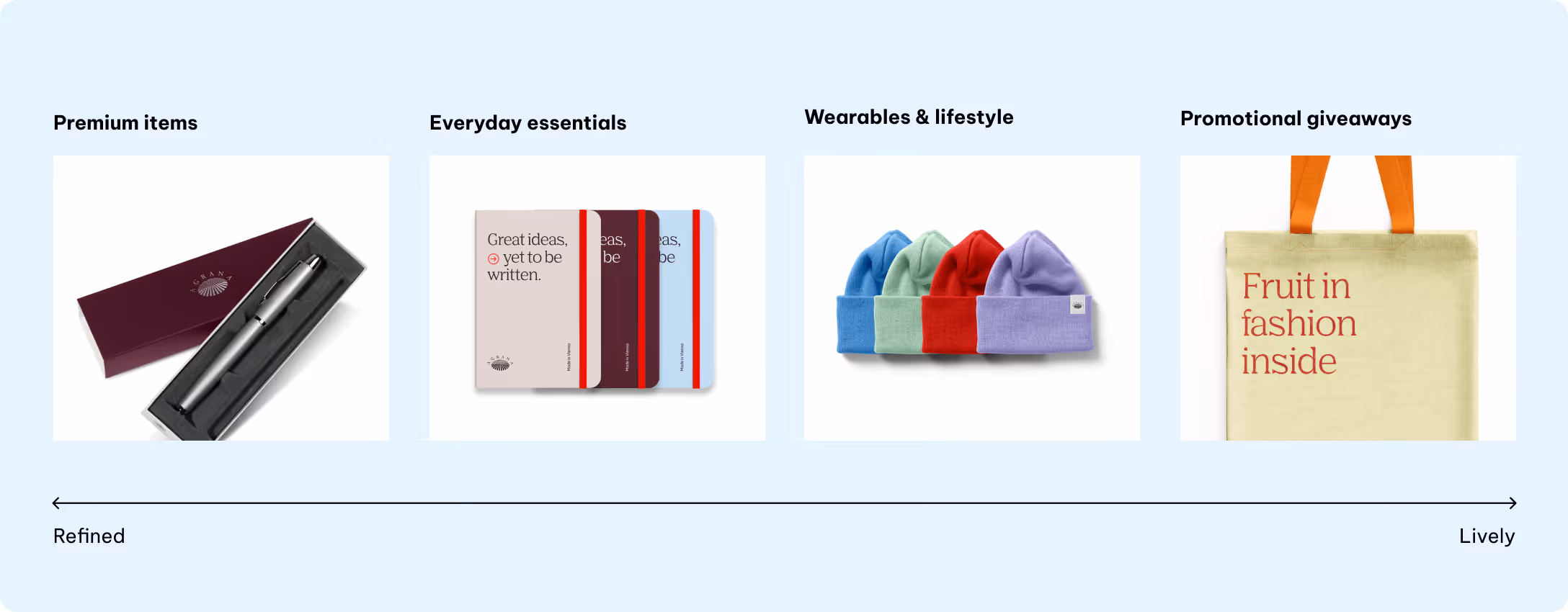
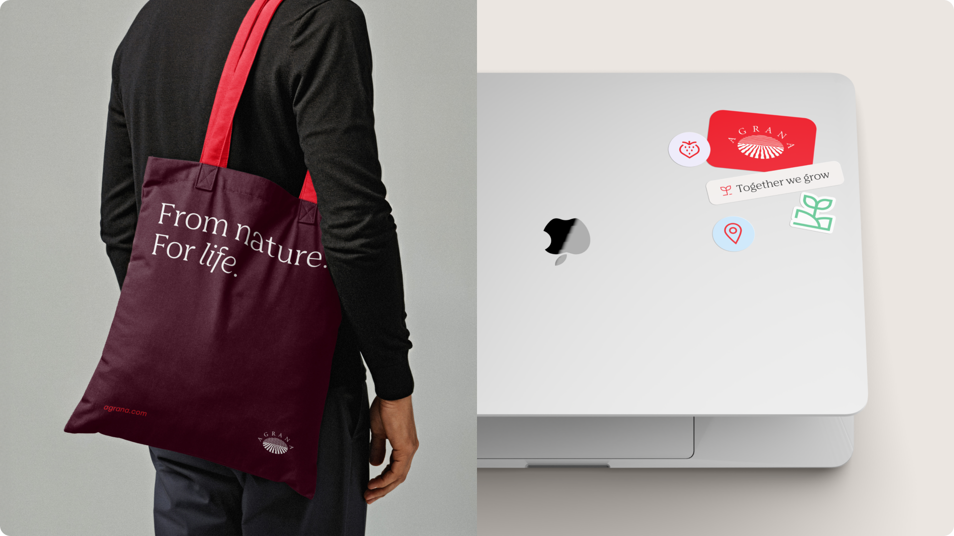
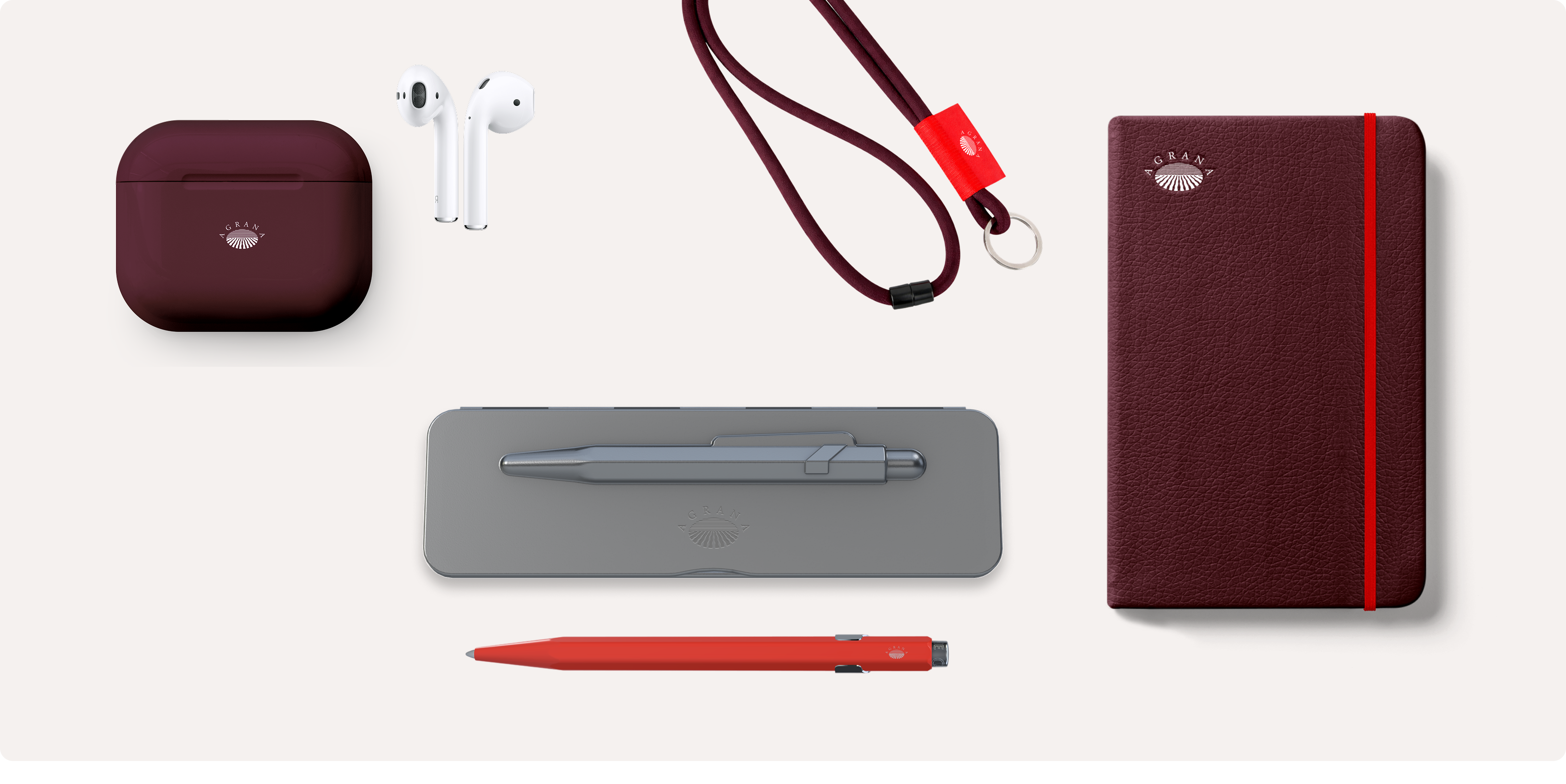
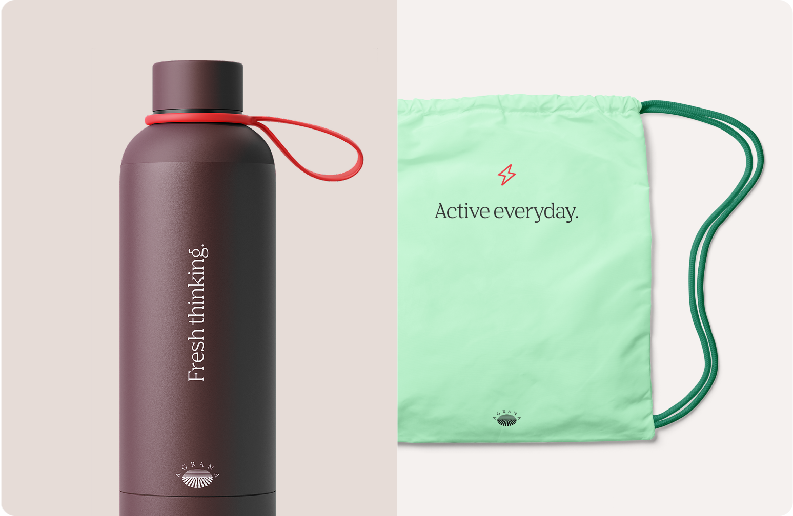
Premium items
Premium items are crafted from high-quality materials and finishes, featuring dark red as the dominant tone with red accents. They’re reserved for selective occasions to convey elegance, prestige, and credibility. Externally, these items are aimed at key clients and strategic partners, and internally for executives, senior management, and special cases.
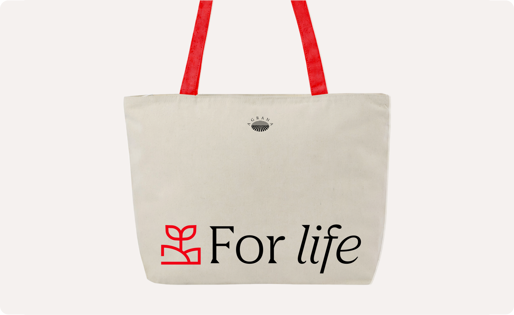
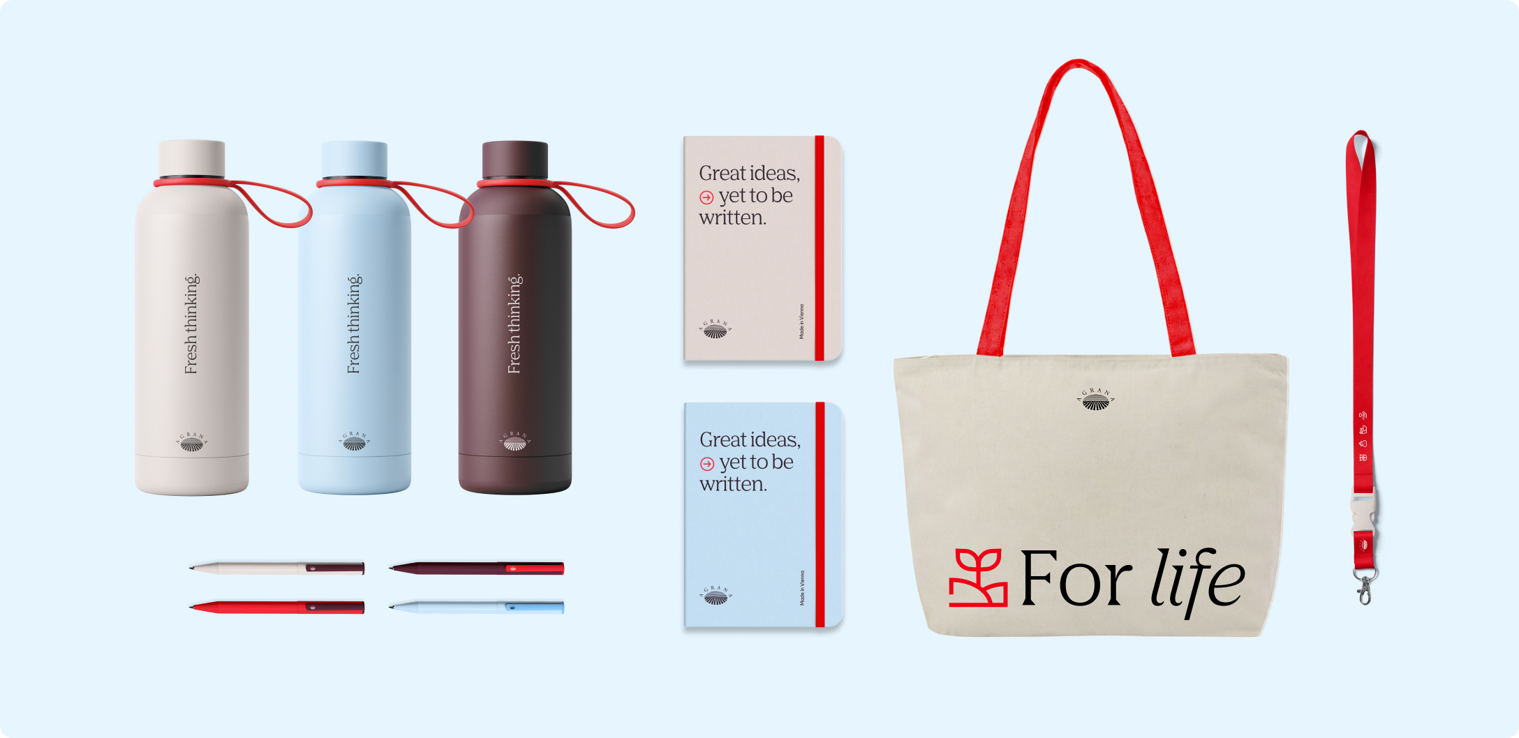
Everday essentials
Everyday essentials combine the full primary palette with blues and grays plus red highlights to create a timeless, versatile look. Designed for a consistent brand presence in daily use, they’re intended for all employees, onboarding participants, and event attendees internally. Externally, they occasionally reach clients, regular business partners, visitors, and recurring stakeholders.
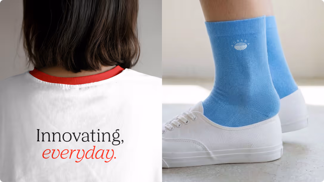
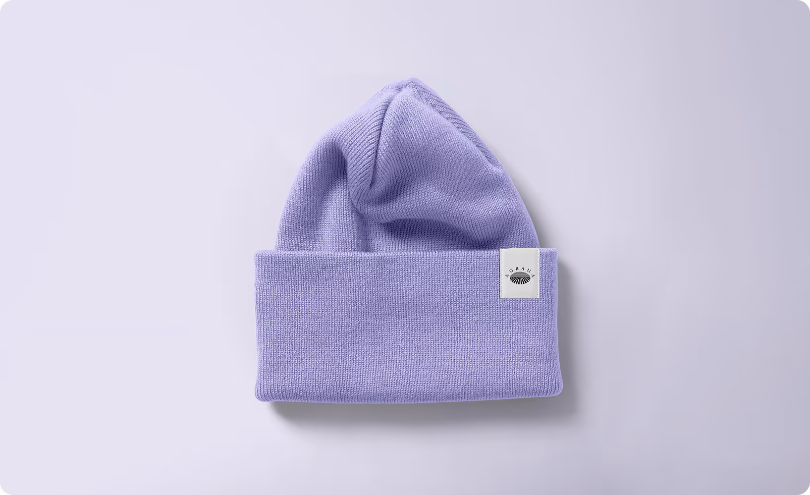
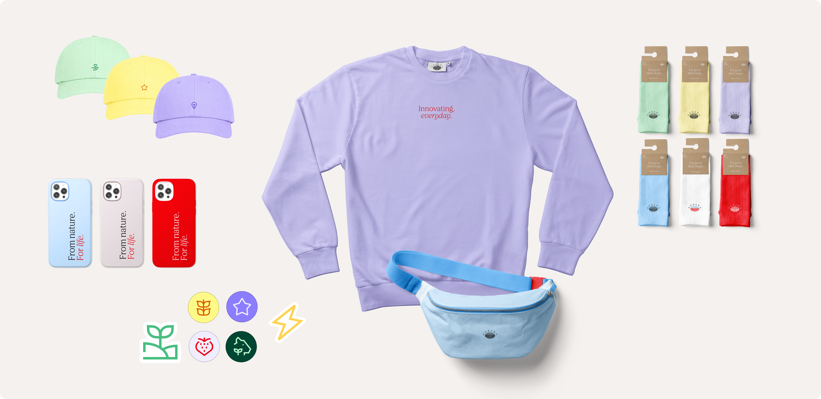
Wearables and lifestyle
Wearables and lifestyle items embrace a flexible use of the primary and secondary palettes with a focus on contemporary design. These items engage employees representing the brand internally at event activities, while externally connecting with community members, close partners, and young professionals.
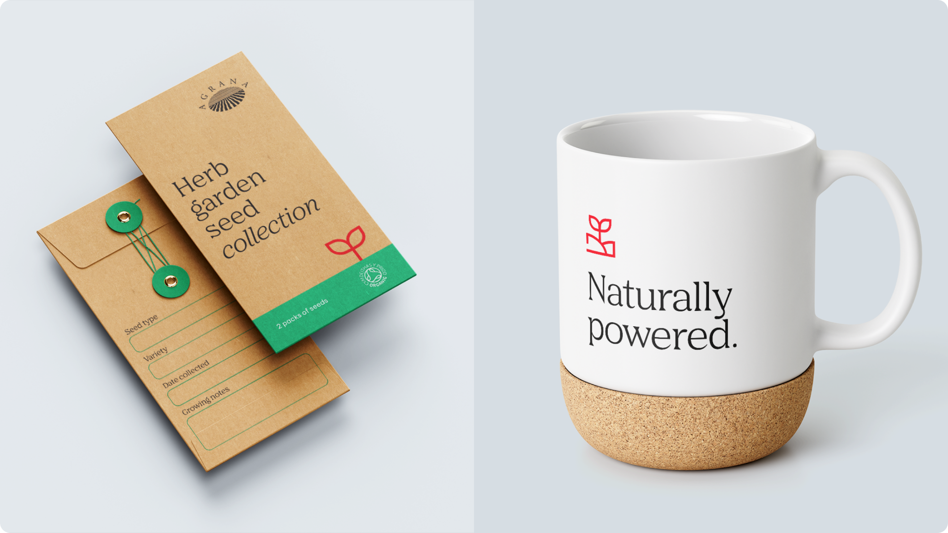
Promotional giveaways
Promotional giveaways use the entire color palette flexibly for temporary campaigns, product promotions, trade fairs, and specific events. Typically available for a limited time only, they’re designed to achieve high visibility and reach for specific product campaigns during trade fairs or events externally, or specific themed events internally.
Brand elements usage
Applying our brand elements consistently across all branded items ensures a clear and recognizable AGRANA presence.
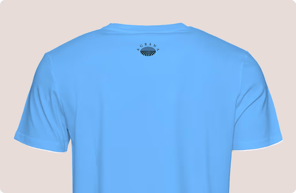
Logo
The logo is the primary identifier of the AGRANA brand and must always be present. It should be clearly visible but subtle without dominating the design. Never distort, recolor, or alter the logo. Proper use ensures instant recognition while maintaining a balanced and refined appearance across all branded items.
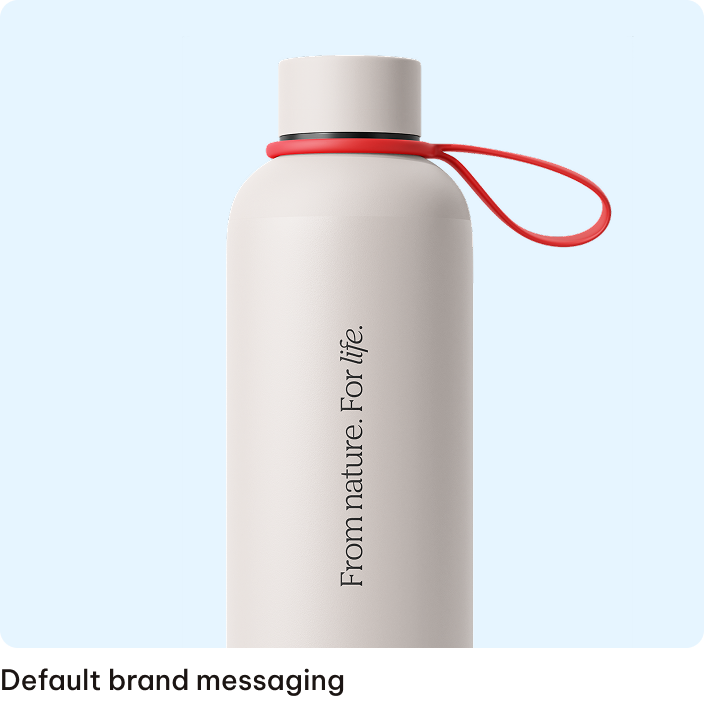
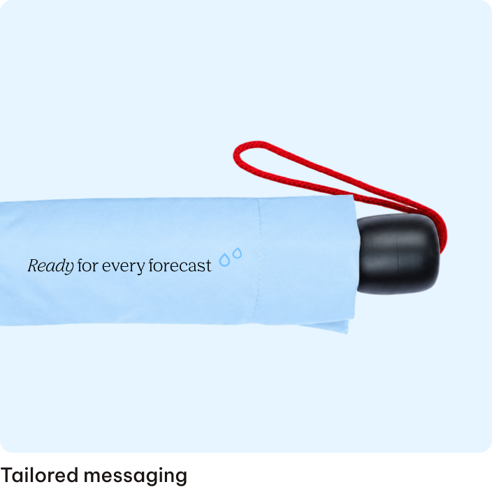
Typography and messaging
Typography communicates our brand voice and style. It can serve as a prominent hero design element or subtle communication support. Use the approved typefaces consistently for headlines, body text, and supporting copy. Follow the defined rules for hierarchy, legibility, and spacing to reinforce clarity and brand cohesion.
Depending on the use case, you can align the message with the defined brand messaging, choose an item-specific one or tailor it to the occasion.
.png)
Color
As described in the “Use cases” section, our palette supports the tone and purpose of each branded item and adapts to each use case. Premium items favor dark red and accents for elegance. Everyday essentials use the full primary palette with subtle highlights for recognizability. Wearables, lifestyle, and promotional items allow the flexible use of primary and secondary colors while maintaining brand consistency.
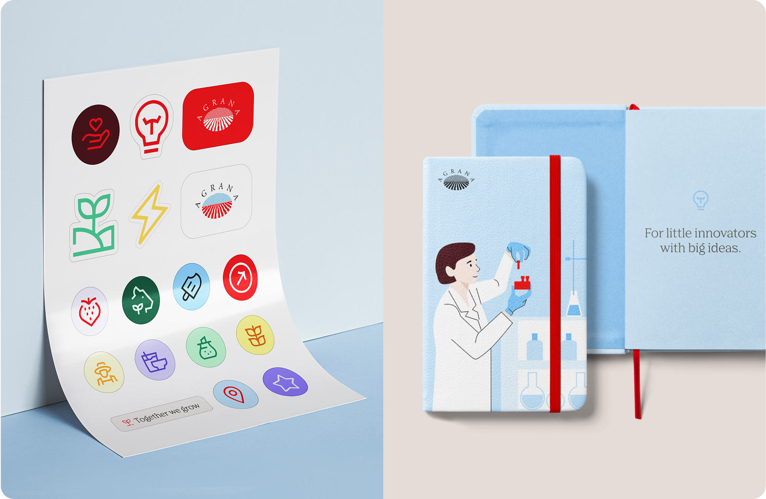
Icons and illustrations
We use icons and illustrations sparingly on branded items to convey approachability and to support certain topics. They should complement the design without dominating, reinforcing the brand in a subtle and thoughtful way.
Don'ts
In this section, we outline what we avoid to ensure consistent branded items. We refer to the dedicated chapters within these guidelines for more details on specific elements.
We don’t ignore sustainability.
Avoid single-use, poorly sourced, or low-durability materials.
We don’t dilute the brand identity.
Always keep our core brand identifiers and use cases in mind.
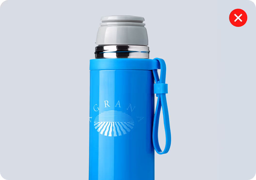
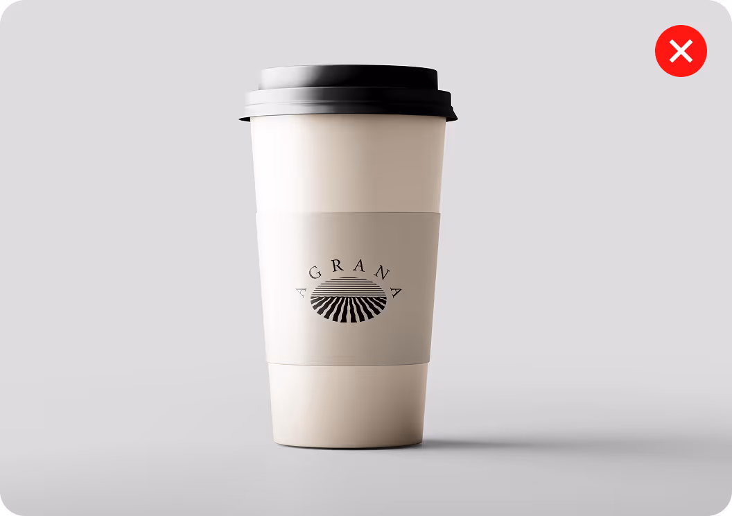
We don’t make the logo too prominent.
It should be visible but subtle.
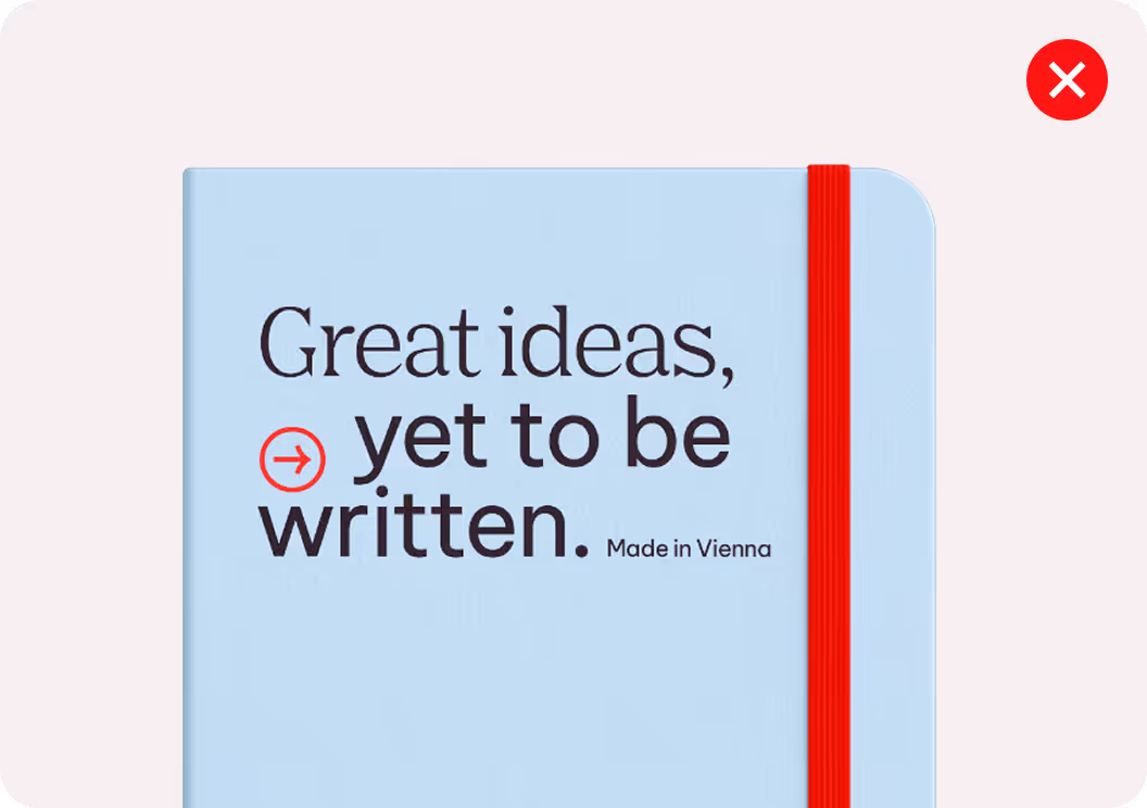
We don’t mix typefaces or misuse typography.
Only use the approved typesettings and spacing.
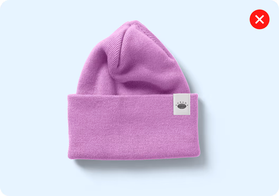
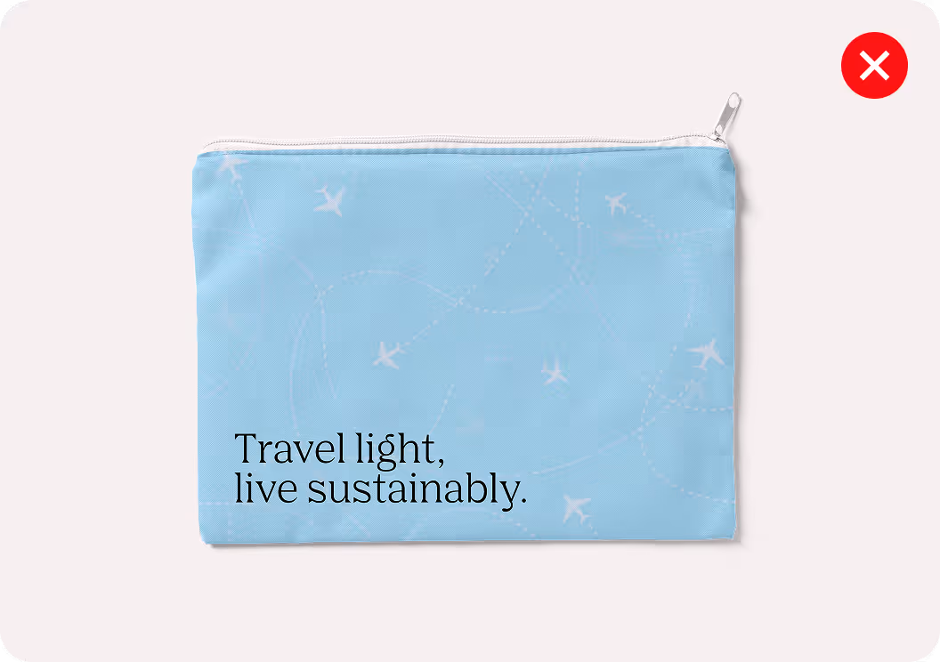
We don’t use unapproved colors.
Always stick to the defined palette for each use case.
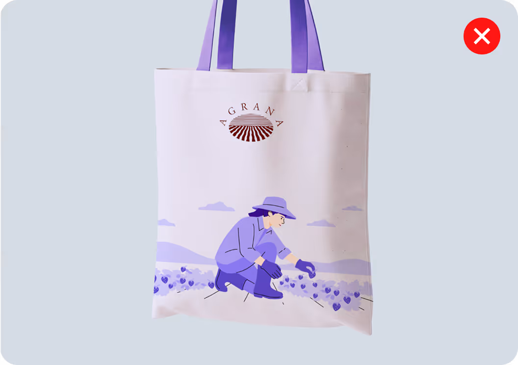
We don’t use prominent icons or illustrations.
They should be sparing and supportive, not dominant.
Standard set of basics (TBD Interbrand)
This overview includes a basic set of branded items that can be produced and ordered globally without additional approval. For any adaptations, special cases, or region-specific requirements, please contact the Brand and Corporate Communications team.

Approval process (TBD Interbrand)
The approval process for creating new branded items ensures that every design aligns with AGRANA’s brand principles, key elements, and quality standards, while maintaining brand consistency and compliance before production or ordering.