Icons
Introduction
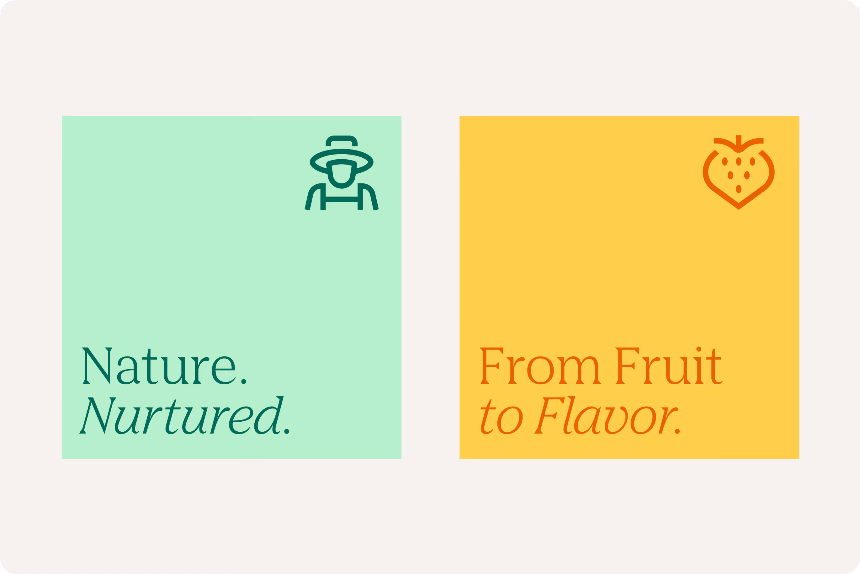
Icons translate complex ideas, objects or actions into clear, recognisable symbols. We use icons to support navigation, highlight information, and improve visual communication within the AGRANA corporate design. Designed to complement our typeface, our icons ensure consistency and clarity across all applications.
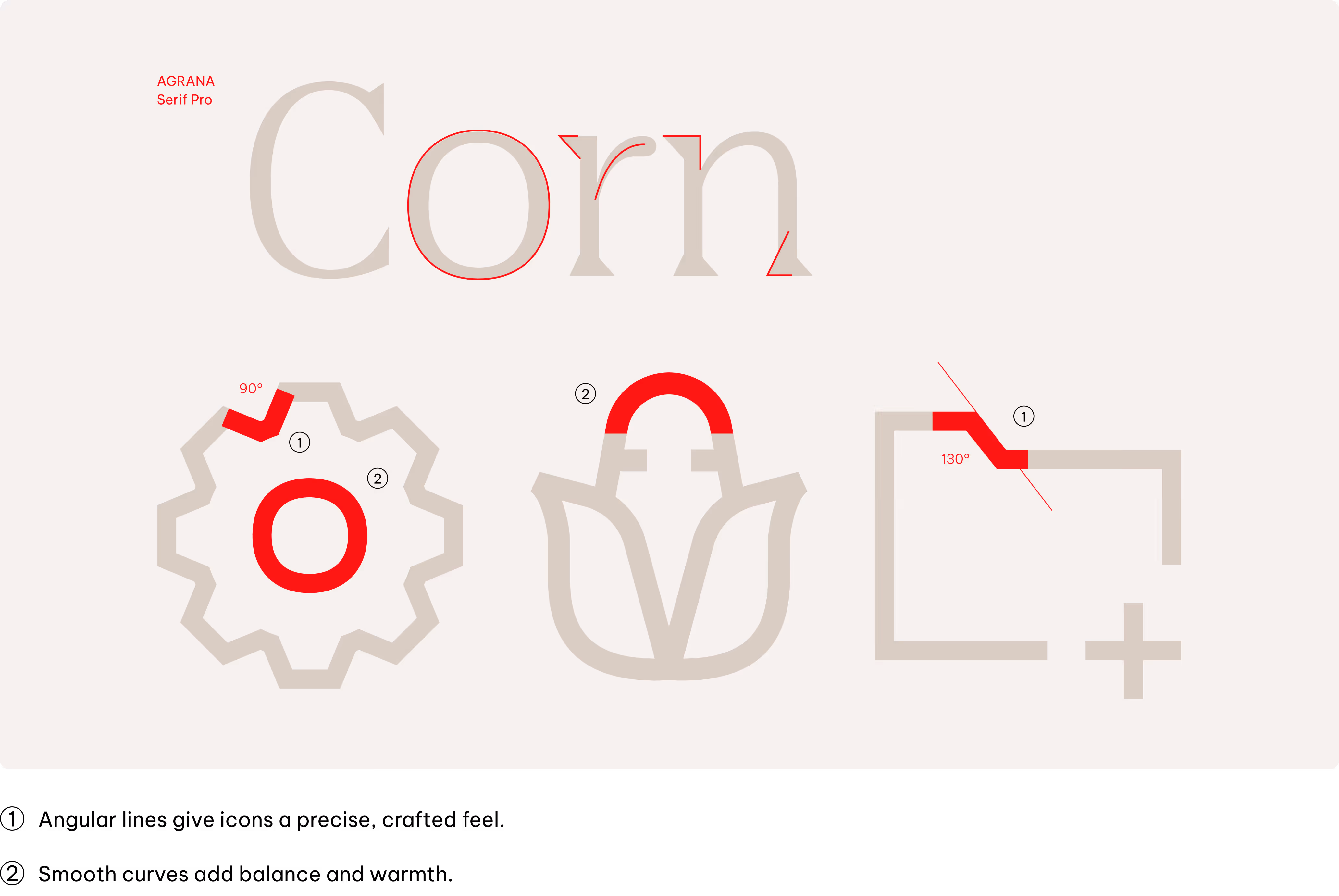
Style
Our icon style take inspiration from AGRANA Serif Pro font, designed to work alongside the Vietnam Pro font as in our typography.
Construction
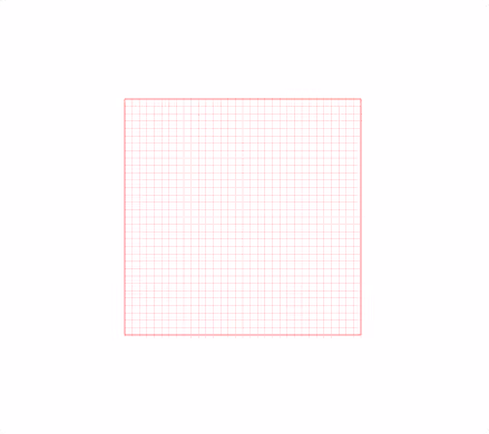
Building icons on a pixel grid ensures precise alignment and sharpness, enhancing visual clarity and consistency. It enables seamless integration into digital interfaces, optimizing legibility and scalability across various screen resolutions.
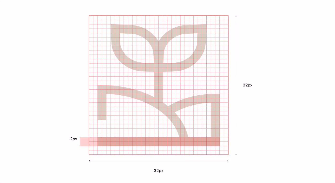
Canvas
All icons are designed on a 32 x 32 px grid.
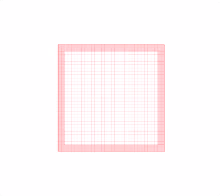
Safe area
A 2 px “safe area”, keeps icons clear and prevents visual crowding.
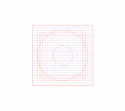
Geometry
To keep all icons looking like part of the same family, we draw them using a set of key reference shapes.
Line weight
Use a consistent 2 px stroke weight for all icons to ensure balance and legibility.
Color usage
Primary colors
Icons follow the same color principles as typography, with contrast and clarity as the top priority.
Accessibility sets the rules for combining primary colours. All primary colour combinations follow recognised accessibility standards to ensure sufficient contrast and legibility.


Secondary colors
Accessibility sets the rules for combining secondary and primary colors. All secondary and primary color combinations follow recognised accessibility standards to ensure sufficient contrast and legibility.
Shades

White & Tints only
White & Tints only

White & Tints only
White & Tints only

White & Tints only
White & Tints only
Mid-tones

Black & Tints only

Black & Shades only

Black & Tints only

Black & Shades only

Black & Tints only

Black & Shades only
Tints

Black & Shades + AGRANA Red
Black & Shades + AGRANA Red

Black & Shades + AGRANA Red
Black & Shades + AGRANA Red

Black & Shades + AGRANA Red
Black & Shades + AGRANA Red
Refer to the Color chapter for detailed color codes.
Where to use
Our Icons are useful tools in our identity toolkit. To ensure consistency across all platforms, it is important to apply them with intention. This section outlines the key contexts in which icons should be used and how they function within each.
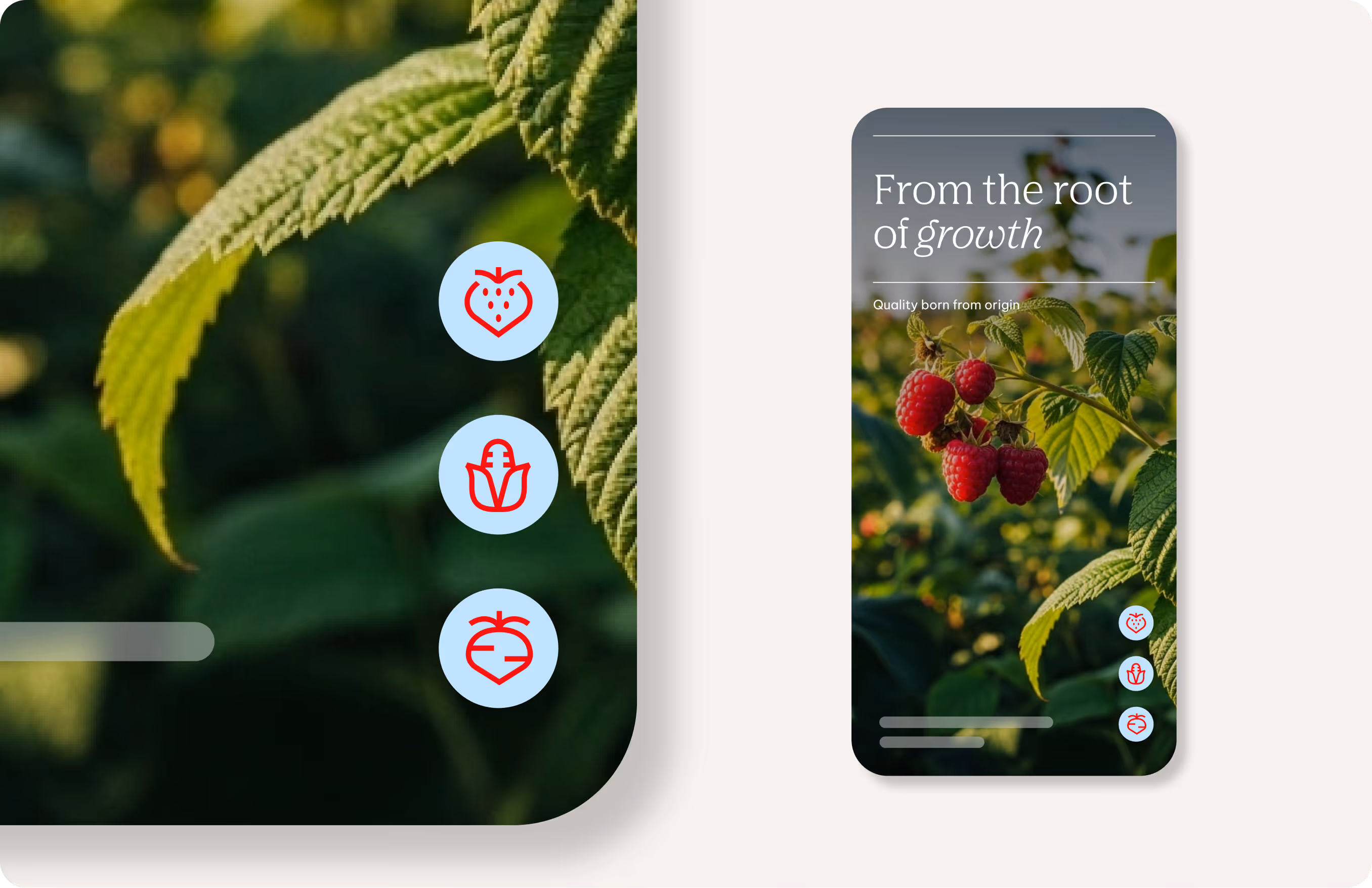
App navigation
Use icons as functional markers for menus, actions, and settings.
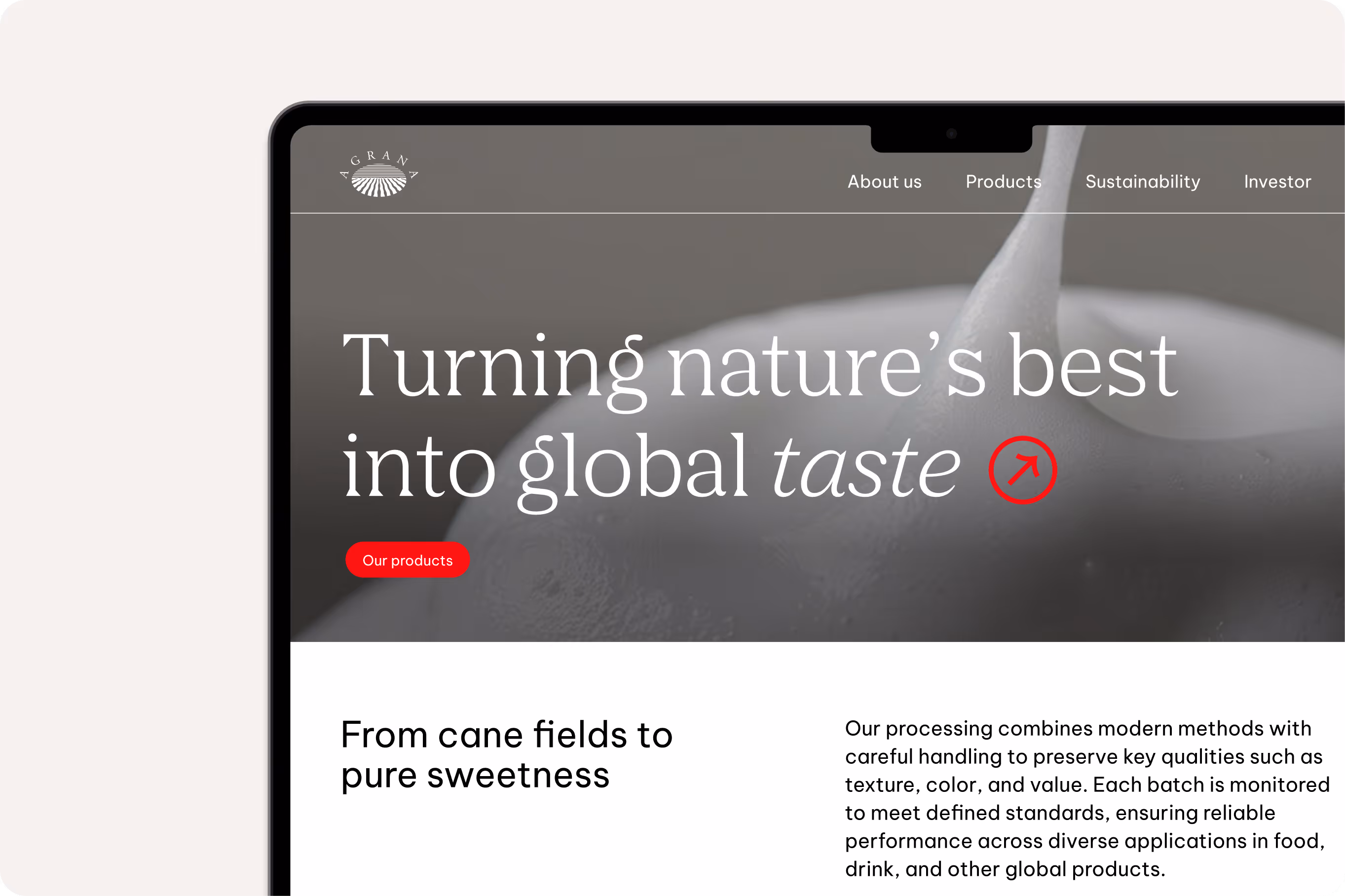
Website navigation & interfaces
Apply icons to highlight features, support interaction elements, and break up text.
Marketing & Social Media
Use icons decoratively to add personality and emphasis.
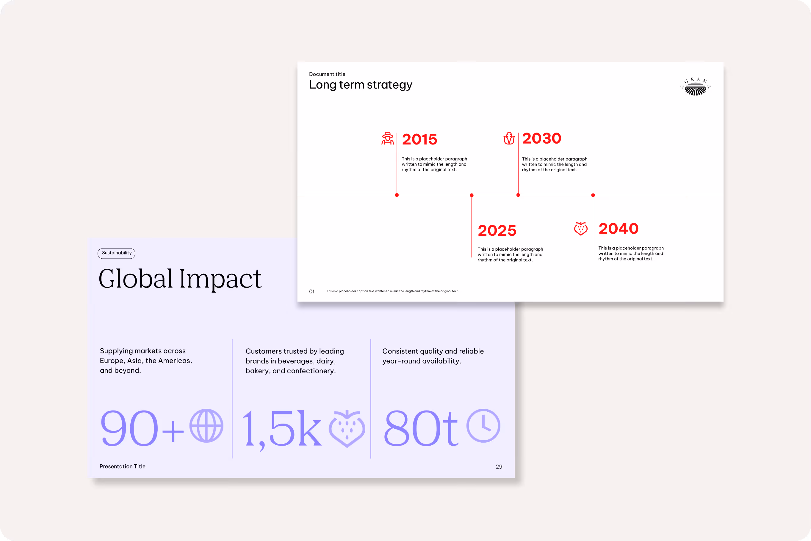
Presentations & infographics
Apply icons to illustrate ideas and improve information clarity.
Don'ts
Icons should used consistently and in line with our guidelines. The following examples outline what to avoid to help maintain the integrity and impact of our visual communication, always reflecting our values and style.

We don’t adjust icon proportions or line width
Icons must keep their fixed stroke thickness and proportions without modification.
We don’t use icons from other sources
Only use icons from within our AGRANA library.

We don’t use low contrast color combinations
Icons must follow the brand palette and maintain legibility.

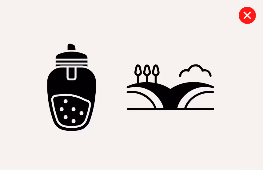
We don’t use for storytelling or illustration
Icons should remain simple, minimal, and free of complex detail.
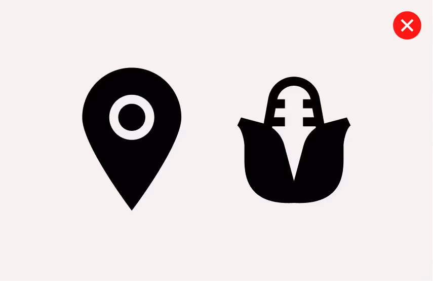
We don’t fill icons
All icons are designed with outlines only and should never include filled elements.
Downloads
Downloads