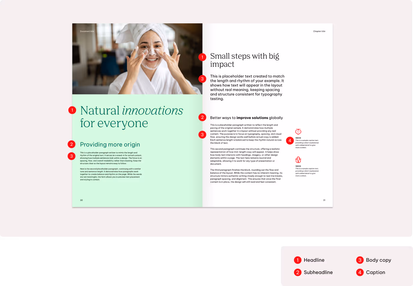
Typography
Introduction
Agrana Serif Pro blends classic serifs with a modern structure, giving our brand a warm and honest typographic tone. Precise yet human, inspired yet grounded. It carries a strong sense of design in every letter.
Be Vietnam Pro is a clean, structured sans serif that pairs clarity with confidence. Its geometric form and steady rhythm bring a forward-thinking, adaptable attitude – leading, driven, and built for progress.
Primary typeface for headlines
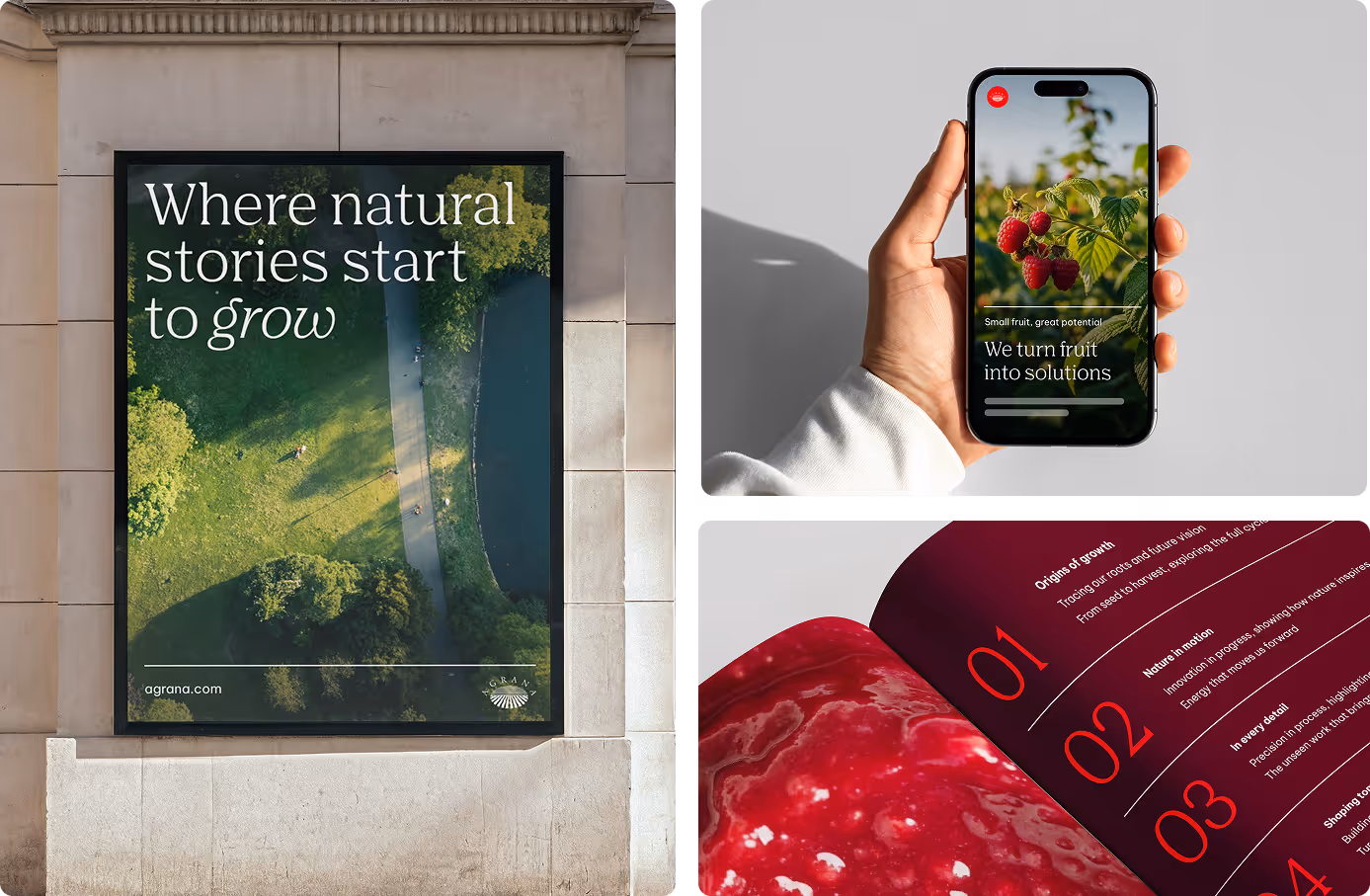
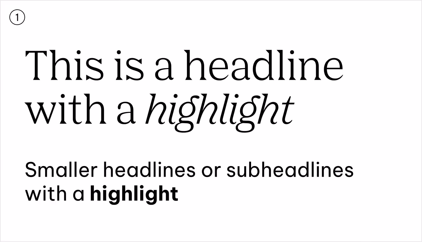
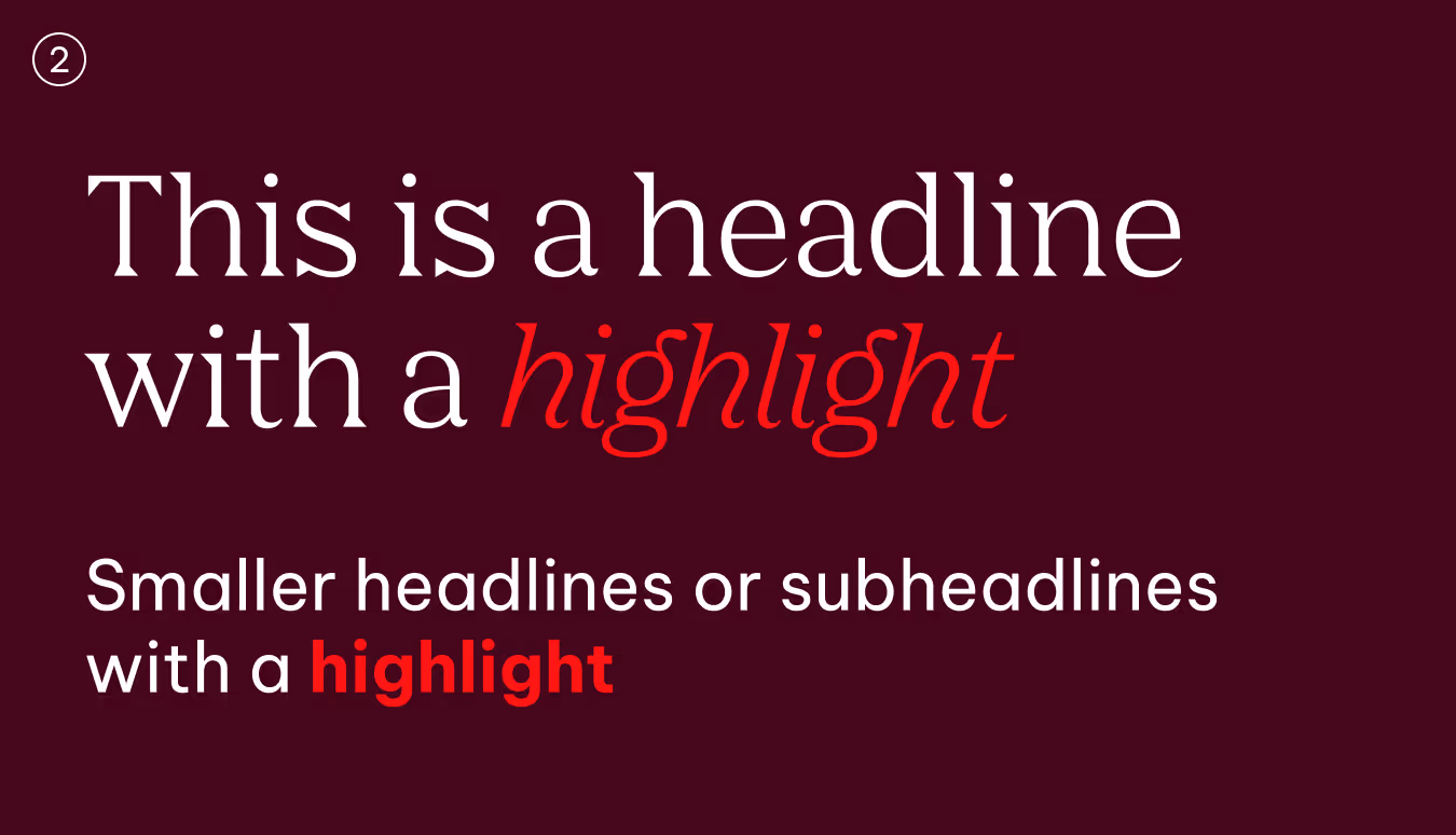
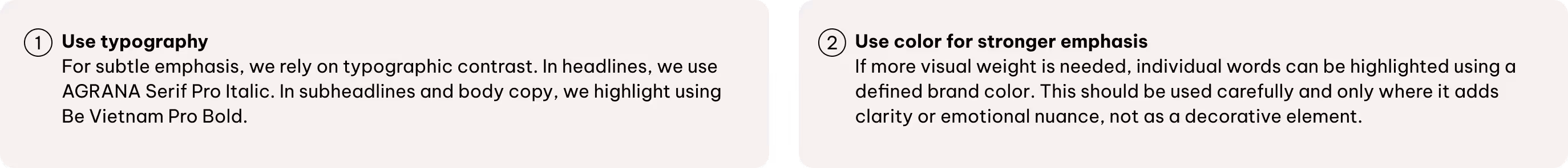
We use AGRANA Serif Pro as our brand-driven font for headlines, statements, and hero text. It delivers impactful, brand-led content with clarity and confidence.
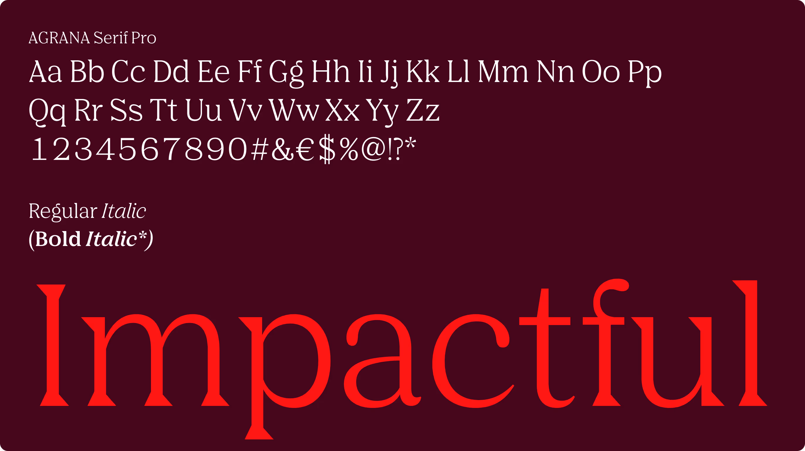
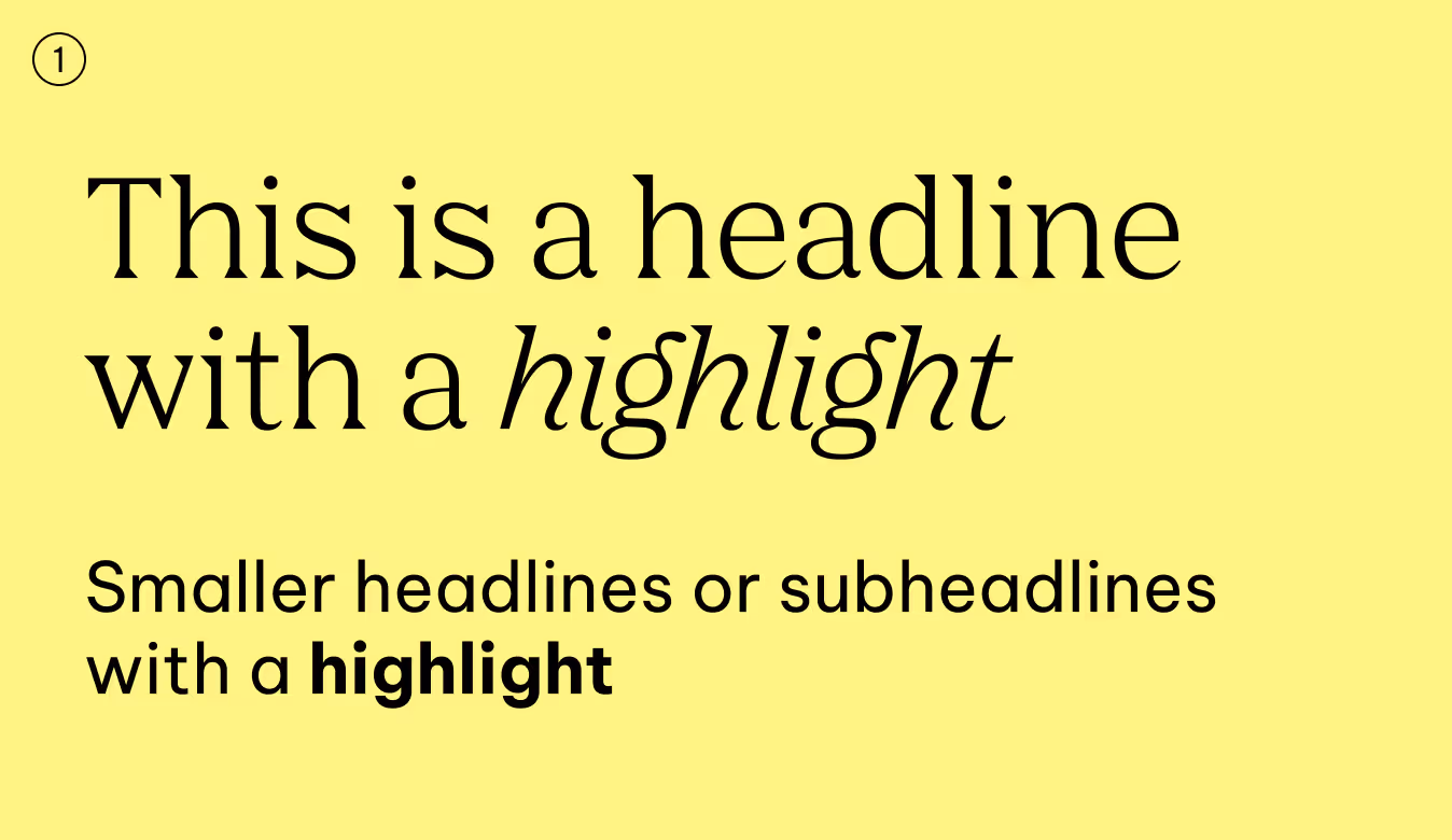
Regular maintains a calm and assured tone. For emphasis, pair Regular with Italic to highlight words or phrases.
Bold is reserved for rare cases, such as presentations, and is never used for simple emphasis.
*AGRANA Serif Bold exists only to support the “Bold” button in PowerPoint for clean file transfer. It must not be used in brand applications—this is a technical exception to prevent errors.
Secondary typeface for body copy
Be Vietnam Pro supports our typography system with clarity and flexibility. Designed for digital and technical use, it flows easily across subheadlines, body copy, toplines, labels, and smaller interface elements. In certain settings, it may also be used for headlines.
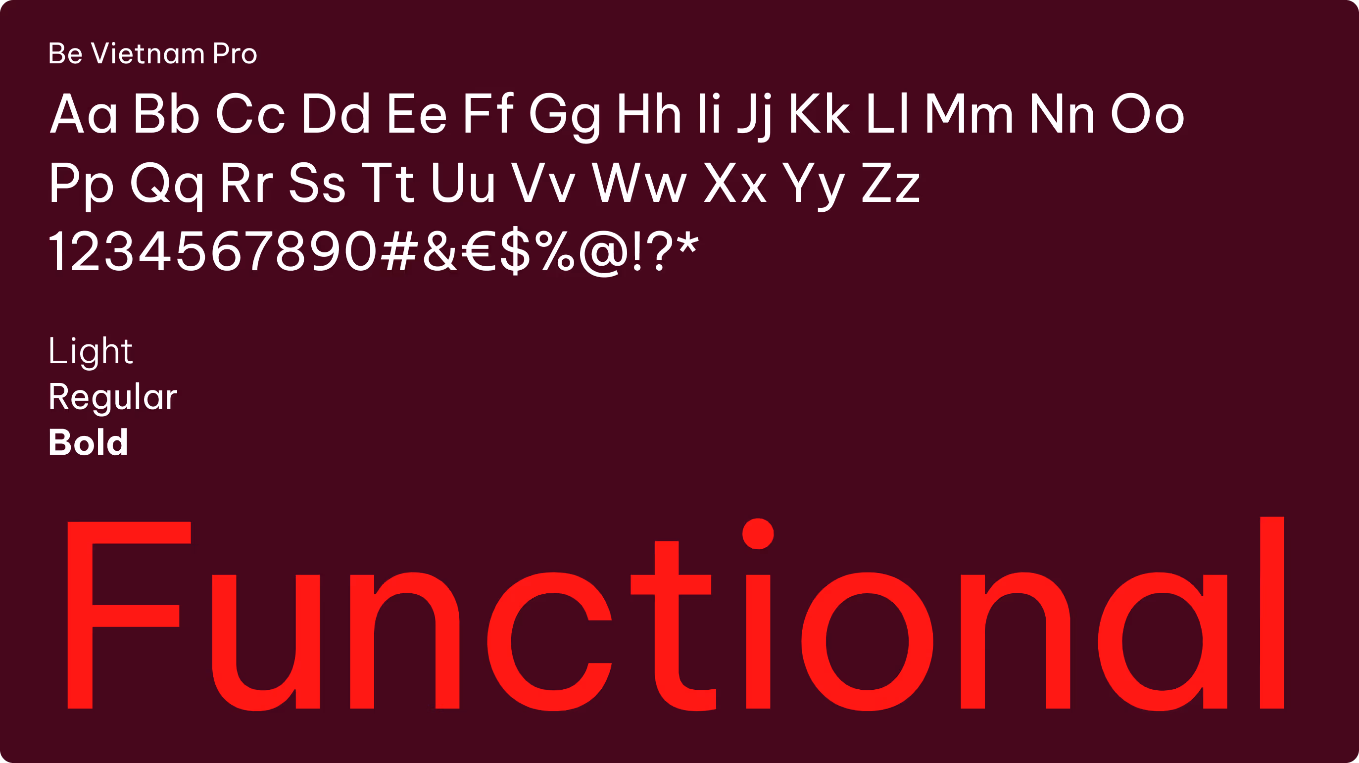
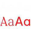
Our sans serif typeface is available in Light, Regular, and Bold weights. Each weight has a defined role:
Regular
Regular is the default weight, suitable for body copy, continuous text, captions, and general communication where legibility is the priority.
Regular is the default weight, suitable for body copy, continuous text, captions, and general communication where legibility is the priority.
Bold
Bold is used for emphasis, including headlines, subheadlines, call-to-actions, and highlighted words.
Bold is used for emphasis, including headlines, subheadlines, call-to-actions, and highlighted words.
Light
Light is used primarily at larger sizes. It works best for expressive headlines, taglines, or display purposes where an elegant and refined tone is desired. Avoid using Light for long passages of text, as readability decreases at smaller sizes.
Light is used primarily at larger sizes. It works best for expressive headlines, taglines, or display purposes where an elegant and refined tone is desired. Avoid using Light for long passages of text, as readability decreases at smaller sizes.
Hierarchy and spacing
Typographic hierarchy keeps content clear, structured, and easy to follow. Differences in size and weight guide the eye and create visual contrast.
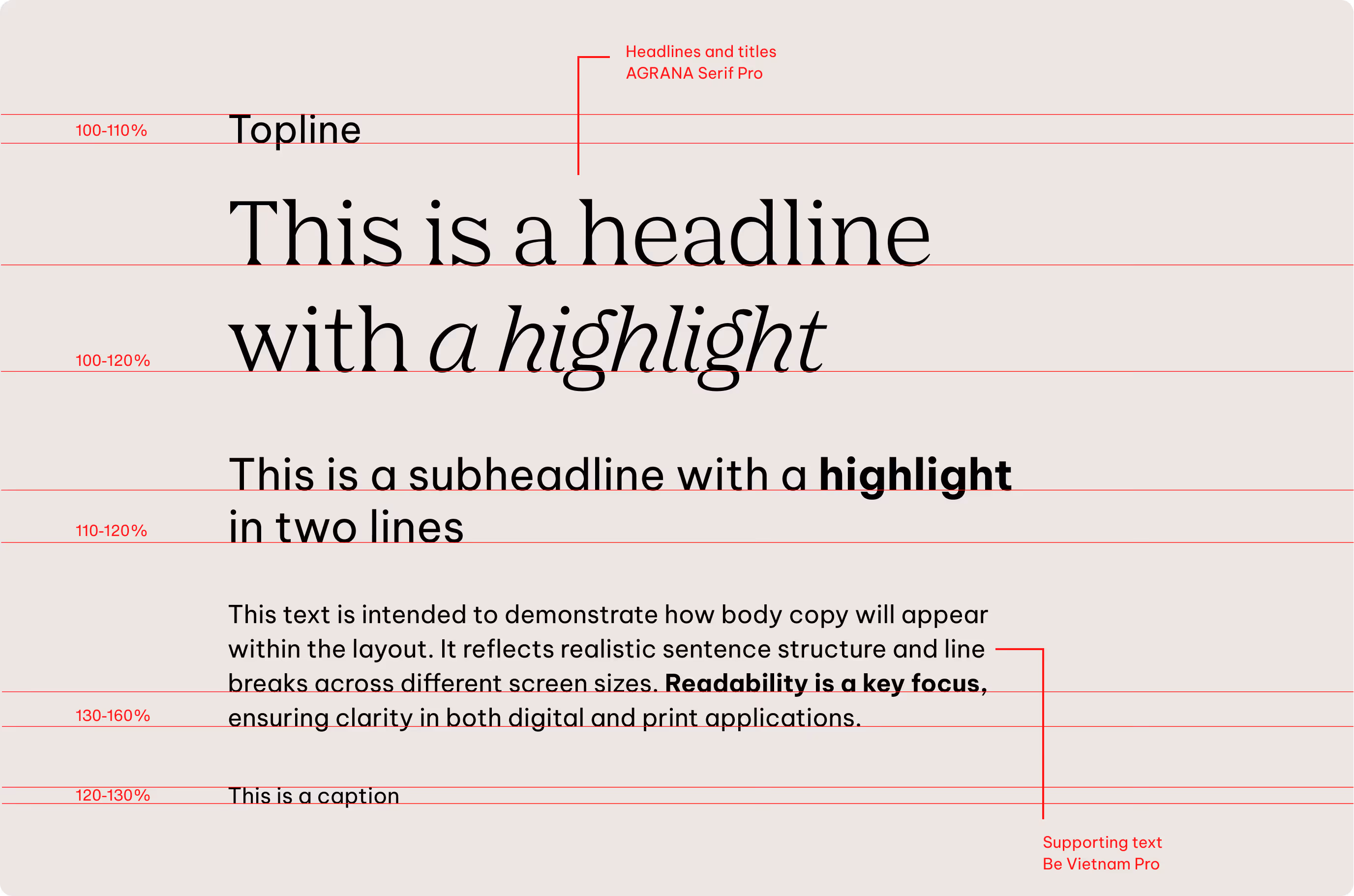
Line height is tailored to each style and generally scales with font size, but we adjust it if needed to maintain legibility. Letter spacing remains consistent in regular settings.
There is no fixed rule for spacing between different text elements, such as between subheadlines and body copy. We allow flexibility so layouts can adapt to the specific format and content. Spacing can be set freely within the grid, even if not all types of text elements are present.
Sizes
Headlines
We define almost all type sizes proportionally to keep the hierarchy clear and consistent across every format.
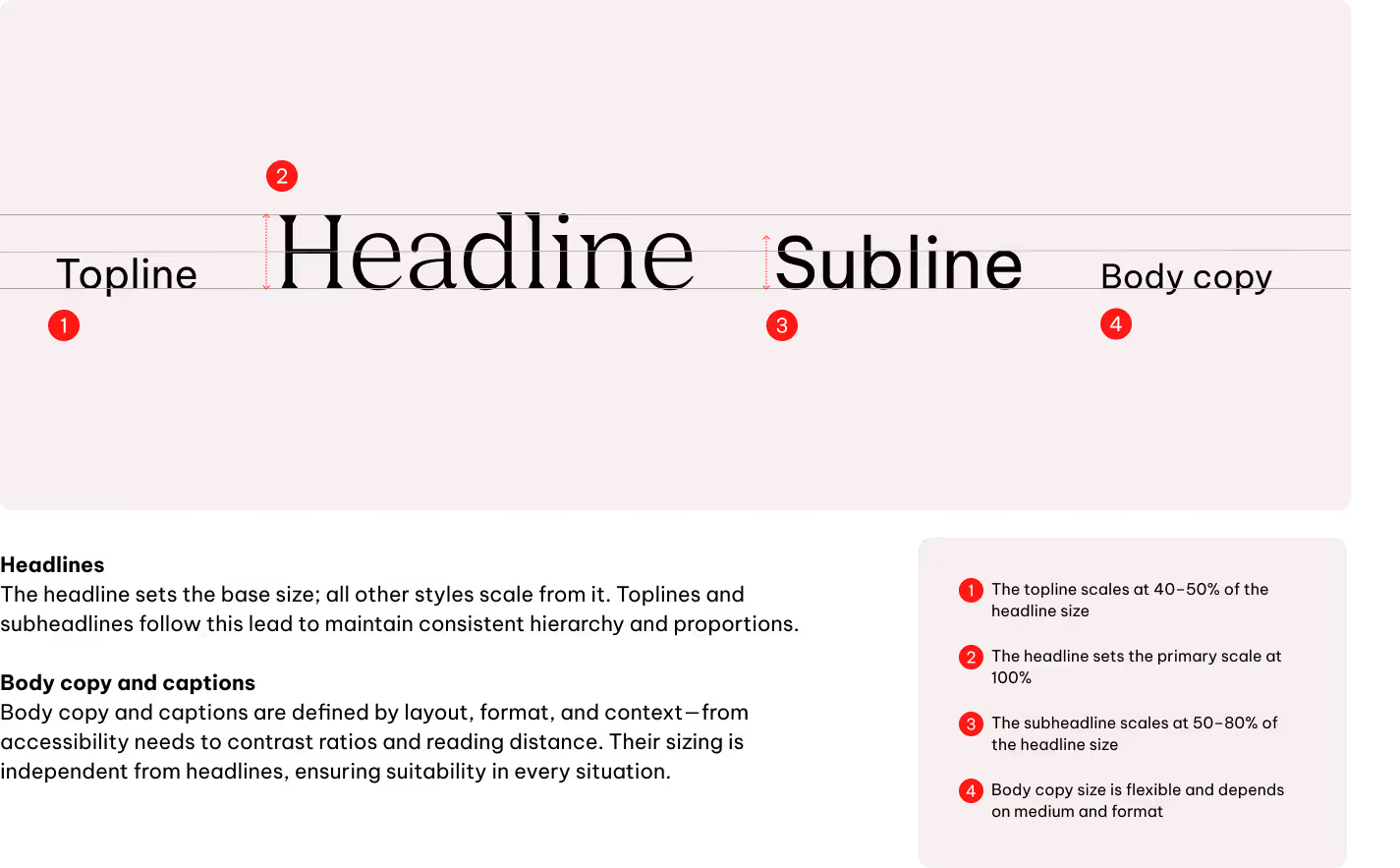
Size relationship examples
In our layouts, dynamic composition works together with clear hierarchy and visual flow. Every placement should prioritize legibility and a strong communication structure.
Text color
The font color is selected according to the background color or image. We always ensure sufficient contrast so that text remains clearly legible.
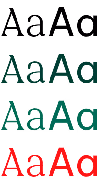
Primary colors
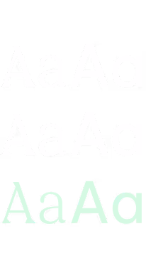
We always prioritize contrast and clarity when using typography on our primary colors. Black is used on all blue shades, all gray tones, and on light backgrounds or images. White is reserved for AGRANA Red, Dark Red, black backgrounds and on dark images or backgrounds.
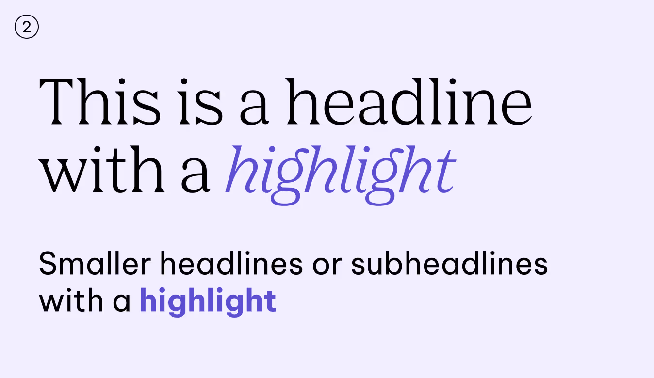
AGRANA Red is used only for accents and highlights. It may be applied on light blue shades, light grey tones, white, and Dark Red backgrounds.
White & AGRANA Red only

Black only

White only
Black only
Black & AGRANA Red only
Black & AGRANA Red only
Black & AGRANA Red only
Black & AGRANA Red only
Black & AGRANA Red only
White only
White only
Black only

WCAG 2
APCA
Do not use AGRANA Red in body copy—reserve it for special highlights only. Dark Red is never used as a text colour.
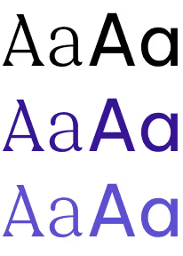
Secondary Colors
Text color
The font color is selected according to the background color or image. We always ensure sufficient contrast so that text remains clearly legible.
Shades
White & Tints only
White & Tints only
White & Tints only
White & Tints only
White & Tints only
White & Tints only
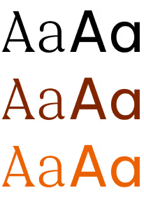
Mid-tones

Black only
Black only
Black only
Black only
Black only
Black only
Tints
Black & Shades only
Black & Shades + AGRANA Red
Black & Shades only
Black & Shades + AGRANA Red
Black & Shades only
Black & Shades + AGRANA Red
WCAG 2
APCA
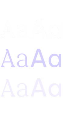
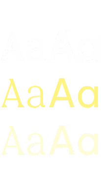
Our secondary palette is flexible, but accessibility and contrast remain the priority. It is structured in three levels: shades, mid-tones, and tints, each with defined text-color rules.
Shades pair only with white text or with tints. Mid-tones use black text exclusively. Tints offer more freedom, allowing either black or the matching shade color as text.
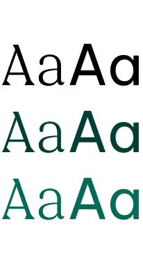
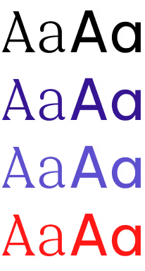
For body copy and text over imagery, we use only black or white. This maintains clarity and meets accessibility requirements. Always check contrast before placing text on coloured backgrounds.
Headlines and call-to-action elements may use AGRANA Red as a highlight, but only on lighter tints. Body text must always be in black or white to ensure legibility and accessibility.
Text on image
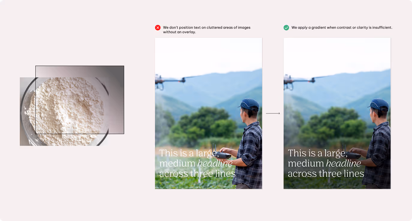
If the image is visually busy or lacks sufficient contrast, apply a gradient or transparent overlay behind the text to support readability and accessibility.
Setting highlights
We use highlighting to guide the reader’s eye and add nuance to our tone, not to compete for attention. Typically, we highlight up to 1–3 words at a time. In body copy, full sentences may also be highlighted when appropriate.
Alignments
The way text is aligned influences the tone of our communication. Most often we keep it simple and clear, yet alignment can be used to bring extra expression when the moment calls for it.

Left-aligned
Is our default. It feels natural to read, creates consistency, and keeps layouts clear.

Centre-aligned
Comes into play on touch points where we want more expression, such as bold headlines on posters or standout statements.

Right-aligned
Is used only when necessary, for specific design situations or functional reasons.
Usage across touchpoints
Typography flexes to match the tone of each touchpoint. For technical or performance-driven products, clarity and simplicity come first, making text easy to read and communication straightforward. Here, even headlines use Be Vietnam Pro to reinforce a clean, functional impression.
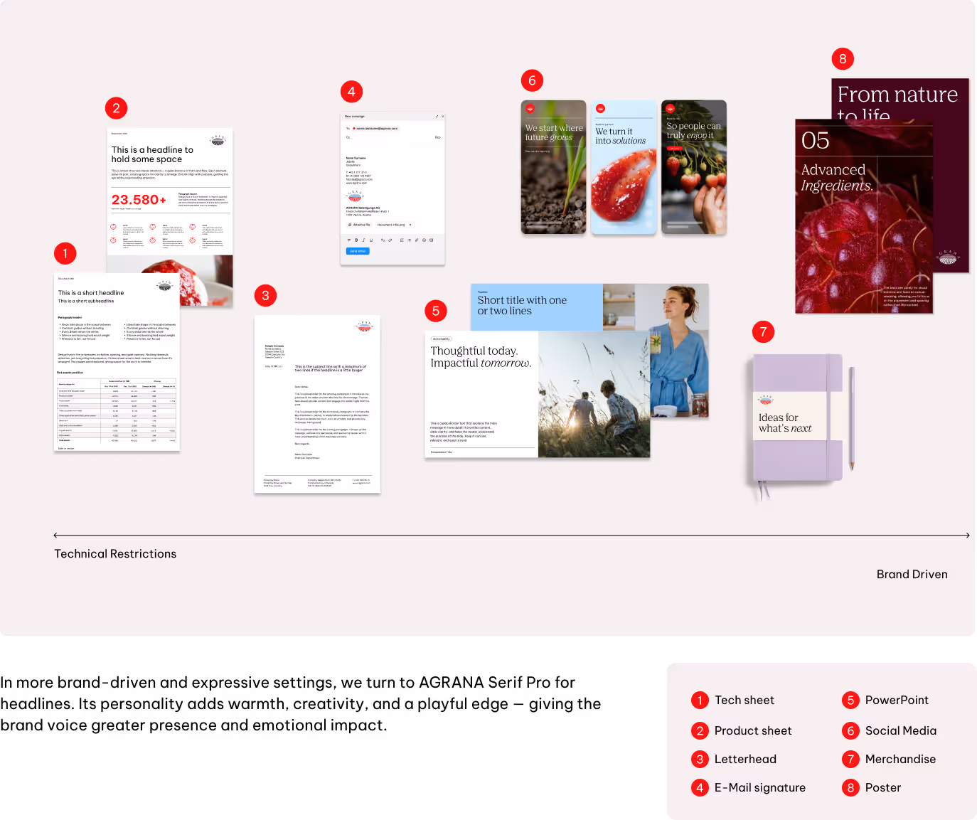
Further details will be defined in specific touchpoint guidelines (e.g., editorial).
Best practices
Substitute typefaces
Our typography system adapts when Agrana Serif Pro and Be Vietnam Pro are not supported, ensuring our brand stays consistent across different languages and scripts.

AGRANA Serif Pro carries our voice in Latin, Cyrillic, and Greek headlines with clarity and character.
For other writing systems — including Chinese, Japanese, and Korean — we turn to the Noto font family. Noto is licence-free, globally available, and designed for multilingual use.
Headlines use Noto Serif in Regular and Bold, while Noto Sans covers subheadlines, body copy, toplines, and labels in Light, Regular, and Bold, reflecting the role of Be Vietnam Pro.
System fonts
In environments where our custom fonts cannot be used — such as internal tools or emails — we rely on system fonts to keep communication clear and consistent.

Georgia steps in for AGRANA Serif Pro, bringing steady rhythm, strong contrast, and a familiar serif tone.

Arial takes the place of Be Vietnam Pro, ensuring legibility and neutrality for body copy, toplines, labels, and other supporting text.
Don'ts
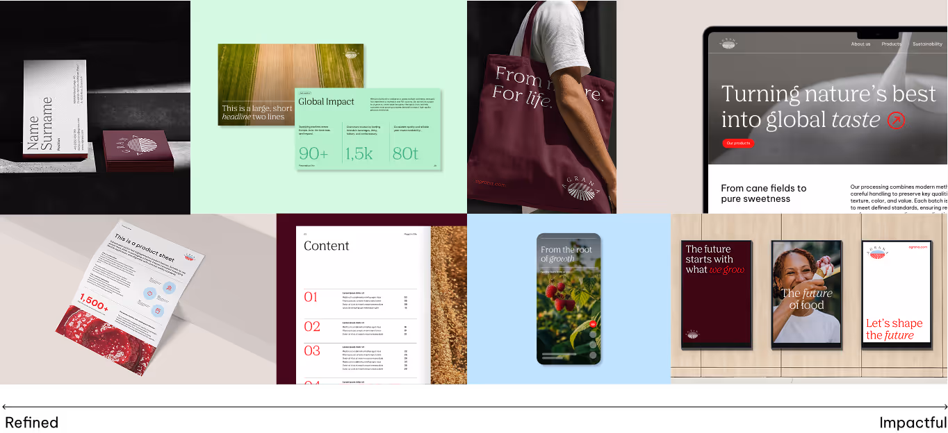
We keep our logo consistent across all touchpoints. That means we don’t alter, separate, or apply effects that compromise its clarity. To make this clear, the next examples highlight some of the most common mistakes and how to avoid them.
We don’t write in all caps
Text and headlines should always stay in sentence case — it’s clearer, easier to read, and feels more like us.
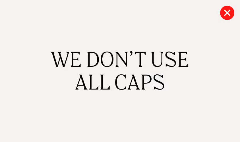
We avoid low contrast
Text and background should stay clearly apart to keep words easy to read. For color combinations, follow the accessibility rules in our guidelines to ensure clarity.
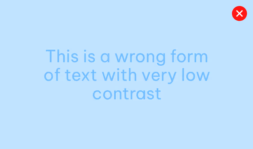
We don’t position text on cluttered areas of images
Always ensure there is enough contrast for easy reading.
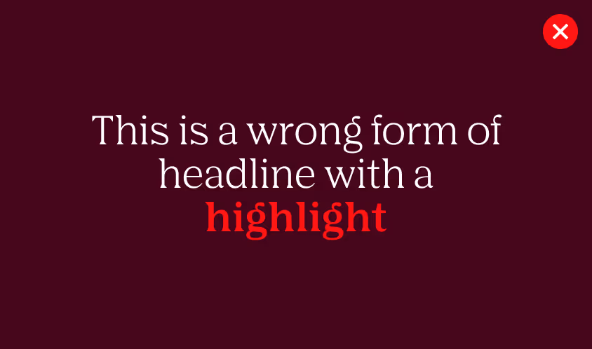
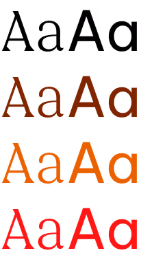
We avoid using bold with AGRANA Serif Pro.
In headlines, emphasis is set in italic to maintain a refined and consistent voice. Bold may be used in PowerPoint for functional purposes only.
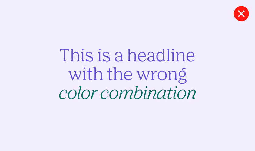
We never mix secondary colors
Text should be set in white, black, or the darkest tone of the matching secondary palette, depending on the background.
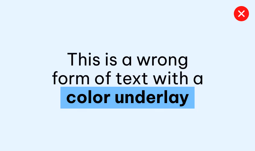
We don’t apply a coloured underlay to text
To highlight words, use text color only, without adding extra elements.
Downloads
Download the official AGRANA Serif Pro and Be Vietnam Pro font files to ensure consistent typography across all brand applications and touchpoints.
AGRANA Serif Pro
Optimized for expressive brand communication, including headlines, campaigns and editorials.
Be Vietnam Pro
Optimized for clear and functional communication across digital and print applications, including body copy, interfaces and presentations.